Imitation is the sincerest form of flattery
The trend of supermarkets to produce own-brand products which appear remarkably similar to market leading brands is controversial.
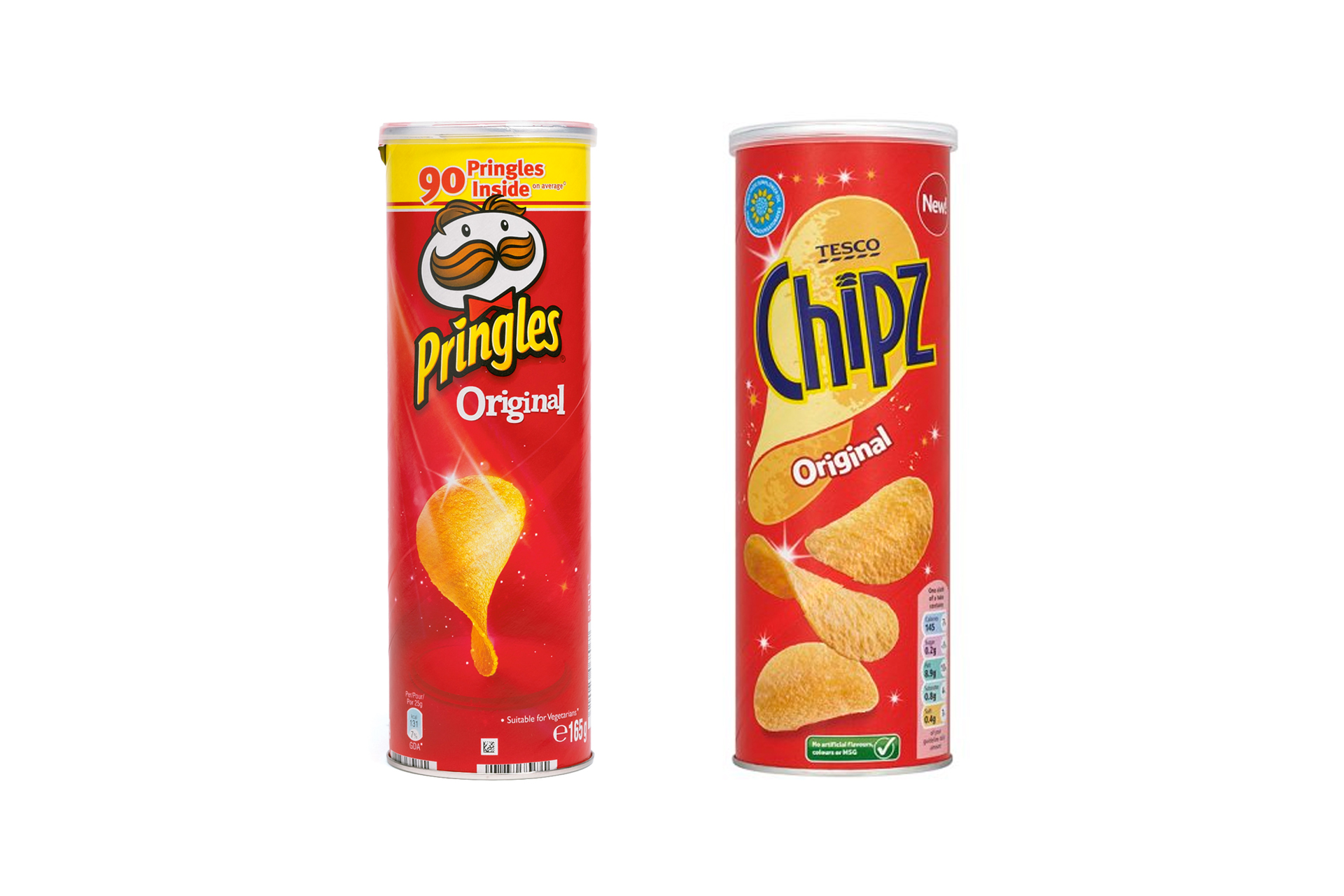
You can see by the above photograph of Tesco Chipz in juxtaposition with Pringles that the similarities in packaging can be pretty close.
Some would argue this imitation is the sincerest form of flattery and a sign that a brand is doing well.
However, many argue this tactic is an outrageous attempt by supermarkets to trick customers into buying their goods and steal market share. A report by Which? actually found that 40% of people buying own-brand products had done so by mistake with 30% claiming they felt misled.
This mimicry may work for the big retail store owners but when comes to a new company developing their own branding this approach is a big no no! Firstly, supermarkets are simply not going to share their shelf space if a company’s product doesn’t offer anything new – they clearly have that market corner.
Secondly, it is essential that any new brand, looking to establish itself, stands out and differentiates itself from the competition.
Let’s be honest the majority of consumers don’t meticulously read the ingredients on every product they pick up. Most people buy the packaging – and the decision on what packaging appeals most is based on what the branding is telling them.
If a company believes it has a great product distinctive from its competitors then it needs to communicate that through the branding.
An example of one of our clients doing this is frozen yoghurt brand ‘For The Love of Yog’. This company is competing in luxurious frozen desert market place which is dominated by the likes of Ben and Jerry’s. Being a healthier option to the market leaders, however, For the Love of Yog developed packaging which appears friendly by using heart shaped imagery and soft comic style illustrations. Short but amusing messages, attributed to the dairy cows, were also included to emphasise that friendly jovial feel. All the time, the branding is set on a purple background – a colour synonymous with luxury.
Another example is the branding for meat sauce brand ‘Bags of Flavour‘ which wanted to establish itself has a premium product. To convey this message the packaging was completely stripped back to a bare minimum in order to let the product speaks for itself – with the sauce clearly visible in the bag. An elegant copper foil emblem with the messaging ‘created by professionals’ was also included to give a high end feel to packaging itself.
It is difficult enough for new a company to succeed in any competitive market place, and whether the business stands or falls will largely be due to the quality of its products – but if the branding is off message at the beginning the business is immediate limiting its chances of distinguishing itself.
If it gets to the stage where others are looking to copy the packaging however, it is a clear indication that they got the branding right and a market leading position will have already have been established.