
BRIEF
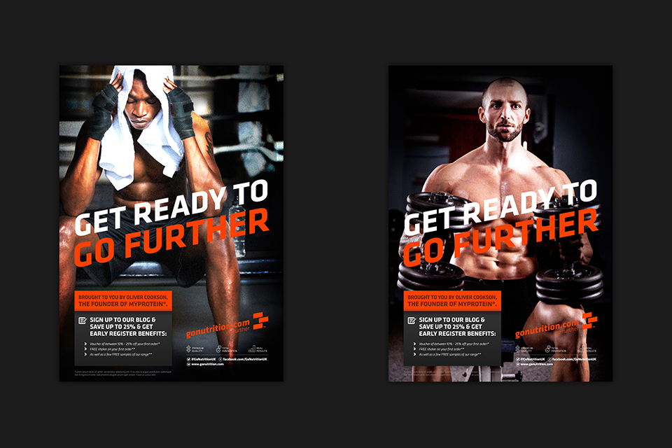
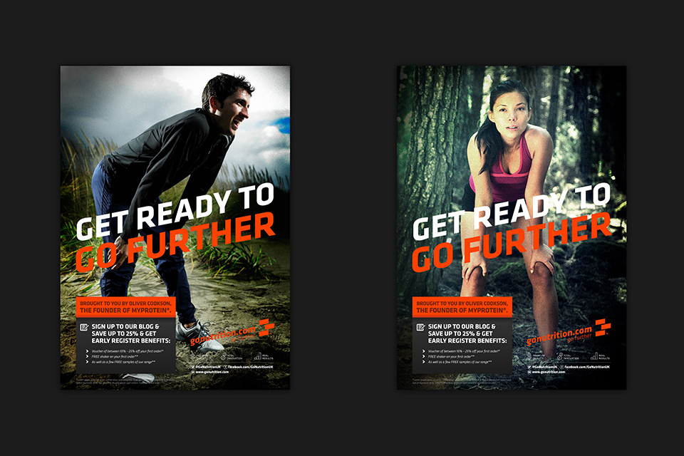
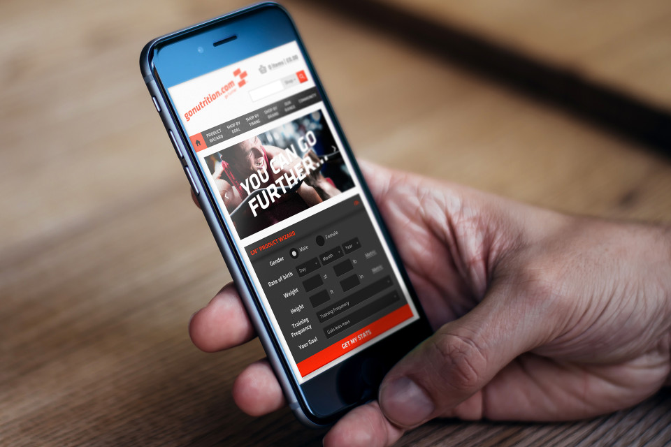
From one nutrition-based venture to the next, founder Oliver Cookson’s next brand was a fresh start, one that emphasised quality, not only of the nutrition offering itself, but of customer service and innovation too. Oliver came to us with these three tenets and asked us to create a vibrant, polished brand that reflected that ethos.


THEORY
We started with a clean, three-block logo in blood orange – arranged in the classic bricklaying Flemish bond to signify strength and the notion of multiple ‘block’ ideas working together to create a strong, cohesive whole – be it a health and fitness regime, or an innovative sports nutrition brand!
PROCESS
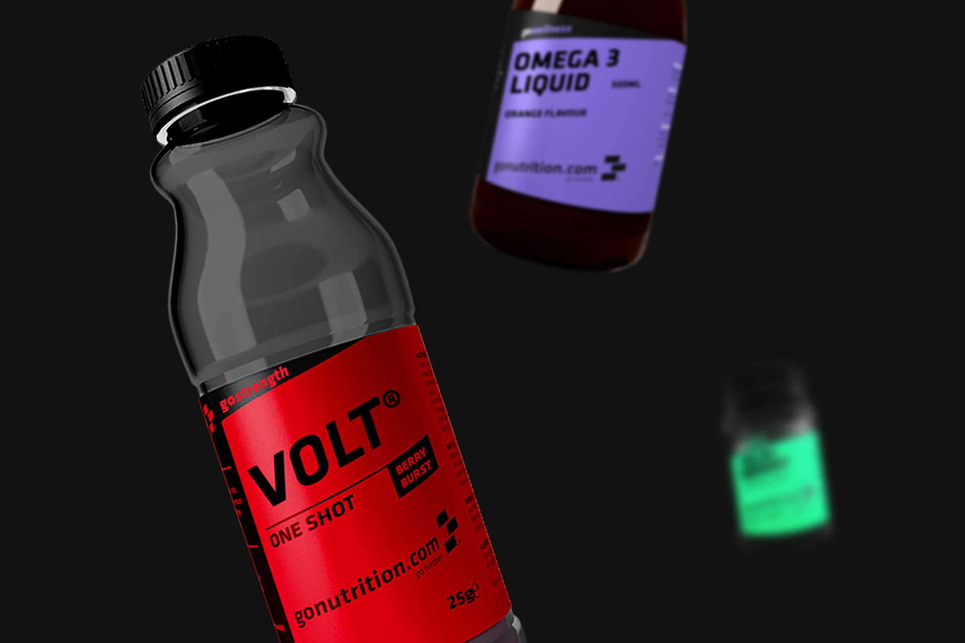
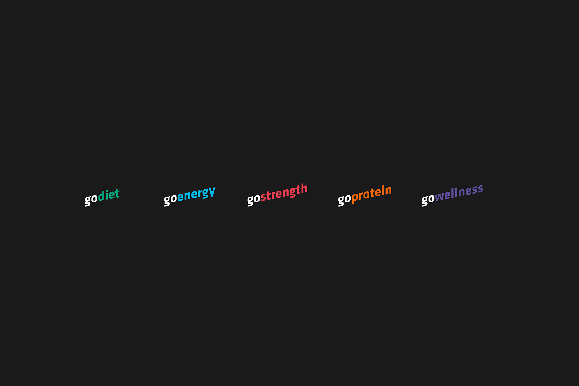
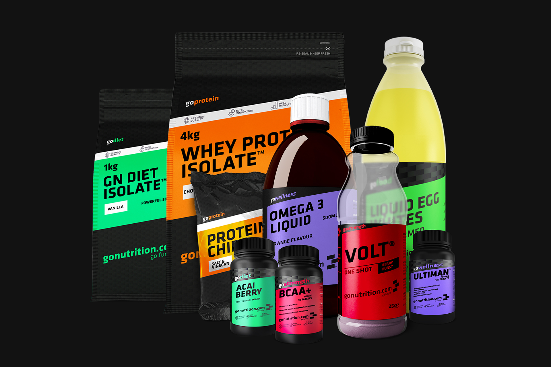
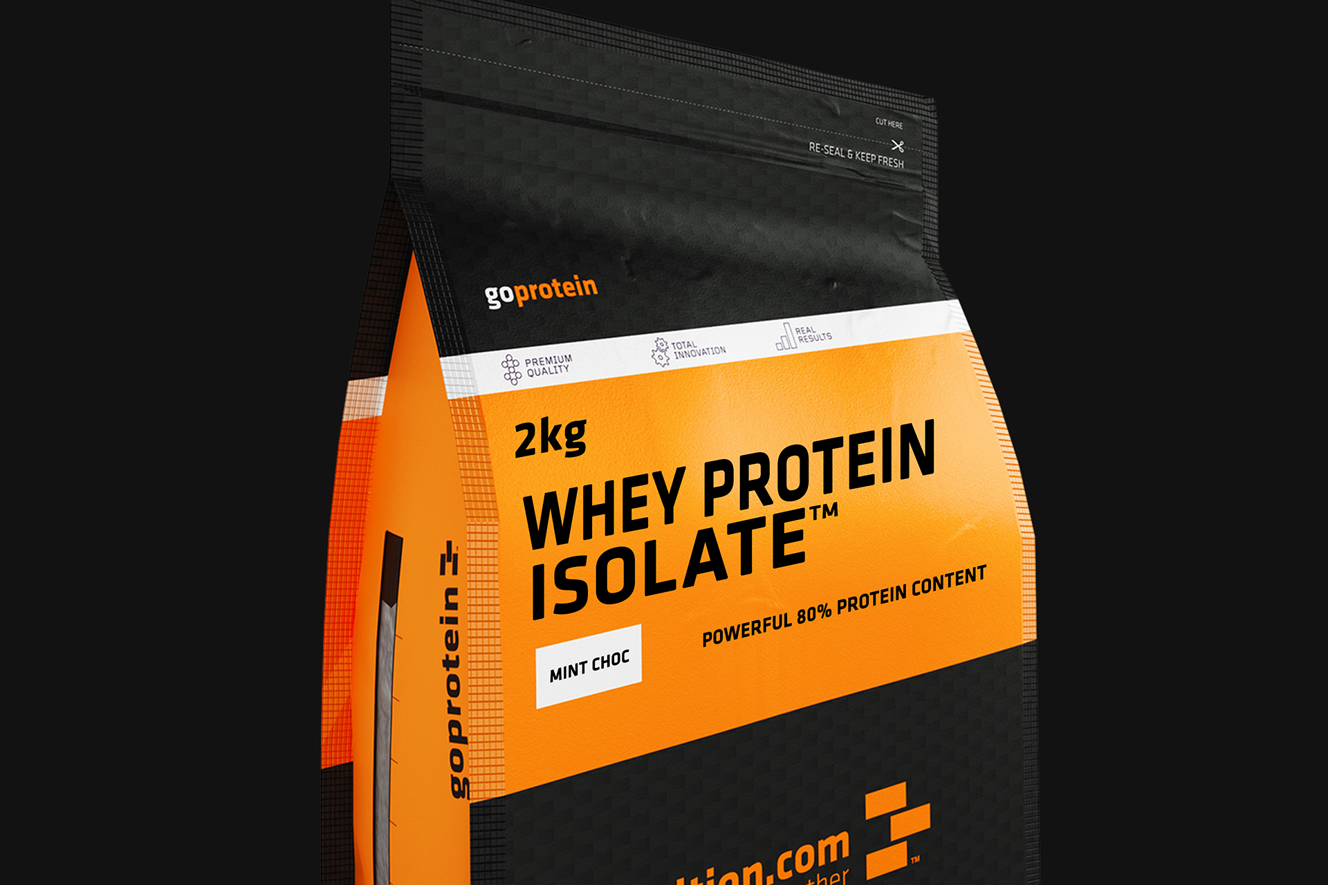
Each sub-brand within GoNutrition (e.g. GoDiet, GoStrength) was given a specific colour depending on its function – these colours were then mirrored on both the packaging for that range of products and the range itself.
process cont.
We designed the packaging with a sealable zip ensuring freshness, and a QR code towards the bottom of each bag that directs customers back to the GoNutrition website to re-order if they want to.
Contact us
Get in touch
 NEXT PROJECT