BRIEF
Lancashire Farm are award winning dairy producers that have been around for over 30 years, specialising in high quality natural yogurt made with milk from British farms. They approached us having reached a point where they wanted to widen the appeal of their brand and range. As such, they needed a Brand that gave everyone at Lancashire Farm something to align themselves with and champion, with a view to repositioning the brand as a major industry contender.
THEORY
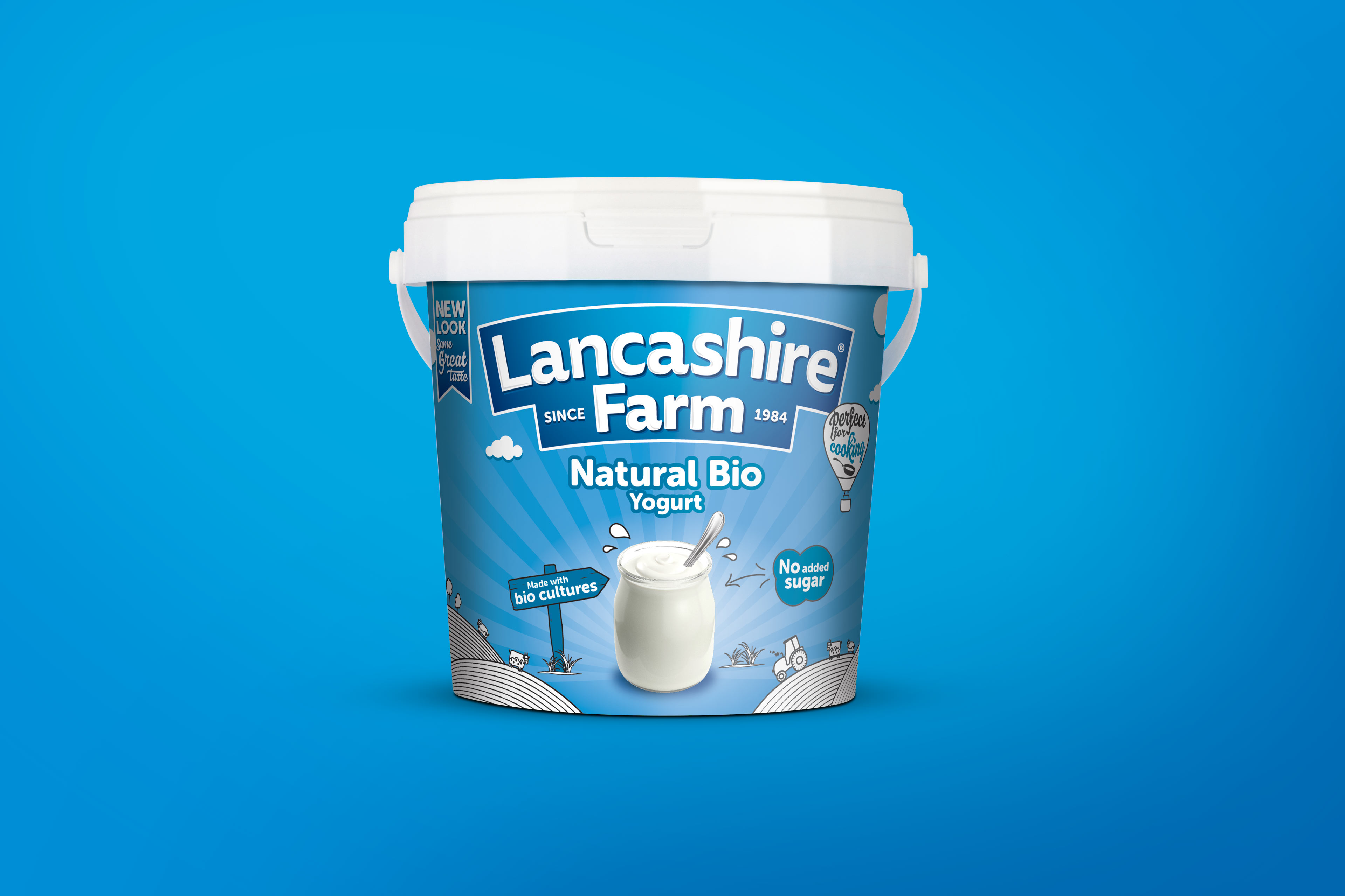
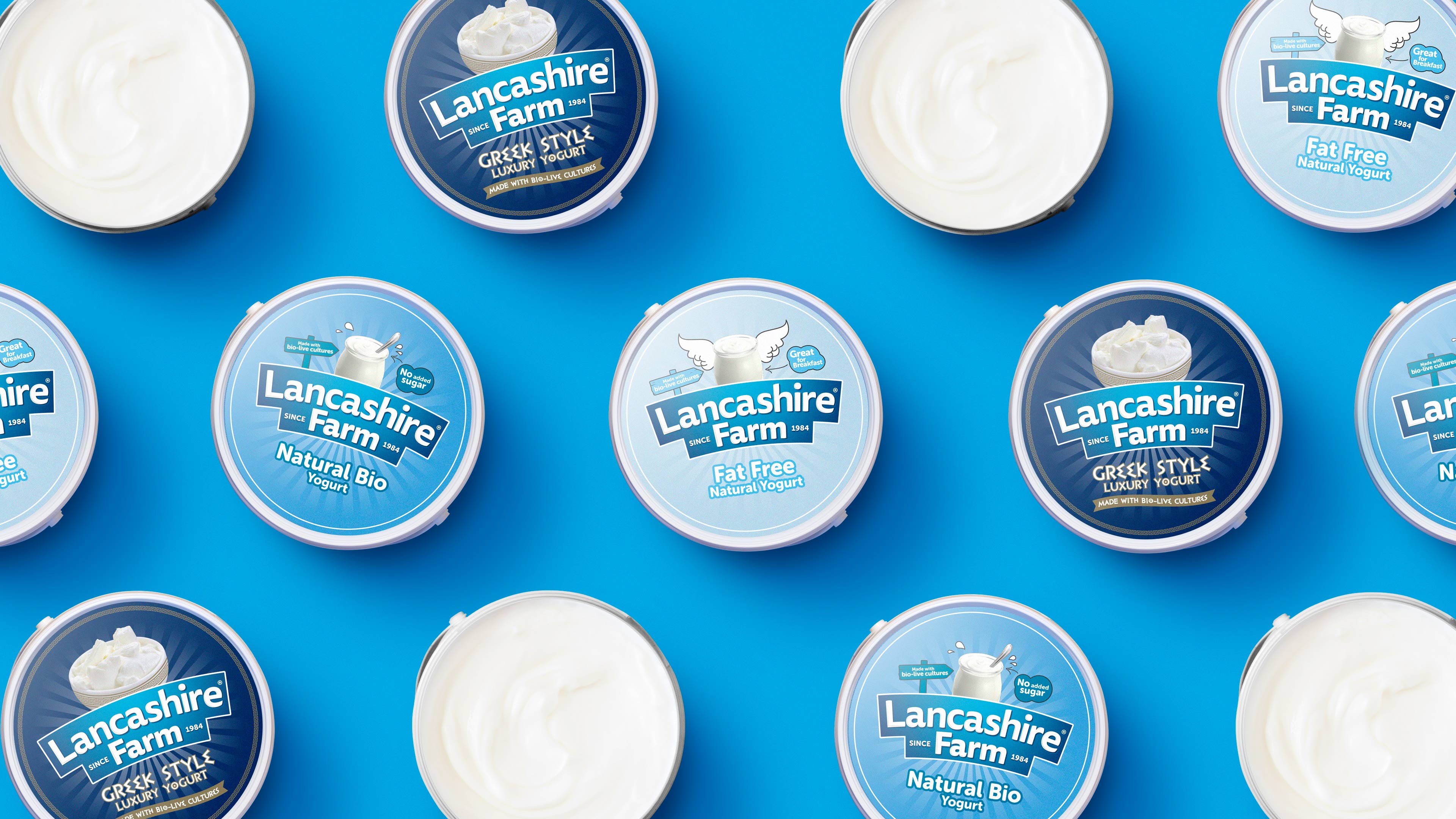
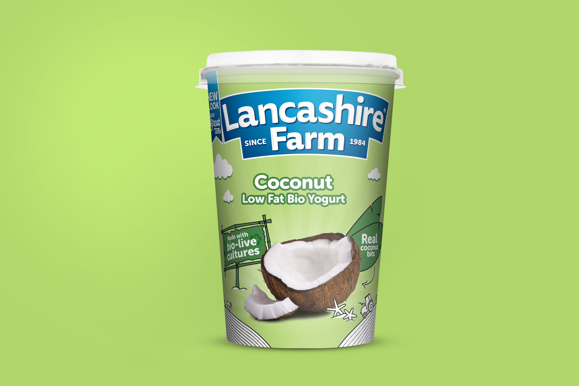
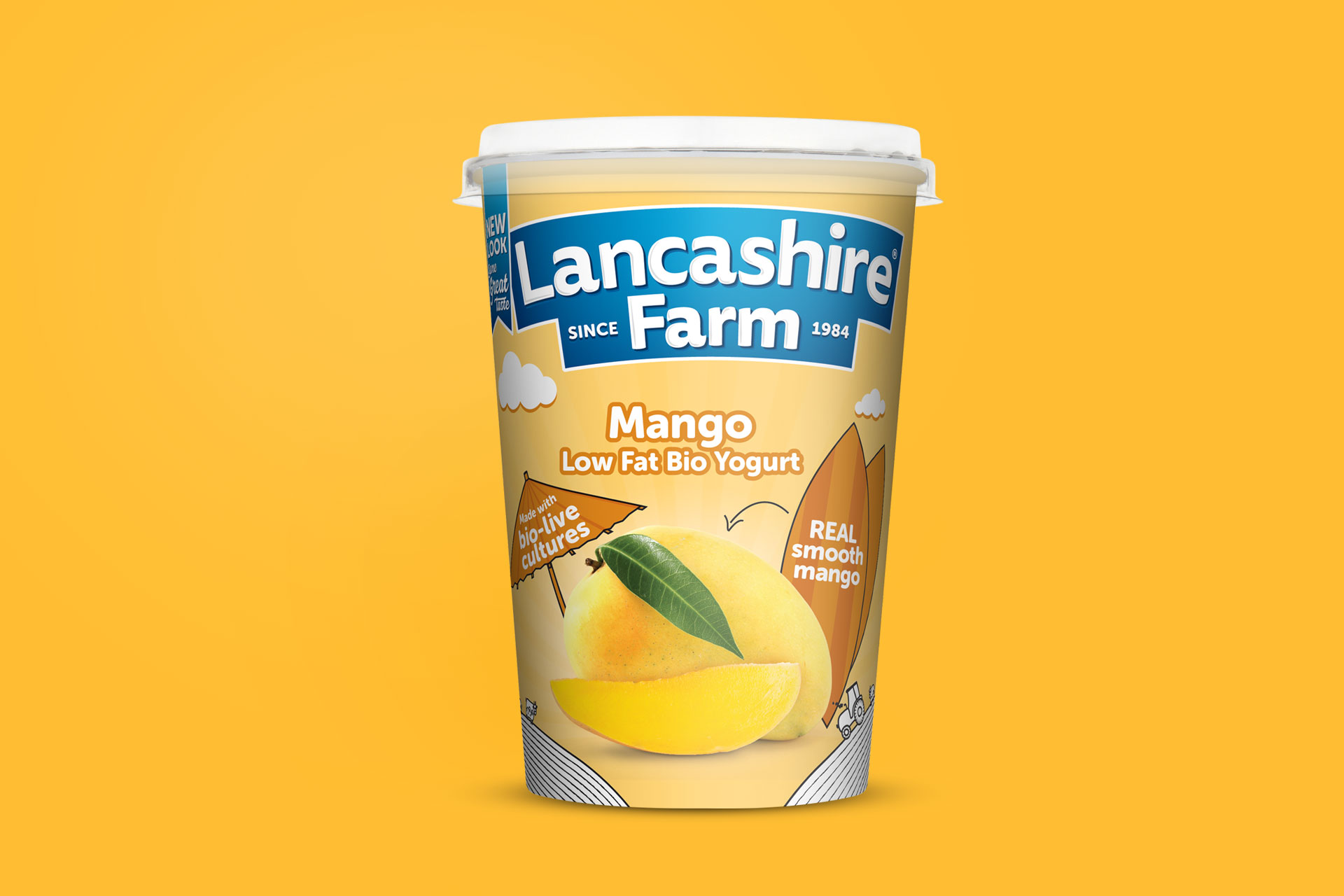
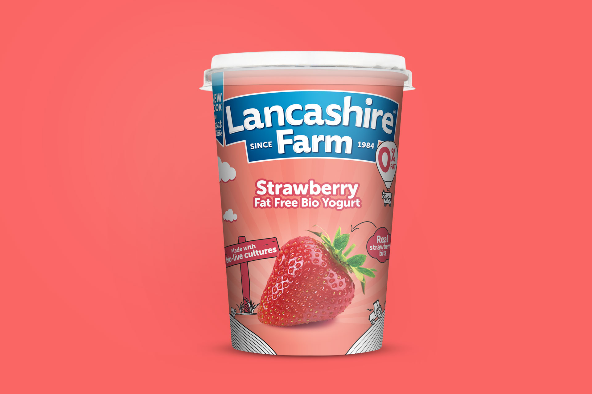
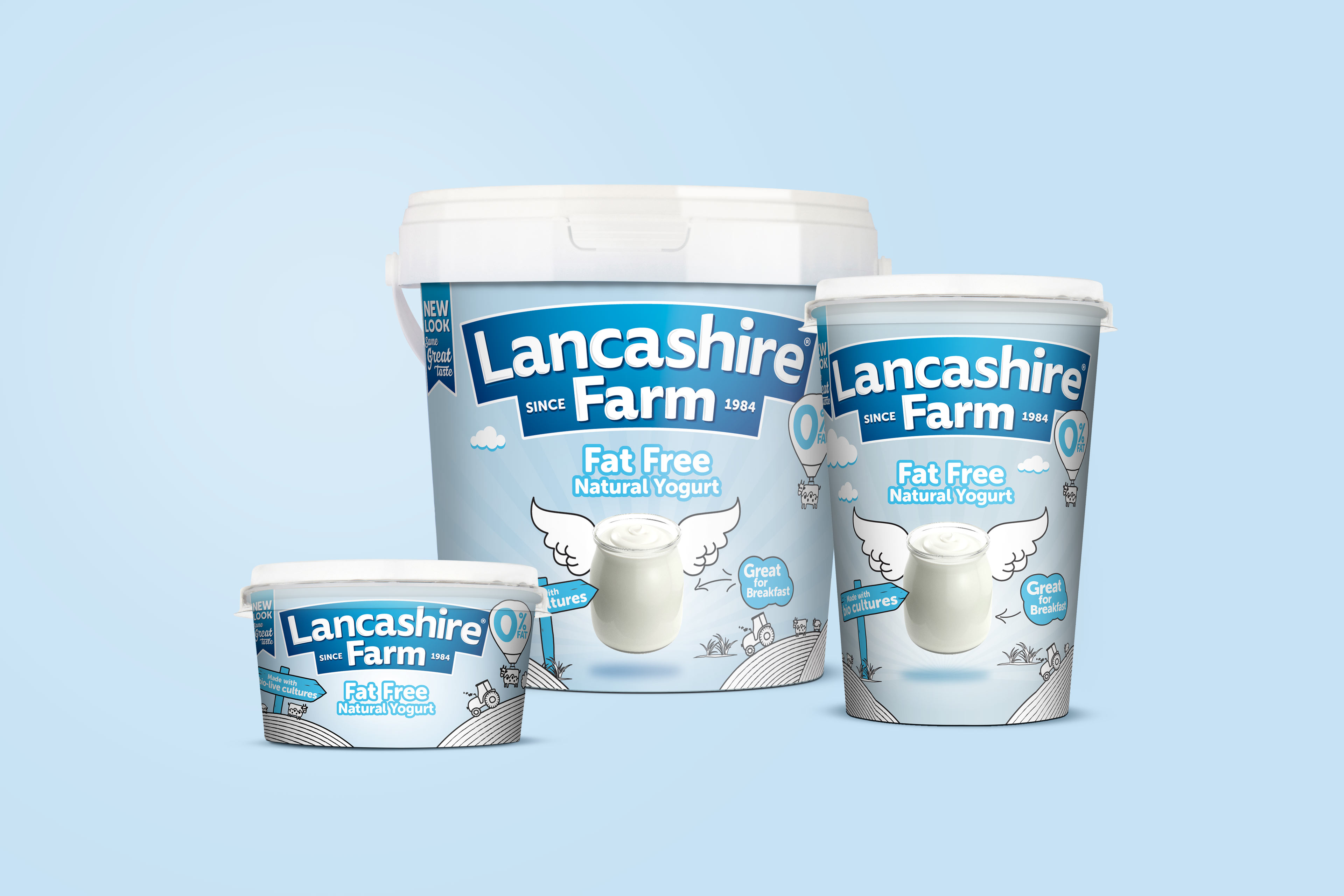
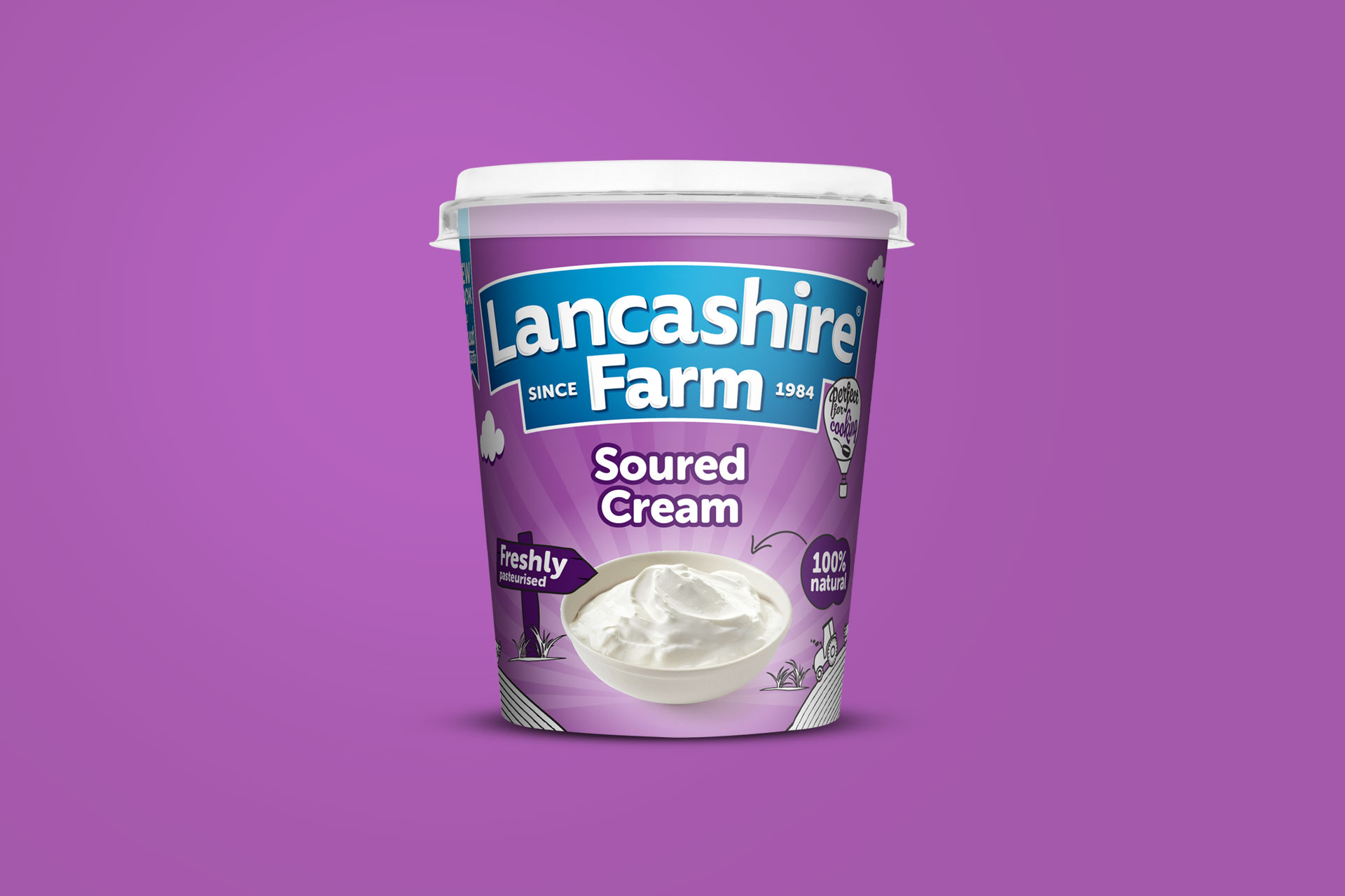
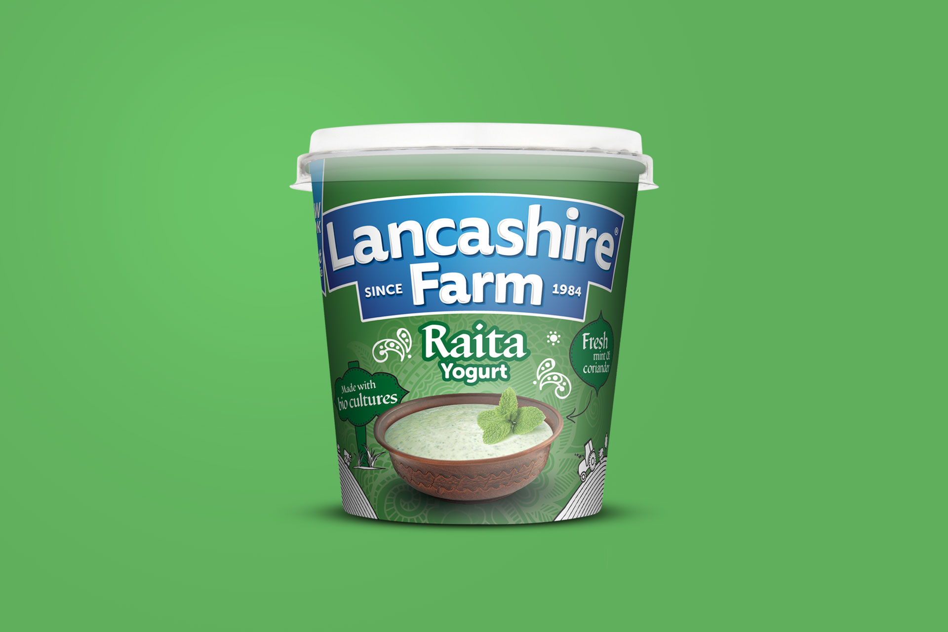
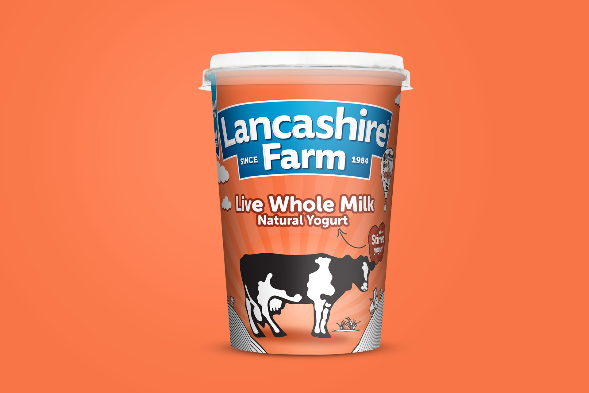
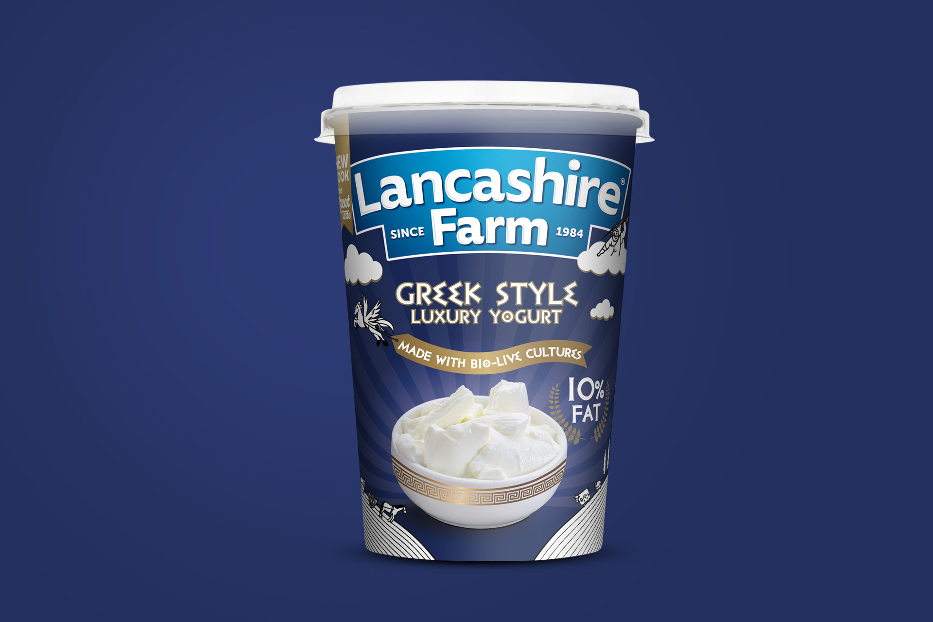
Lancashire Farm’s previous packaging lacked visual consistency. It looked dated, with little in the way of differentiation between range categories. This meant that customers were unclear as to the purpose of the various pot sizes, which in turn meant that there was little perceived value in the Lancashire Farm brand. We needed to make Lancashire Farm stand out on the shelf.
theory cont.
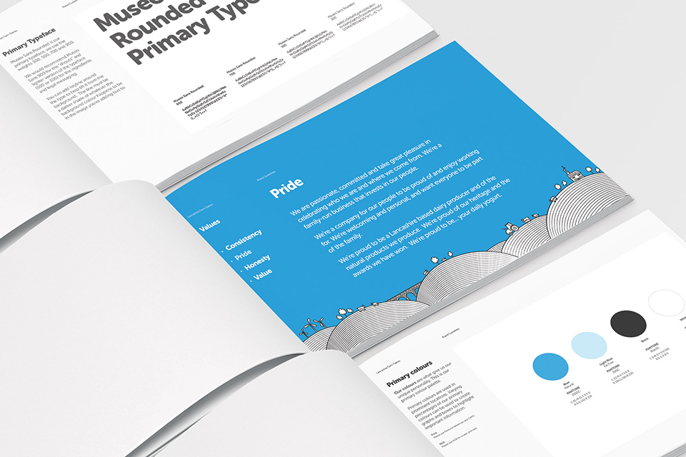
After running a comprehensive brand workshop, we decided upon four central brand values of consistency, pride, honesty and value, then set about creating an identity and packaging that reinforced these values.
PROCESS
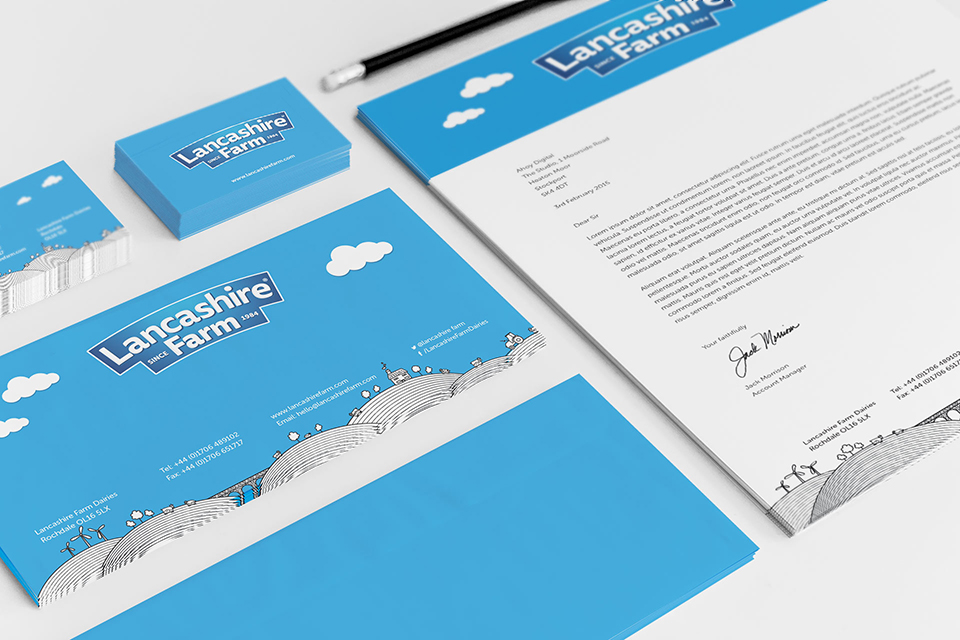
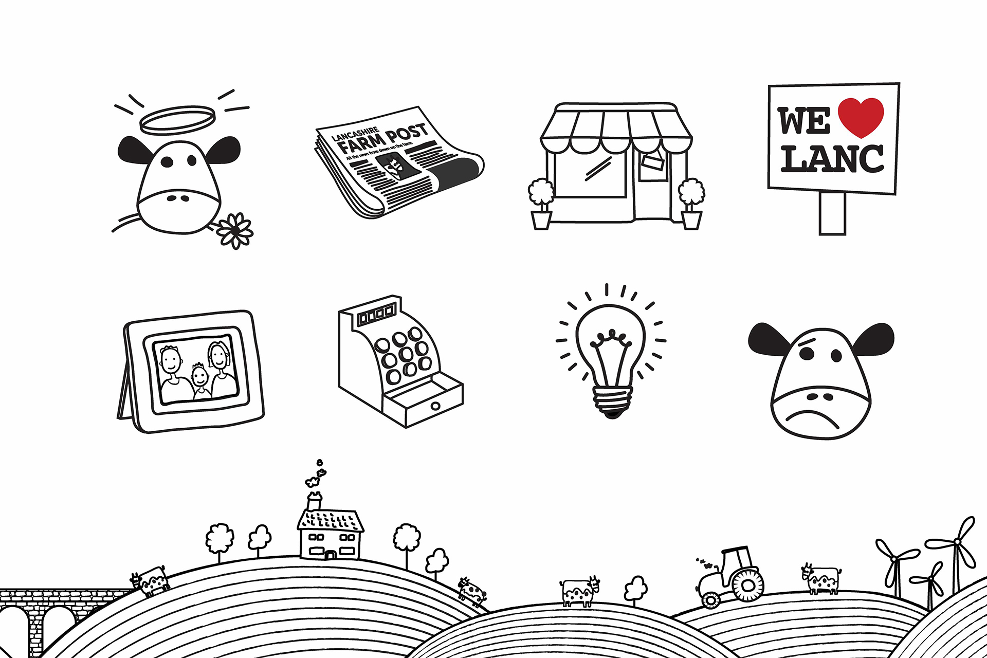
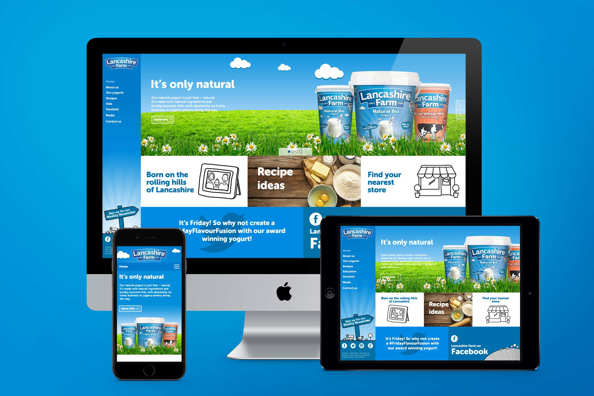
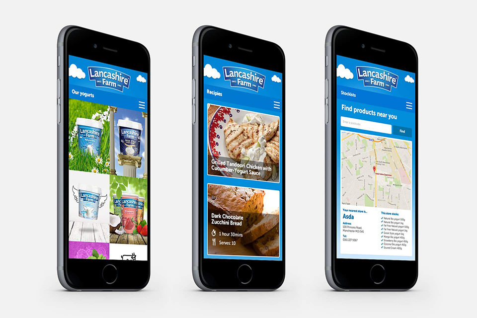
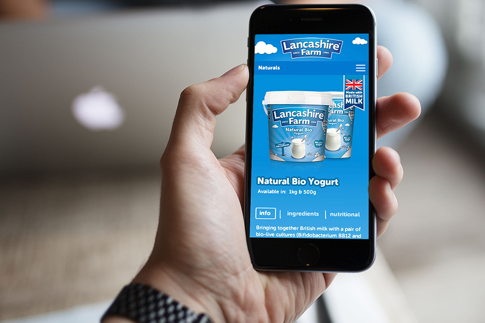
Given that location and local sourcing are second only to price when it comes to factors influencing a purchasing decision, our design route was inspired by the rolling hills of Lancashire, which feature prominently on every brand touchpoint. It’s a route that literally and figuratively paints a friendly picture of the brand and the farm. Our use of mixed media illustration and interaction with the product gives an overall impression of playfulness and inclusivity. This aesthetic was carried through to every single touchpoint within Lancashire Farm’s Brand Atmosphere, including all of the pots in their various ranges, the boxes that carry them, aisle fins, shelf strips, shelf talkers, van wraps, stock request letters, as well as on the brand’s fully responsive website and social media profiles.
process cont.
To further increase the perceived value of the brand, we needed to make sure that there was a consistency between all avenues of communication. As such, the new brand identity is supported by completely rewritten copy throughout the site and on the packaging, as well as within Lancashire Farm’s company blog, with tone of voice guidelines and an aspirational mission statement established to carry the brand forward. In addition, we wrote suggestions for how this voice could be applied to positive and negative messages from customers over social media.
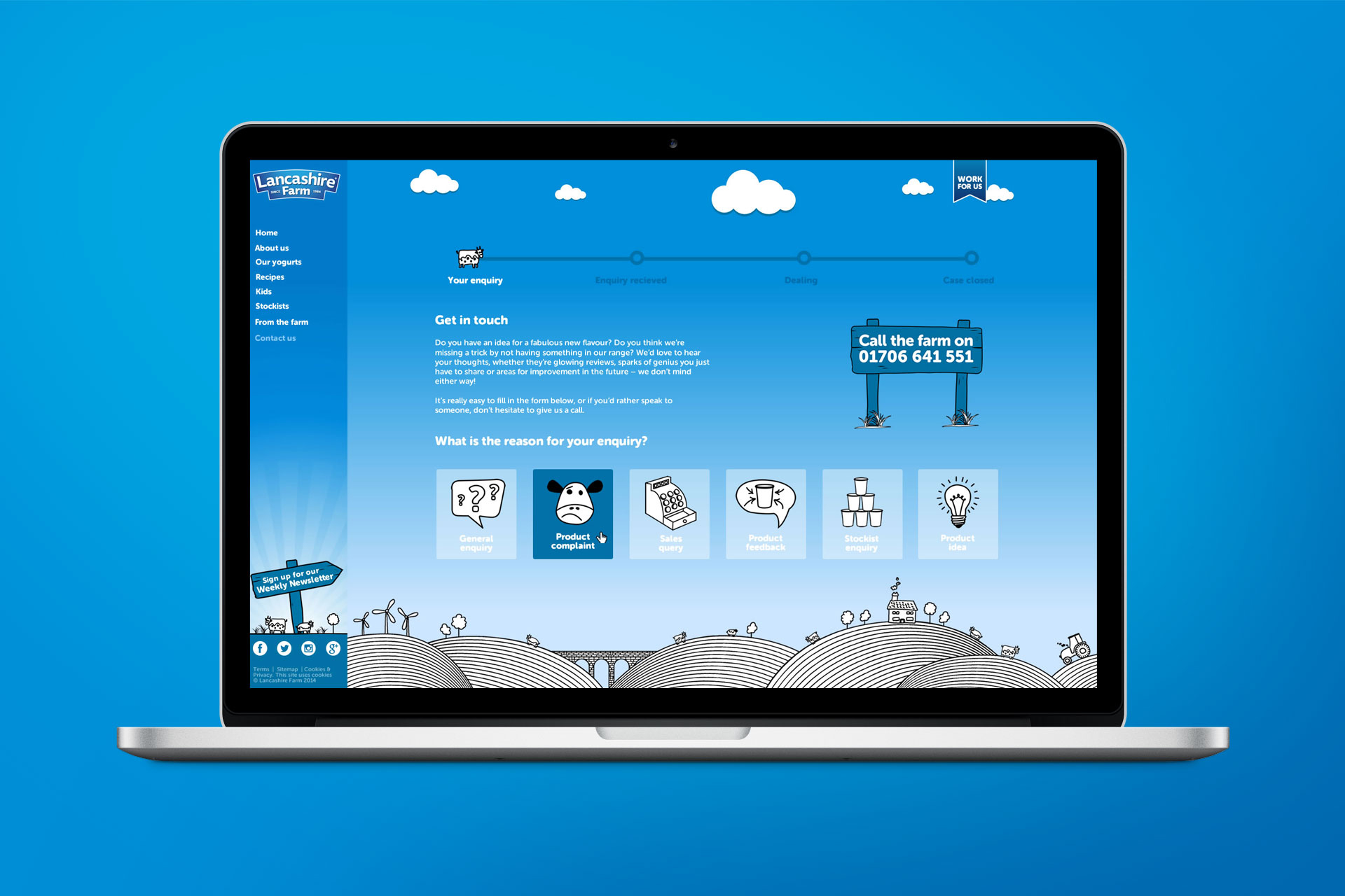
Contact us
Get in touch
 NEXT PROJECT