BRIEF
Magnafi is a motion marketing agency creating engaging hero content and campaigns, as well as fully-fledged brand experiences that win hearts, captivate minds and, ultimately, make brands desirable. We entered the Magnafi picture when the team were still getting their heads around how they wanted the brand to work, and what they wanted to be able to offer their clients. As such, we were tasked with creating a Magnafi brand atmosphere from the ground up – with a brand story, values, visual identity and overall brand direction that sold Magnafi as an experience as well as an offering. It’s only fitting that a brand that specialises in creating brand experiences is an experience in and of itself, right?
THEORY
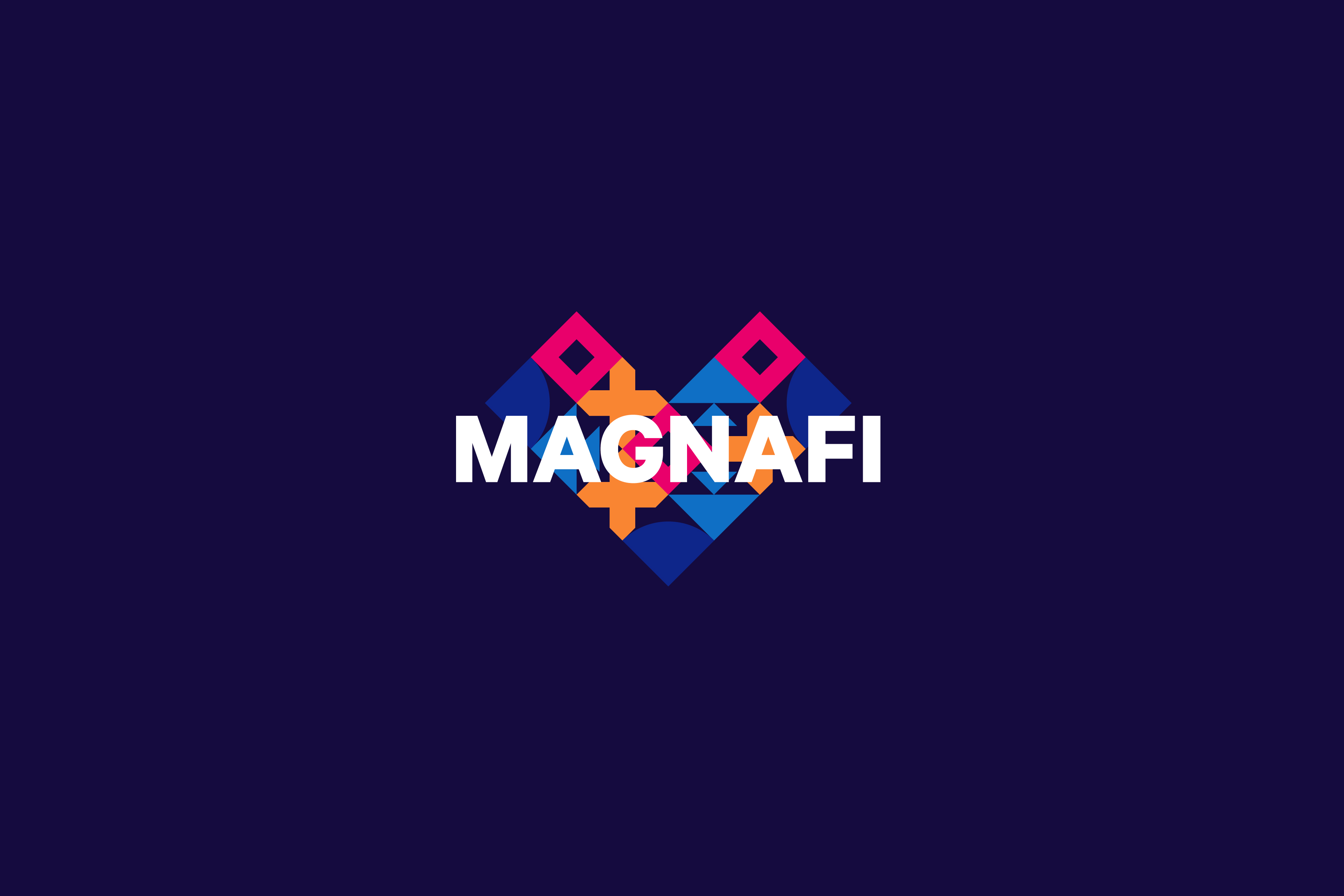
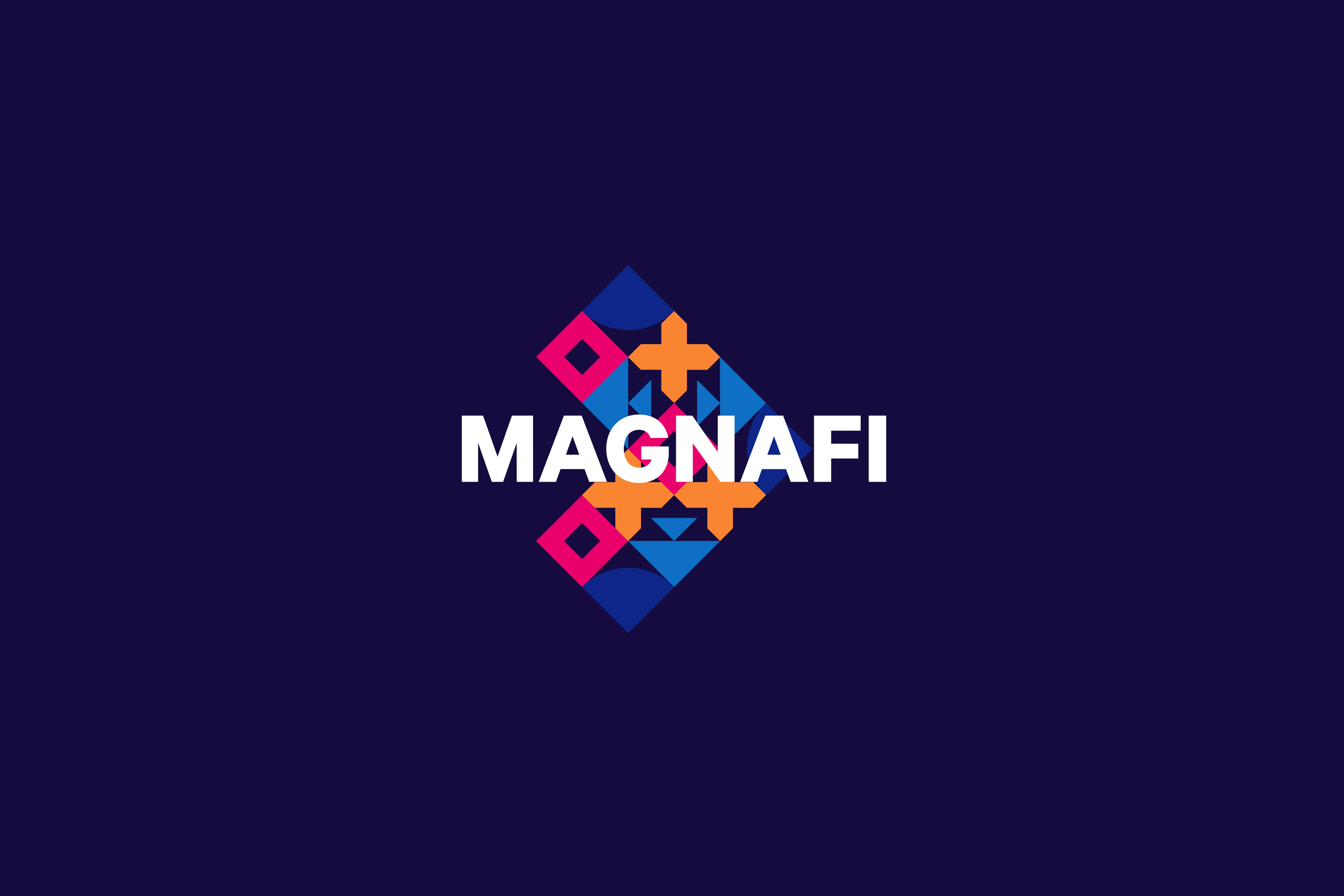
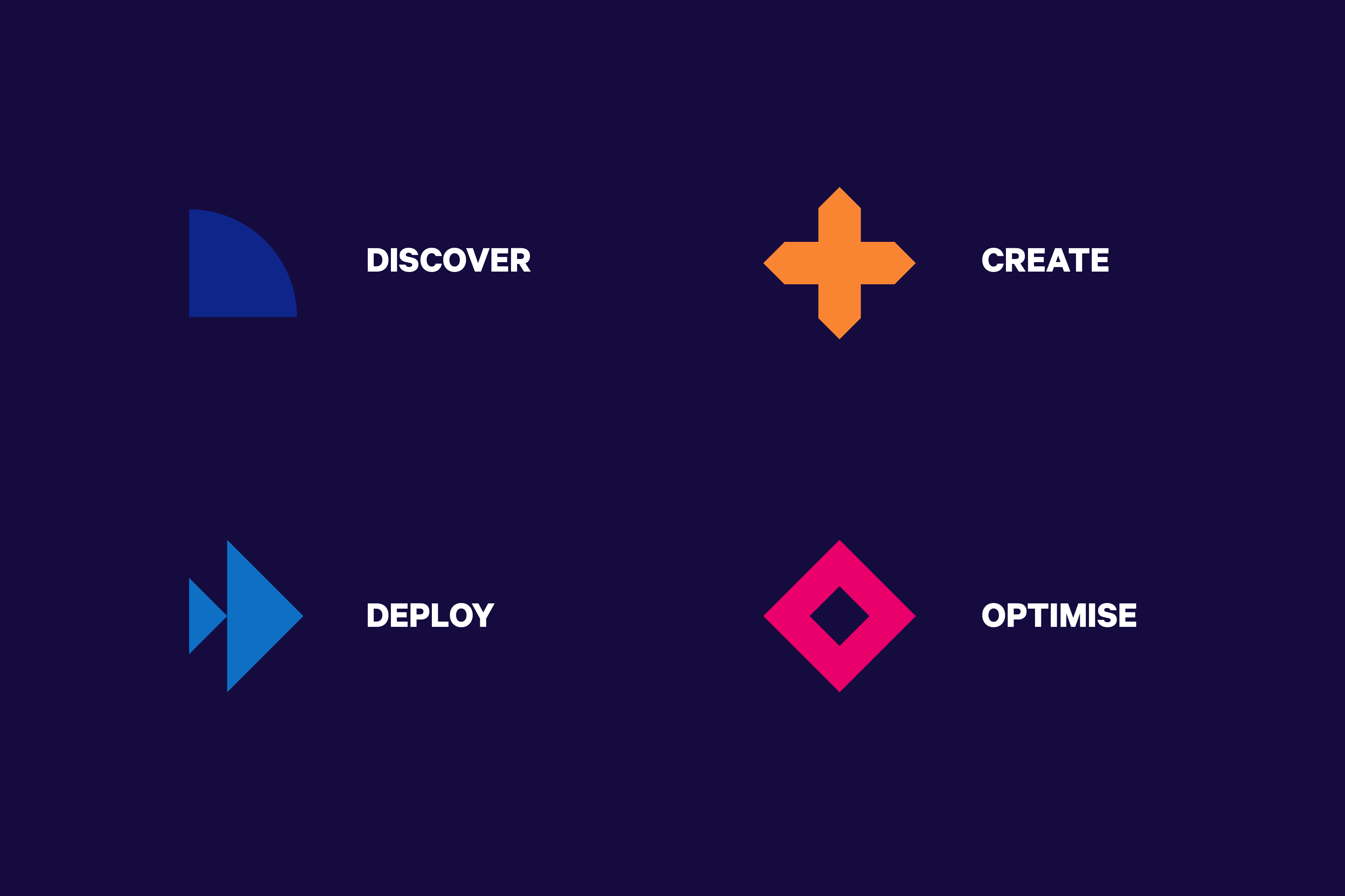
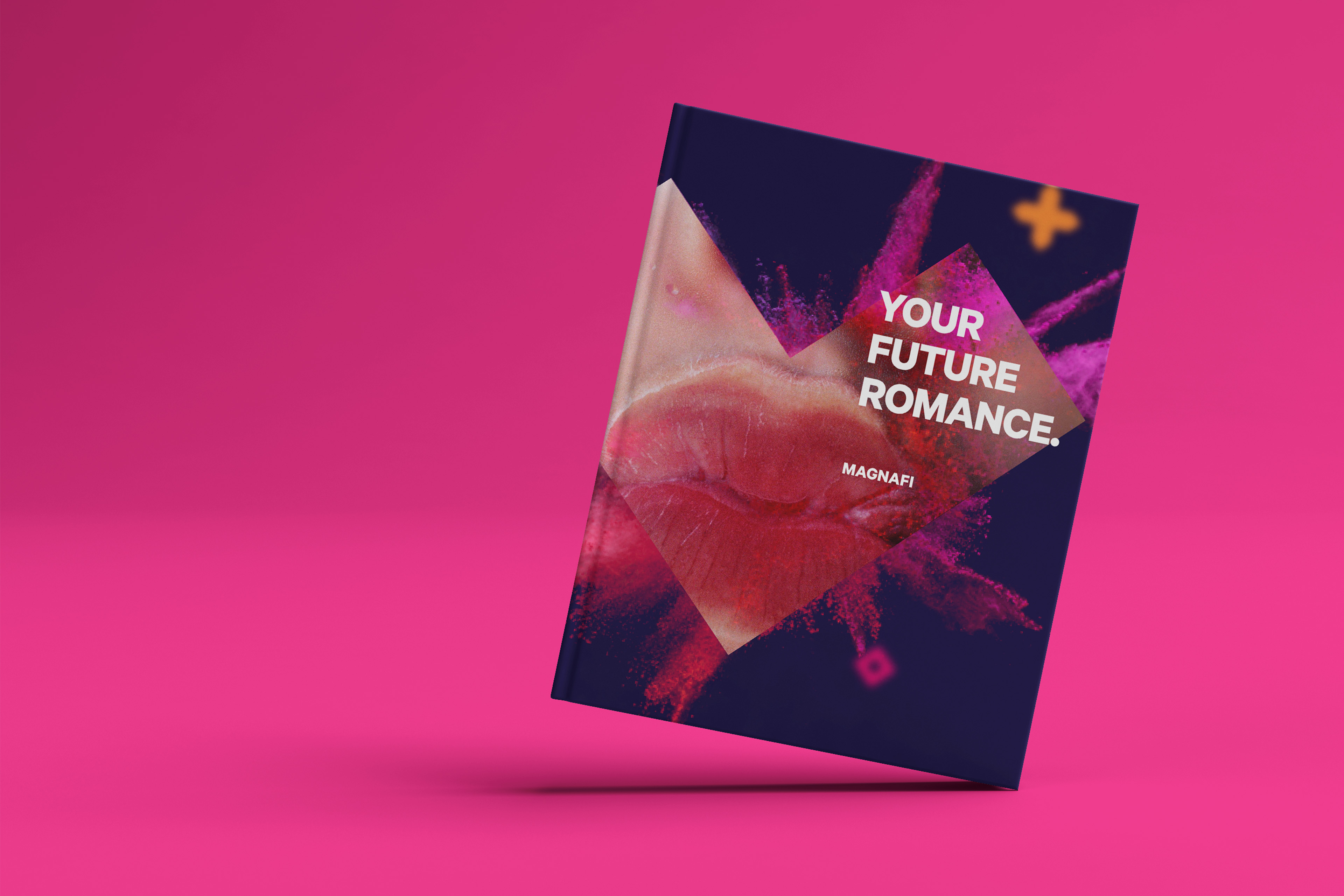
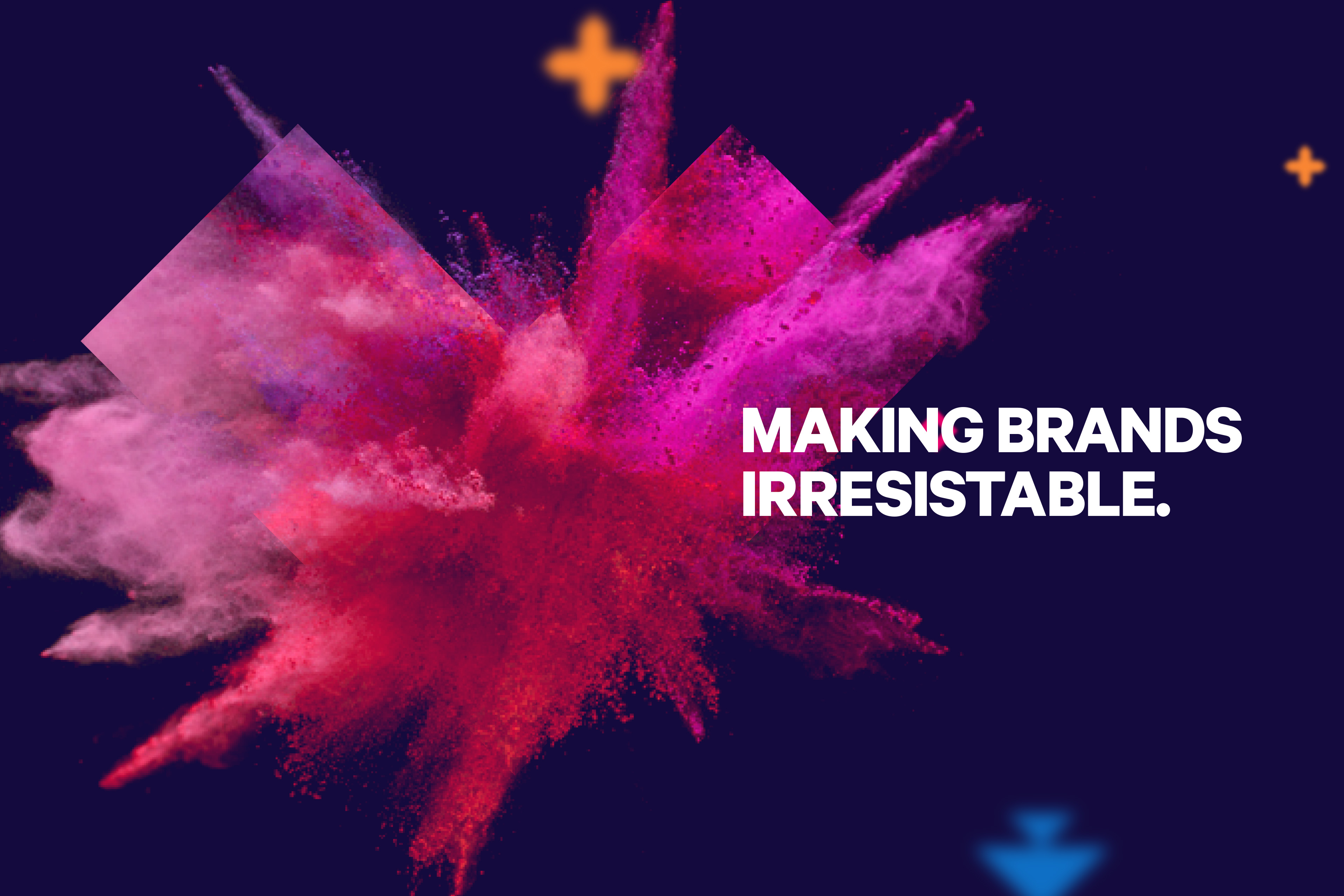
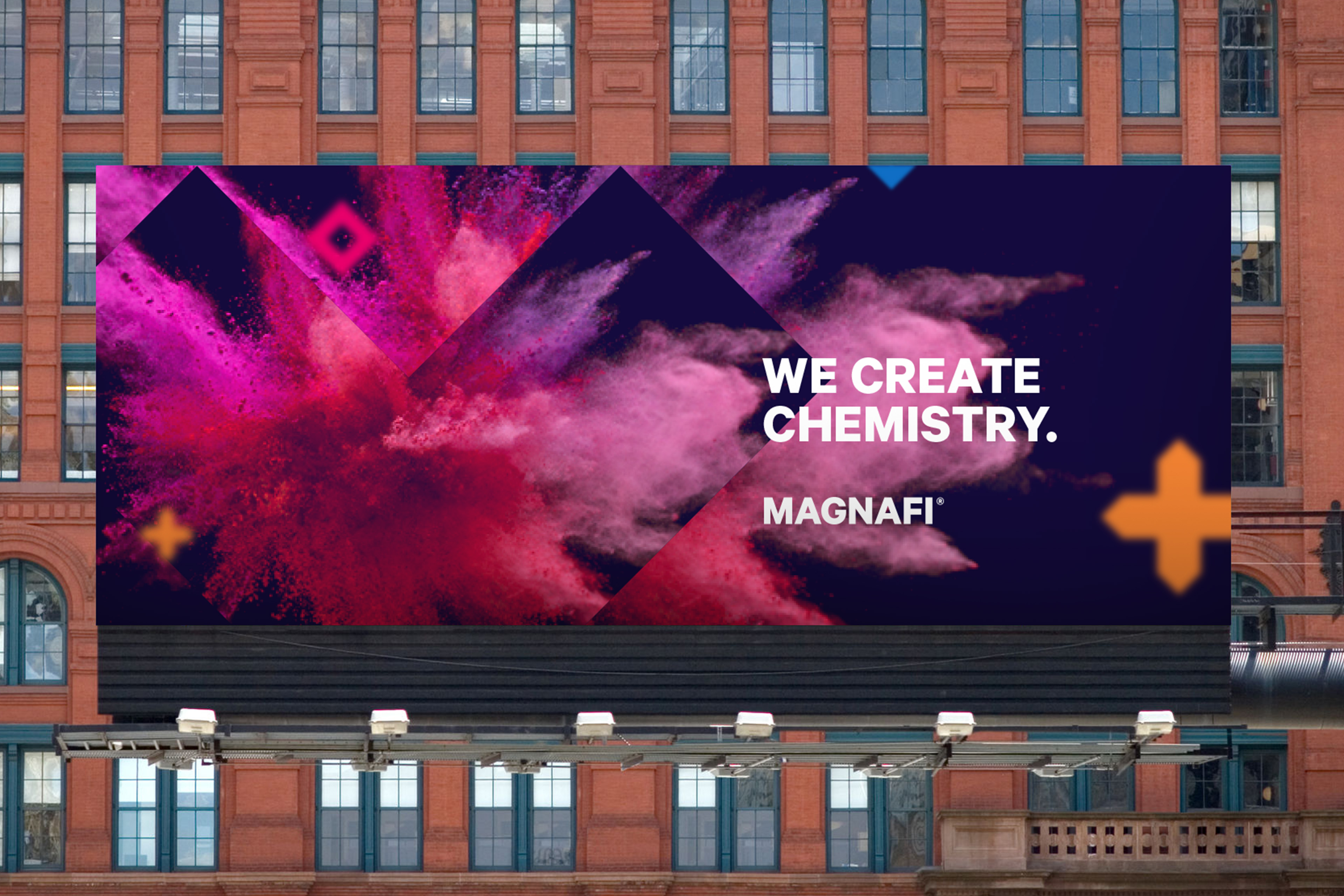
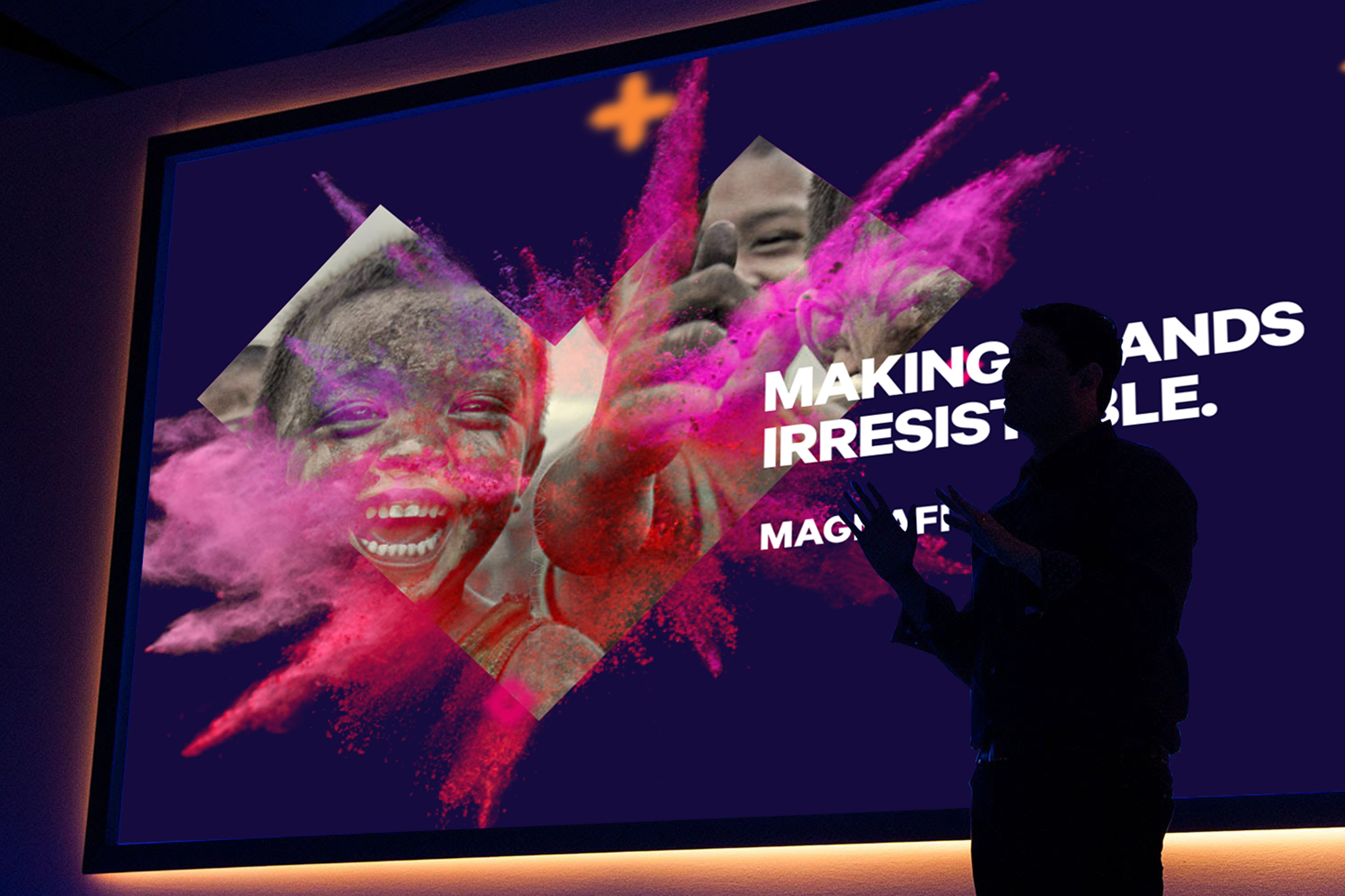
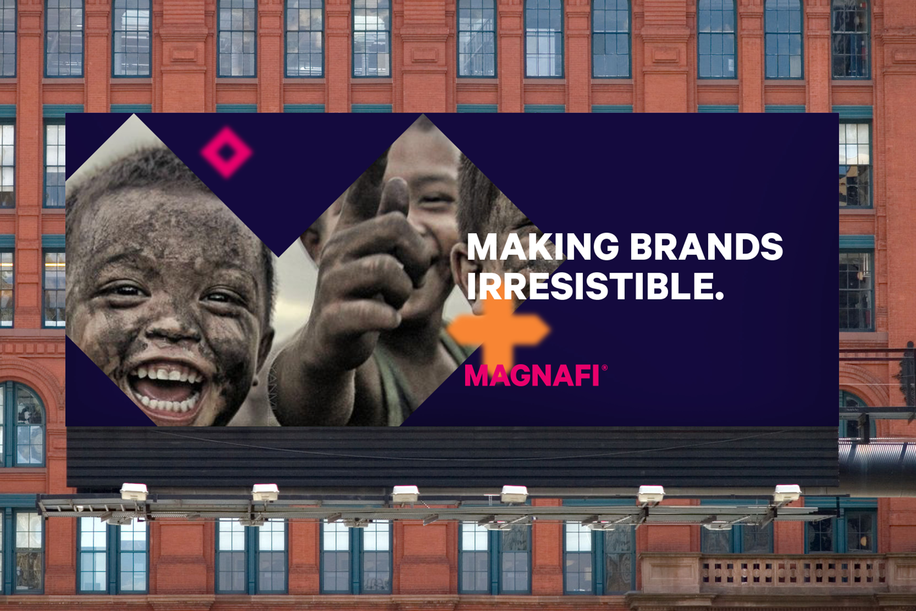
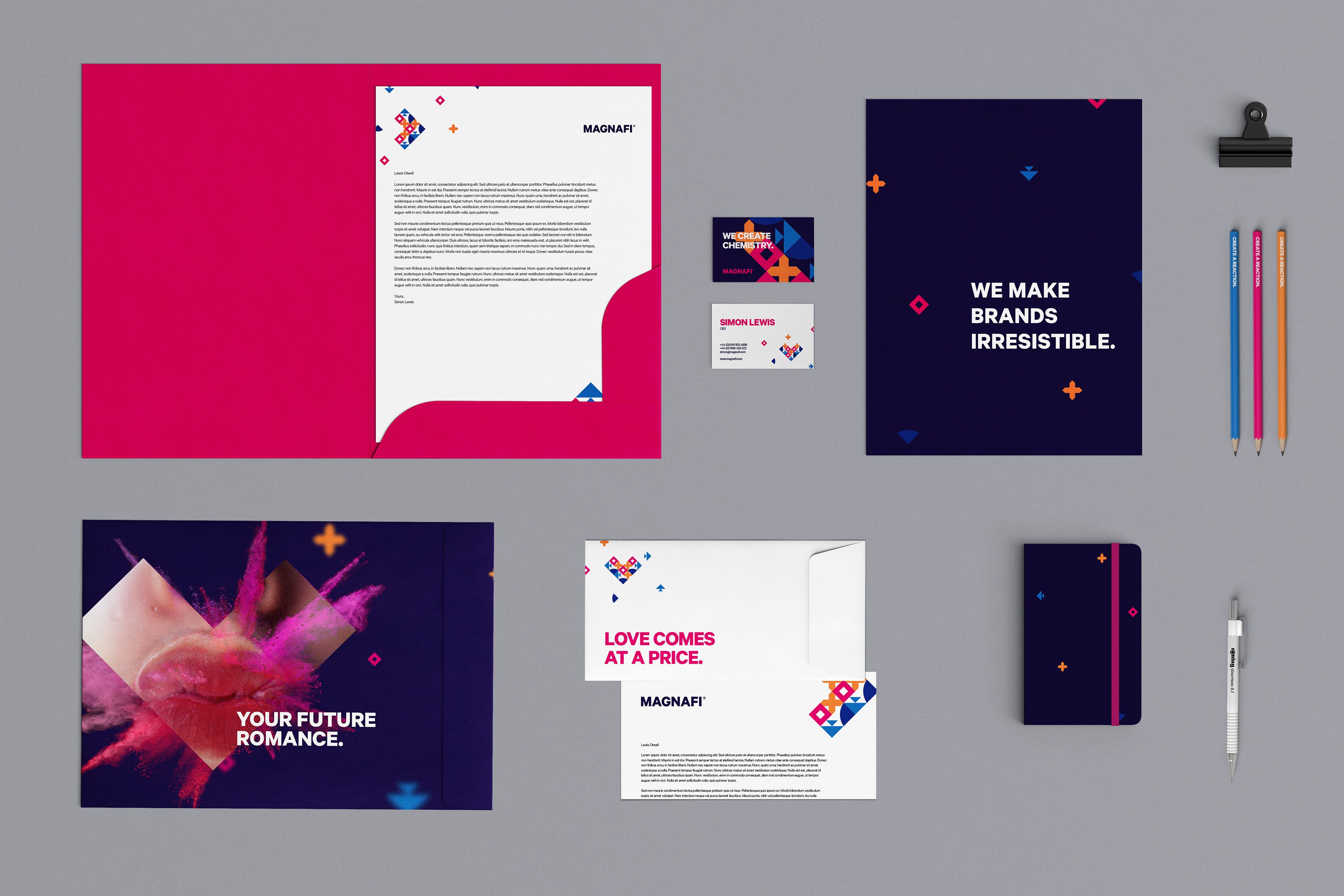
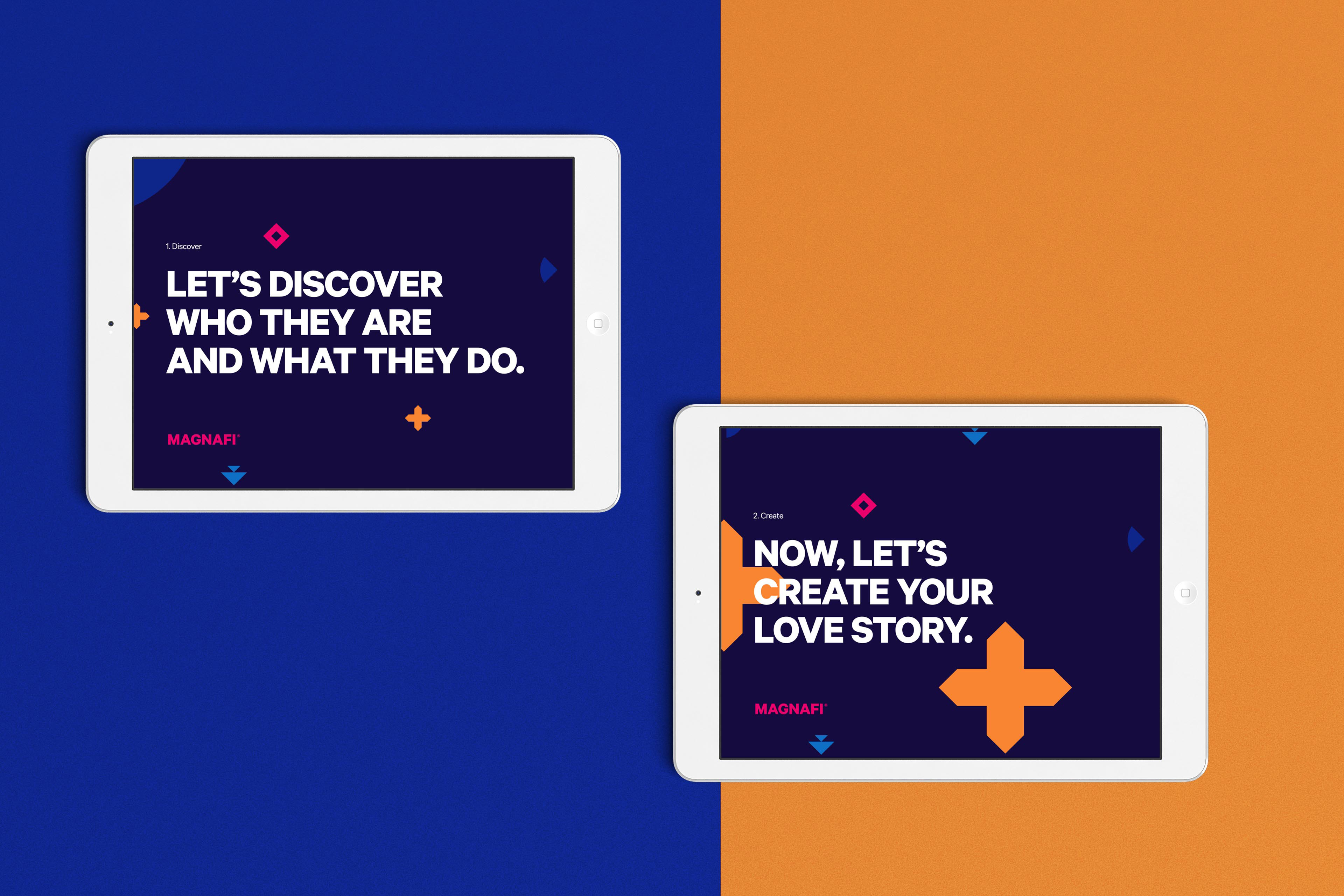
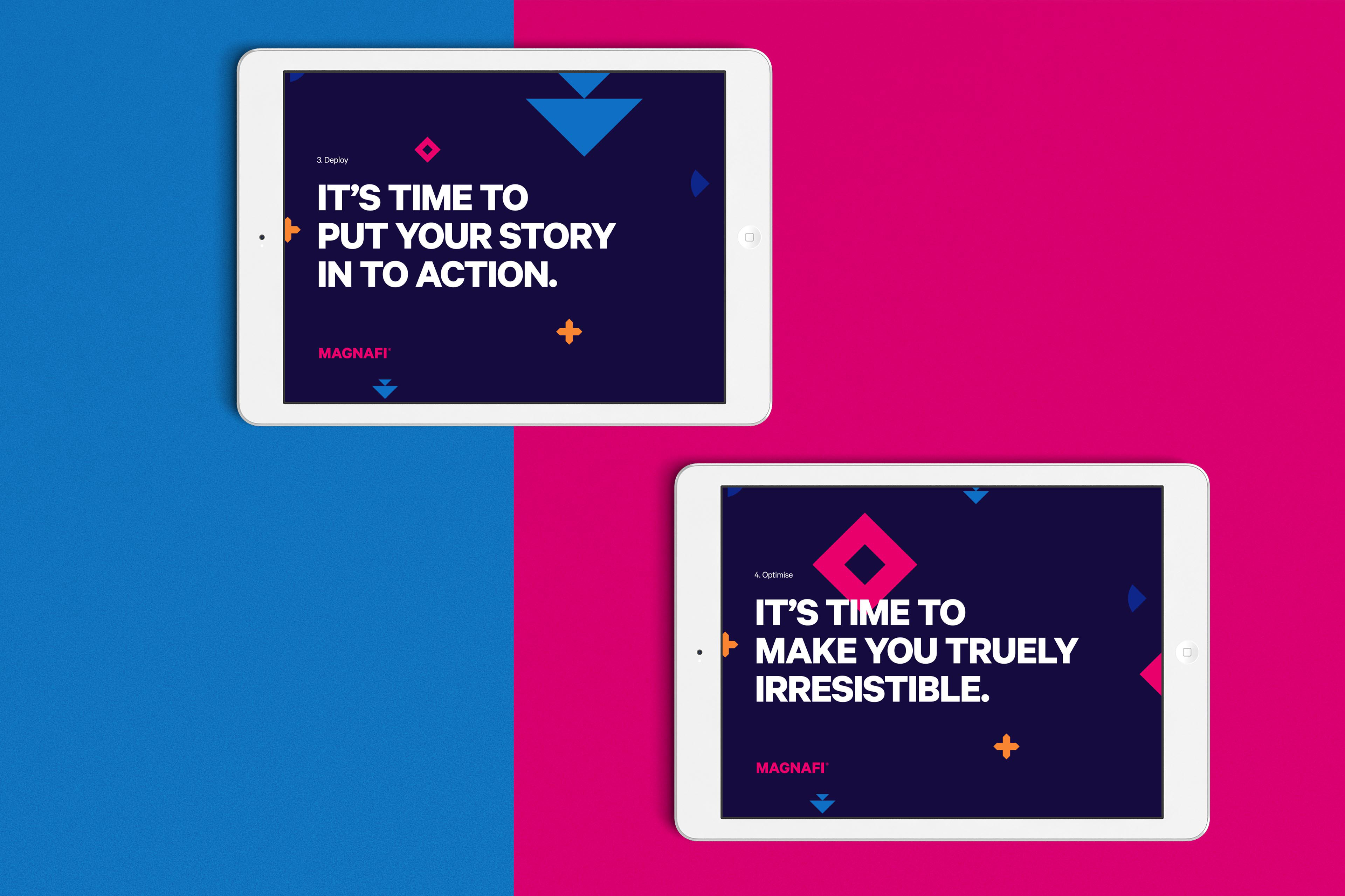
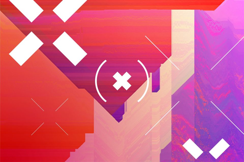
The central theme of our entire brand direction for Magnafi was one of chemistry, of making customers and audiences fall in love with brands. The use of the word “chemistry” here is paramount – not only referring to chemistry in terms of relationships, but in the scientific sense too. Visually, the Magnafi marque is made up of the four elements that summarise Magnafi’s central offering – discovery (the circle), creativity (the plus), deployment (the down arrow) and optimisation (the diamond).
When combined together, these elements form two distinct marques – a heart and a play symbol. The heart, of course, alludes to the chemistry and relationship that Magnafi’s content aims to create between audiences and clients. The play symbol, on the other hand, is a more explicit nod to the brand’s filmmaking background and expertise.
process
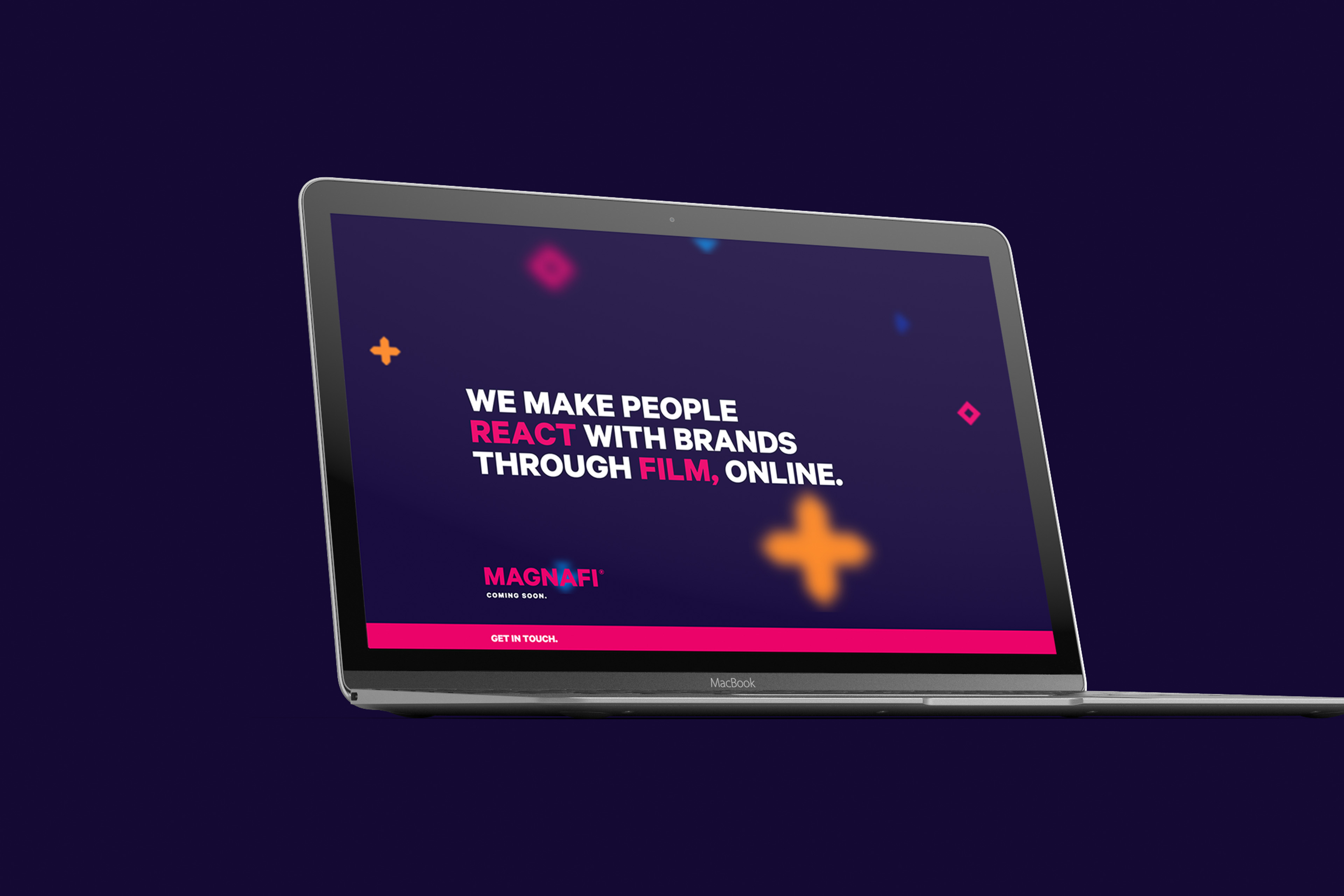
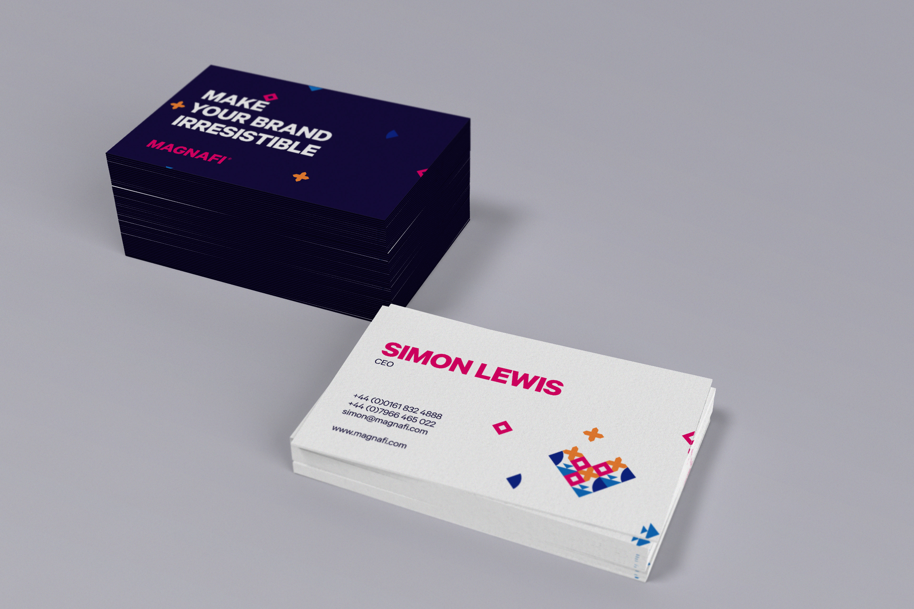
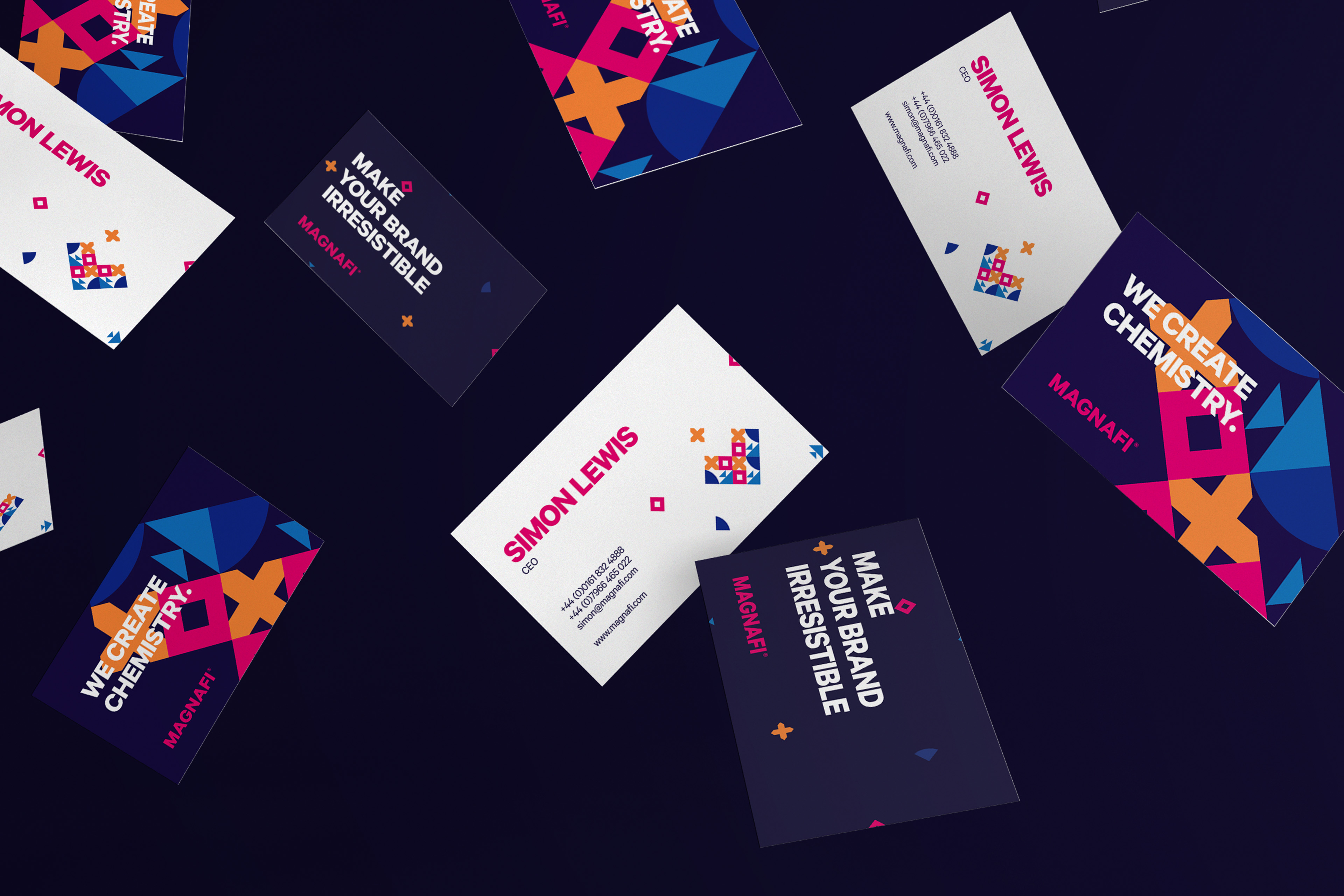
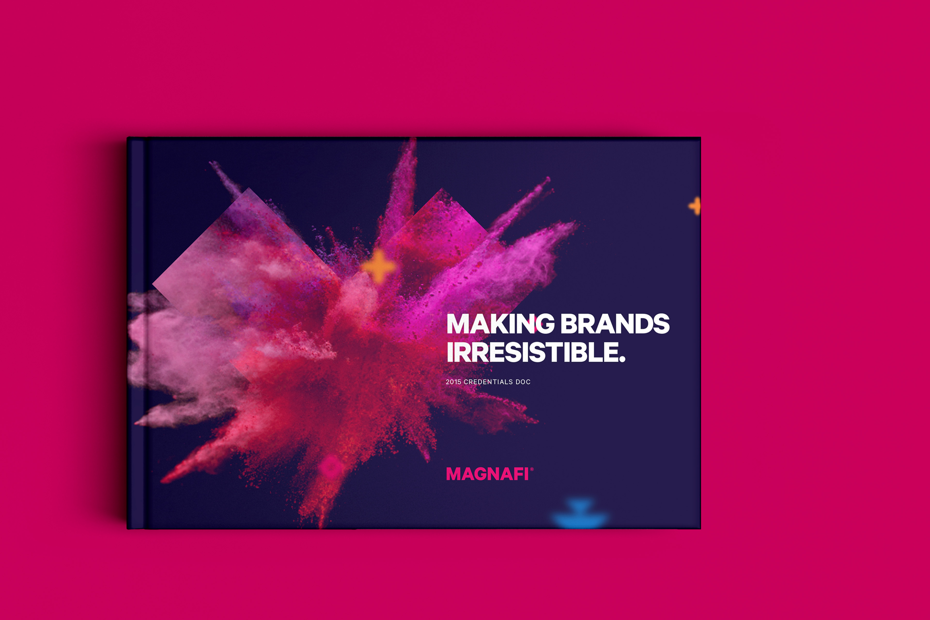
After creating the identity itself, our next step was to apply it to a number of touchpoints that could be used to represent the brand going forward. Though not strictly part of our brief, as part of our atmosphere process we often mock up what touchpoints could look like if they were created in keeping with our brand identity. We feel this is more useful than a traditional brand bible as it offers a greater sense of context, and shows how we might have created the touchpoints if we were, indeed, asked to create them. That said, it still gives clients the freedom to take away our inspiration and either recreate those touchpoints in-house, or with another agency.
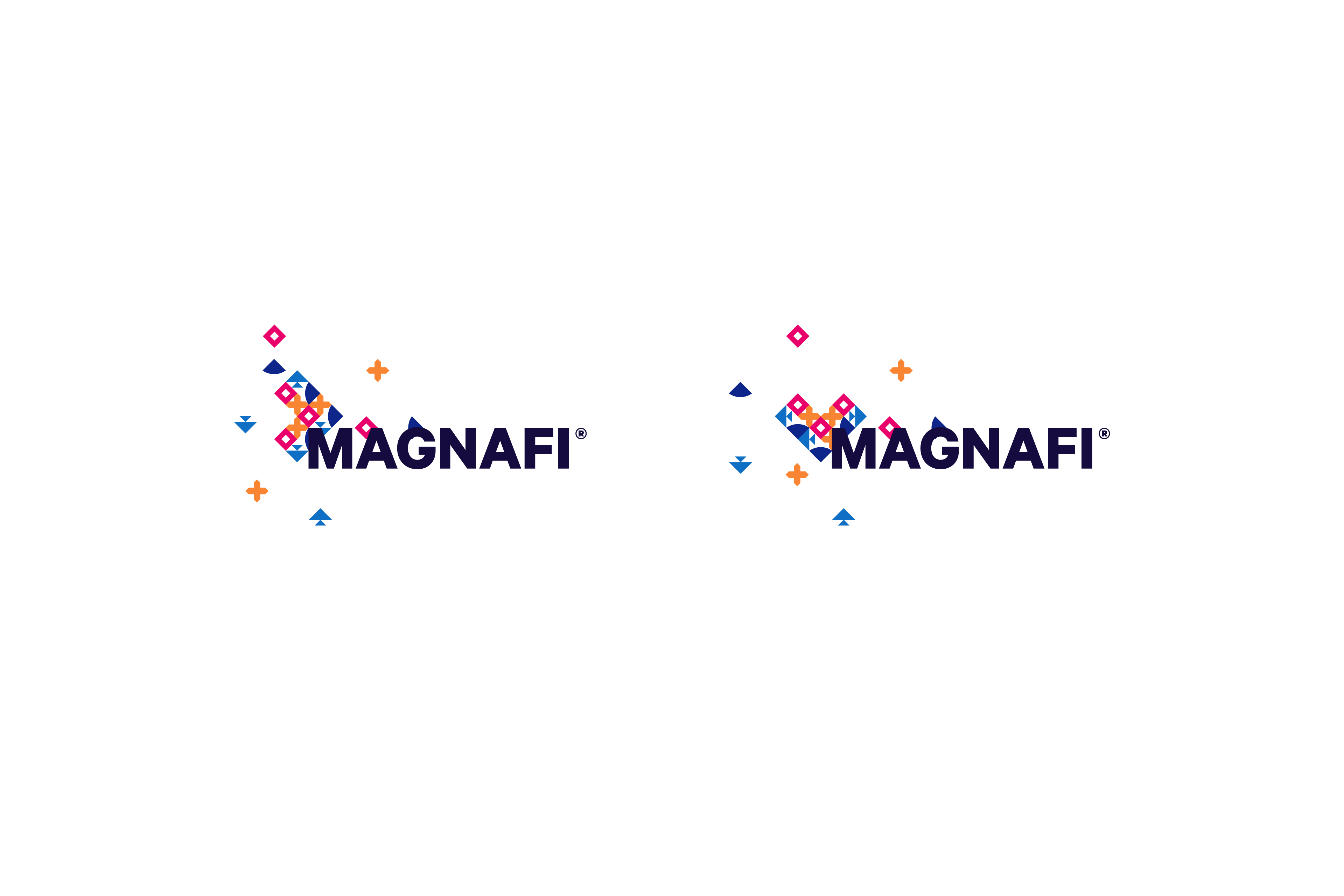
One touchpoint that we did design and develop, was a holding page at Magnafi.com. Though simple in terms of core data collection functionality, the site contains subtle animation of the floating discovery, creativity etc. icons that gently slide along with the cursor as it moves across the page. When the user points the cursor at one of the two bolded words in the main company tagline, the elements join together to form either the heart or play symbol marque.
Contact us
Get in touch
 NEXT PROJECT