BRIEF
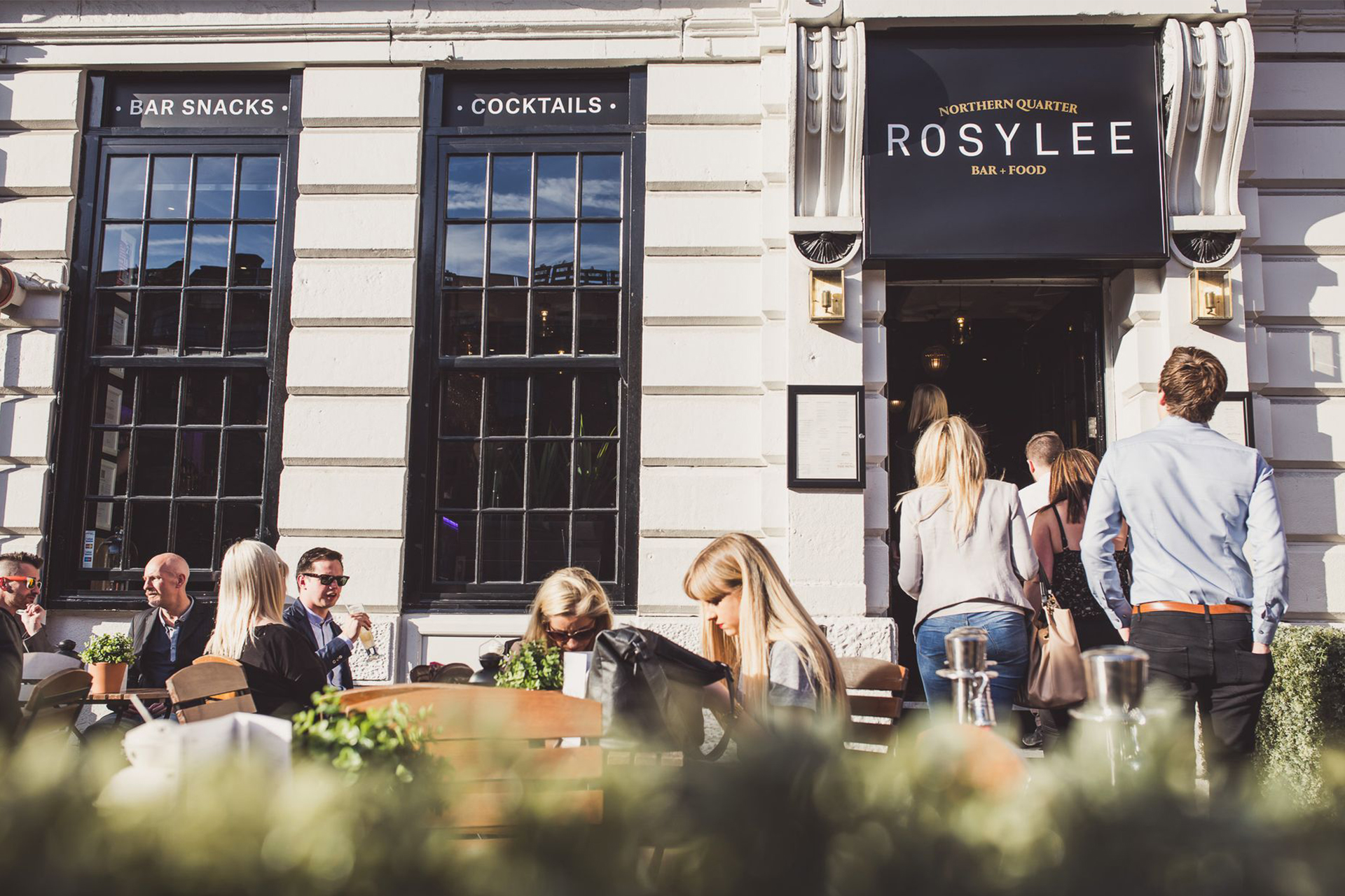
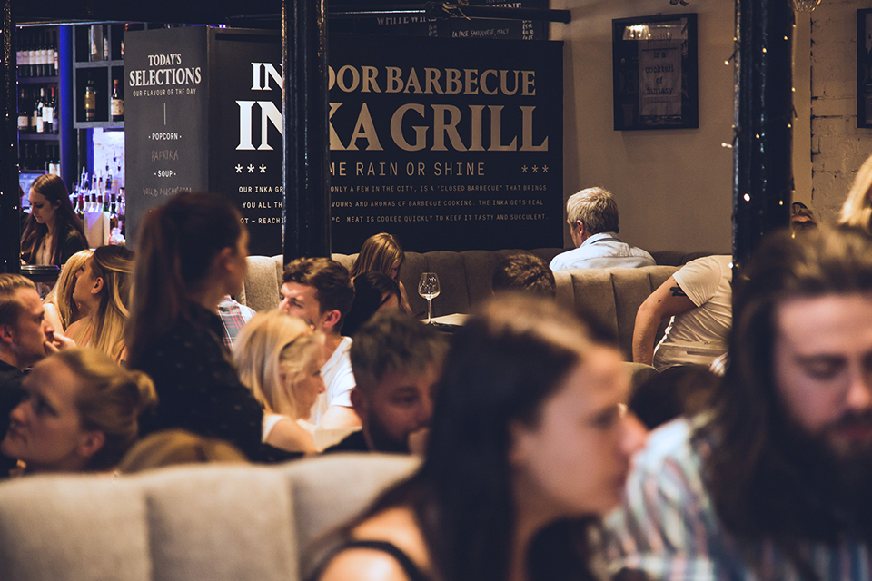
Mark Andrew Developments approached us not long after the arrival of their new executive head chef, eager to liven up the bar and restaurant’s interior and shake off its overly formal, stuffy image. With this came a completely revised food offering and interior, all of which we used as inspiration to redesign their website, menus, window vinyl and café barriers – giving an overall impression of a more approachable, modern and unmistakably British Rosylee for the future.
theory
The challenge in this project was completely unique in many ways. Distancing a brand from a stuffy image is difficult to pull off at the best of times, especially if you are trying to do so visually. As such, rather than having our visual identity guiding our verbal identity like we normally would, we created the verbal identity first and let that feed into every touchpoint that we produced.
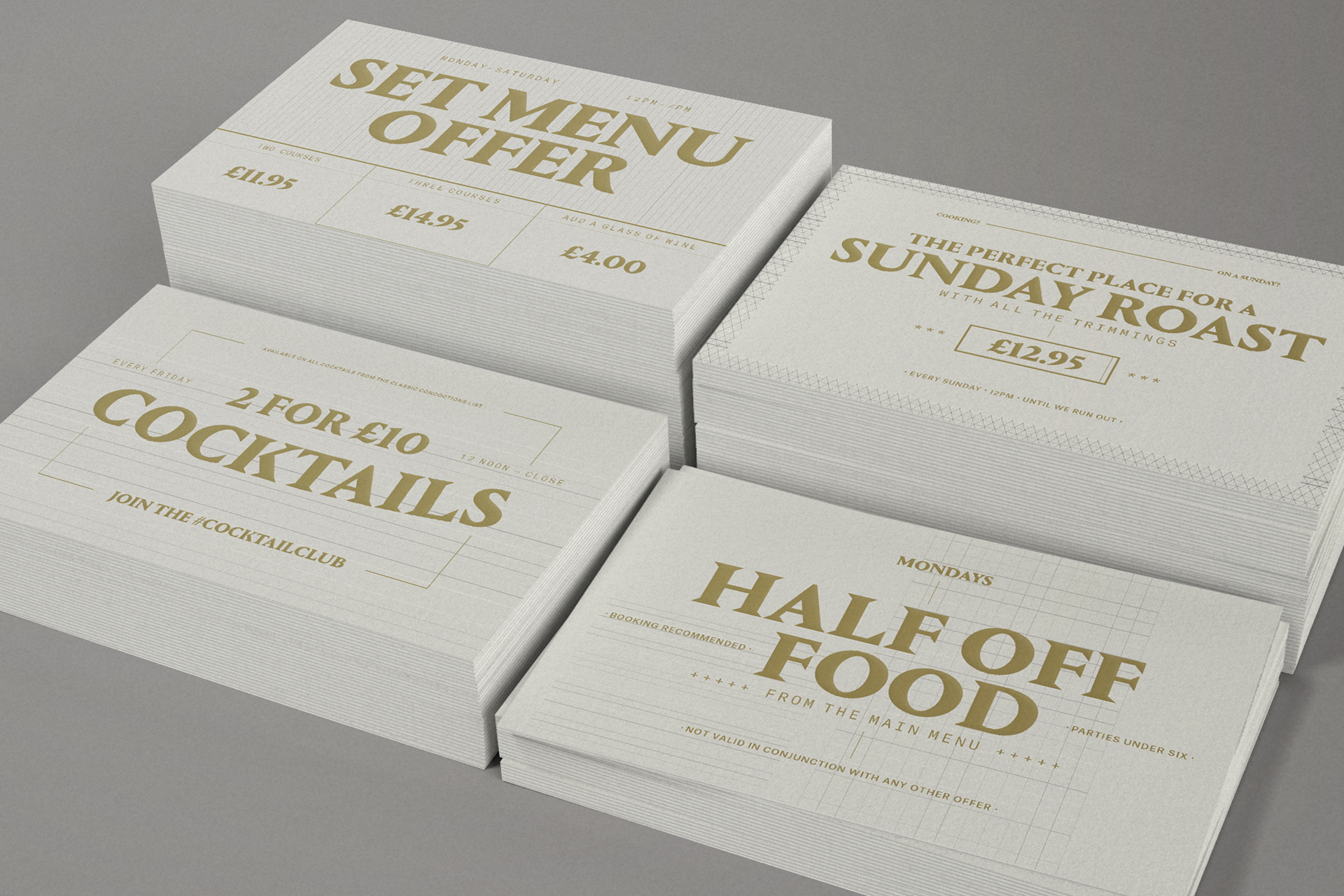
The best way to communicate a lack of stuffiness in a business is, well, to not communicate in a stuffy way. As a result, our verbal identity is conversational, casual, but above all, natural. It is an identity that embraces British colloquialisms, but does so in a true-to-life way – using language that the average British person actually uses. Less “cor blimey guv’nor” and more “get another round in”, in other words. No impenetrable slang, no British stereotypes – just direct, informal communication with the exact customers that might have been alienated from Rosylee in the past.


process
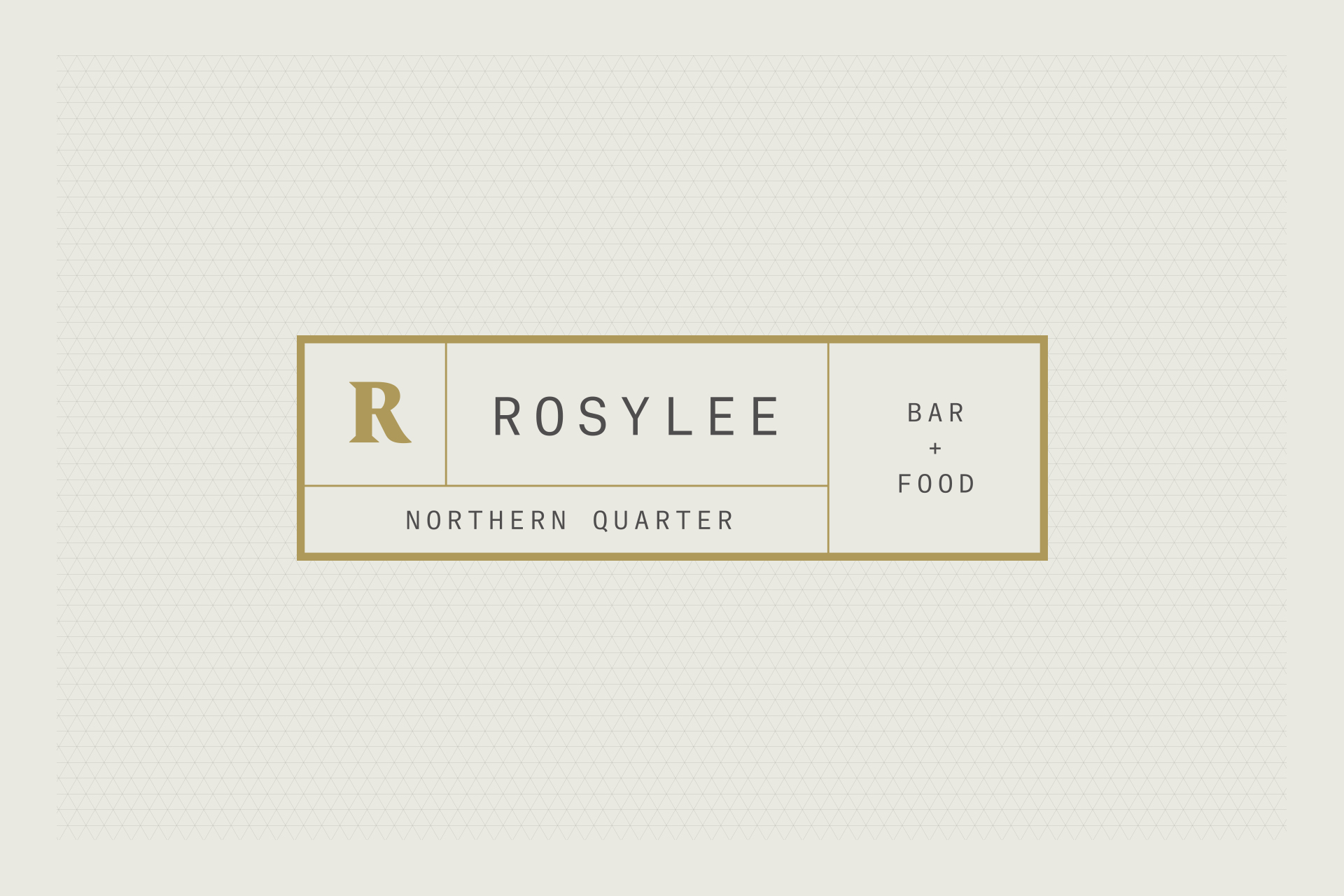
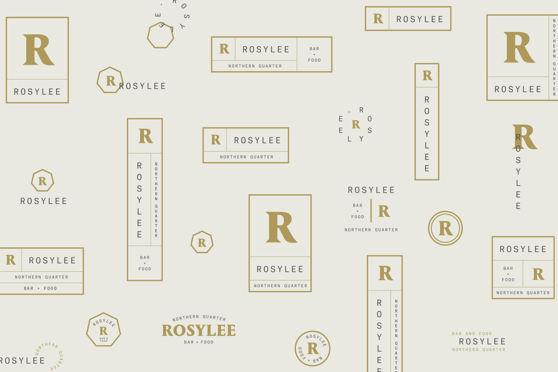
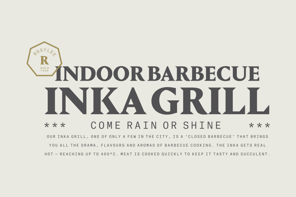
This messaging was carried through to short, snappy lockups that feature throughout our touchpoints – communicating clearly without sacrificing the contemporary aesthetic flair you would expect from a Northern Quarter restaurant and bar. These lockups are supported by a brand logo that we designed in several different configurations, making it incredibly flexible – fitting any piece of branded media, digital or physical. We also created a handful of secondary flourishes to accompany the logo, providing yet more variation for how the brand type and logo could be represented.
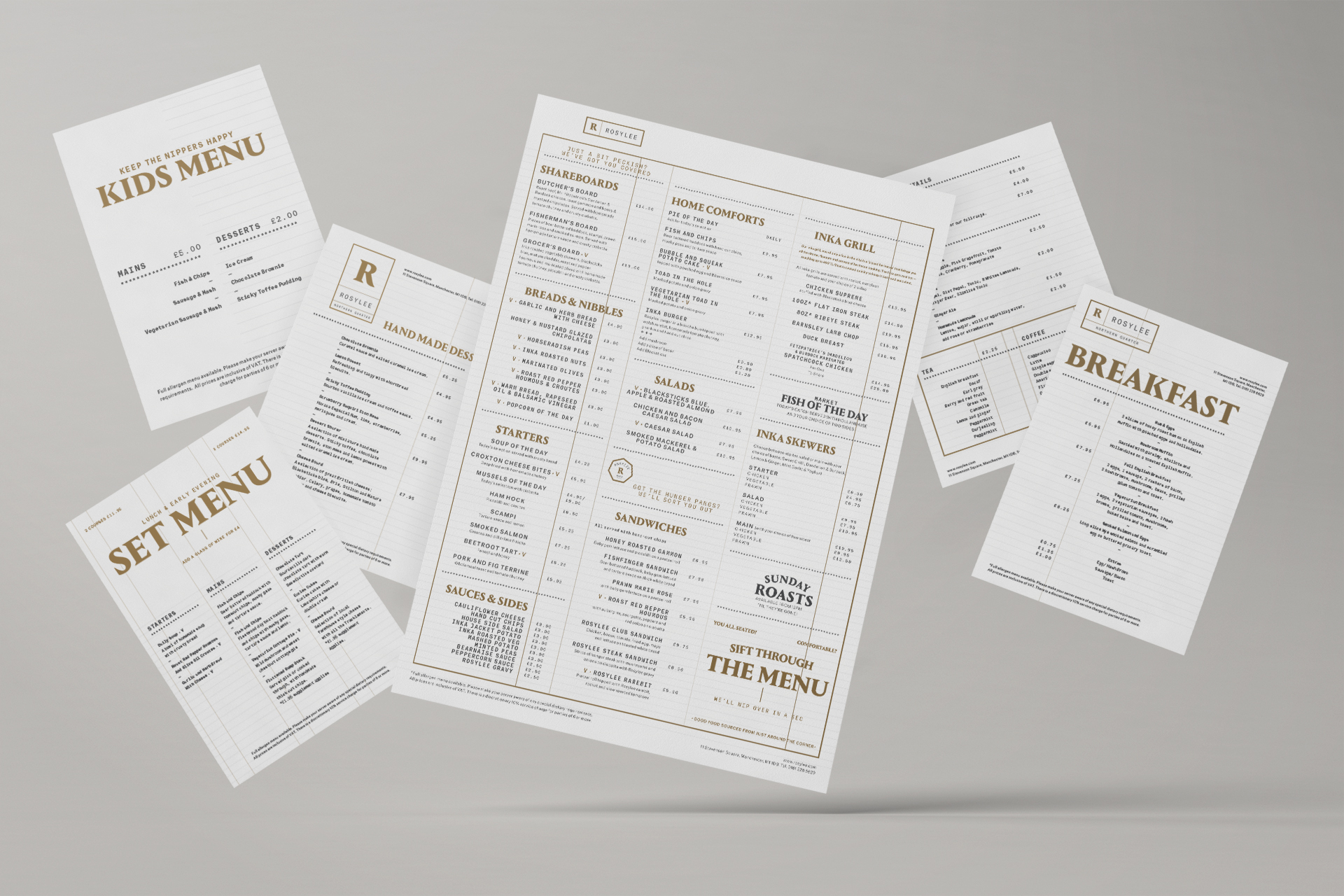
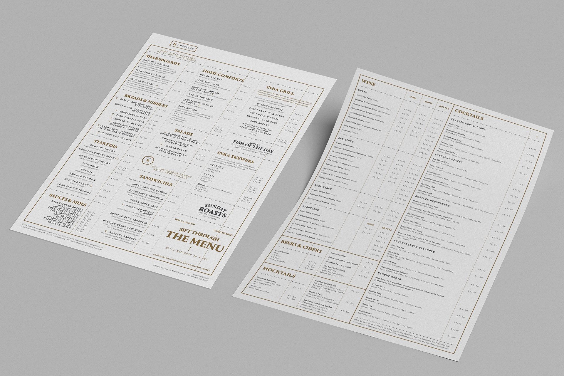
As for the fully responsive website, our goals were more straightforward – carrying through our verbal and visual identities to a fully responsive website offering four main points of information: contact details, opening hours, online reservations (via OpenTable) and full food and drink menus.


Contact us
Get in touch
 NEXT PROJECT