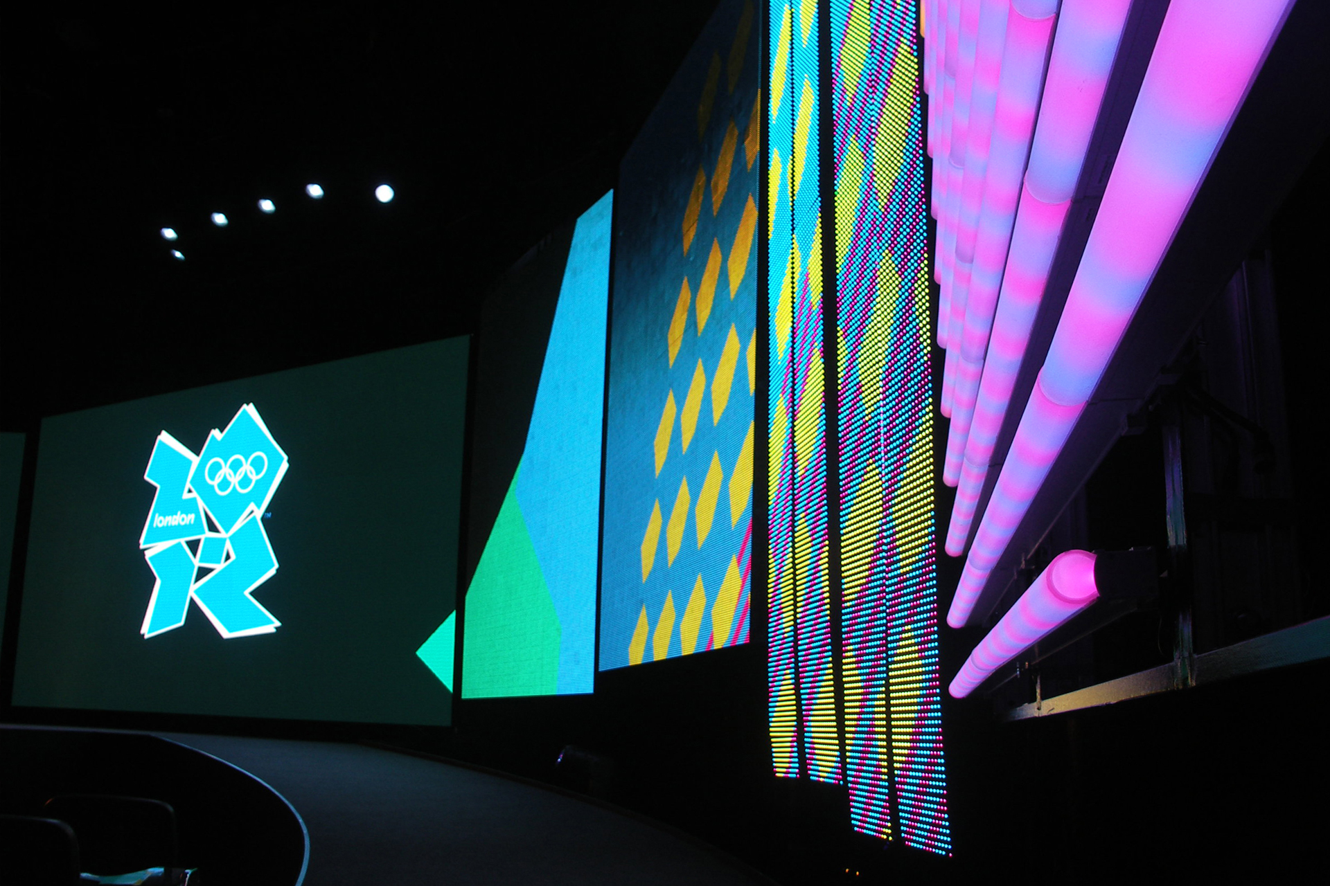
London 2012: the Marmite of Logos
When the London 2012 logo was revealed way back in June 2007, reactions to it were diverse to say the least. While many hailed it as youthful and edgy, a great many others struggled to find enough superlatives to convey their sense of disbelief and disapproval. Indeed, when the BBC set up a page on their site inviting opinions, the response was overwhelming, with comparisons made ranging from ‘a broken swastika’ to ‘a pink Larry Grayson doing the “I’m a little tea pot” dance’.
Now five years on, with the games just over 6 months away, it’s interesting to see how the logo has contributed to the development of a clearly discernible brand. Widespread acceptance and recognition, along with its successful absorption into popular culture, offer evidence of the logo’s virtues while offering a grand two-fingered salute to all the naysayers who were so quick to condemn it.
What all those knee-jerk reactions neglected to take into consideration was just how unique the 2012 design is. When placed next to the logos produced for the last 5 summer games, it’s hard to argue otherwise, regardless of whether your still loathe to accept its aesthetic properties. Moreover, in dismissing it too quickly, it’s easy to overlook the fact that the logo’s structure and proportions make it perfect for viewing on the screens of mobile phones, something that its creators, brand consultancy Wolff Olins, recognised as essential in an increasingly digital age.
With several colour variations already released and others due in the run up to the big opening ceremony on July 27th, it’s clear that versatility can also be added to the list of the logo’s more notable qualities, further reinforcing its contribution to the success of the brand as a whole.