APPROACH
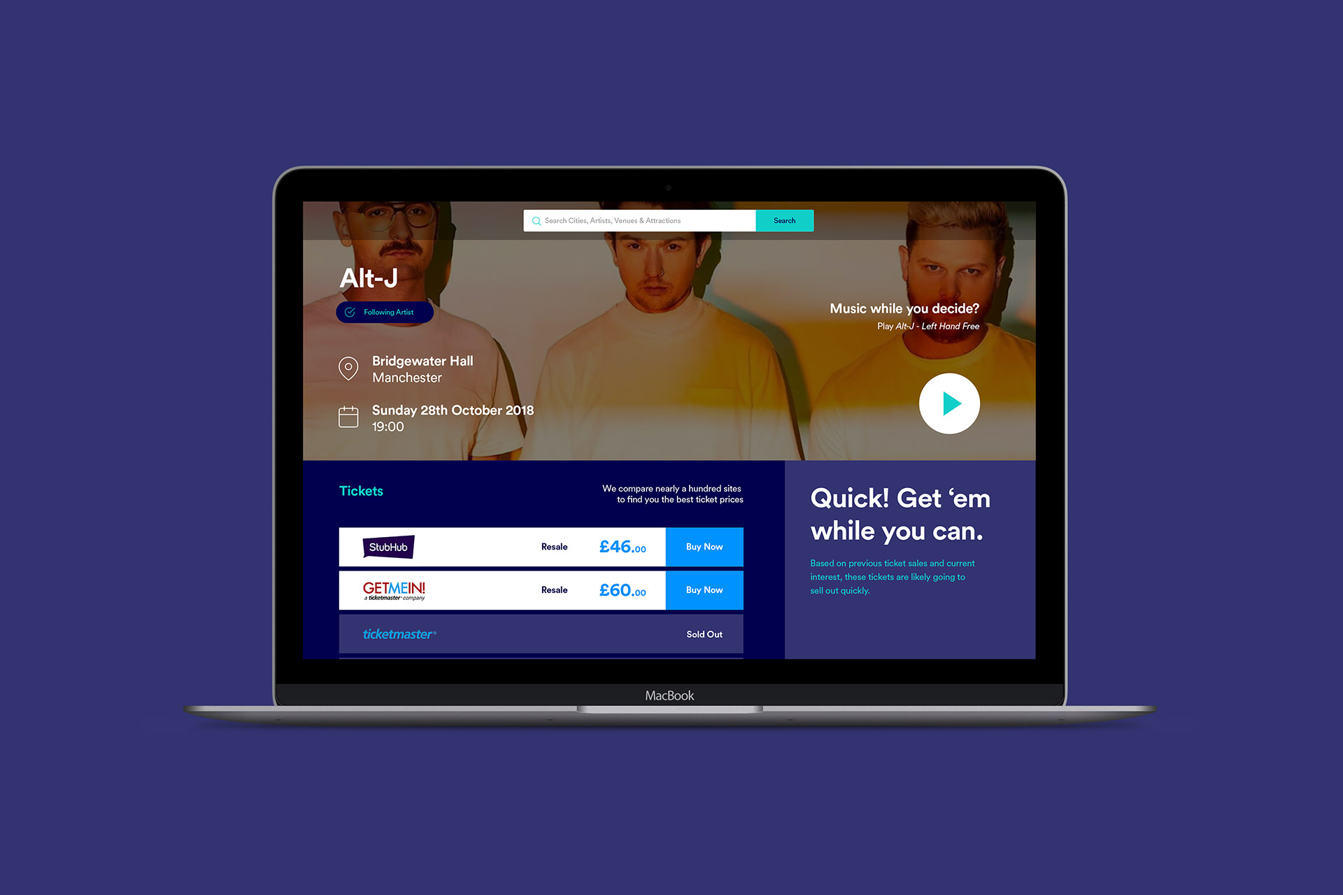
TickX had a great proposition when we first met; a place to search and discover events and experiences, with price comparison to highlight the best deals and availability. They even had a way to recommend new gigs based on your music streaming activity. With a wealth of experience types and so many stories to tell, the one thing they didn’t have was messaging clarity—how could they communicate so much to so many?
OVERVIEW
TickX is the UK’s leading search engine and discovery platform for events.
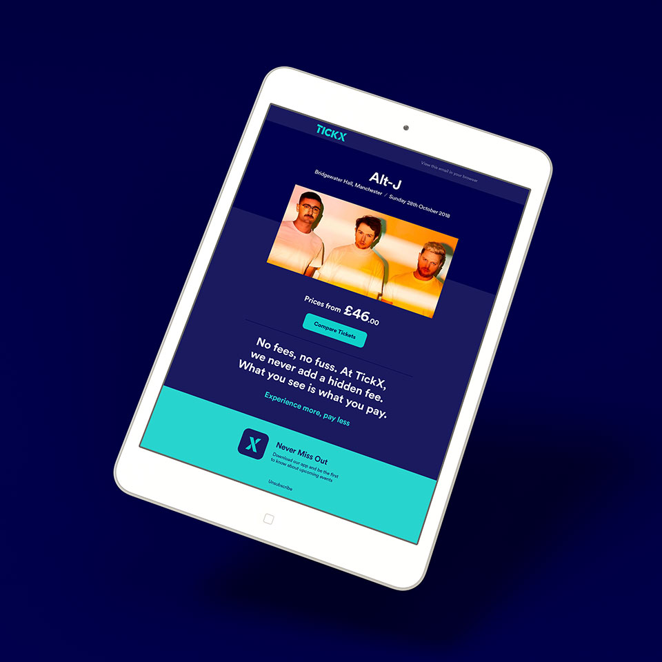
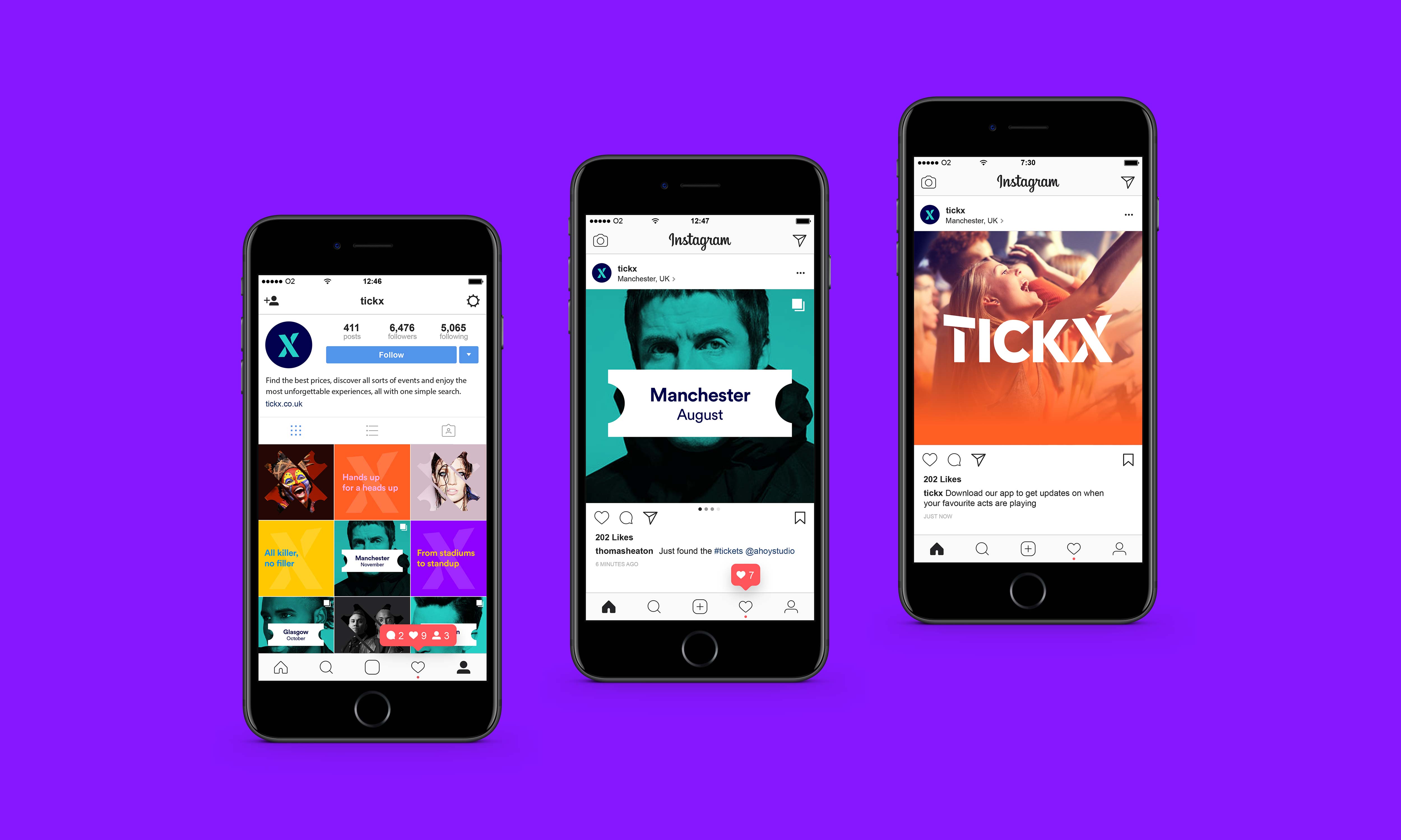
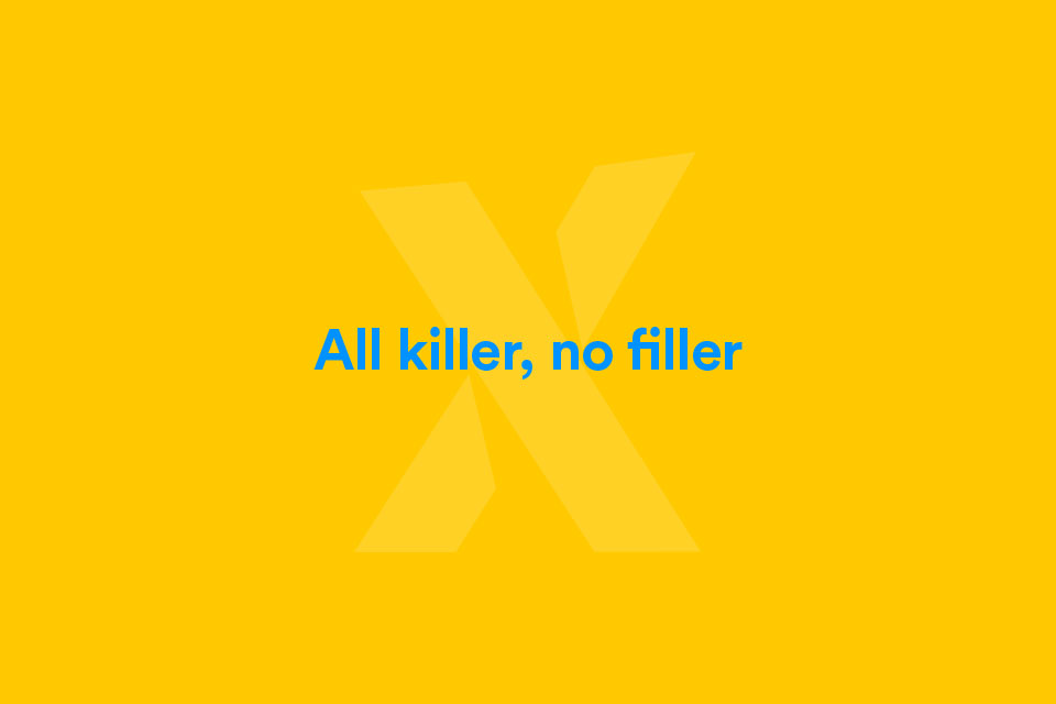
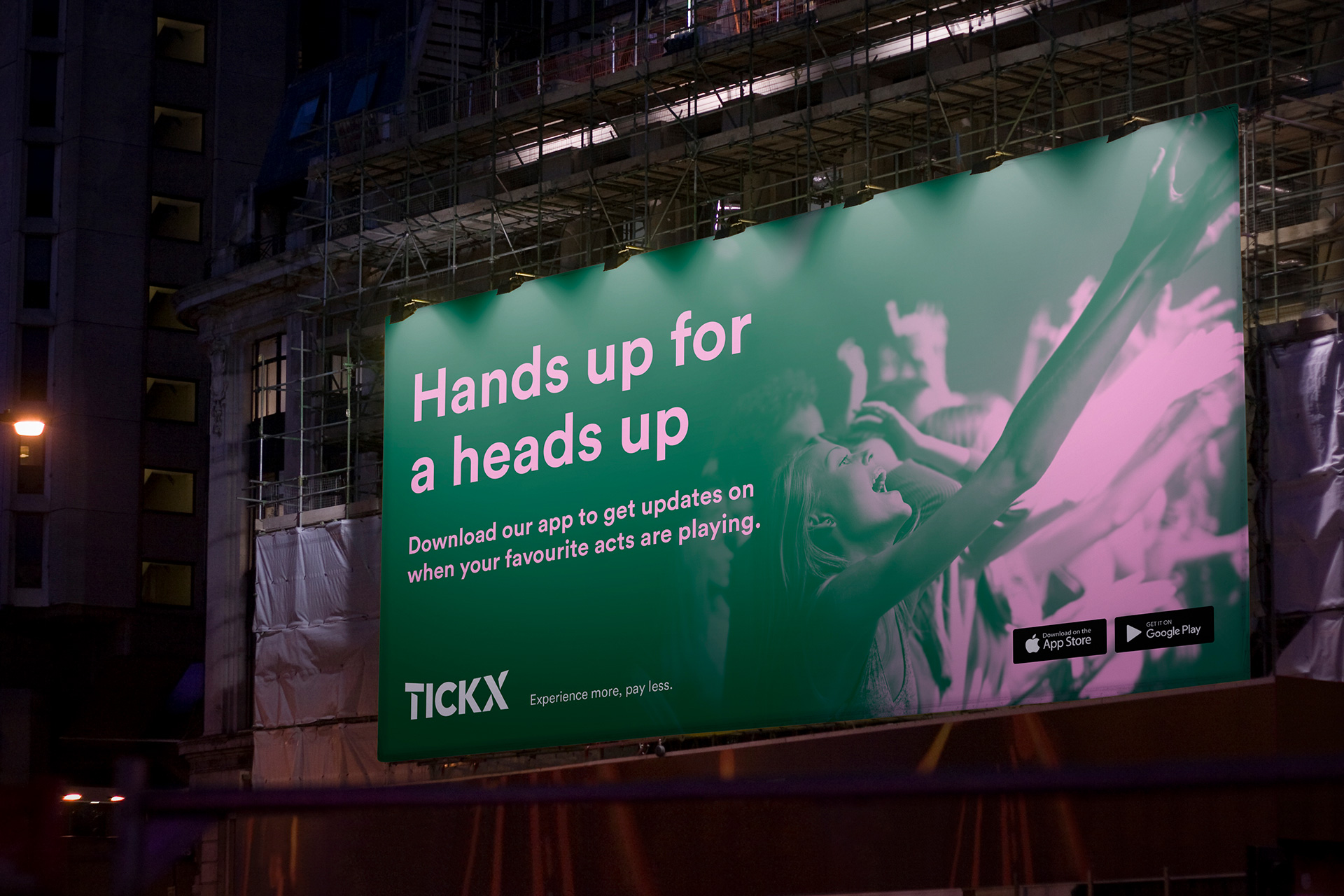
We approached the problem in two-ways; the first was to build a visual identity that reflected the abundance of exciting attractions and impressive USPs TickX has to offer. The second was a clear and compelling messaging framework that allowed us to articulate these benefits to TickX’s broad audience groups.


BRAND STRATEGY
This began with a comprehensive brand workshop to invite all stakeholders to discuss the aforementioned challenges and gain a deep insight into the company. We were able to define a brand strategy that underpinned the entire creative and keep the clarity and consistency of messaging throughout. Experience Discovery was the essence that underpinned this direction. It related to both the literal location to find new experiences, and also the feeling you experience when you discover your next favourite band/film/sport/activity.
VISUAL IDENTITY
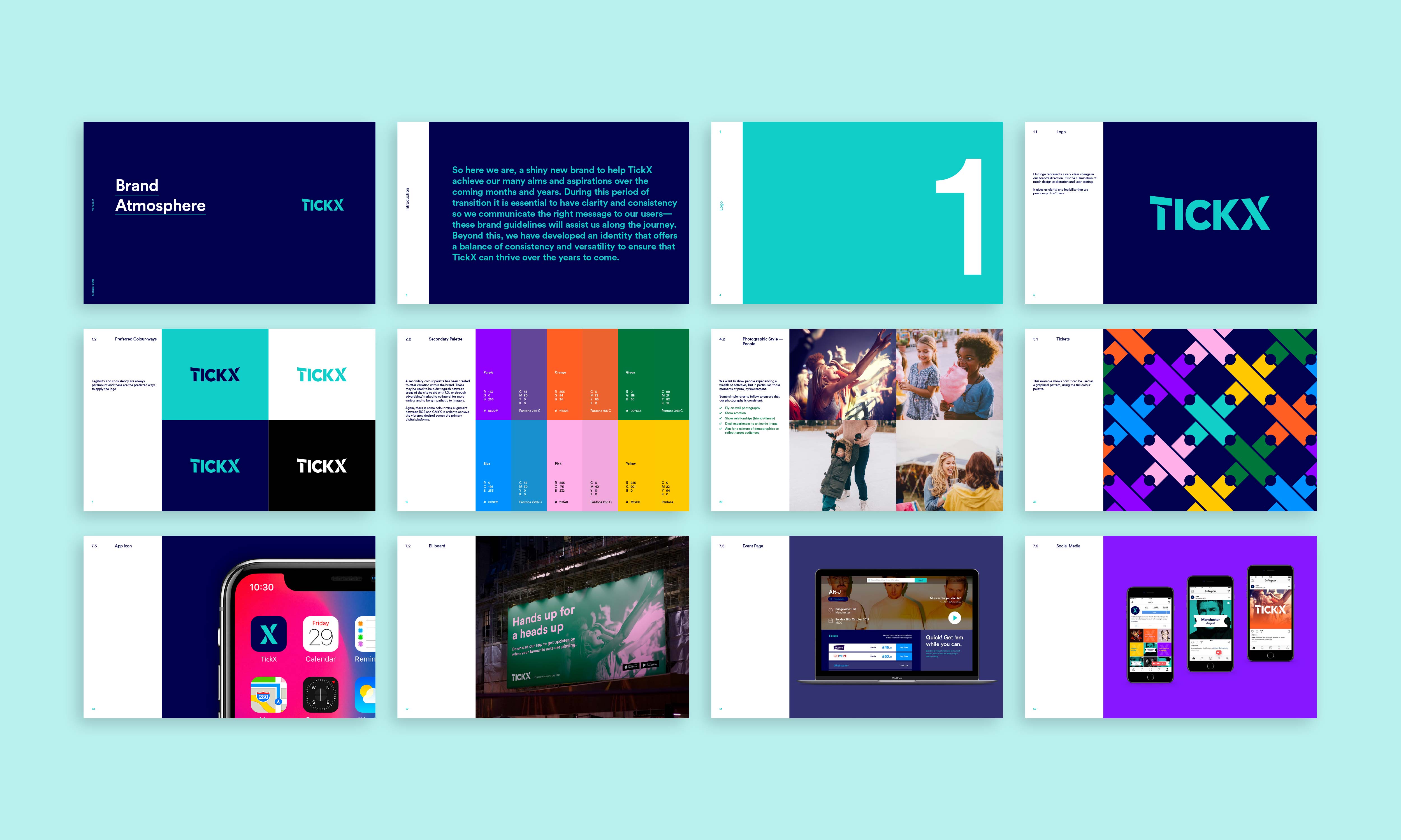
The visual identity was a challenge. The previous logo had legibility issues and often people referred to the company as ‘Ticks’ rather than ‘Tick X’. After much exploration and testing, we agreed that a clear, stripped back approach was needed. A broader palette was essential to add more vibrancy to the brand, whilst a primary palette kept consistency for core communications.

GUIDELINES & IMPLEMENTATION
A comprehensive set of brand guidelines left no stone unturned, giving TickX’s team everything they needed to implement the brand both visually and through our messaging framework. Of course we were happy to give some examples.
