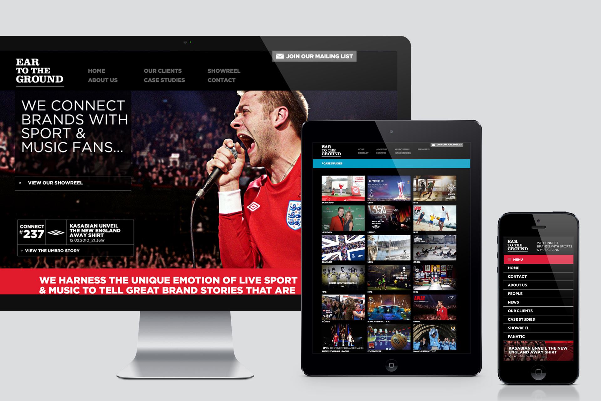
Ear to the Ground new website launches
We’re really pleased to announce the launch of Ear To The Ground’s new website. We successfully won the work from the guys as ETTG a couple of months ago and have been working hard to get it “off the ground”.
Ear To The Ground connect brands with sports and music fans, live. Anything from Kasabian unveiling the new England away kit at a gig in Paris to re-inventing the traditional ‘Cup Lift’ for Manchester City’s Premiership win; creating a global media moment that would engage fans on an international scale.
From our initial meeting it was clear that they had outgrown their previous site and had so much more to shout about. They wanted to be know for devising moments rather than just providing the platform. The website needed to be more focused, streamlined and specialist; acting as a 60 second elevator pitch to potential customers. It had to tell the user exactly what they did and tell it with the same engaging energy as a live event.
Visually the site needed to stay inline with their current brand style, colour palette and chosen typeface. It need to reflect the personality of ETTG – bold, loud and exciting! Imagery was key – capturing that unique moment that’s only possible with a live event. They needed to be a big as possible on the homepage creating a huge impact when you first visit the site and draw the user further into the site to find out the full story.
We developed the concept of numbering each event or moment with a “connection number” – The very moment when the brand connects with the fans. These were once in a lifetime moments, recorded and filed into ETTG’s huge library, illustrating the wealth of experience ETTG have gained and the length of time in the industry.
It was important to communicate each brands journey, and the part ETTG had played in repositioning that brand. These weren’t just one-off events but long term relationships. The detailed individual case studies allowed ETTG to fully communicate their role in the project, their thinking behind it and the individual services. We also allowed a large space at the base of the page to house either glowing feedback from the client or impressive statistics that showed the extent and reach of each project.