New Work: Unique Digital
Unique Digital have made their name in the somewhat niche field of B2B content delivery software and services for cinemas, studios, distributors and advertisers. They came to AHOY in need of a revamped digital presence, but the project soon expanded to become a stealth rebrand too.
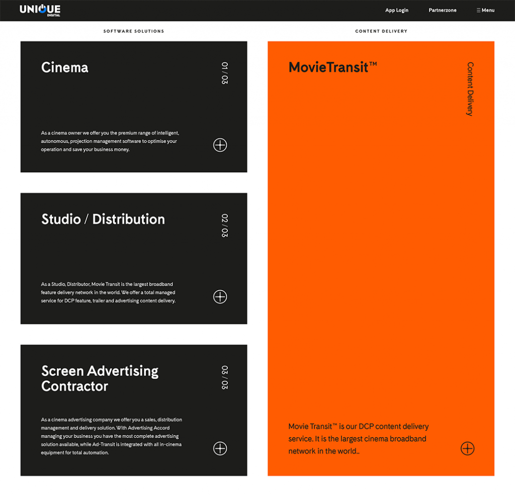
The problem with Unique’s identity was twofold. For one, the brand wasn’t any way near as contemporary as a software company’s identity should be – they are on the forefront of technology and industry-wide advances, after all. Secondly, the brand wasn’t coherent, with each of their services looking completely different.
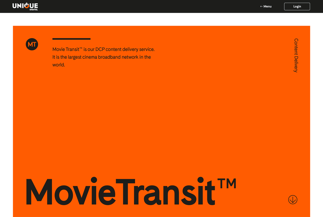
Our solution, given the complexity of their offering – or rather, the difficulty of communicating “content delivery software” in a way that anyone could understand instantly – was to lead with typography instead. Carrying through the previous brand colours of black, white and a vibrant blue, we then expanded the palette with unique colours for each product in every context it is mentioned in. This means that even a first mention of a product in a content block on the new, fully responsive Unique website will be appropriately coloured to fit the product, leading users back to the individual product page using the colour even more liberally – a breadcrumb trail to the product page, in a way.

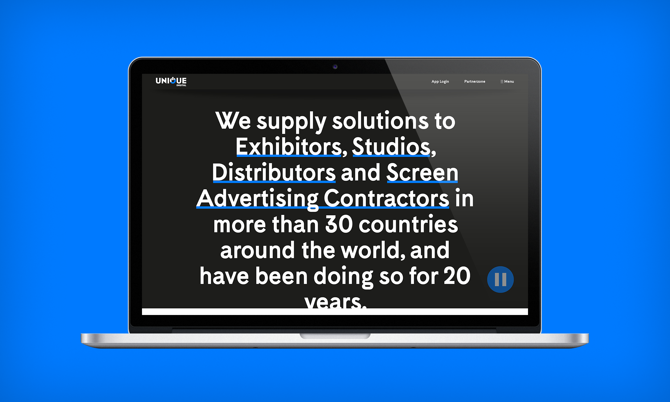
Perhaps the most striking element of the site, a fun piece of finish that links directly back to the company’s cinematic focus, is the brand proposition statement presented as a credits scroll from the moment you arrive at the site. It’s a simple touch, but one that shows that sometimes the simplest of flourishes can best represent a brand and offering.