Branding has changed dramatically in the digital era
Branding has changed dramatically in the digital era – and forward thinking businesses need to take note.
When print was king, branding was much more restrictive. Companies would stick to a rigid set of guidelines on how their name and logo could be used. In the digital world, however, this way of thinking is prehistoric as it completely fails to take advantage of the capabilities of digital platforms.
Progressive companies are now using ‘dynamic branding’ – which is allowing trademarks and logos to morph, change and adapt. This dynamic approach keeps branding fresh and appealing and prevents imagery from becoming static and boring
The most simple and obvious example of this is the trademark on Google’s home page which changes regularly. This is usually to mark a significant date or event. Google memorably displayed a series of sports themed branding on its home page during the London Olympics.
Producing branding at this level everyday would of course be too much for most businesses. Dynamic branding is, however, being produced in many different ways which are achievable by most.
Here are five ways organisations have embraced dynamic branding in subtly different ways and to varying degrees:
This Canadian organisation regularly changes its distinctive five lined branding to incorporate different colours and patterns. It is a style of dynamic branding that works best when the branding changes for a clear reason. For example, this could be to correspond with a forthcoming production.
The museum regularly promotes it exhibitions by incorporating images within its N shaped logo. This is an extremely simple but effective way of using dynamic branding as it, not only prevents the brand image from becoming stale, it also conveys a marketing message.
The City of Melbourne’s M shaped logo is one of the original examples of dynamic branding. By leaving its logo open and adaptable, in the same way the Natural History Museum has, it has allowed local businesses to incorporate their own secondary branding within the shape. This has encouraged companies to embrace the city’s branding in their own marketing efforts.
4) Nordkyn
Rather than just change the colours or images around the logo, the Norwegian Meteorological Institute continuously changes the shape of its logo. It cleverly alters the logo’s appearance depending on the temperature and wind direction in Norway. The logo never changes so much that it is no longer recognisable however. Even when static each different image would be distinctively Nordkyn as all the shapes belong to the same style family.
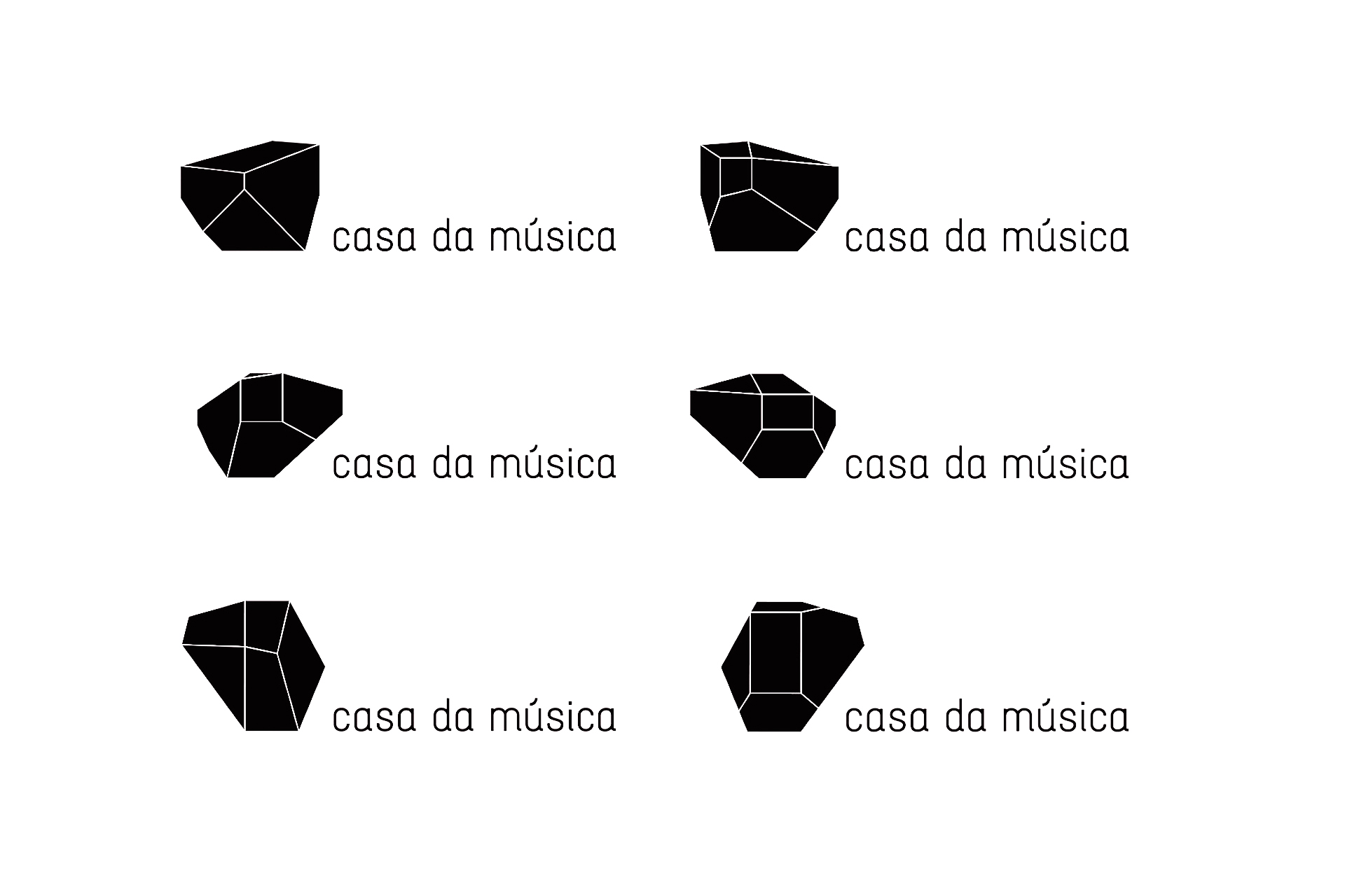
Casa da Música in Portugal also has a distinctive family of shapes for its logo which are based on different views of the building’s unique architecture. It combines this family with the techniques used by the Natural History Museum to incorporate imagery within the logos. The colours of the logo correspond with promotional posters of whatever show is currently playing at the venue.