What Everyone Should Know About Mega Menus
There’s an old proverb that says “no chaos, no creation”. You need a website, and you want it to look good. But you’ve just got too much stuff! Does there really have to be a trade-off between putting everything you want on show and having your site look a striking and clean as you want it to? The short answer is no. Good design agencies can give you solutions for this, and one is the Mega Menu. Keep everything – just present it better.
What is a Mega Menu?
We understand. You don’t want your site more complicated, you want it less complicated. You want everything delivered as simply as possible, and you want the site looking as attractive as possible. So why would you want a Mega Menu? Sounds unwieldy, right? Not exactly. It’s called a Mega Menu because it’s more packed with possibilities than a regular menu, not because it’s more complicated.
If you have a lot of options or categories available within your site and need a place to put them, the Mega Menu could be for you. If you’re worried about keeping your front page as clean as possible, the Mega Menu could be suitable for that. If you want a convenient shop front on your site for customers to browse through, the Mega Menu is, again, perfect. It’s a versatile customer, no doubt, but why is it so worthwhile? We’ll explain:
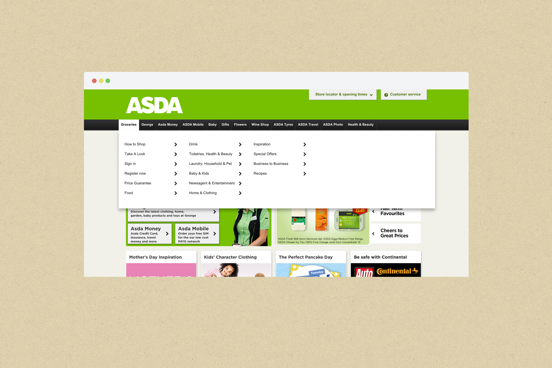
In essence, a Mega Menu provides a large panel filled with options to the user when they scroll over a button on a homepage. The Mega Menu, as opposed to previous drop down menu types, allows a wider selection of links to be displayed, and also gives you the opportunity to group things together into categories within the menu panel itself. Using layout, typography or even icons and images, it’s possible to present a wide range of options to the user in an easy, understandable way, minimising the amount of work they have to do to get where they want to go on your site.

Mega menu showing simple text based categories
Everything within each Mega Menu is visible with a single swoop of the mouse, meaning sites with a lot of categories and content will no longer feel like a maze to the user as they attempt to find what they were looking for in the first place. It’s all there, a la carte. Take your pick.
Advantages
One of the biggest advantages of a Mega Menu is that it removes the navigation element from the page, tidying it away at the top. Keeping everything neatly organised within a set of Mega Menus means that a website’s front page can be devoted to more important concerns – delivering your message in a striking way or drawing attention to something new and special, for example. Where links were previously taking up prime real estate on the front page, it’s now open to be whatever you need it to be.
And while the navigation options are tidied away, they’re still easily accessible to the user. With good category titles, a user can arrive on the site, scroll over the category they’re interested in and then discover, easily, what they’re trying to find. If, on an e-commerce site for a clothing retailer, a user arrives trying to find a dress shirt, consider how much easier things are with a Mega Menu. Scroll over ‘Men’, find the dress-wear category and then the option for shirts. Click it. Within seconds of arriving to the site, you’ve found what you wanted, clicked it and are able to move on to the purchase without having to engage in the usual treasure hunt.

Mega menu showing the use of images for category sections.
Having all relevant options visible to the user also means that they have the full menu, if you’ll excuse the pun, to order from. A traditional drop down menu simply can’t give the user all the tools they need to find what they’re looking for. Show the user what you have an offer. Let them explore sections that interest them, especially if they’re not what drew them to the site in the first place. A Mega Menu with a lot of options and a browser with tabbed browsing is a combination that’s likely to work for you – they’ll open everything that’s relevant, and decide from there. Mega Menus are about enabling discovery.
There are also a wide variety of ways to organise the options within a Mega Menu to suit both you and the user. Related links can be grouped together, meaning that no user will ever get bored trying to scroll through a long alphabetised list for the exact keyword they have in their head. A user can easily, instantly find the grouping they’re looking for and discover the link they were looking for with minimum stress and effort. Mega Menus can even incorporate images and icons for greater clarity and to ensure their experience is as good as possible. If you can SHOW the user that a link contains what they’re looking for, it makes the experience even more natural.
Mega Menus and E-Commerce
Mega Menus have been utilised very effectively in e-commerce and provide a perfect management system for a site that has a lot of categories and types of product to sell. Think of the Mega Menu’s organisation of links as being like walking through a big department store. If everything is simply presented in an arbitrary order, alphabetical or worse, it makes it very difficult for the customer to browse the wares. Even if they ask for a particular pair of shoes – in the parallel, using a search bar – they may not be in the right place to look at other things they’re interested in.
With a Mega Menu, the customer instantly knows where everything is. It’s just a case of one or two decisions, a matter of split seconds, to find the right top-level category, and all of a sudden they’re presented with every option that’s relevant to their needs. They can go and browse the shoes easily on your site, but they also know where everything else is if they need it. The Mega Menu is a good way to ensure everything you want to show a customer is available, and can help to maximise each customer’s value. Just like in a real-life store, it’s all about the decisions you make in advance, and how you lay things out.
Things to watch out for
There can be an urge to exploit the potential of a Mega Menu by overloading it, but it’s easy to avoid this. The power of the Mega Menu is its ability to make things more organised and accessible, not less, and ensuring that there’s a logic to your menu shouldn’t be difficult. Make good use of category groupings within the menu, and make sure it’s not just a place to hide a big, disorganised list. You’re not just sweeping everything under the carpet and out of sight – you’re putting it where it can be easily found, whenever it’s needed, like one of those nifty Ikea units that seem to double the size of the room.
It’s also important to make sure that users can find what they’re looking for with a minimum of effort. The average user will come to a site with a couple of keywords in their mind, and the goal is to put as few obstacles as possible between them and what they’re looking for. Your Mega Menus should have very intuitive names – make it so that it’s impossible for them to choose the wrong one. Again, the power of the Mega Menu is that, once they’ve found the menu they should be browsing, they can find the link they’re looking for with a minimum of effort.
Mega Menus can be quite big on the screen, so there’s a trade-off between piling information into the menu and ensuring it’s not taking over the whole browser and affecting the user’s experience. As ever, this can be avoided by choosing good graphic design Manchester based or otherwise. Your Mega Menu should be helpful, not disruptive, and a good design agency will listen to your concerns in order to ensure that this is the case.
Clients in the north don’t even need to go far to find a place to implement this. When it comes to web design Manchester can provide Mega Menus that are intuitive and functional – Ahoy has been short-listed for twelve awards and can implement the best solutions for your site. The Recommended Agency Register placed the company within its top five, and with two offices in the area it’s amongst the best design agencies Manchester has to offer. The Mega Menu is an element that marks a site out as modern as well as making it easy to use and optimal for e-commerce, so with a fun, friendly attitude as well as expertise in graphic design, Manchester’s Ahoy can update your website, or build it from scratch, to join the best on the web.