BRIEF
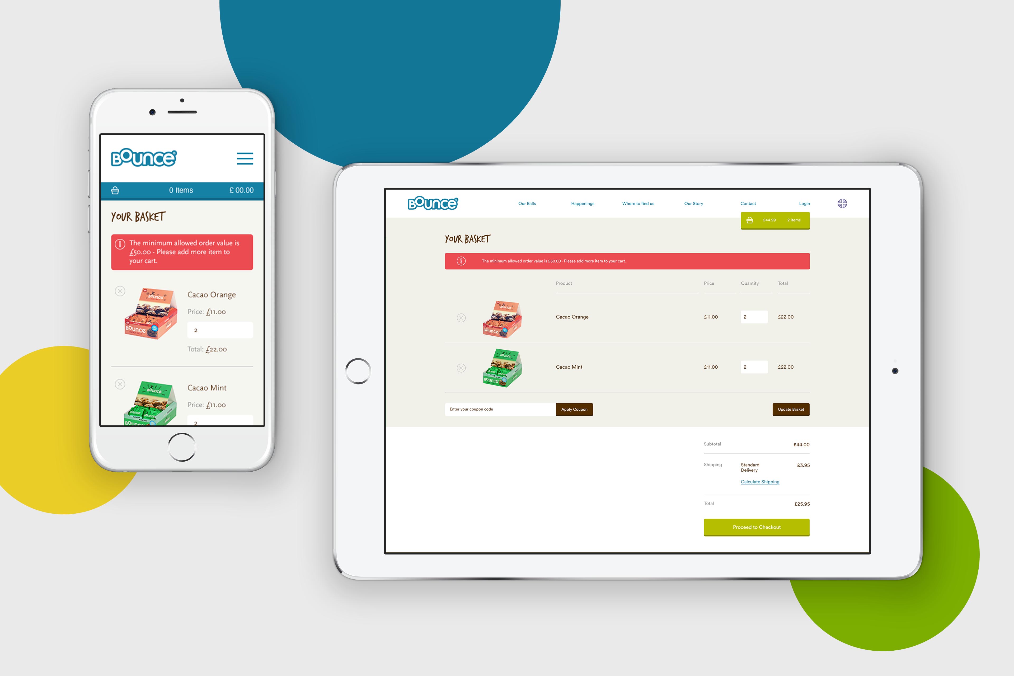
With a strong, unique product and accompanying fun, friendly brand already established, it was time for Bounce to enter the ecommerce space – selling directly to customers rather than simply pointing them to a “where to buy” page. Enter AHOY.
THEORY
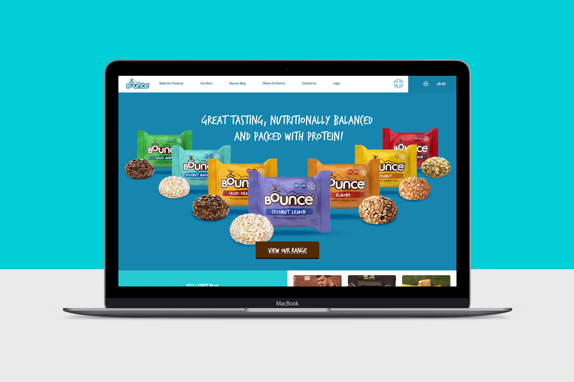
The previous Bounce site was a simple affair, one that hardly represented the personality and vibrance of the Bounce brand as it stands now. As such, accurately representing the brand in its current form was essential in our site design. That said, when it came to communicating the brand’s sense of humour and unique story, we were given carte blanche with animation and fun flourishes. The ‘Our Story’ page is perhaps the centrepiece of the entire site, with a single Bounce ball prominently placed throughout, almost serving as the vehicle around which the user experiences the Bounce story. As you scroll down the page, the ball animates and text – whether it’s the ball wriggling out of the brand’s old packaging, to the Bounce company philosophy circling the central ball with rings being drawn in around each bullet point for further emphasis.
Look and feel
Our site for Bounce, particularly the homepage, is filled with fun flourishes to convey the brand’s personality better than any single bit of design or copy ever could.
PROCESS
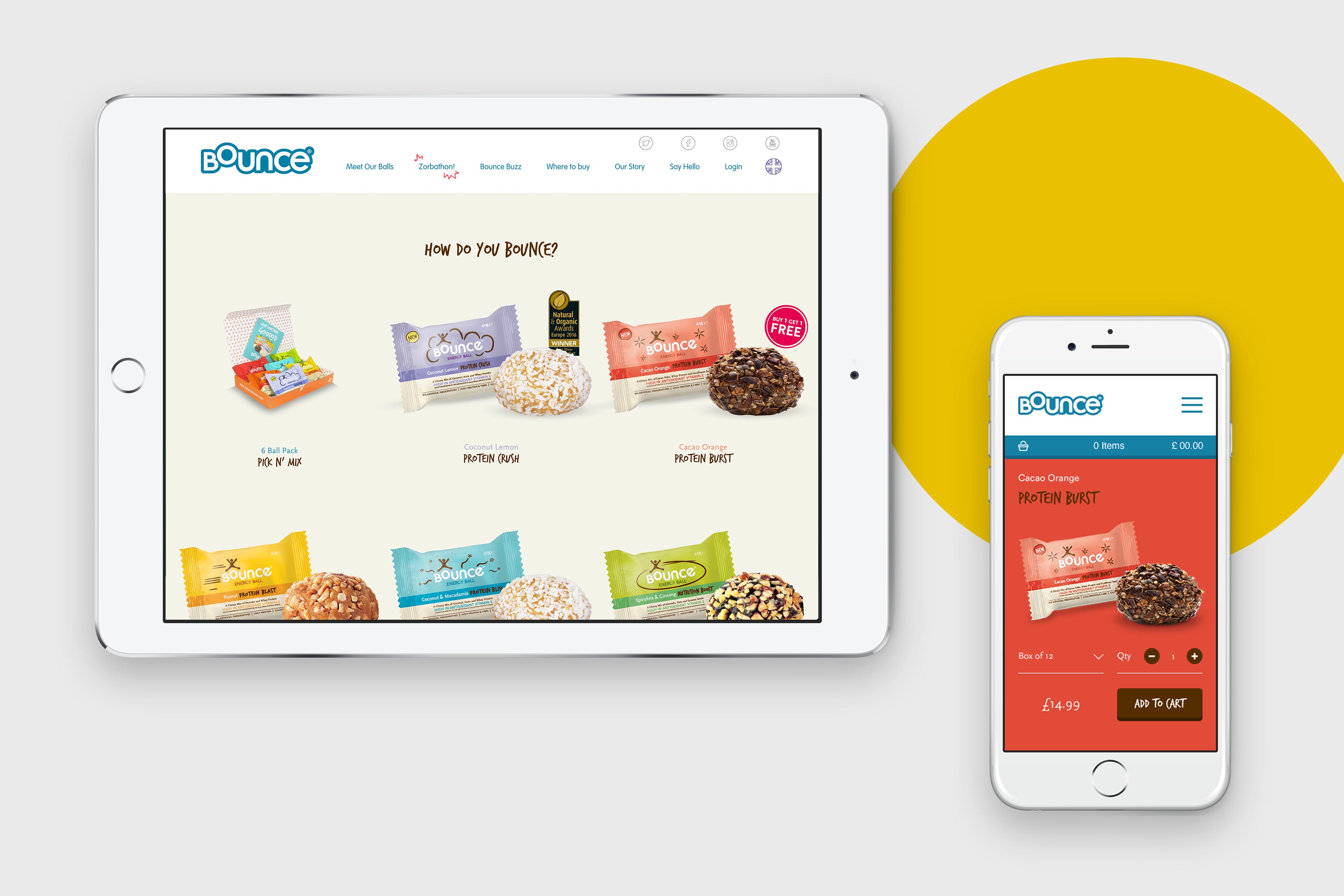
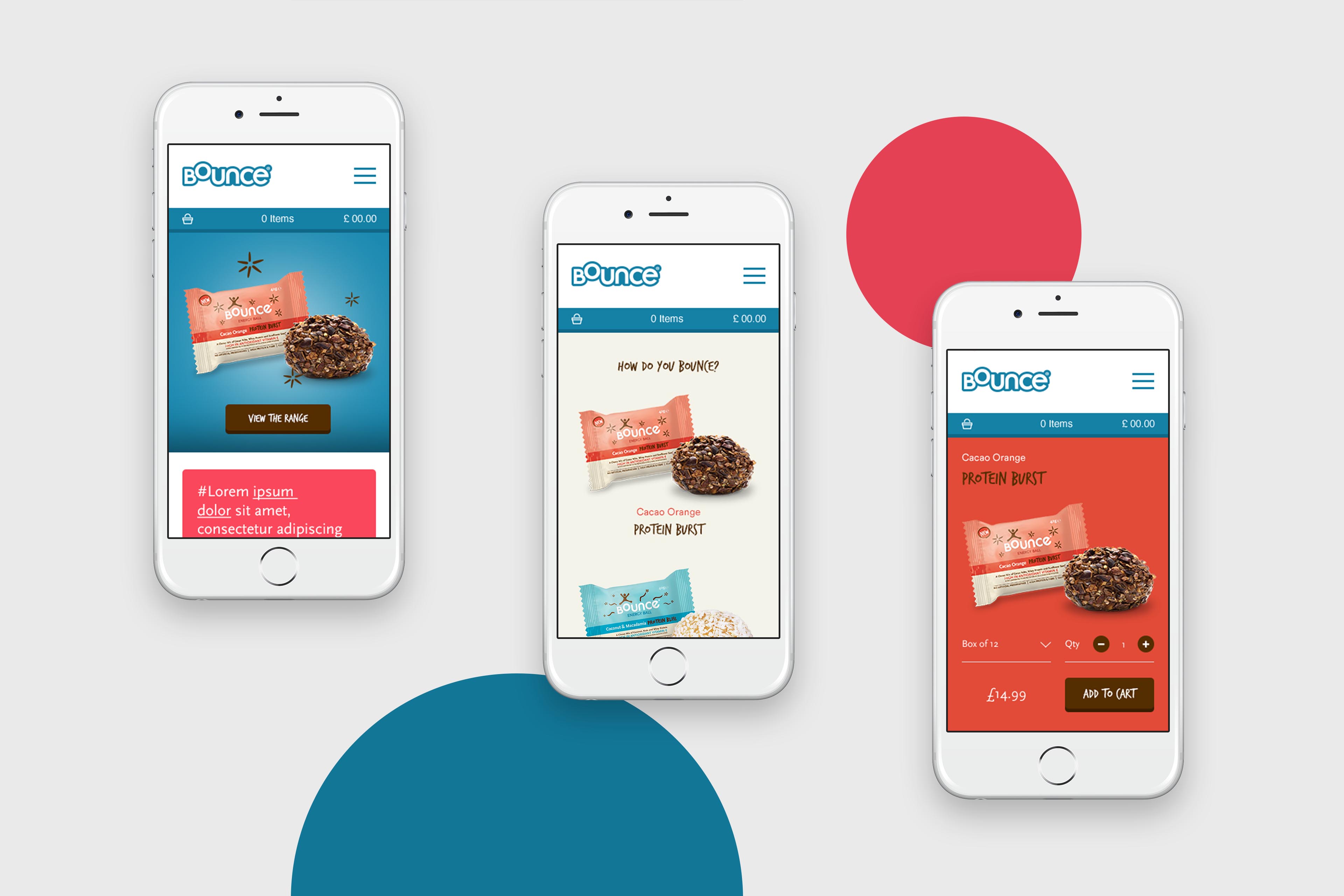
With the comparatively small selection of products that Bounce has (or at least, that it does as of writing), it was particularly critical for the back-end that we built to be easily-updatable by Bounce themselves – meaning that they could add new flavours to their on-site range as soon as new flavours arrived in supermarkets. This approachable back-end, as mentioned earlier, is supported with a fun, quirky front-end – not only in terms of the animations featured throughout, but the unusual page layouts and interactive changing background colours too.
a scrolling story
The Bounce story is an engaging one when you hear it for the first time, so it only made sense for it to be just as engaging digitally – giving users the opportunity to scroll and track the brand’s journey from birth to the present day, following the progress of a Bounce ball throughout – even featuring their original packaging in the earlier points of the story.
