BACKGROUND
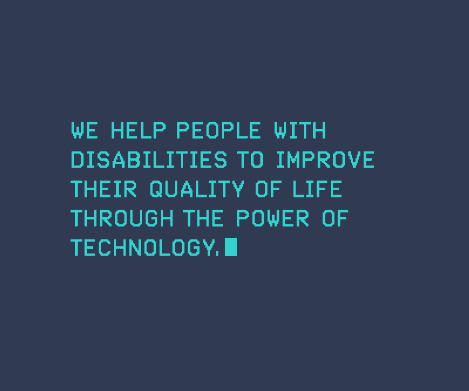
Everyone Can help disabled people by matching technology solutions to their needs—often to assist learning and engagement. They provide assessments, training and technical support for adults and children with disabilities, parents and carers, as well as those employed in the care, education and health sectors.
Recently, Everyone Can moved into the gaming sector—introducing children with disabilities to technology through playing games. We were asked to create a brand to reflect this new direction, whilst still remaining relevant and identifiable with their wider core services market.
AIMS
Within this industry, even funding has an element of gamification. Games industry charity, GamesAid, provides funding for charities and organisations nominated by its participants. Each year these nominees are voted on by members of the gaming industry, resulting in the level of funding received. Therefore, visibility and recognition within the gaming industry itself, is hugely important.
Everyone Can wanted to create a playful identity that strongly resonated with the games industry. The aim of this was to establish themselves as the gaming charity, opening up new funding opportunities and communicating the great work they do within the sector.
The identity needed to amplify Everyone Can’s strengths of playfulness, accessibility and inclusion, in order for the brand to be front of mind for voters and donors.
The identity needed to amplify Everyone Can’s strengths of playfulness, accessibility and inclusion, in order for the brand to be front of mind for voters and donors.
OUR APPROACH
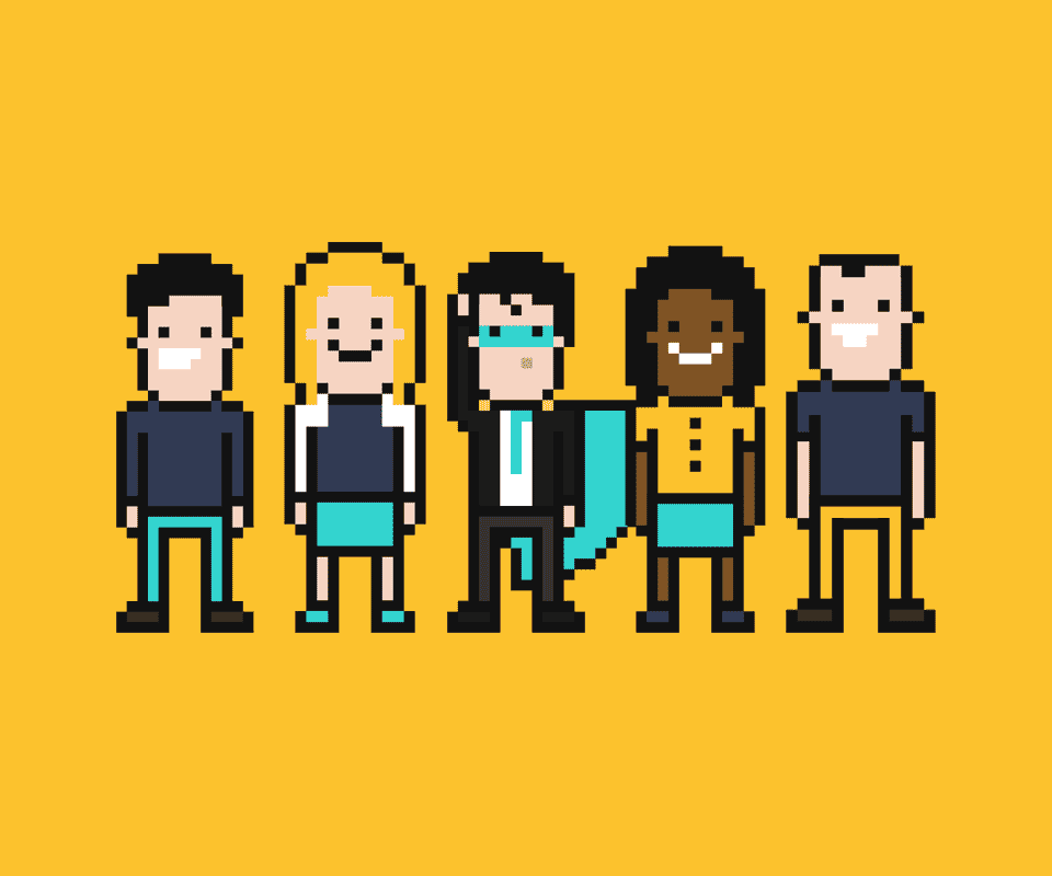
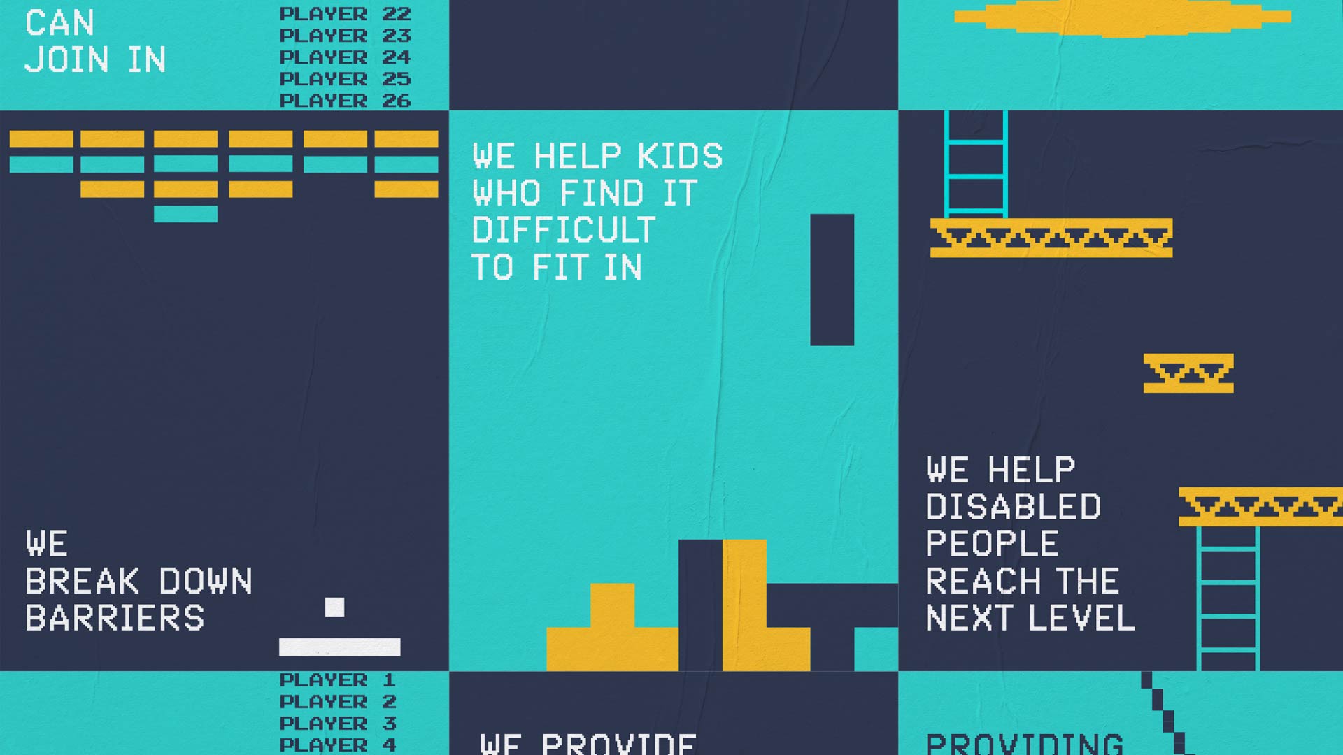
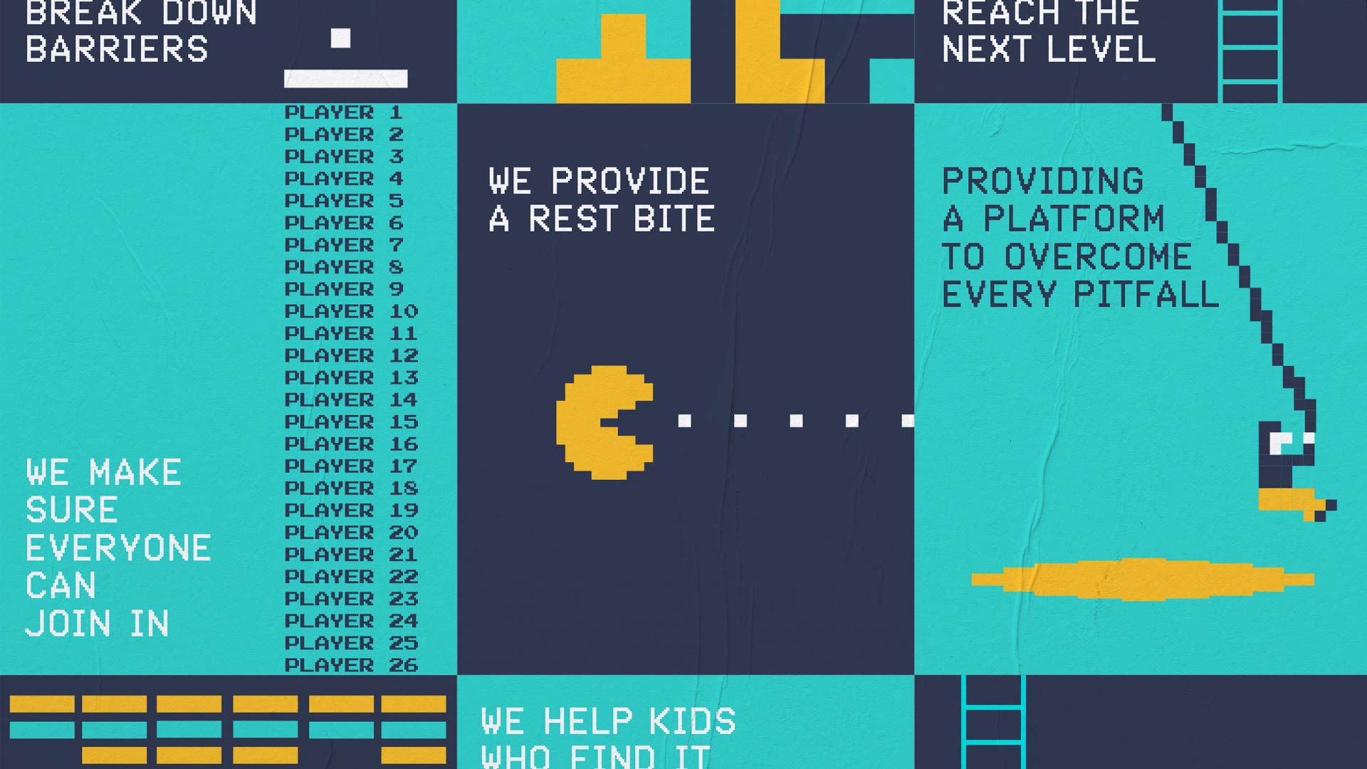
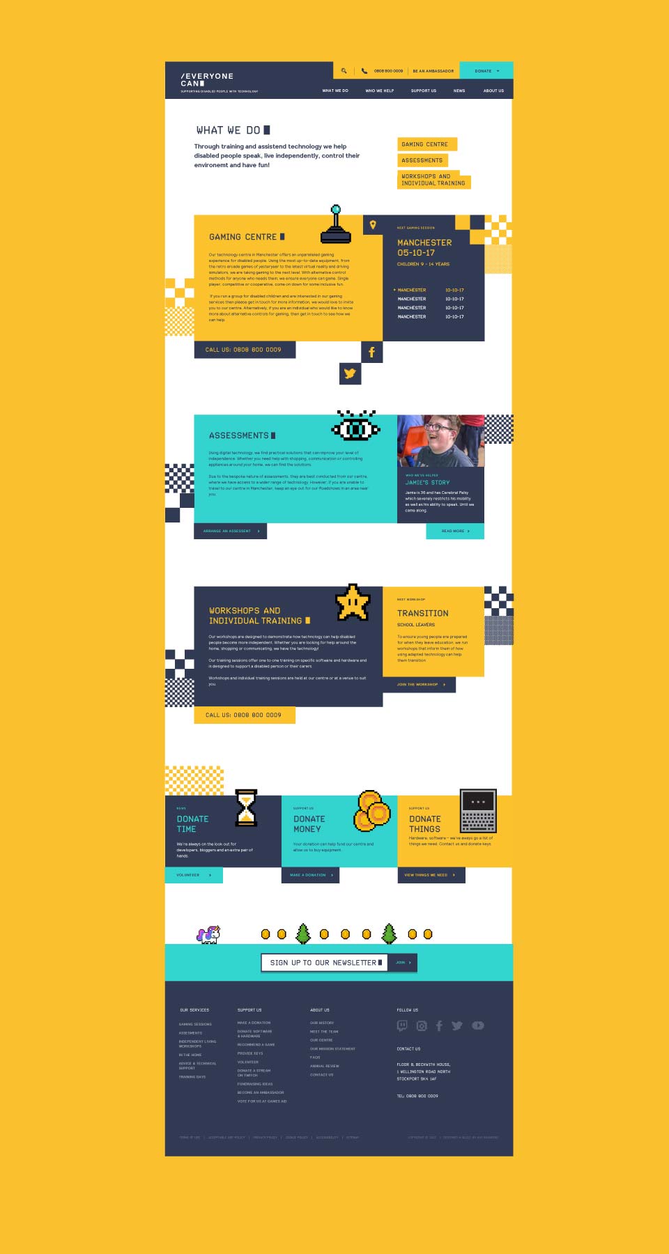
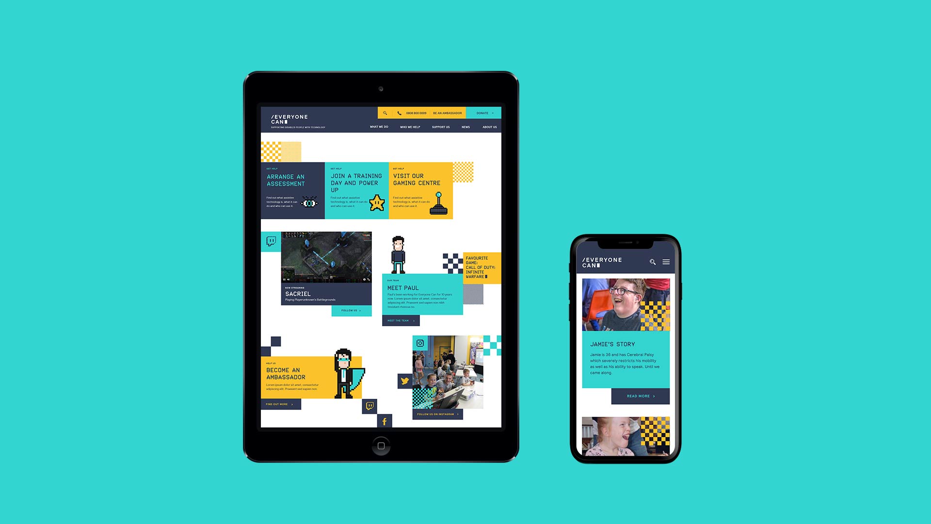
Embracing the computer gaming theme, the brand is inspired by the distinctive aesthetics of classic video games. Nostalgic ‘pixel art’ and a vivid 8-bit colour palette expresses the fun and playful side of Everybody Can—altogether resulting in a distinctly recognisable brand, undeniably associated with computers and gaming across all generations.
LOOK & FEEL
Everyone Can are ‘the brains’ behind the game—and with this in mind a typographic logo was created, inspired by the loading screen of early computer games. An angular typeface in confident upper-case, accompanied by a forward slash and solid block, subtlety hinting at code.
The pixel art style was used further in all assets of the brand—from drawing classic game characters to social icons on the website. A library of checkered ‘pixel blocks’ were also created and used as decorative assets thought digital and print material.


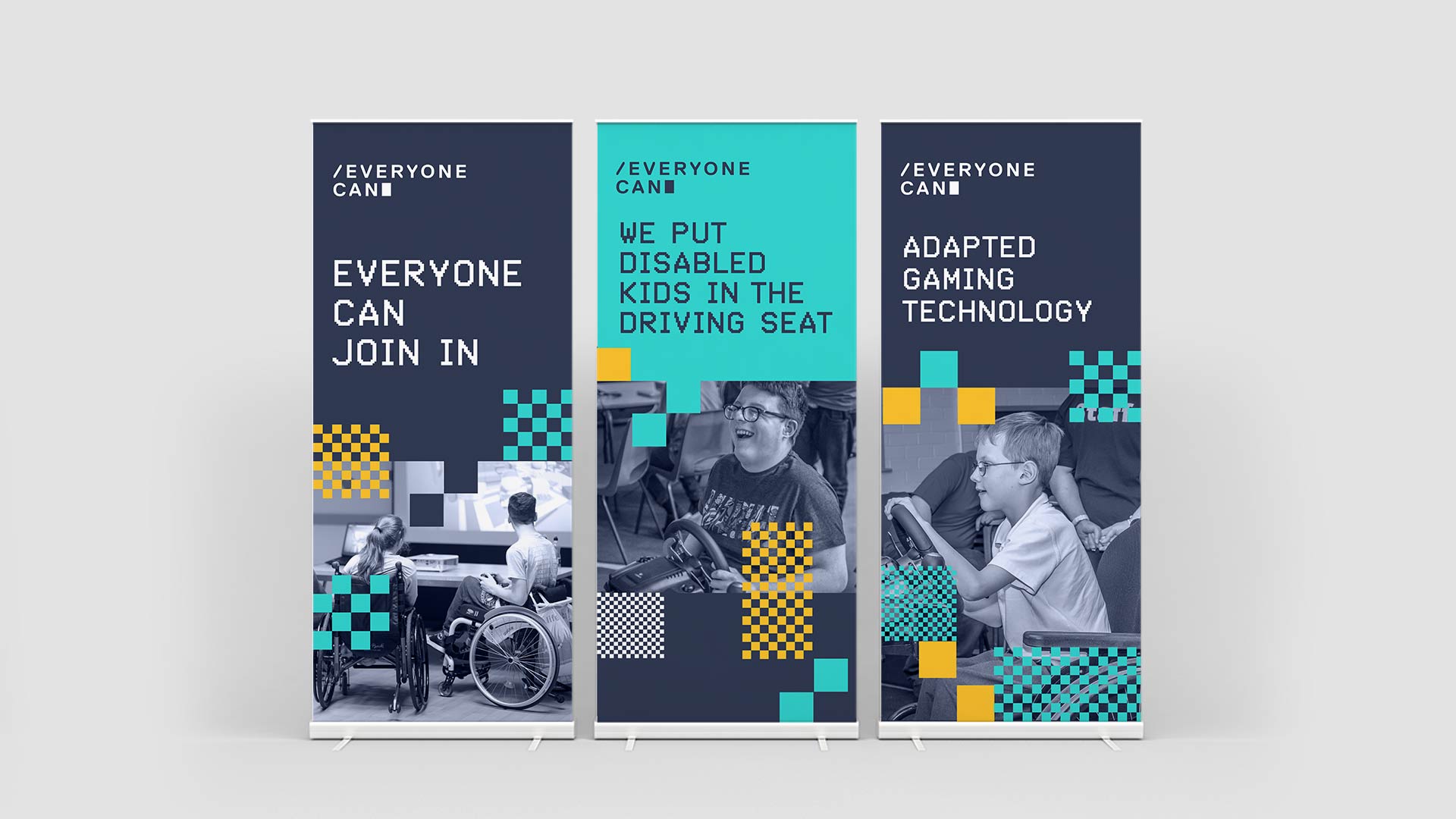
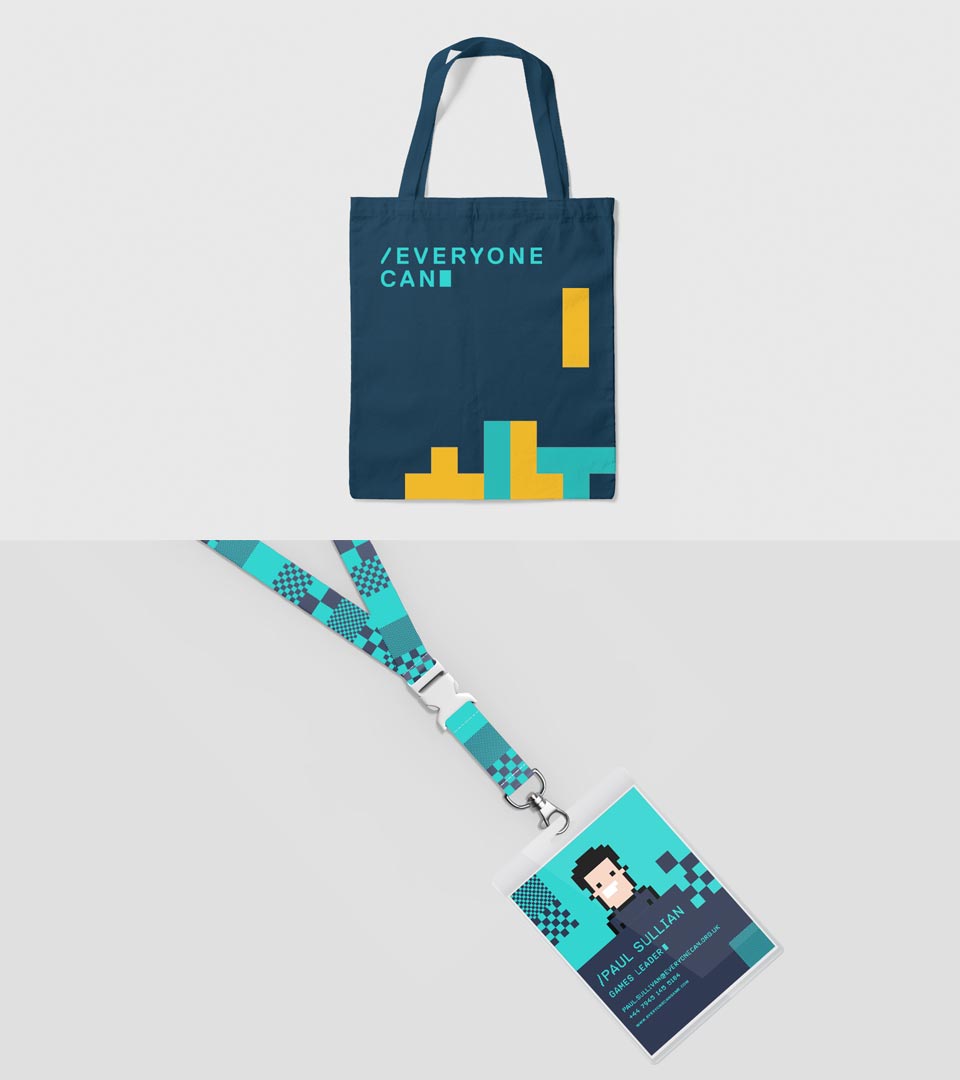
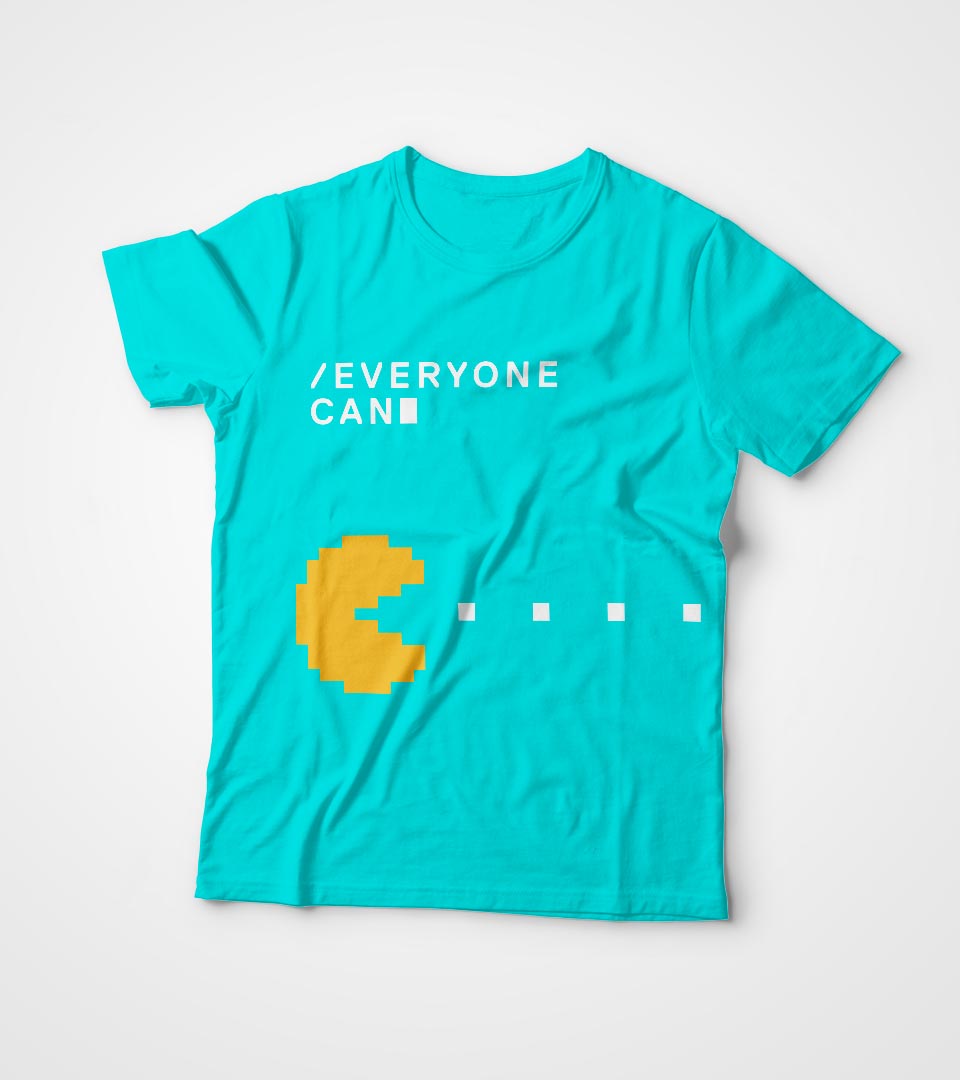
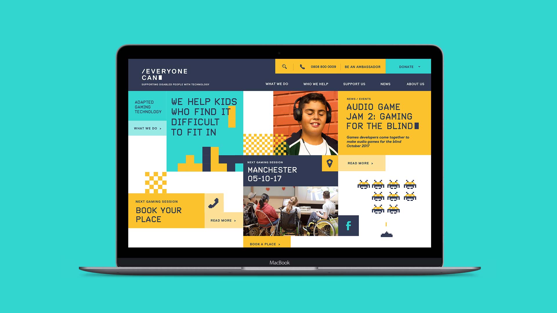
ROLLOUT
With the identity complete, we worked with Everyone Can to bring the brand to life. Working across a range of touch points—from website design through to pull-up banners, business cards and flyers, all in time for the opening of their new premises in Manchester.
Contact us
Get in touch
 NEXT PROJECT