BRIEF
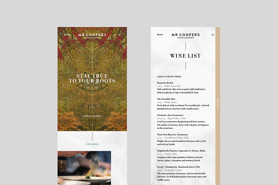
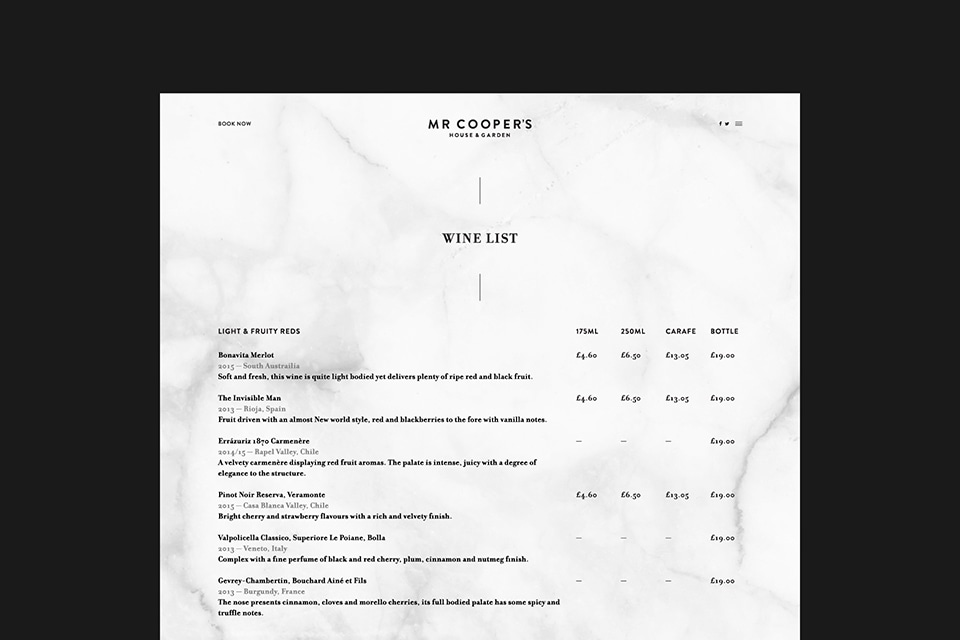
In 2013, AHOY was invited to create a brand and website for Mr Cooper’s House & Garden, the new 150-cover flagship restaurant at Manchester’s Midland Hotel. Following a change of management and direction in 2016, we were asked to refresh the website, improving user experience and introducing some exciting new elements.
THEORY
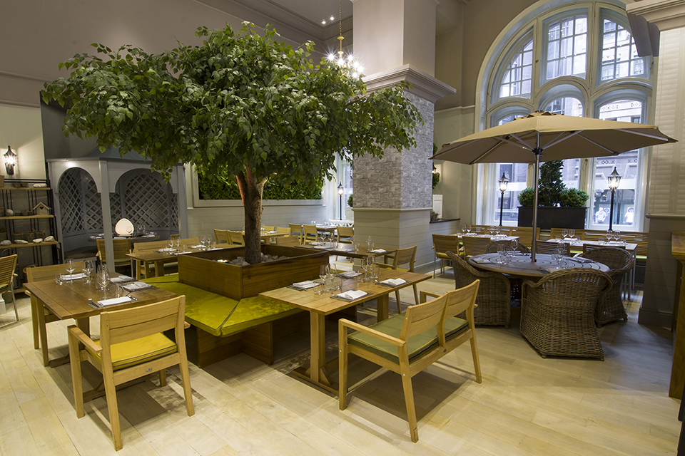
The brand we created for Mr Cooper’s centred on coach manufacturer and noted philanthropist Thomas Cooper, whose mansion and ornamental gardens once stood on the site where The Midland is now located. The gardens were open to the general public every Sunday, creating a diverse and welcoming natural space in the heart of a burgeoning industrial city. It was these beautiful gardens, and Cooper’s spirit of openness and community, that provided the inspiration for the restaurant itself – albeit with an imaginative twist.


PROCESS
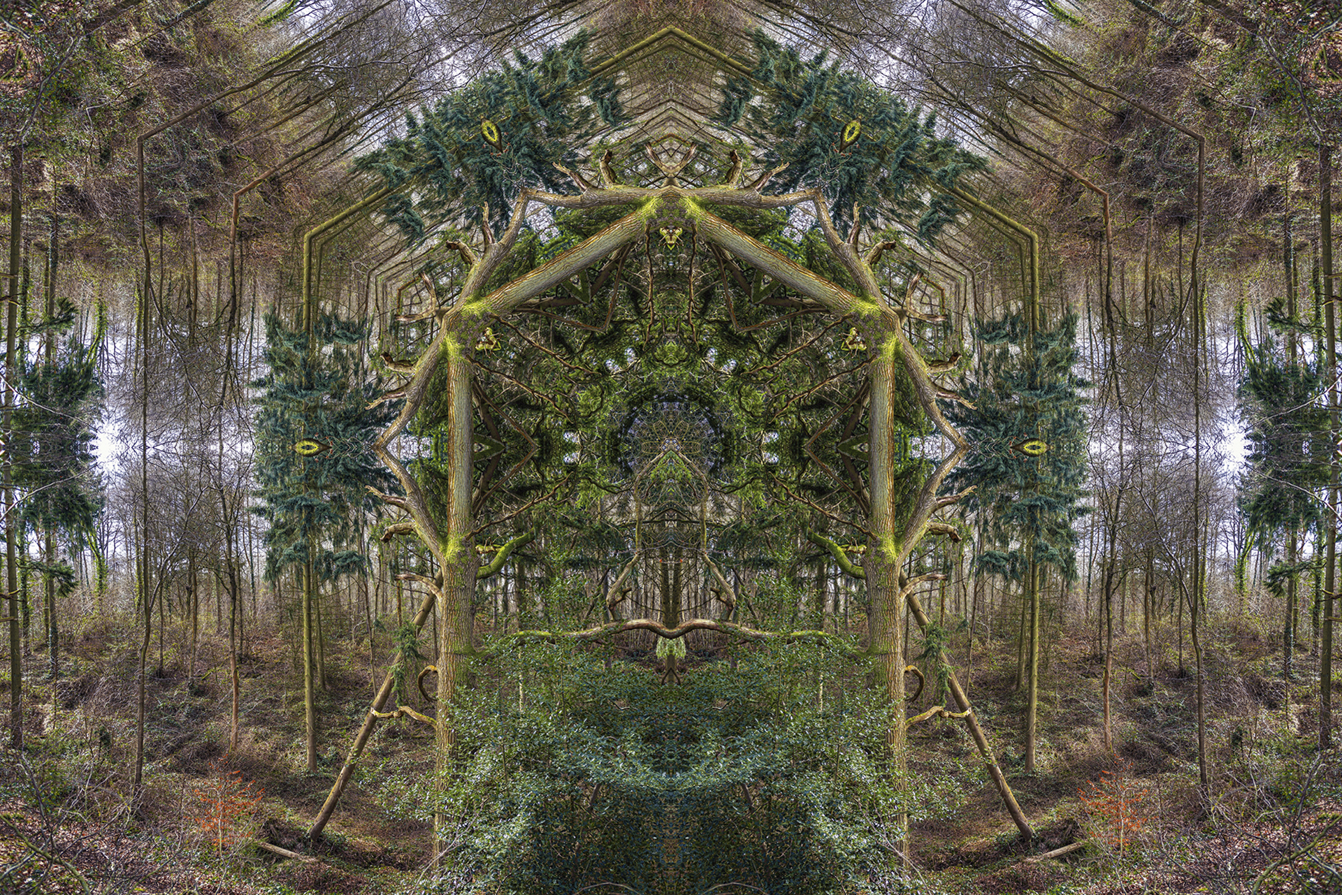
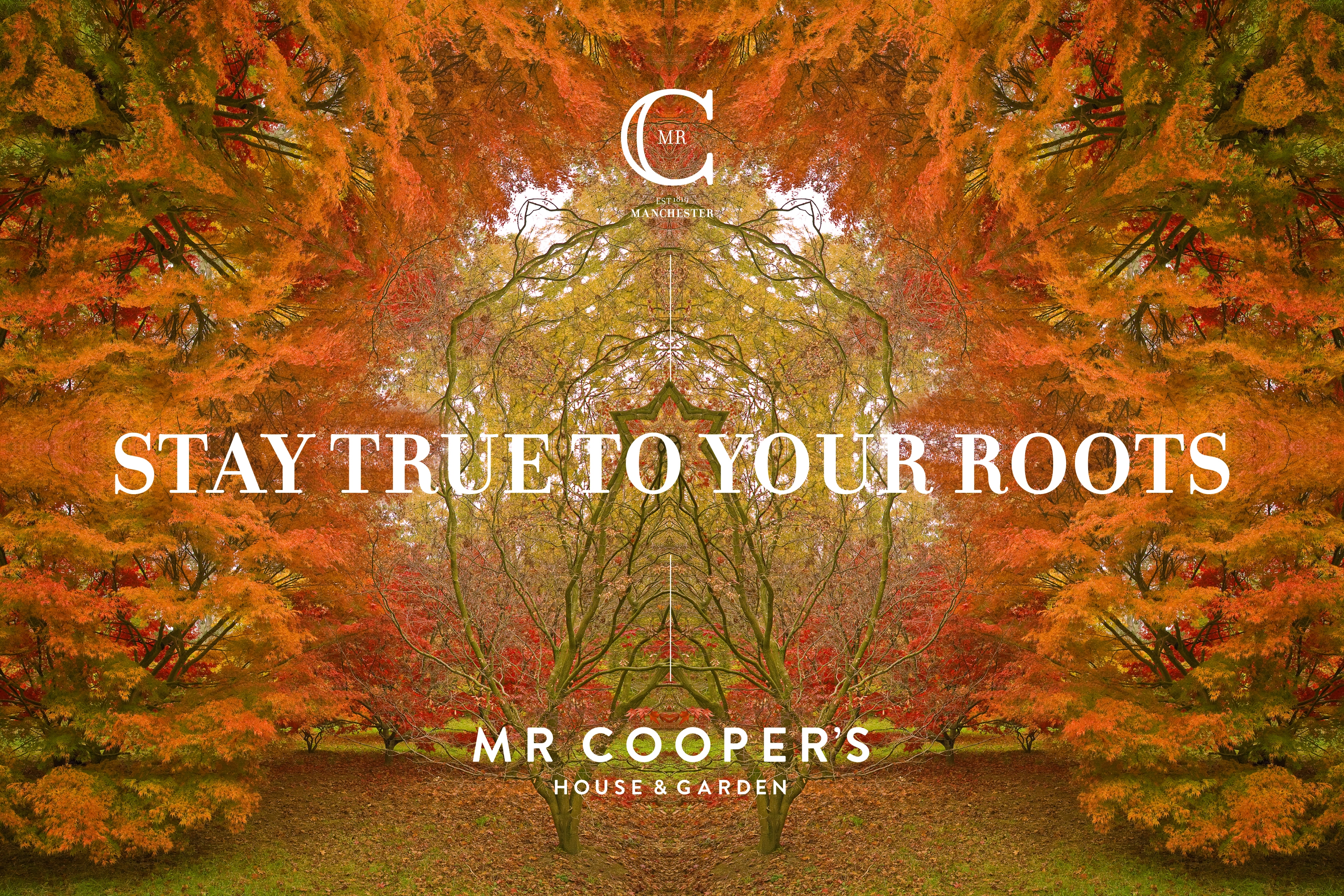
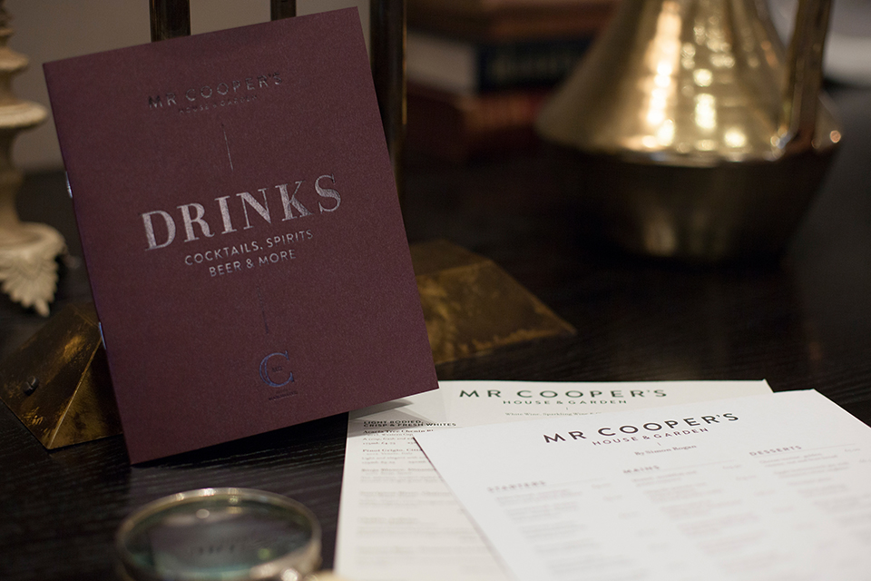
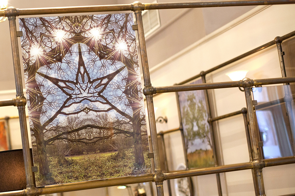
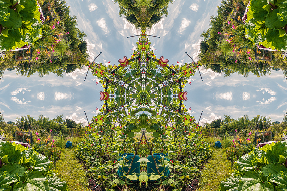
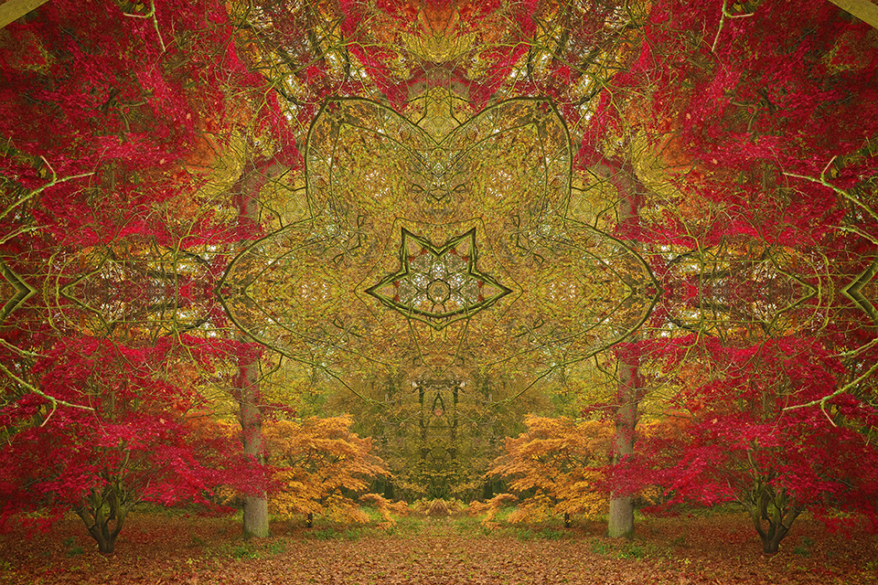
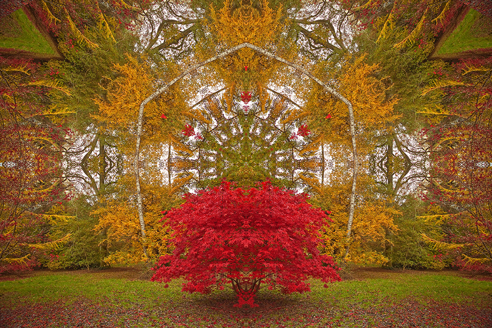
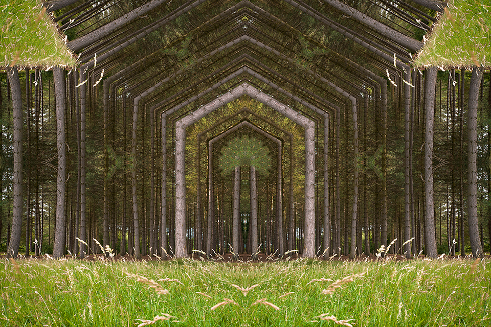
The link between inspiration and visual identity is a strong one at Mr Cooper’s. We used striking, kaleidoscopic photography by noted artist Matt Walford, featuring his colourful and mesmerising images across all print and digital touchpoints. The website now features an animated version of one of these works, gently rotating and expanding to reveal an unending array of autumnal colours.

PROCESS CONT.
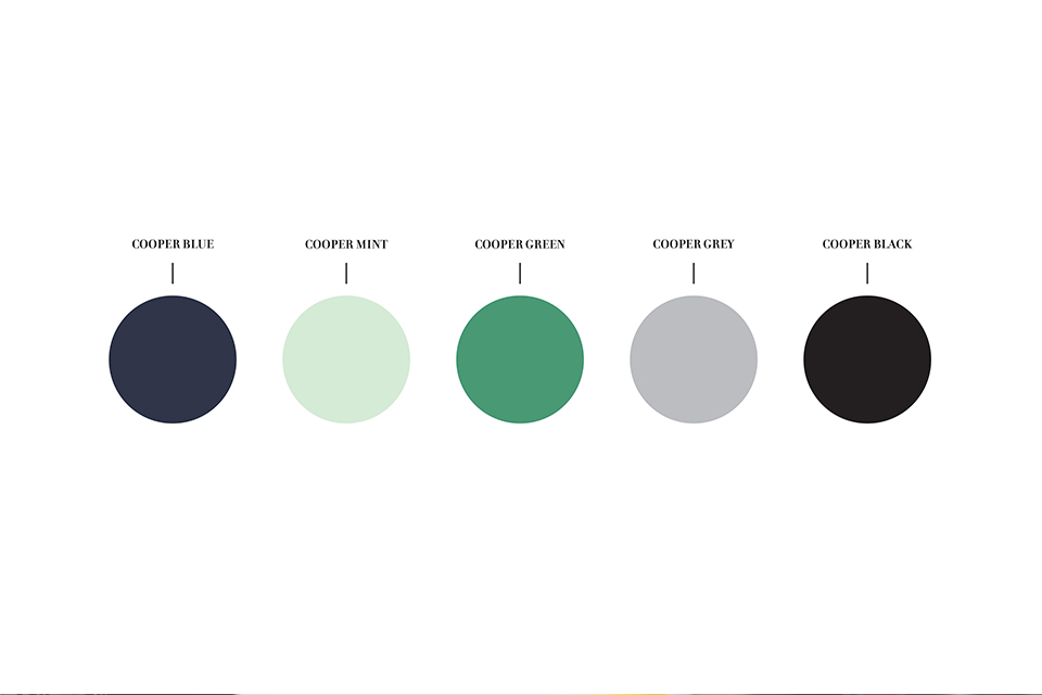
Stunning cinemagraphs take the place of static images, bringing to life some of the dishes on offer at Mr Cooper’s, and showcasing the chefs at work. Set against an elegant, marble white background, these media complement the classic typography and restrained colour palette.
PROCESS CONT.
The Mr Cooper’s website is fully responsive and features an integrated booking system and content management system, ensuring optimum user experience at both front and back end. The website attracted a good deal of acclaim, appearing on respected design blogs Httpster and Sites We Like.
