Brief
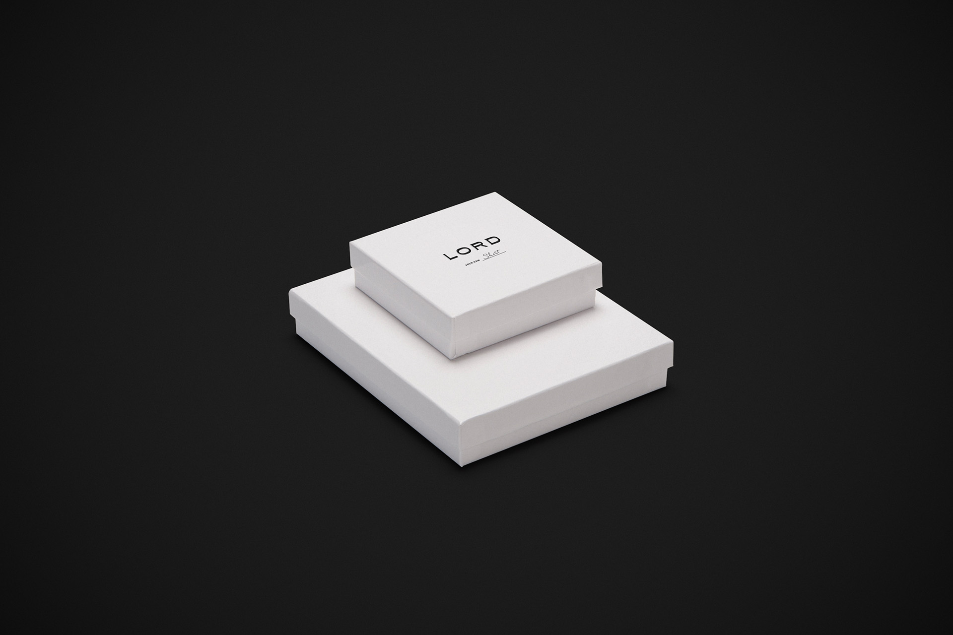
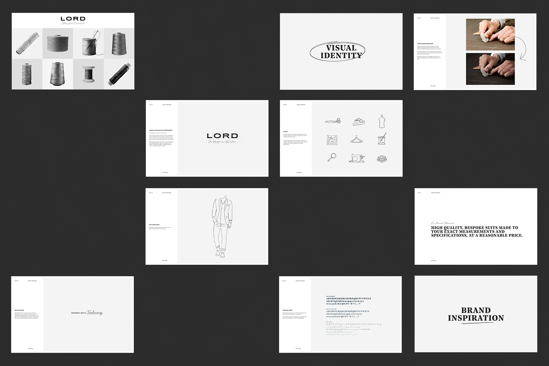
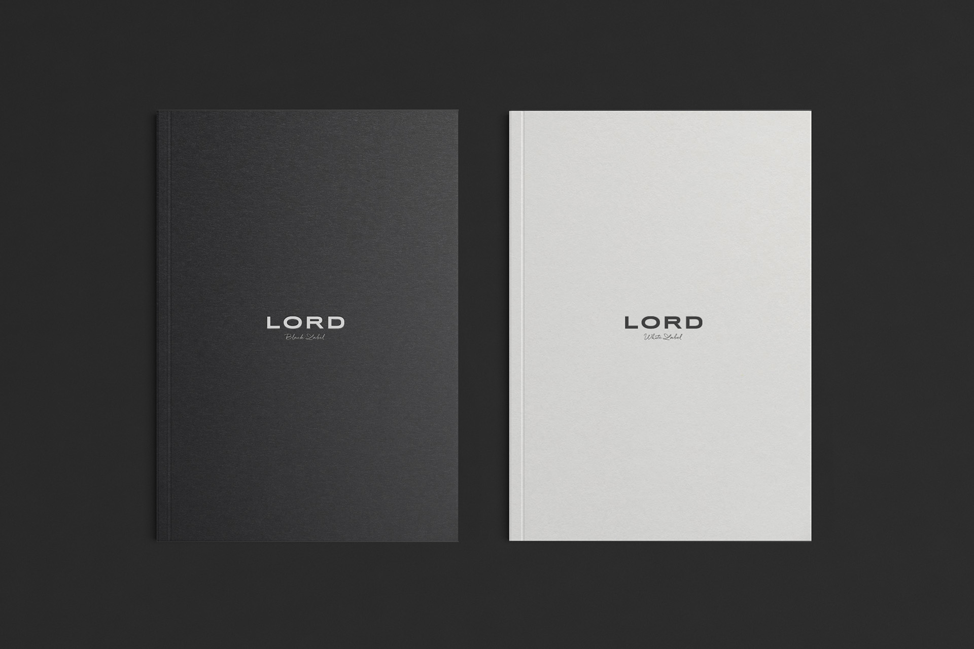
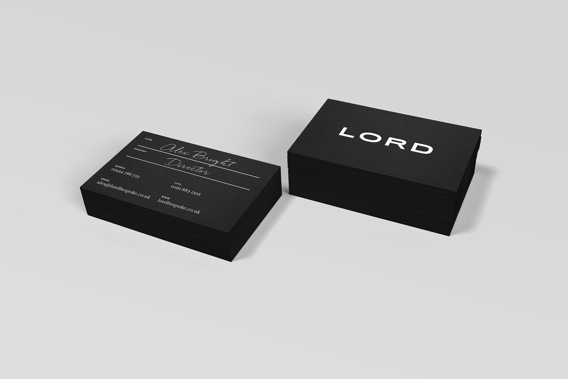
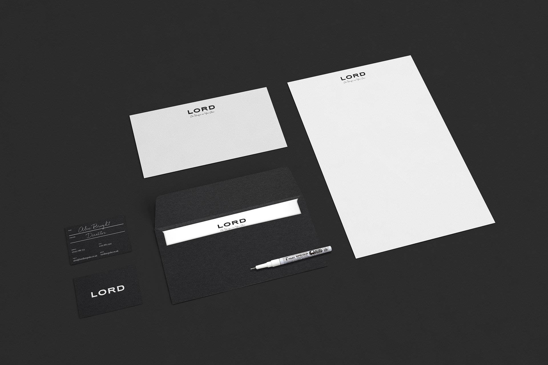
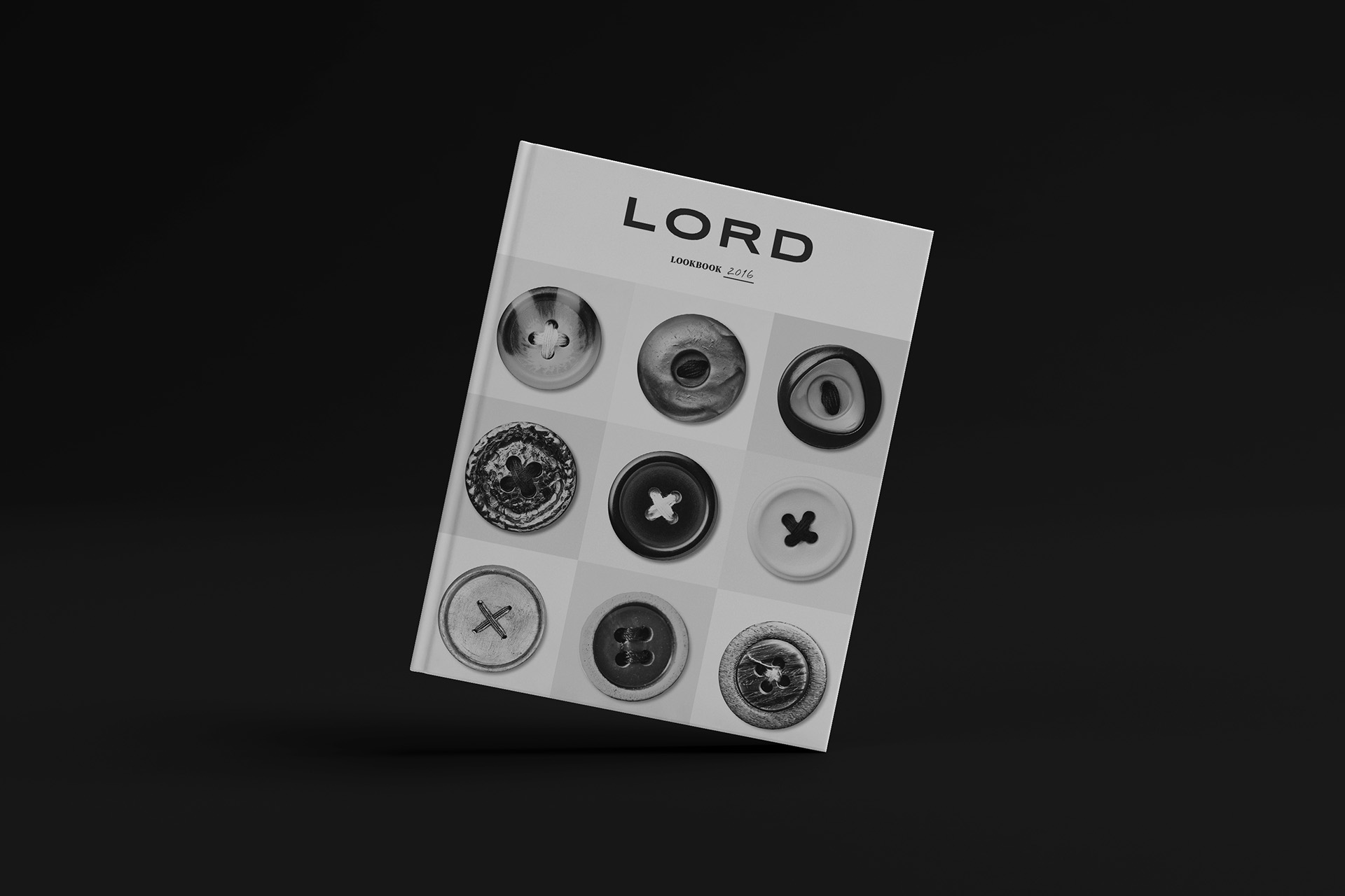
Personalisation and craft are the key guiding principles of this identity, with a confident and timeless logotype free from flourishes and unnecessary complication. Handwritten flourishes inject personality into the identity too, reinforcing the personal touch that Lord provides.
THEORY
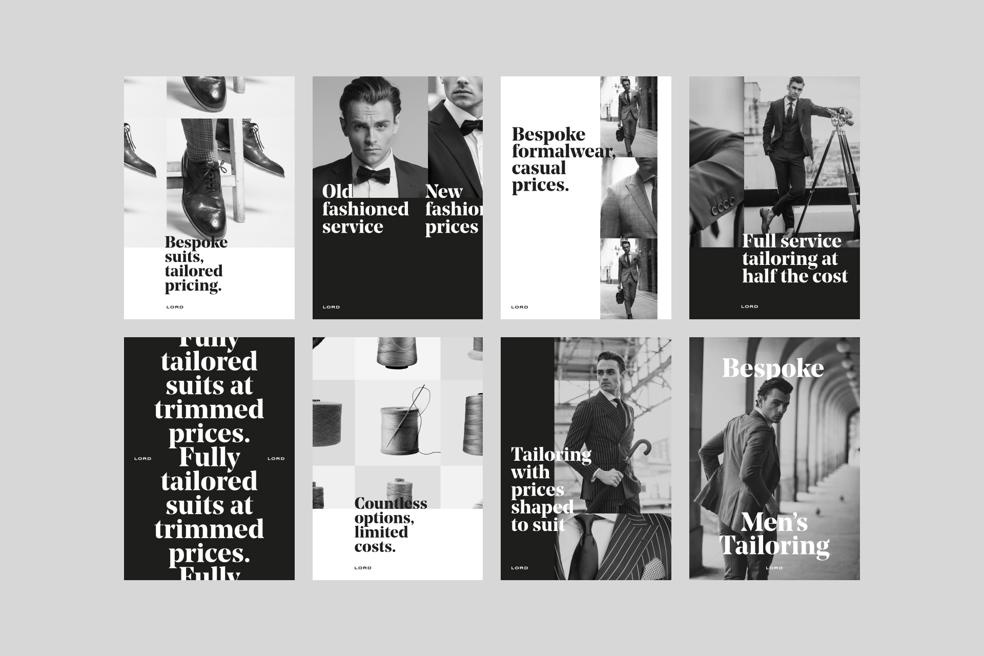
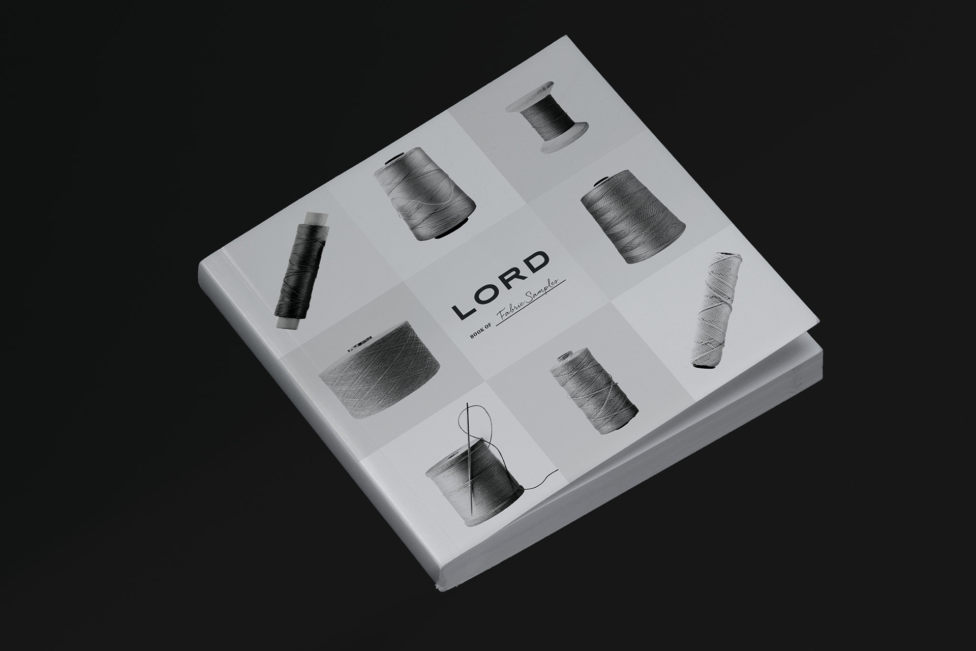
Perhaps the most striking aspect of this identity is the super high contrast brand imagery, displaying multiple images of the same object at once, but highlighting the texture, detail and personality of each item. In doing so, we make the ordinary seem extraordinary.
