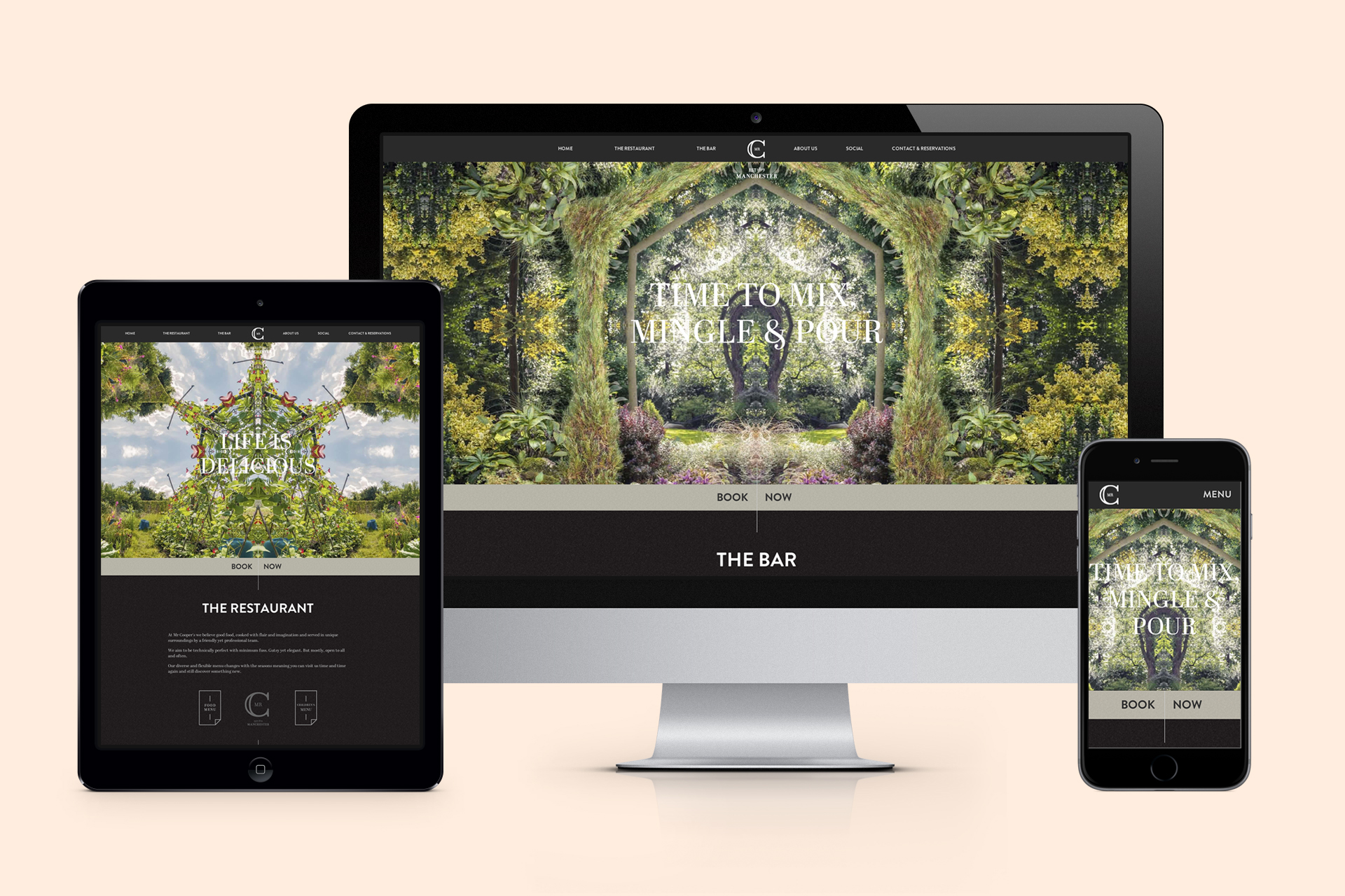
Responding To Change…
I’ve always loved the web; I like to think that I can see the potential that is locked away in every single web page and I wholeheartedly believe that a fully responsive web is a better web. As AHOY’s front-end developer, my day to day job is to ensure that all of our existing and future clients get the best possible front-end development they can for their websites, which in turn means giving users the best possible front-end experience.
Developers can’t hide behind the arguments of responsive websites being unstable anymore because, well, they aren’t – any developer worth their salt should be able to make an existing website fully responsive. They can’t even hide behind the excuse of having to support older browser versions, as more and more users are now seeking the latest features and customisability that modern browsers offer. The days of progress being halted by long-forgotten versions of Internet Explorer are all but gone.
Usually, companies will draft in an agency to patch their website up – simply making the existing website fit to any screen size. This is a great first step, but really, responsive design means creating a unified experience between desktop and mobile – not squeezing a desktop interface onto a smaller screen.
1. Useful information should never be hidden
A mobile website should have all of the core information and functionality of a desktop site, but in a quick to view, mobile-friendly format. Don’t get rid of information – allow users to choose what they see. Accordion-like sections of information that slide and expand into place are just the ticket for mobile users, keeping the overall design flowing and interactive without taking a sledgehammer to key sections of content.
2. Embrace the fact that your users are mobile
Previously, developers and designs saw mobile websites as a headache. Creating websites that displayed cross platform was a daunting prospect, but thankfully the web is starting to fully embrace mobile design.
Restaurant owners can offer mobile reservation systems, for instance, letting potential customers reserve tables on their morning commutes. Owners of retail empires can offer mobile-friendly overviews of their entire fleet of branches, letting users tap the branch closest to them for instant directions from wherever they are at that moment.
How many times have you wanted to find a store’s opening times but found yourself zooming into drop-down menus, trying to get them to stay open and then finding that the touch areas were two narrow for your fingers to select the option you wanted?
A long winded analogy, admittedly, but this is exactly the kind of information that users should be able to navigate to without difficulty.
3. Tablets are devices too
Viewing websites on tablets is now commonplace. The best-designed tablet websites will have menus and navigation designed specifically for tablets. The version of the site that you see on a tablet shouldn’t just be a larger version of the mobile site.
4. Keep clicks minimal, keep clicks big
The number of required clicks should always be kept as low as possible. The less clicks it takes, the less chance you have of a user changing their mind. Remember, it only ever takes one click to close a website.
Speaking of buttons, keep them large and in charge – you don’t want to irritate users with tiny buttons that they have to zoom right in on to be able to use. Give buttons plenty of room to breathe, with white side on both sides – minimising the chance of a mis-click that could cost you a sale.
5. Your user’s data limits have increased, for the most part
Gone are the days of mobile internet being a little-used luxury, now it’s a stable and integral part of our mobile lives. Mobile networks have reacted accordingly, increasing the amount of data they offer on contracts, as well as the reliability of their 3G and 4G signals overall.
That doesn’t mean you should fill your website with retina-quality images, of course, but it does make image-heavy mobile designs viable again – letting designers tease users with preview images, simple image effects and AJAX-loaded slideshows.
Responsive websites are no longer the future, but the standard. They are becoming critical to business’ web success, bringing bounce rates down and giving users everything they need, rather than forcing them to rely on traditional desktop designs.