BACKGROUND
IMO (In My Opinion) specialise in affordable mobile communications, with a range of phones marketed to people who want high-quality devices that won’t break the bank.
In preparation for a potential exclusive deal with one of the UK’s biggest cell phone network providers, IMO were looking to re-energise their online presence and create a website that truly reflects the brand’s ethos and aspirations.
BE DIFFERENT
In a fiercely competitive sector of huge global players, IMO proudly hold the position of affordable devices with high quality build and technical specification. This strategic proposition of ‘affordable quality’ is celebrated with their motto; “Be different”. It’s this brand ethos which was absent for their previous website.
Our challenge was how to communicate their brand values in a way that resonated with their broad range of customers whilst presenting the products in a visual style which matched the big brands.
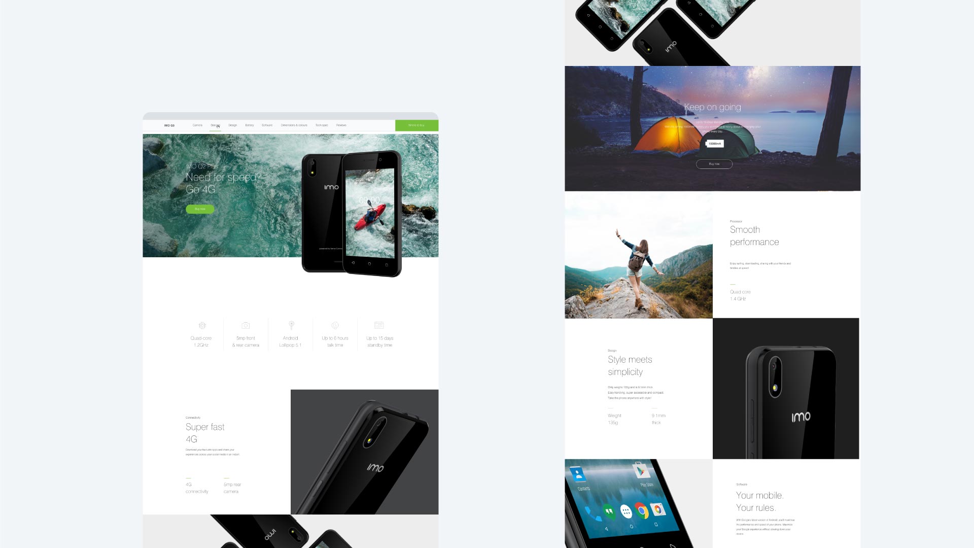
CONVEYING THE BRAND VALUES
Developing a ‘personality’ for each phone not only helped to highlight key features, but created clear differentiation between devices. A combination of photography and copy gave each model a narrative that reflected IMO’s brand values and resonated with the consumer.
Combining existing product shots with carefully considered stock photography formed a unique narrative for each phone model, as well as conveying the values of the brand. A wide variety of lifestyle photography with faces young and old appealed to, and reflected, the broad target audience.

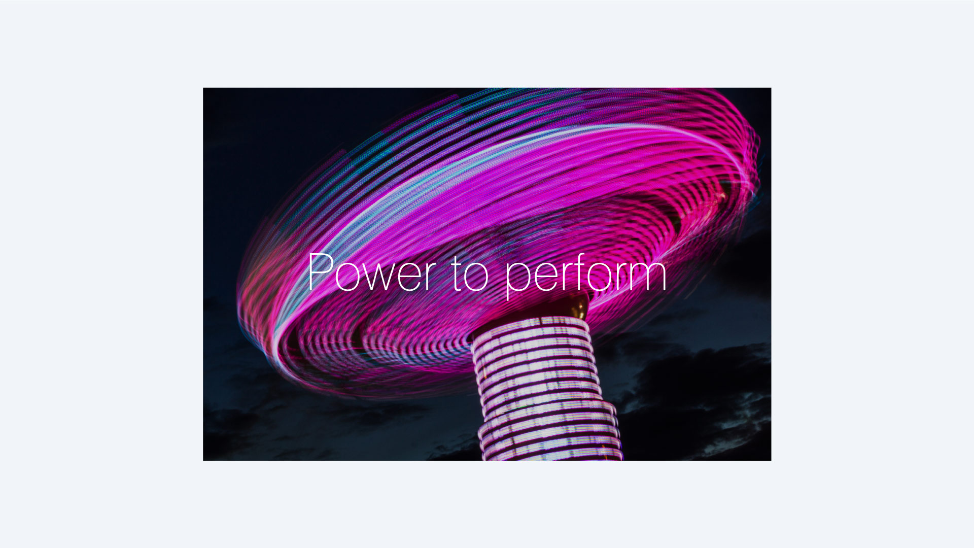
TONE-OF-VOICE
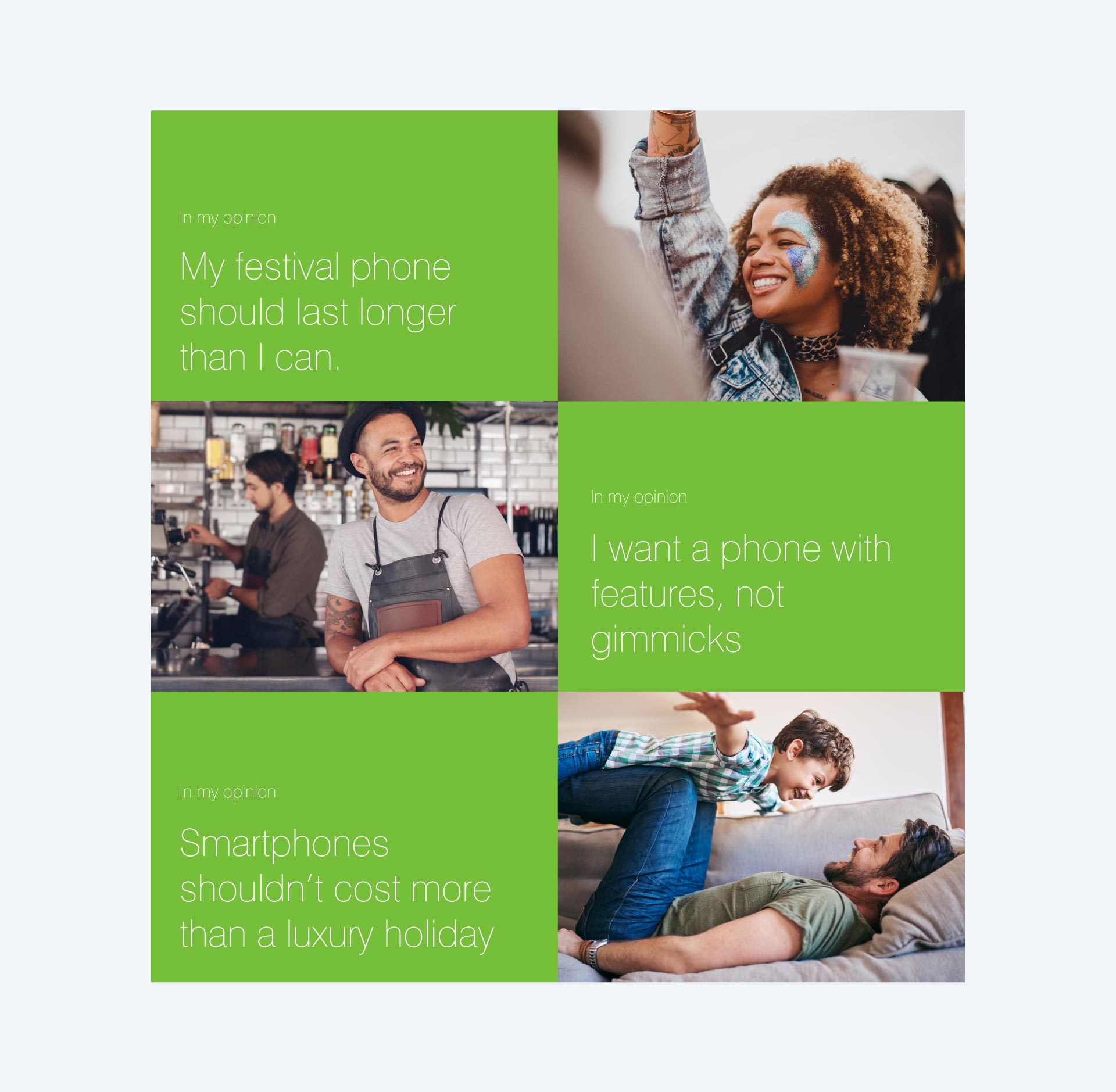
Tone-of-voice was developed to educate audiences around the definition of IMO as well as further express the brand’s characteristics and values. Matter-of-fact statements represented the thoughts and feelings of the consumer and encompassed the honesty and attitude of IMO.
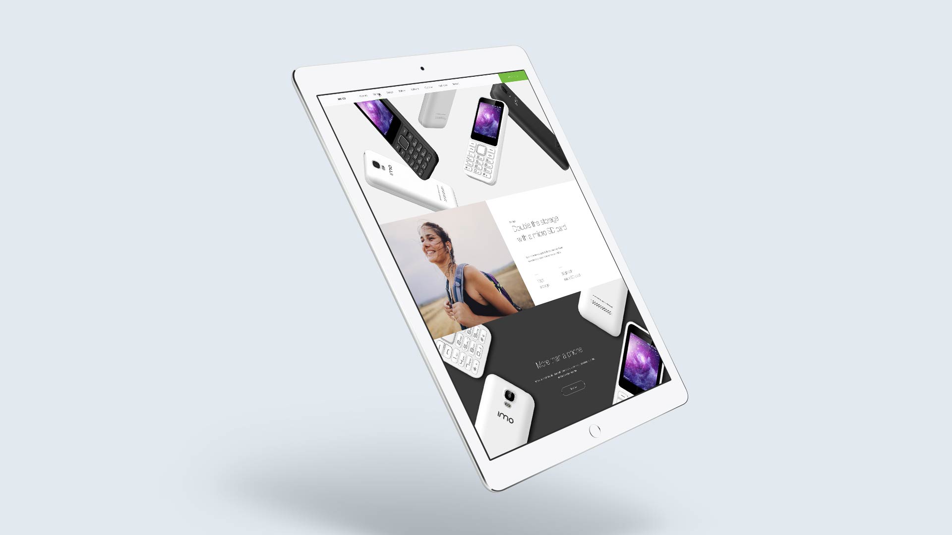
WEBSITE DESIGN
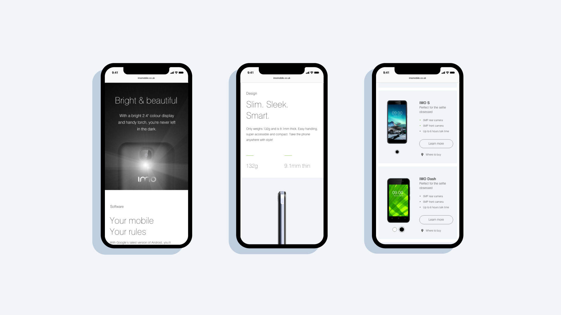
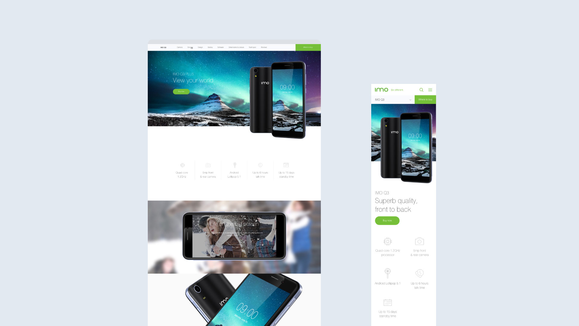
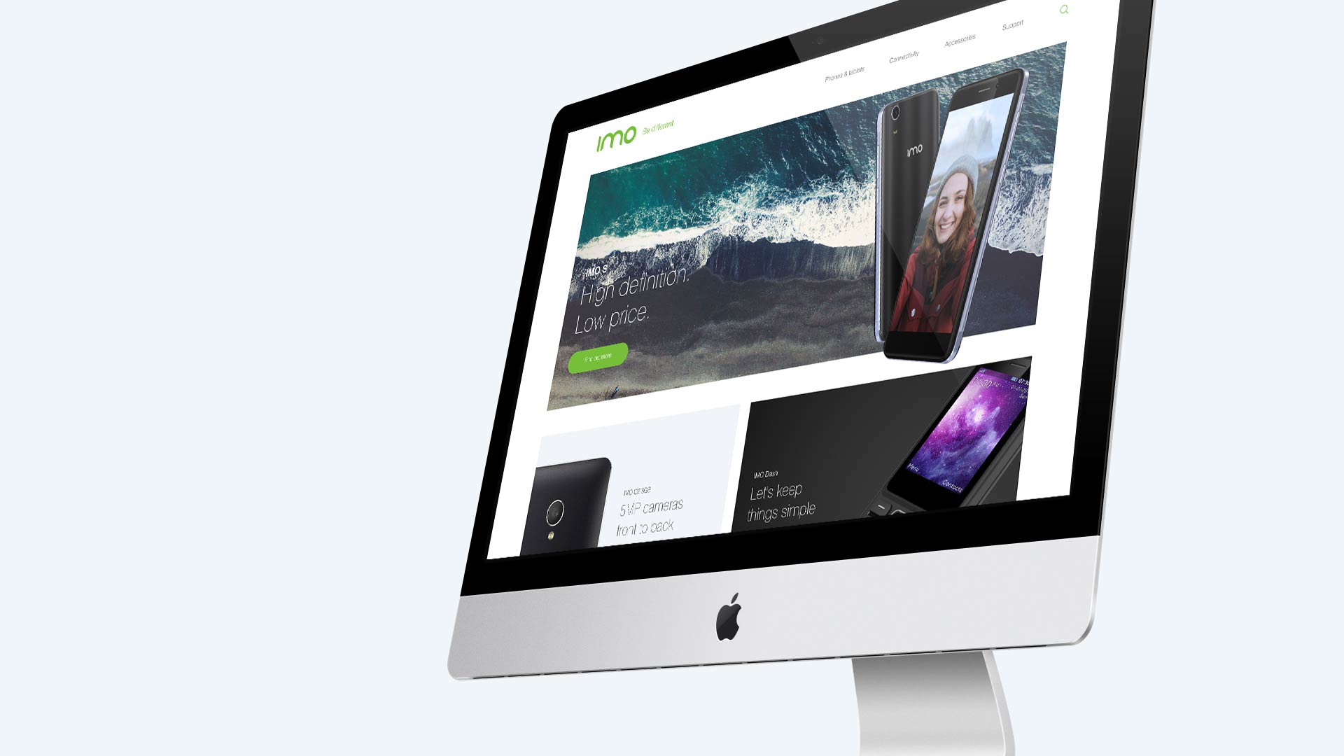
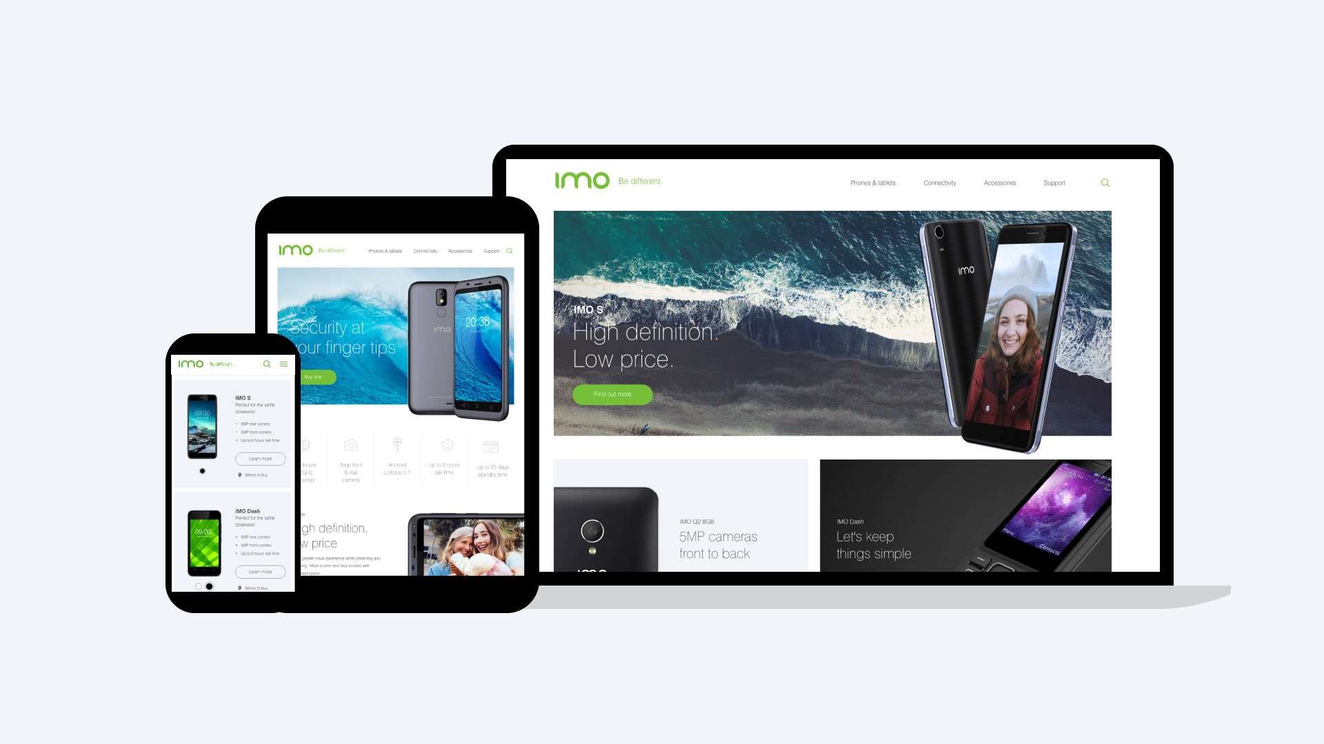
We designed a fresh, contemporary, fully responsive site. The versatile page template design and CMS capability allowed for easy updates and developments as IMO grows and new devices are released and added. A library of icons was created to highlight the key features of each devise.
