BACKGROUND
Use is a discount app that allows customers to discover amazing offers on everything in their local area—from days out to nights out, and looking great to living better.
Users can browse offers near them, redeem, record and keep track of how much they’ve saved, all within the app. By recording these amounts each time, users can see how quickly they add up; making huge savings worth celebrating.
DONE WITH DISCOUNT APPS
Discount apps are everywhere and often feature the “same old deals” on burgers and bolognese. With little differentiation in product experience, Use wanted to shake things up. We worked with them to build a brand which would transform the digital discount market and create a brand which offers an engaging customer experience unlike anything else on the market.
THE IDENTIYTY
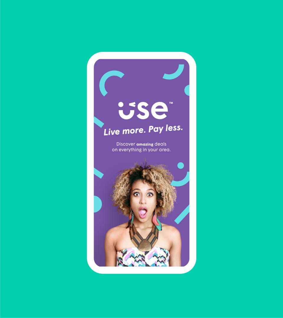
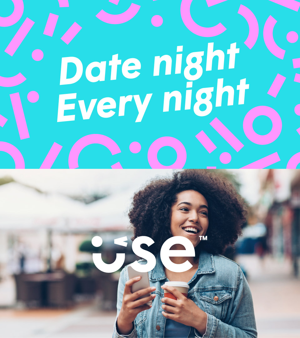
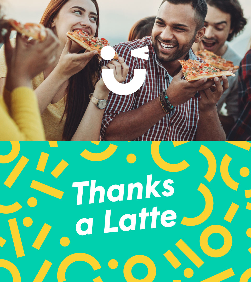
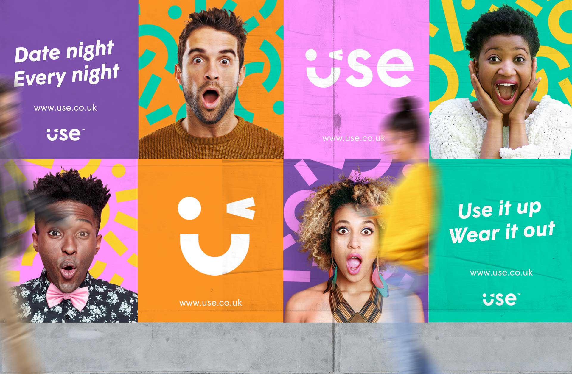
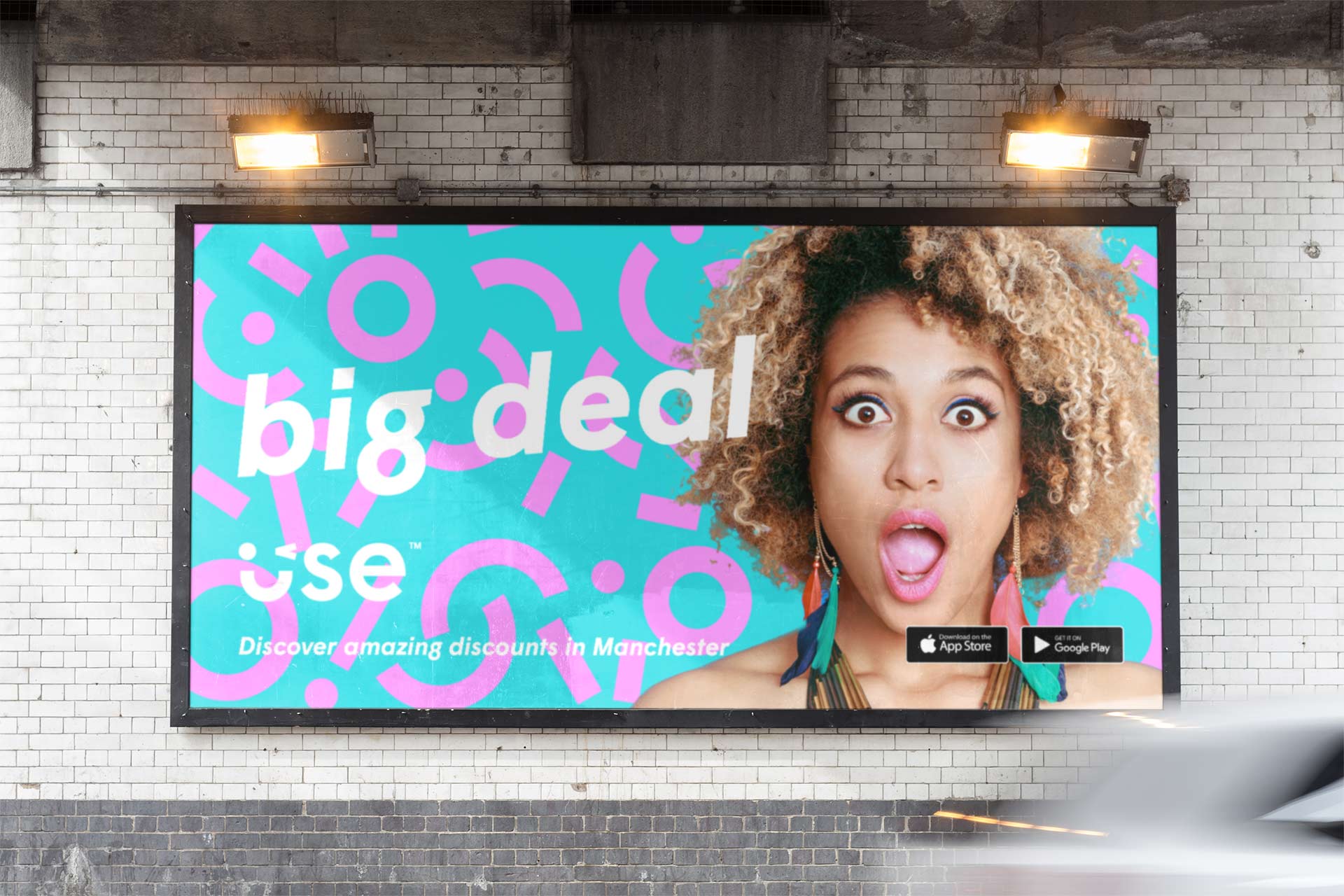
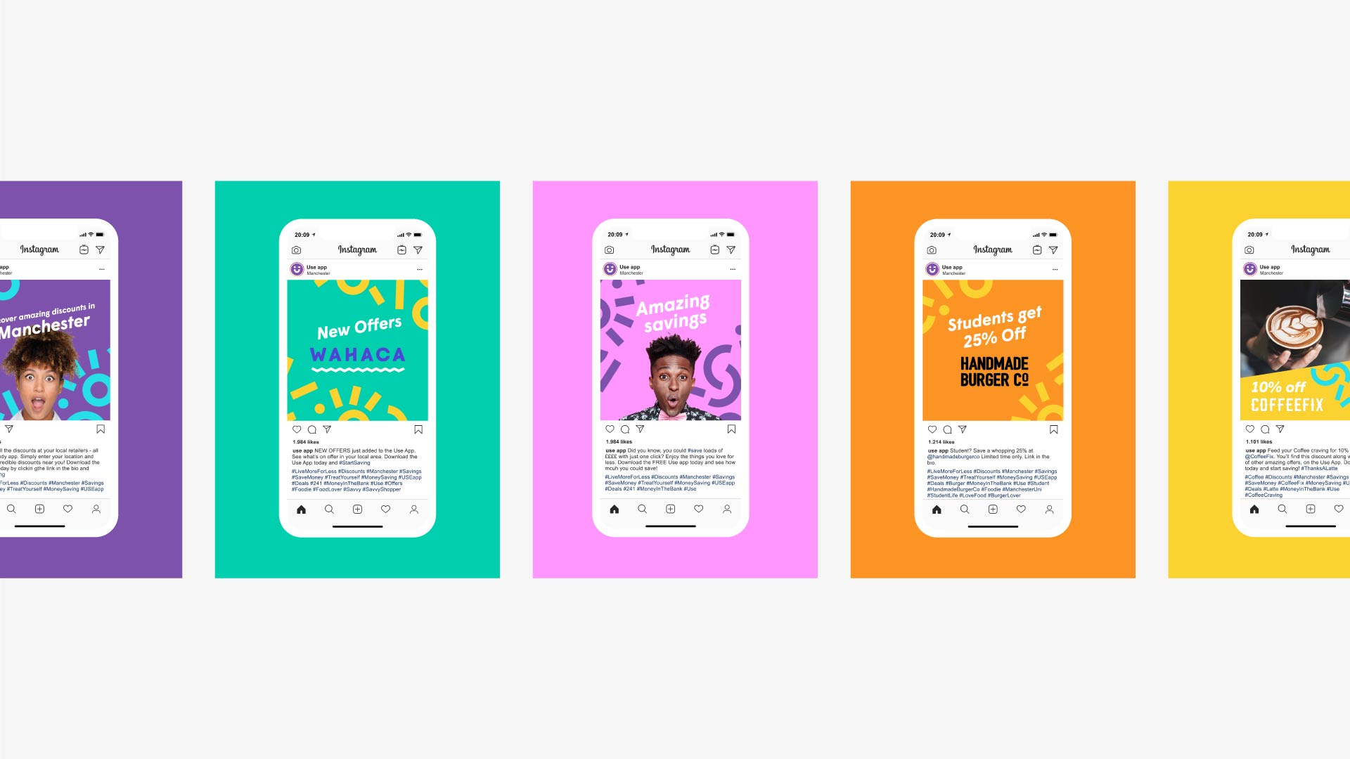
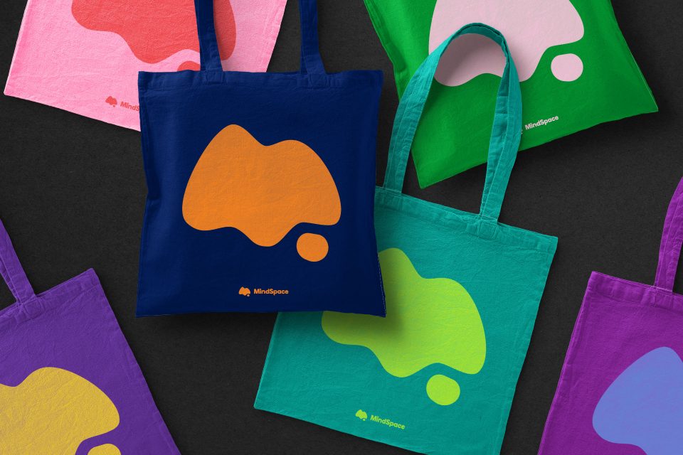
Playful, fresh and bursting with feel-good energy; the visual language of the brand encapsulates the experience of using an offer. This feeling of surprise and happiness when realising how much you’ve saved flows through the visual language.
The word mark itself can be reduced down to a simple wink and a smile; a shorthand representation of shared secret knowledge. In the case of Use, this represents a great deal that only users of the app are privy to.
These are savings worth celebrating and with that in mind we injected colourful confetti illustrations throughout the brand applications. Based on the shapes found within the logo and laid out at random, this bold and expressive asset was used thoughtout all media, providing a distinct and playful visual identity.
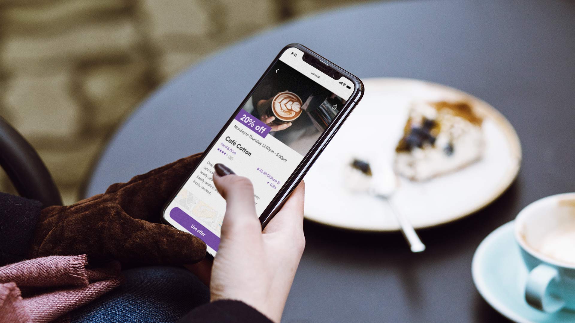
APP – PLANNING & WIREFRAMING
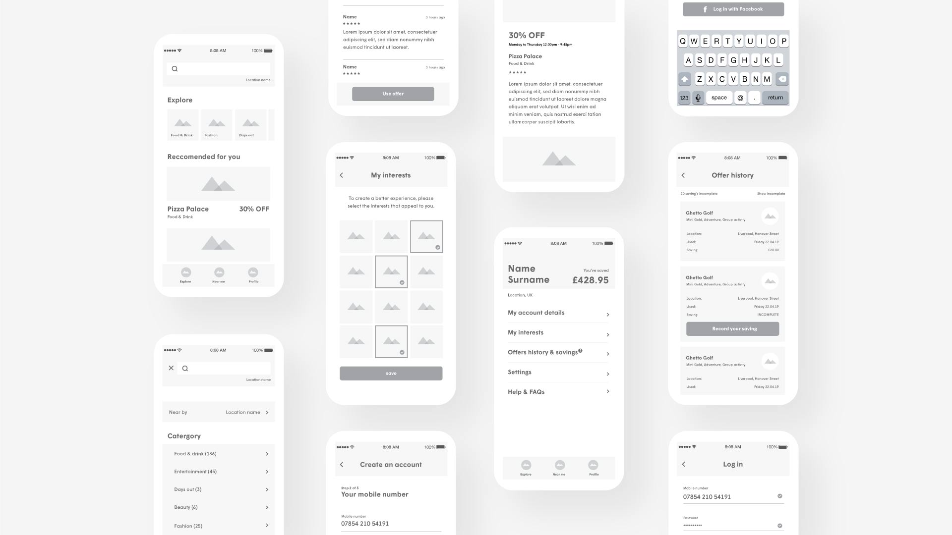
Once we articulated the essence of the brand identity and the aspirations of the company were outlined, we began work on the native iOS and Android app.
This started by identifying the core features and objectives. Users must be able to find, search for and use offers quickly and intuitively. With these objectives in mind, we created a working prototype (a UX-based wireframe) to understand how each user would navigate the app, and rigorously test the variety of features we had created.
APP – DESIGN
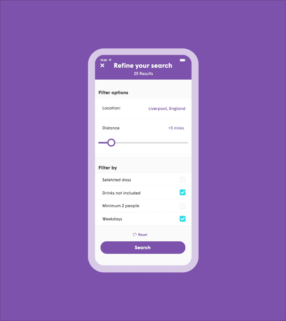
Once finalised we moved on the visual design (the User Interface), integrating the brand within the app using typography, photography, colour, pattern and motion flourishes.
With a clear focus on customer experience, animation and motion transitions were added at the development stage, improving the overall usability of the app as well as enhancing the brand – creating a truly engaging customer experience.
Contact us
Get in touch
 NEXT PROJECT