MindSpace
MindSpace is an organisation that helps young people and families in the South Yorkshire area with mental health issues through dedicated carers. It is a free service, funded by the Wellspring Trust and the NHS.
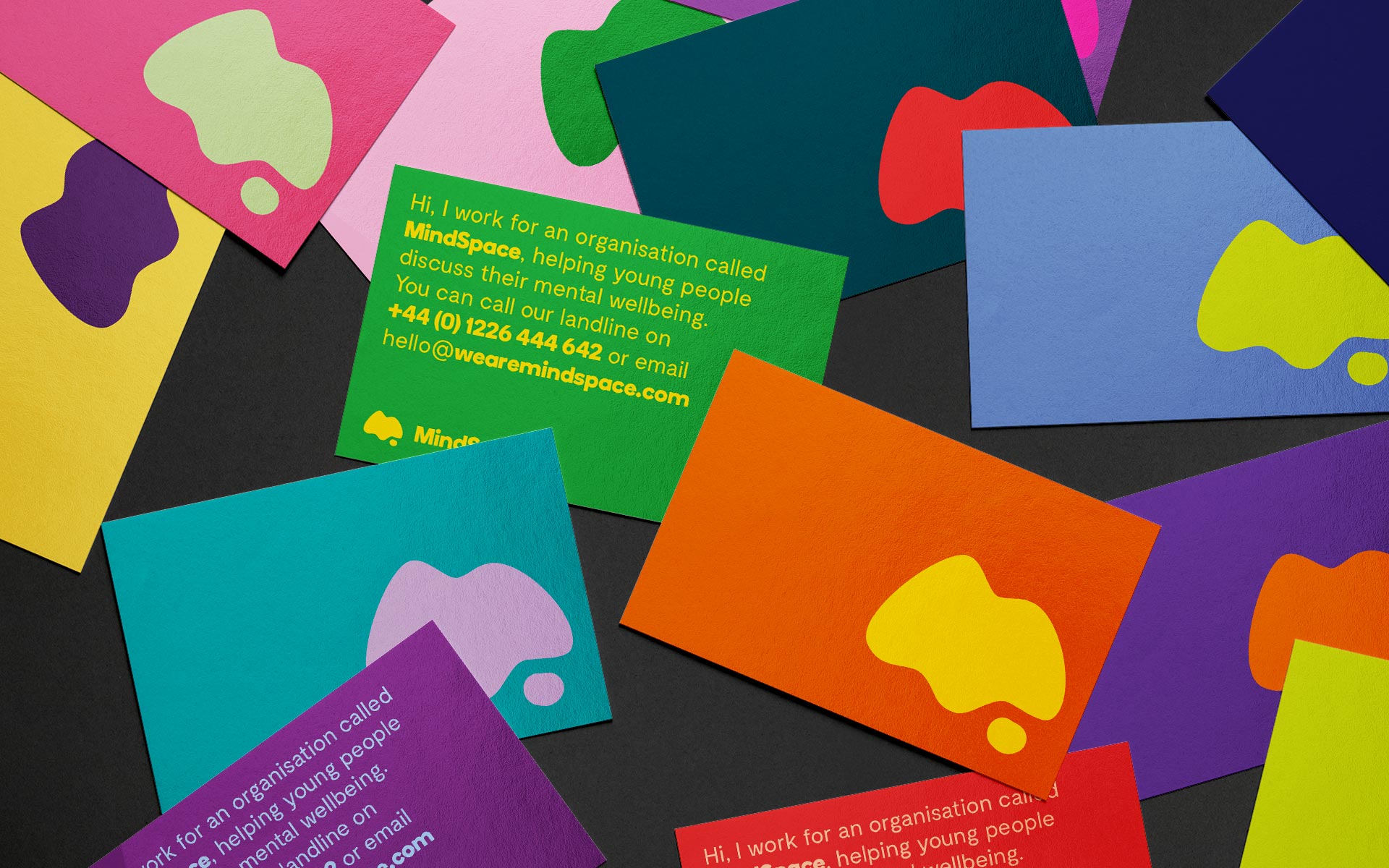
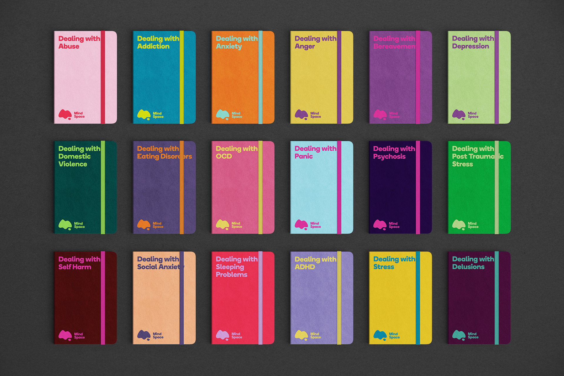
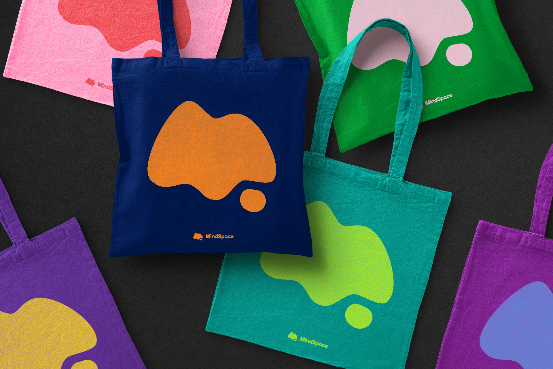
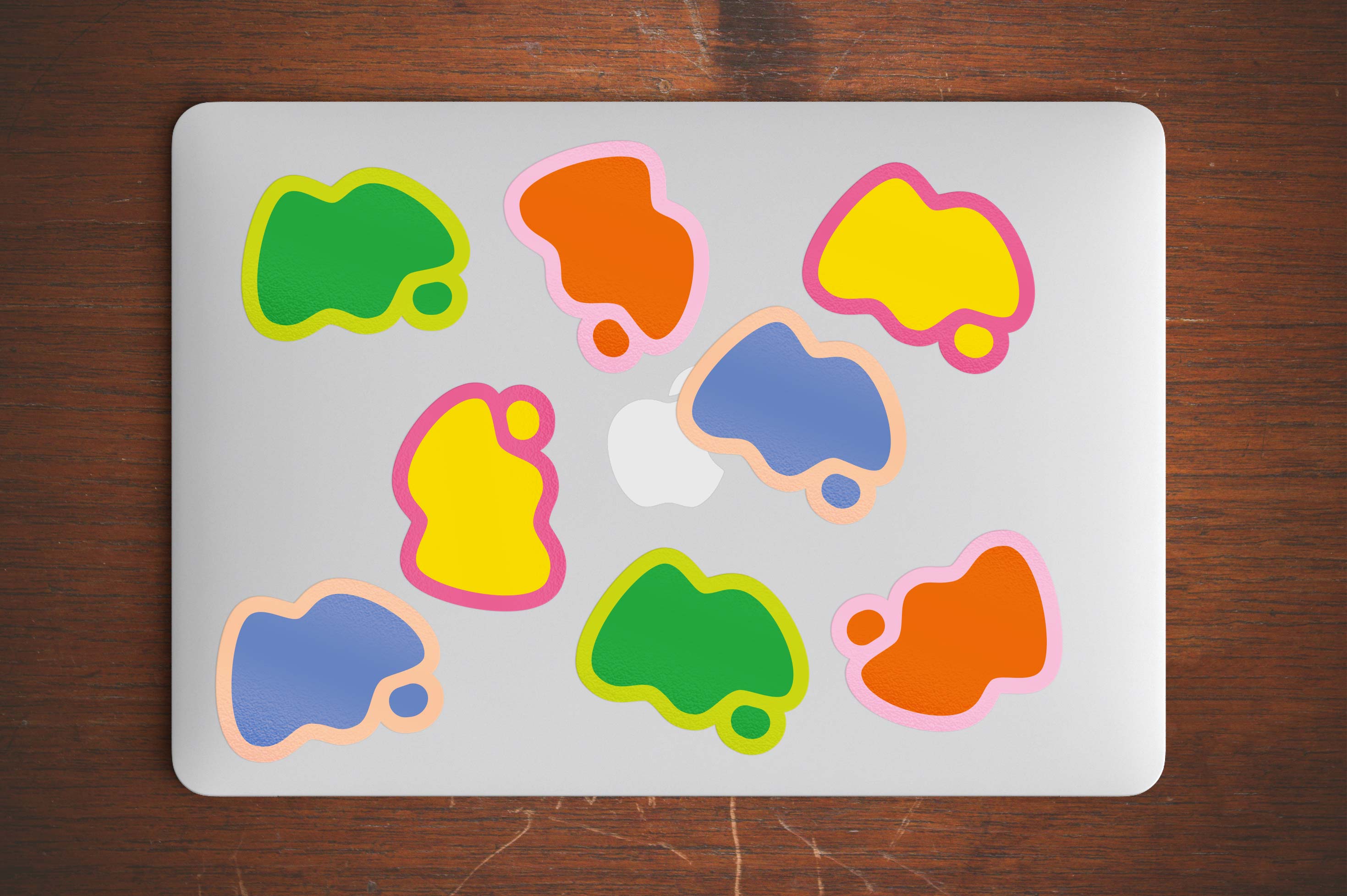
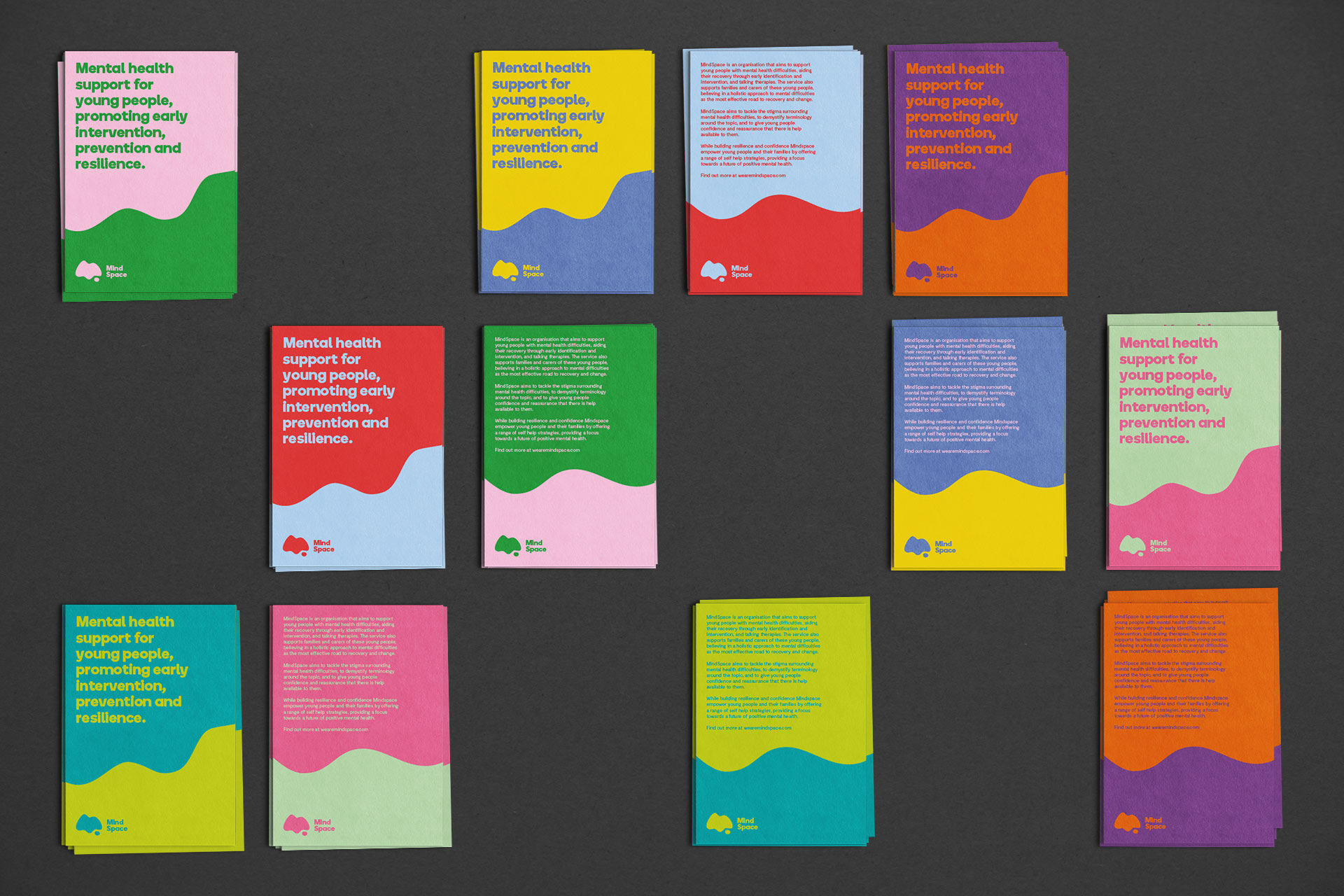
We created a vibrant brand identity that speaks to young people in many different tones. The logo is a focal point of the brand, combining an ‘M’ with a thought bubble, enforced by repetition and given life in campaign work when ‘thoughts’ are applied.
Colour Theory
Colour is incredibly emotive. It quickly became apparent that there was not one single colour palette that could summise all of the thoughts and feelings of a generation of young people.
A palette of 28 colours split between pastels, brights and darks underpin the identity. When combined there are nearly 400 combinations, spanning a massive spectrum of moods.

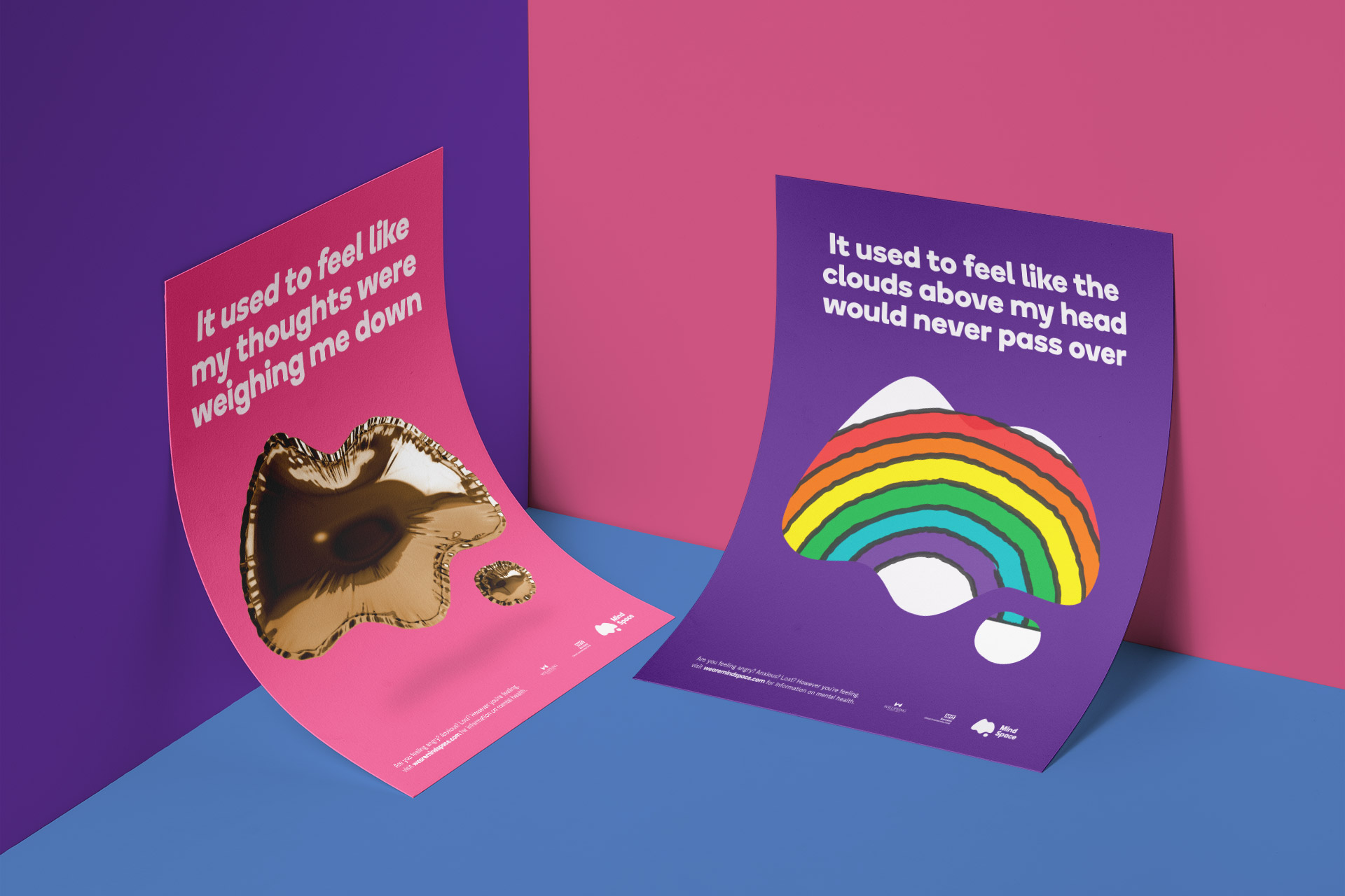
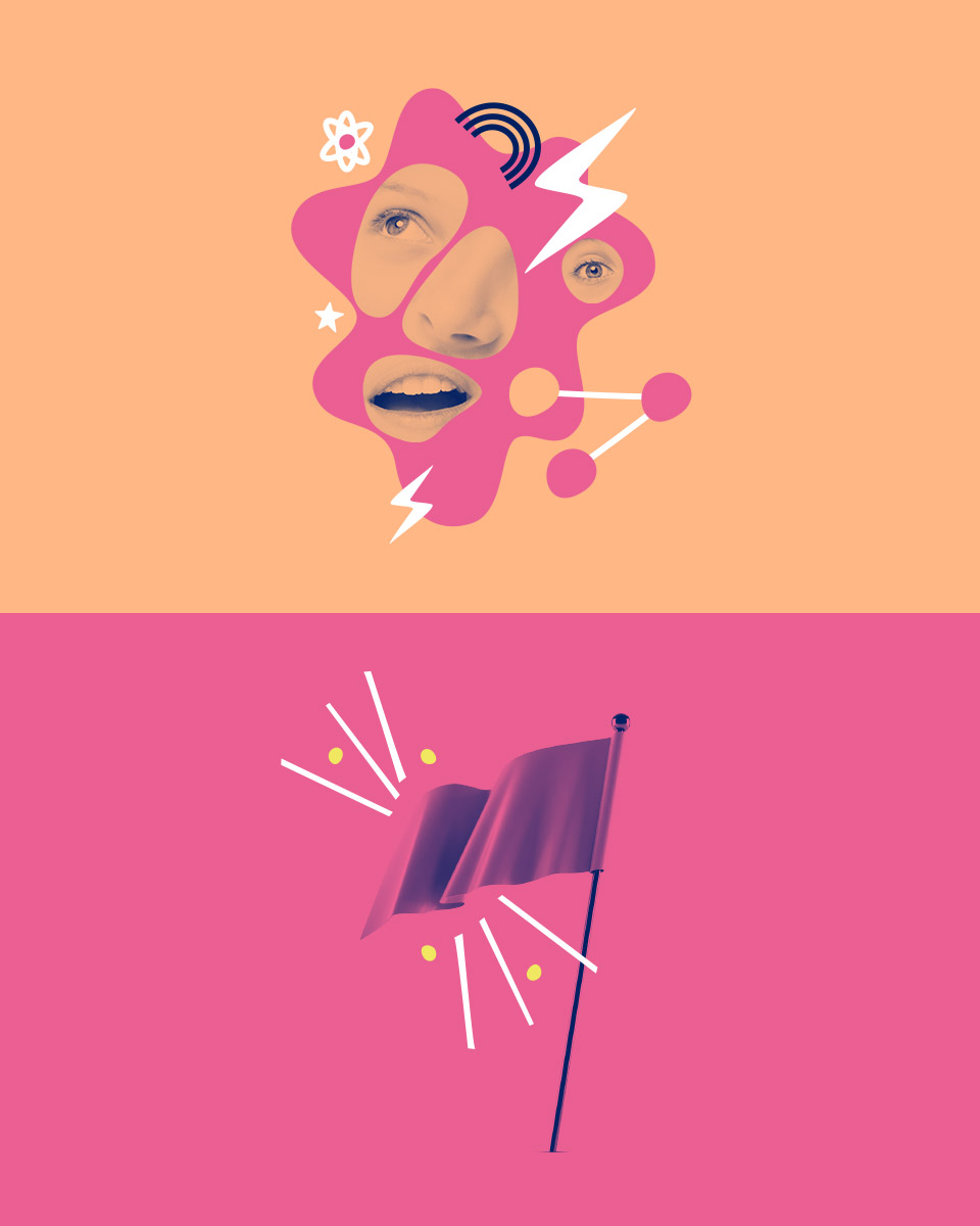
Campaign
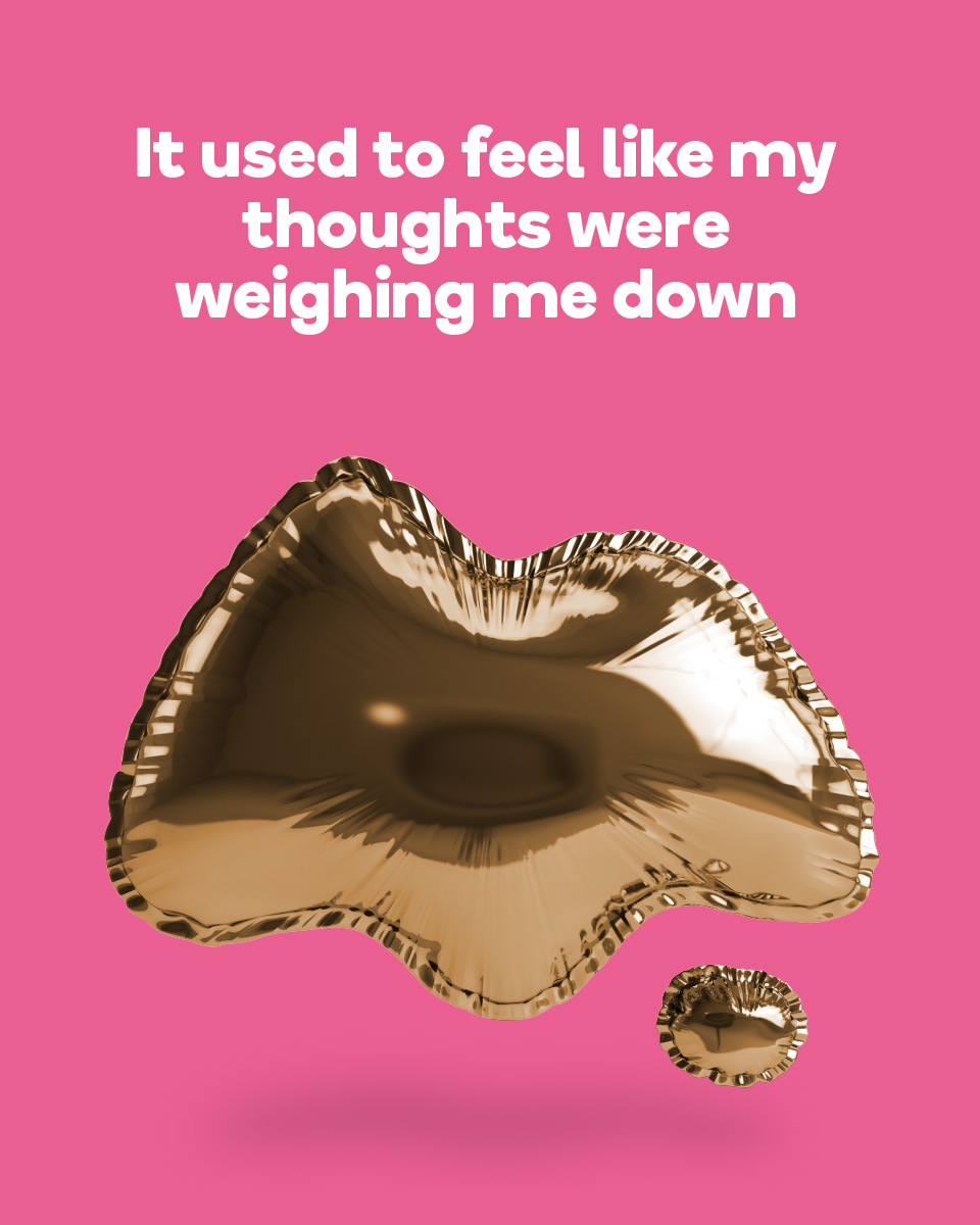
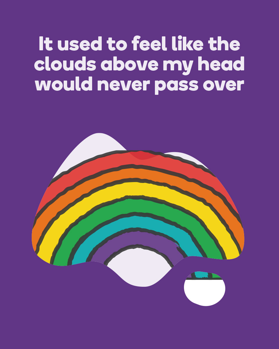
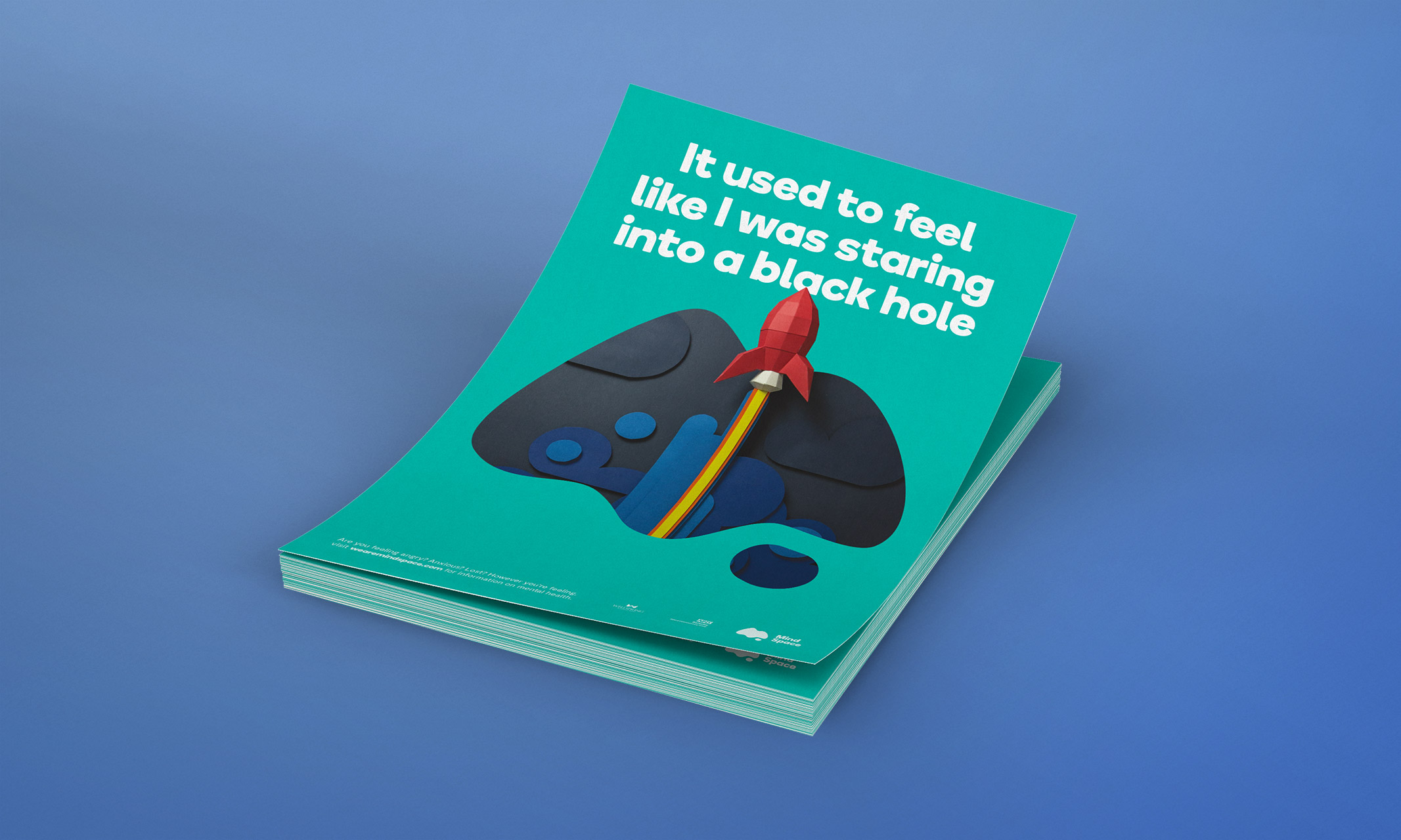
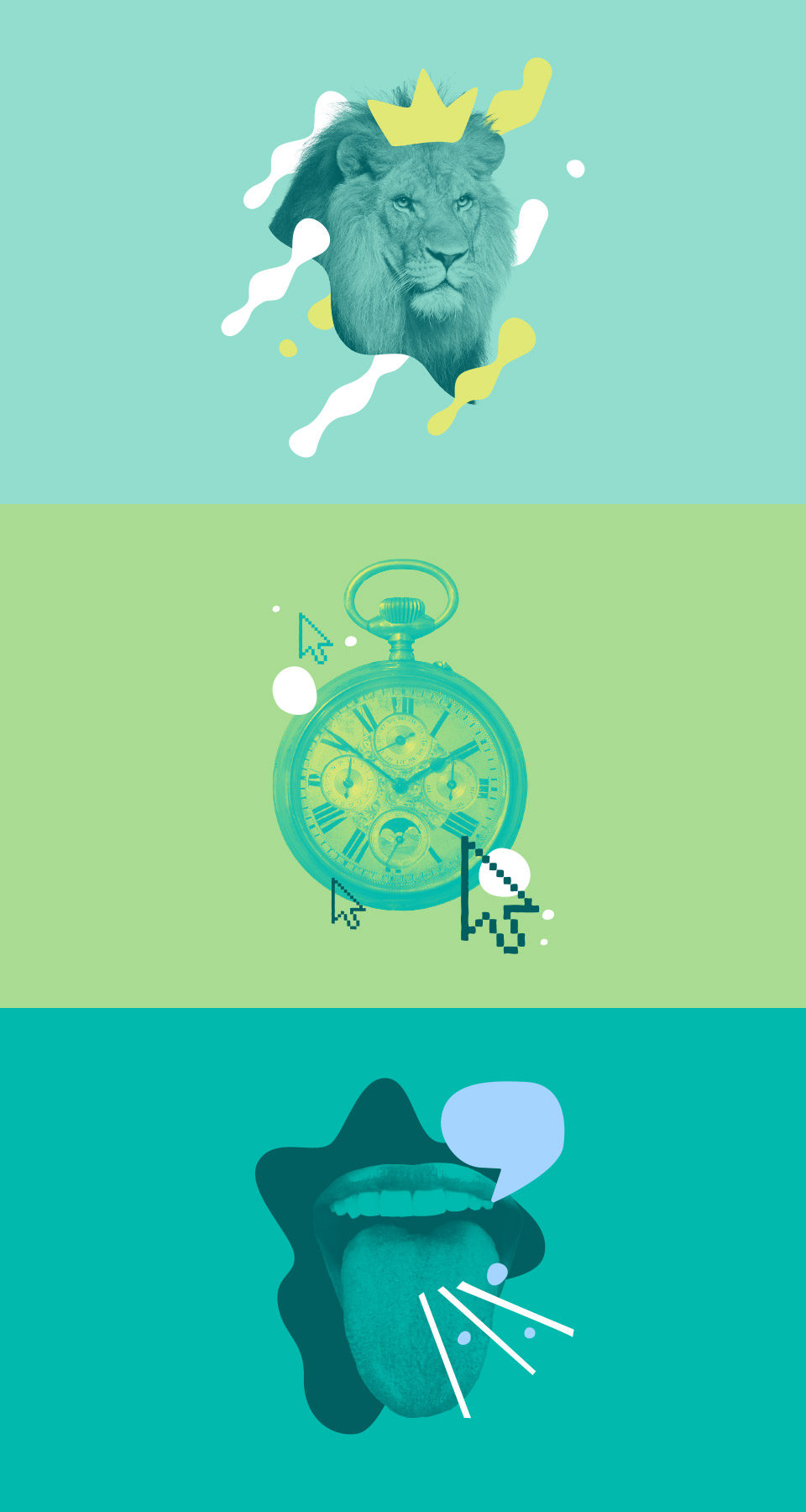
MindSpace campaigns aim to improve brand awareness and reduce stigma surrounding mental health issues.
This is where our logo comes to life by transforming into different positive ‘thoughts’ — becoming imbued with simple metaphors that contrast relatable messaging.
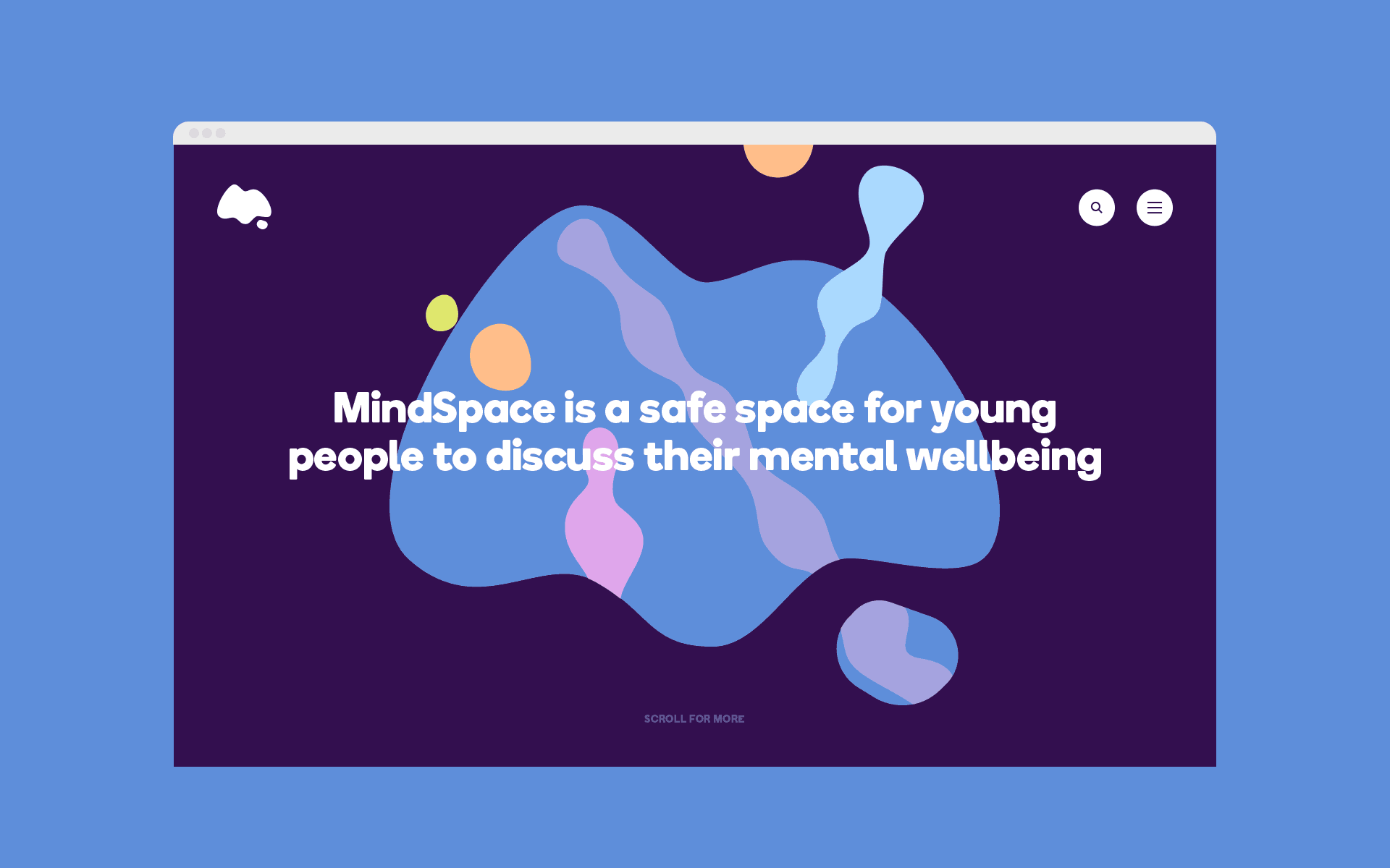
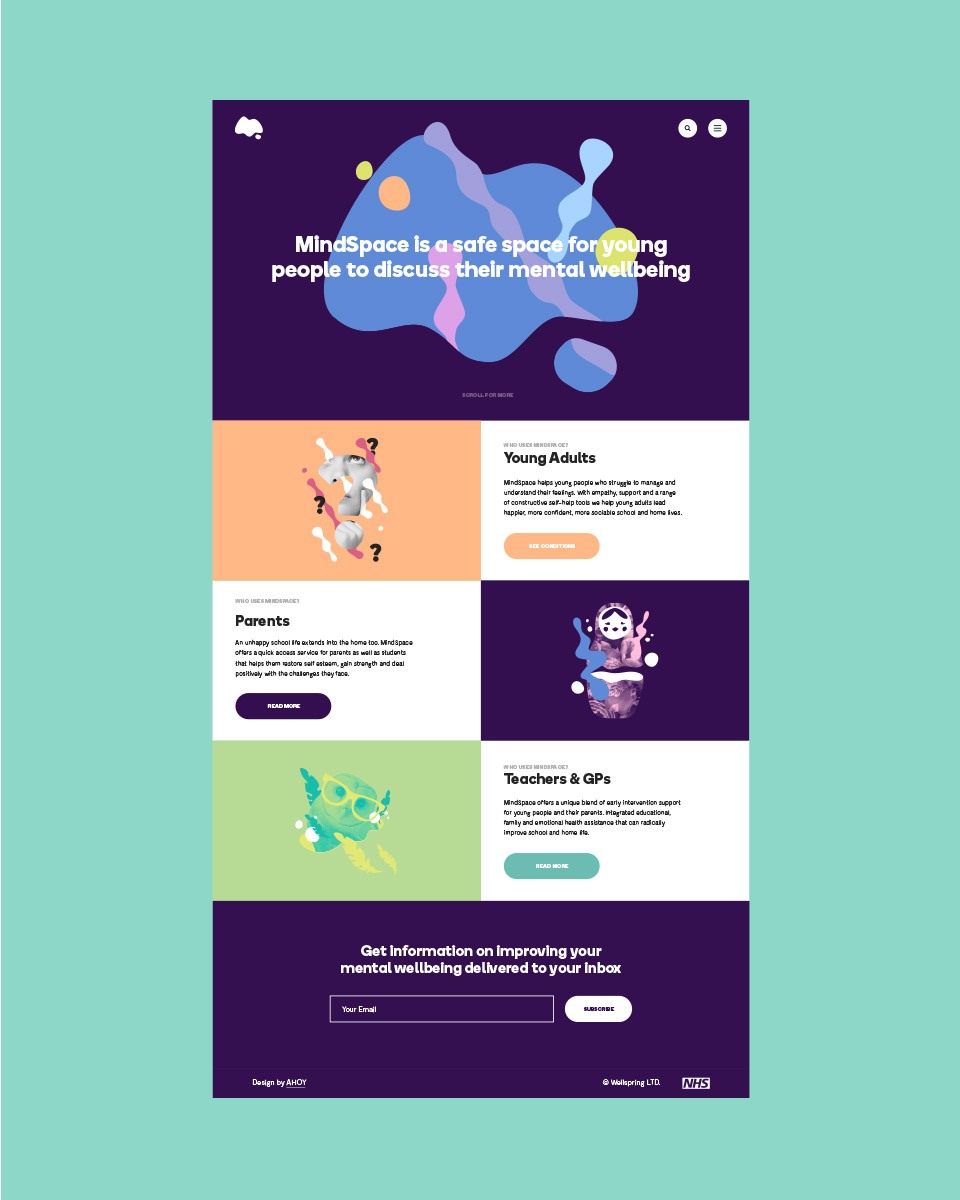
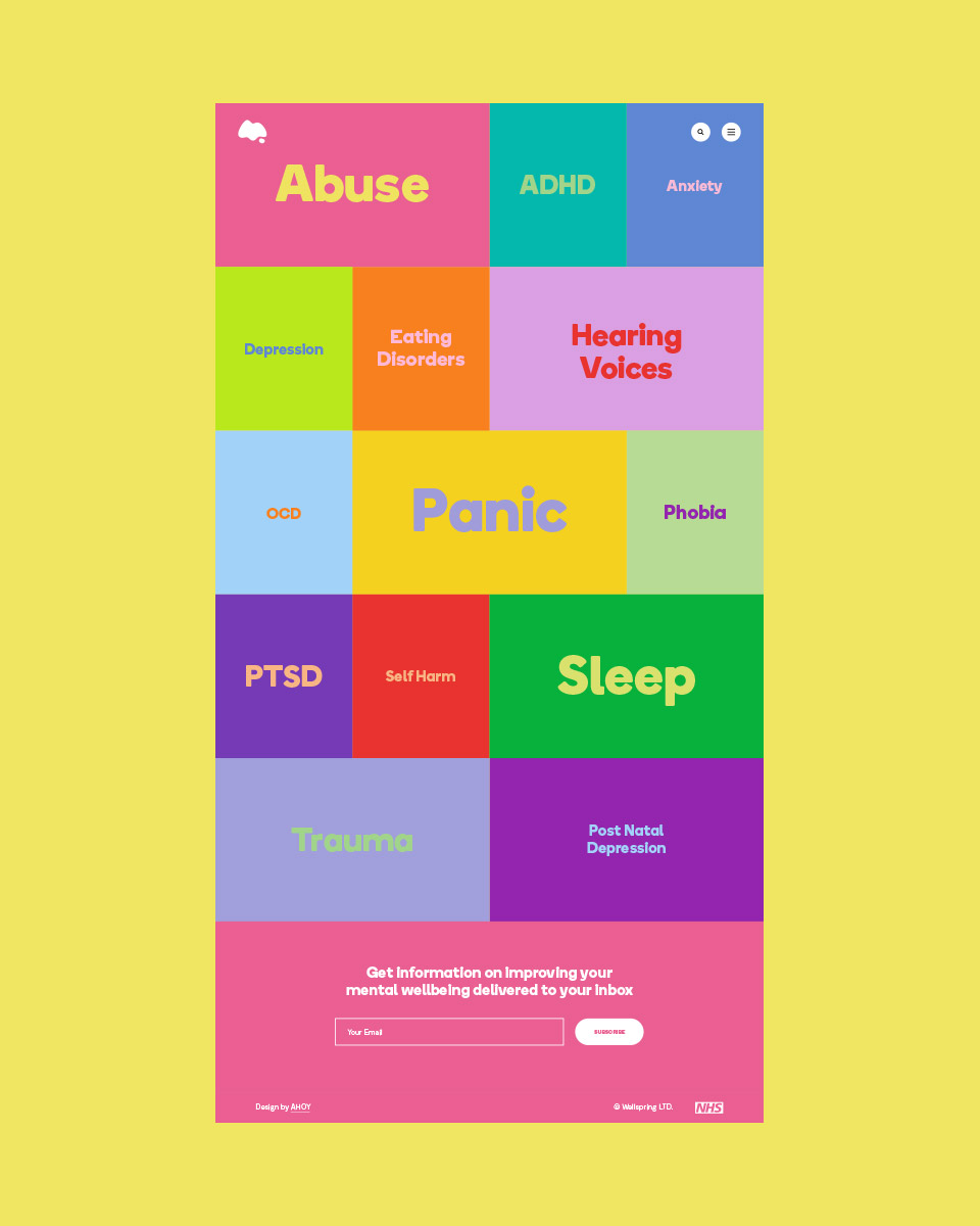
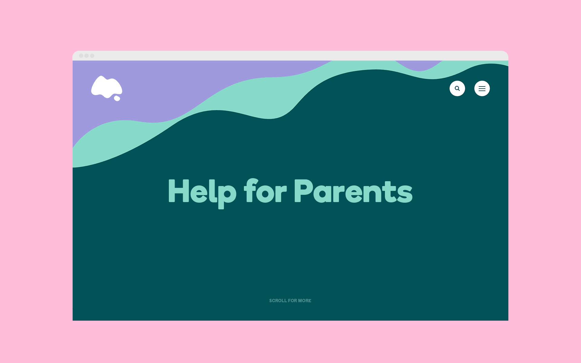
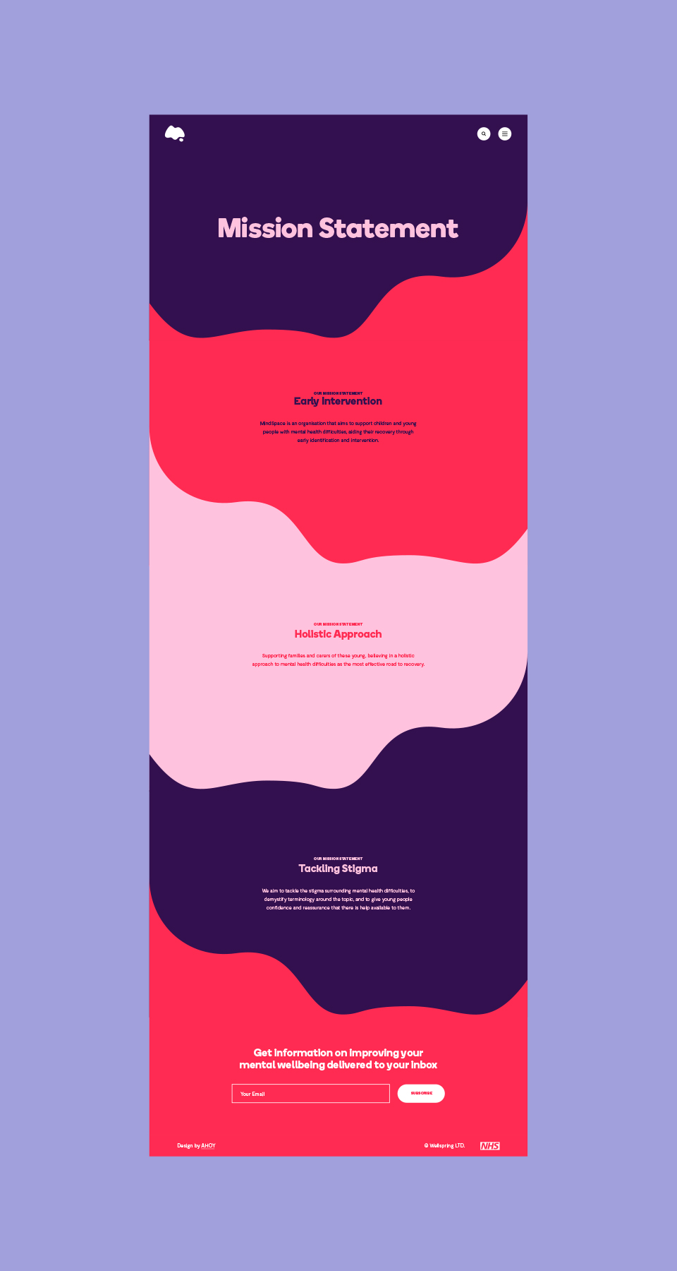
WEBSITE
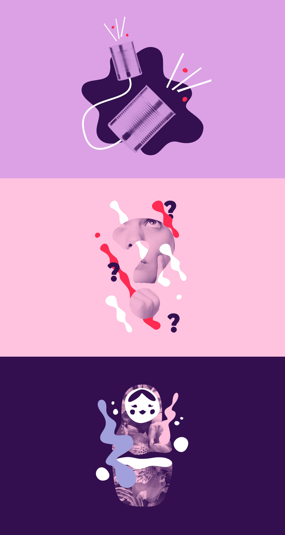
The MindSpace website is a hub of resource for young adults and their parents. The website continues the theme of bold colour usage and advances established brand assets through motion effects and a series of illustrations.
Our goal with the website was to provide informative content in an approachable and friendly wrapper. A simple content plan leads users to sign up forms in order to receive more personalised help through consultation meetings.


Contact us
Get in touch
 NEXT PROJECT