We Like It Wednesday #5
Hi Spring, how’s it going? Long time no see. Bet you were as eager to see Winter jog on as we were. God, blog introductions are hard… Now we’re talking directly to entire seasons… Christ.
You know the drill by now, this is the fifth instalment of #WLIW after all. Be that person, get your shorts, sunglasses and sun cream on, march on outside, ideally within range of wifi, let’s not be crazy now, and drink in that sweet #WLIW goodness. Or something.
WE LIke Learning – 5 questions for 100 designers

Well, we had our first degree show invite of the year last week (cheers, Salford Uni!) and it put us into a bit of an educational mood. Thankfully, before we all became career counsellors, recalling our own best bits of advice, we found “5 Questions for 100 Designers” by Yevgeny Yermakov – a project consisting of short interviews to help young designers get into the industry. Saved us a job there…
There’s even a handy ebook PDF with every last interview in one document. It’s so much better to sit back with a brew and read it on an iPad or Kindle rather than a laptop screen – treat yourself!
WE LIKE PASSION – WITH LOVE PROJECT

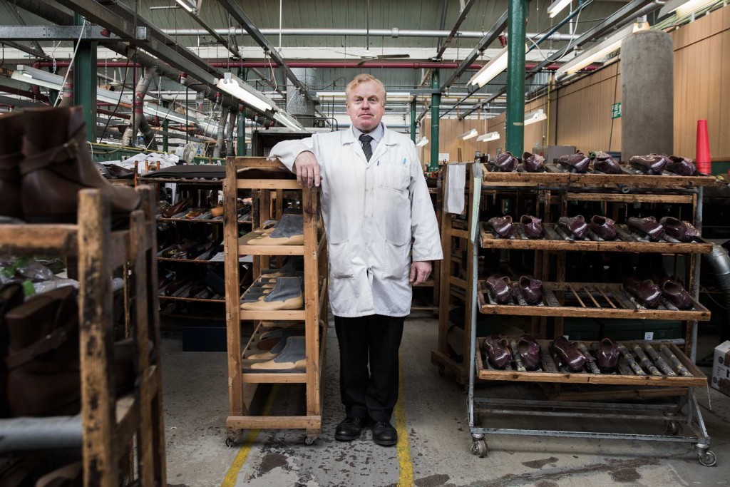
Friends of the studio Rob Evans and Chris Roberts began the With Love Project a couple of years ago, with the mission of meeting UK makers, producers and manufacturers to ask them just one simple question – “why do you do what you do?”.
They’ve since travelled up and down the country to create a beautifully shot film to support their Kickstarter campaign and fund an even nicer book to go with it. The project hit its funding goal fairly recently, but Chris and Rob are committed to putting “any extra money over and above the total…straight back into the book to push the printing techniques”.
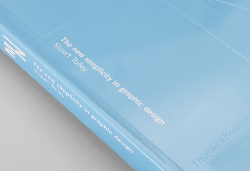
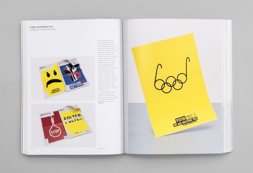
WE LIKE MINIMALISM – MIN: THE NEW SIMPLICITY IN GRAPHIC DESIGN


We’ve all received some variation upon this bit of feedback, some of you reading this might have even given it…
“It’s too simple. I could have done that in Word.”
*Sigh*
…It sends shivers down the spines of designers everywhere. Well, it turns out it’s not as easy as it looks, and Stuart Tolley, of Brighton-based studio, Transmission, is one of the men best qualified to tell us why. “I think the main hang-up with minimalism is, when successful, it looks effortless. People assume that because it looks effortless, it was created with little effort. There’s a massive difference”. Hear hear!
– Rick