BRIEF
We first worked with The French back in 2013, creating a visual brand and website to reflect the vision of then head chef Simon Rogan. The brand identity centred on earthy tones and stylised typography, reminiscent of the original moulding around the restaurant’s doors.
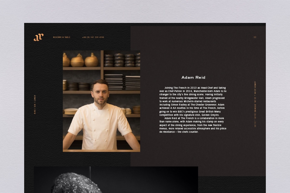
When Adam Reid was appointed head chef and chef patron in 2016, he wanted a new brand – something darker, a look that pointed to Manchester’s history as the industrial metropolis of the north.
THEORY
Inspiration for our new brand came from the interior fit-out at The French.
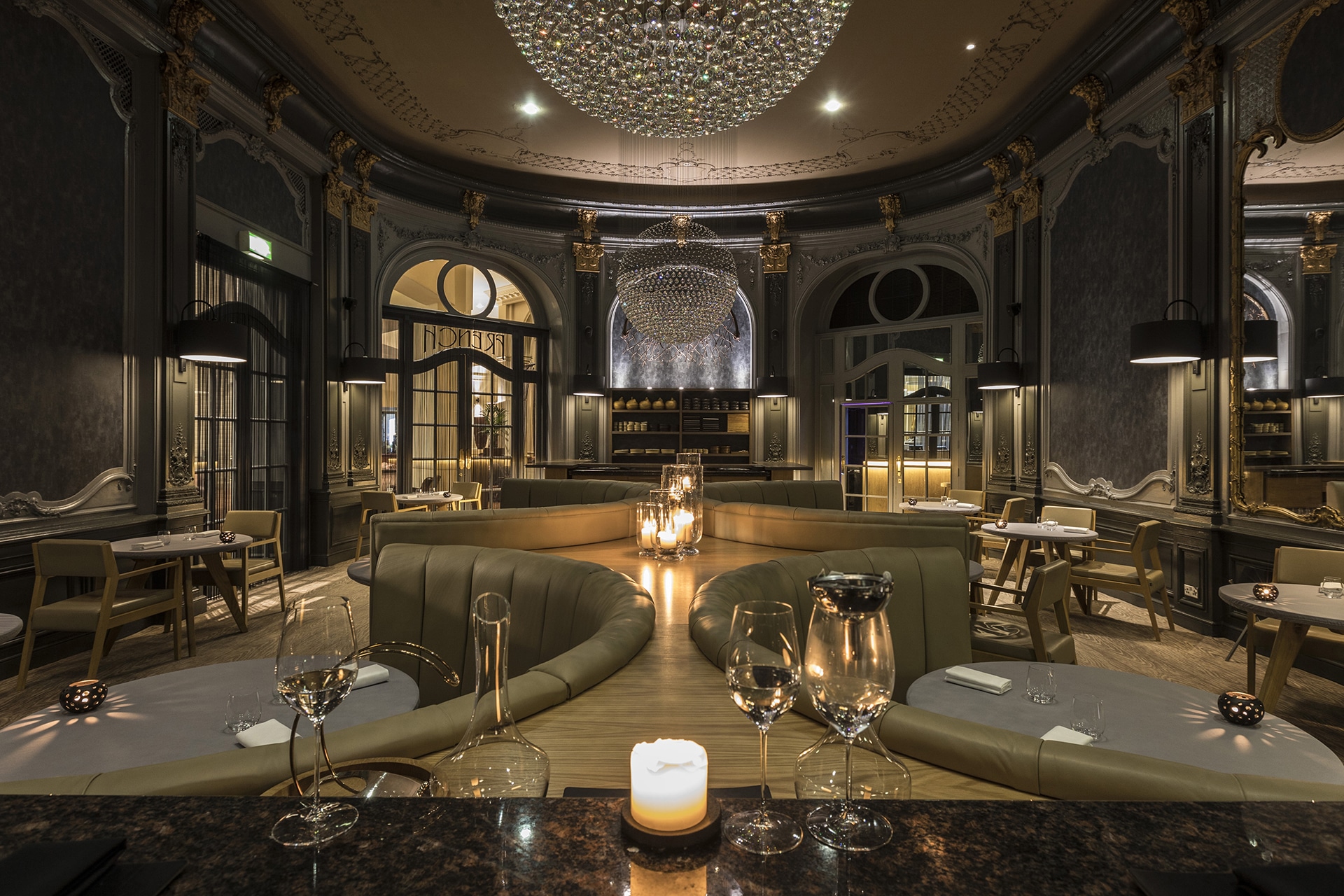
The Grade II listed dining room was refurnished with bespoke lighting, art, upholstery and paintwork, creating an intimate and inviting space. Muted greys, greens and taupes are lifted by flashes of light: polished marble counters, crystal chandeliers, and the restaurant’s trademark leaded glass door silhouetted against the light from the lobby.
Our aim was to communicate the understated luxury of this dark, sumptuous look across both the new website and the full suite of print collateral.
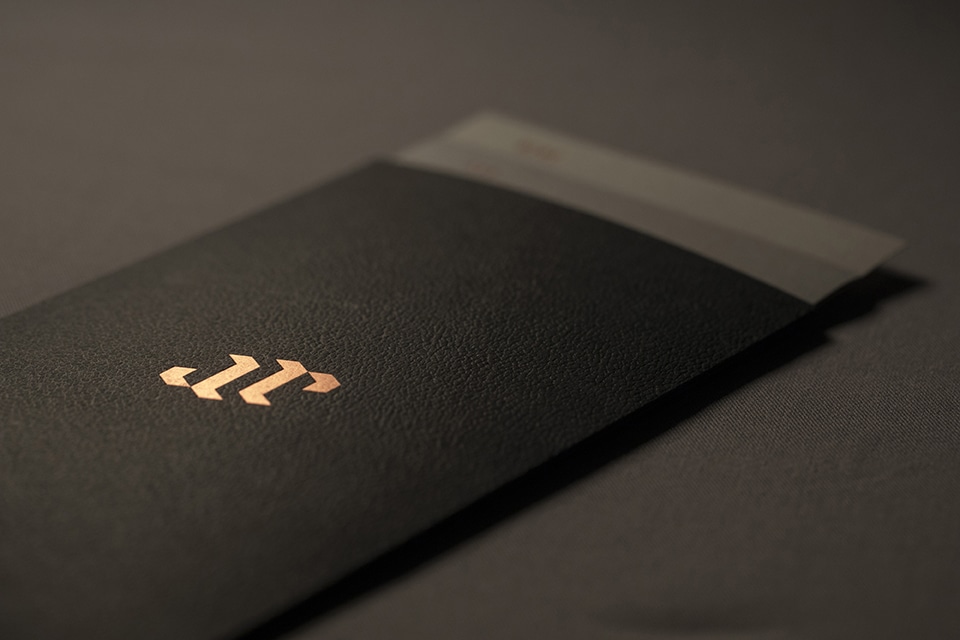
Copper foil on a textured, matt black background captures the mood perfectly and gives another nod to Manchester’s industrial roots. A cunning ambigram – the initials AR – brings a touch of intrigue to the visual brand, and reminds diners that Manchester native Adam Reid is now at the helm of this prestigious and luxurious establishment.
PROCESS
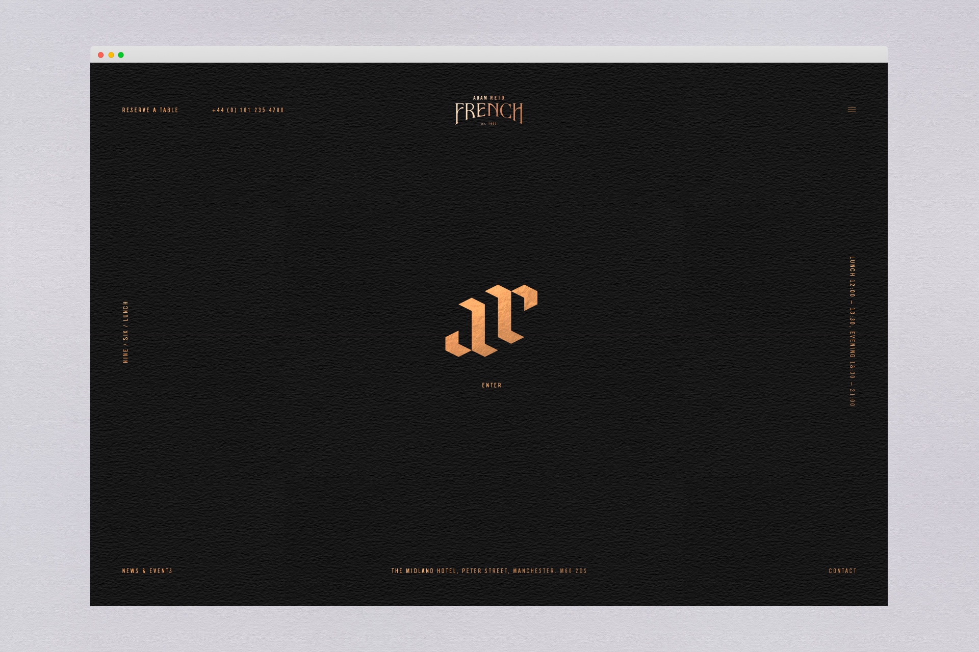
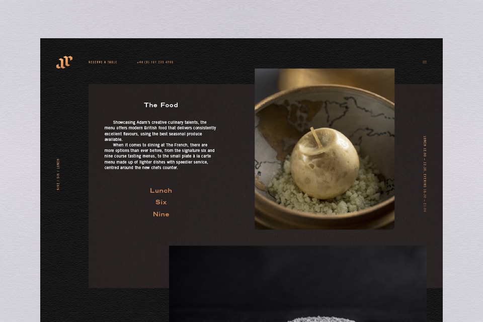
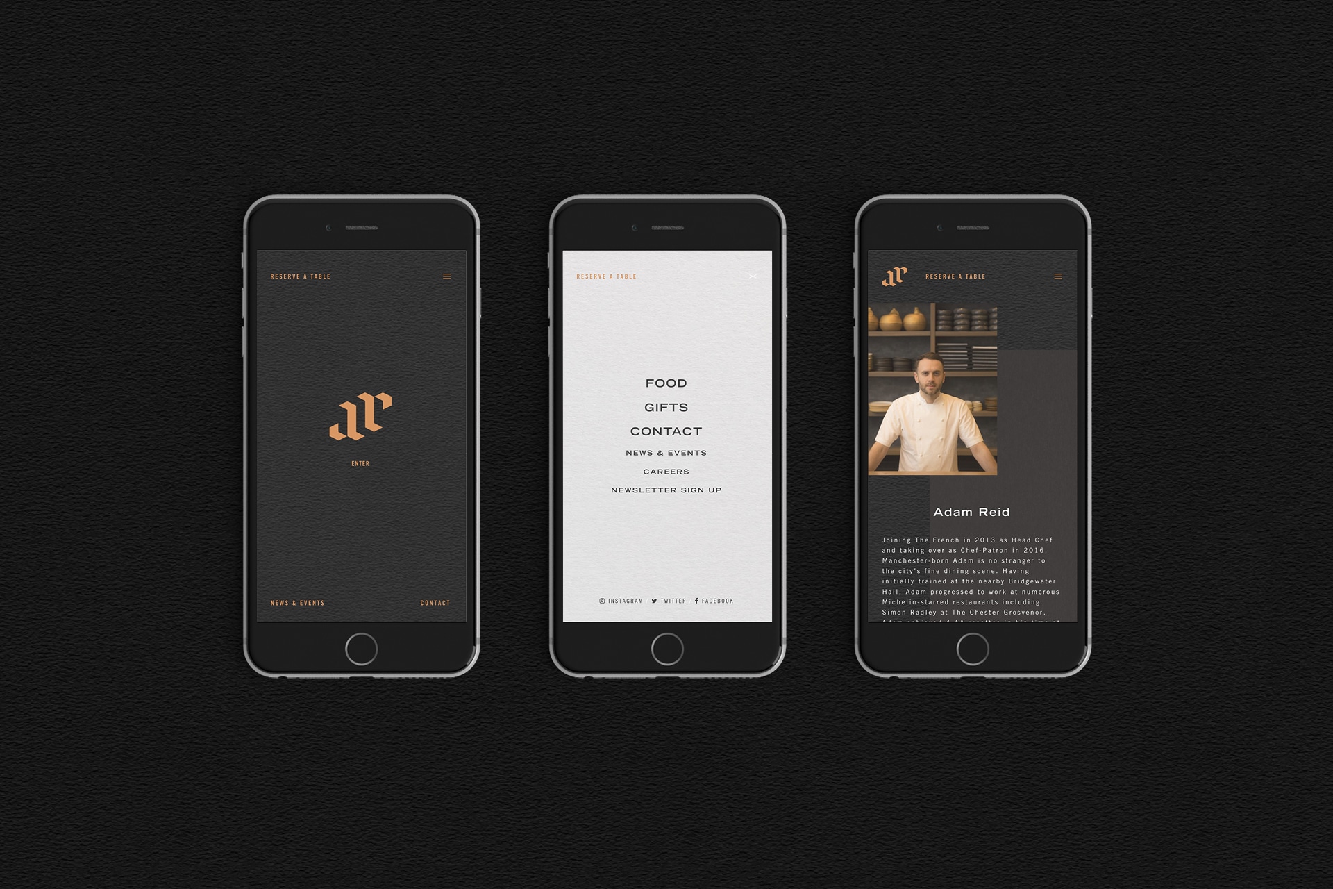
The new responsive website for The French was an exercise in duality, combining the understated style of the refreshed brand identity with a sleek, functional website via which customers can browse the updated menus, and make online reservations.
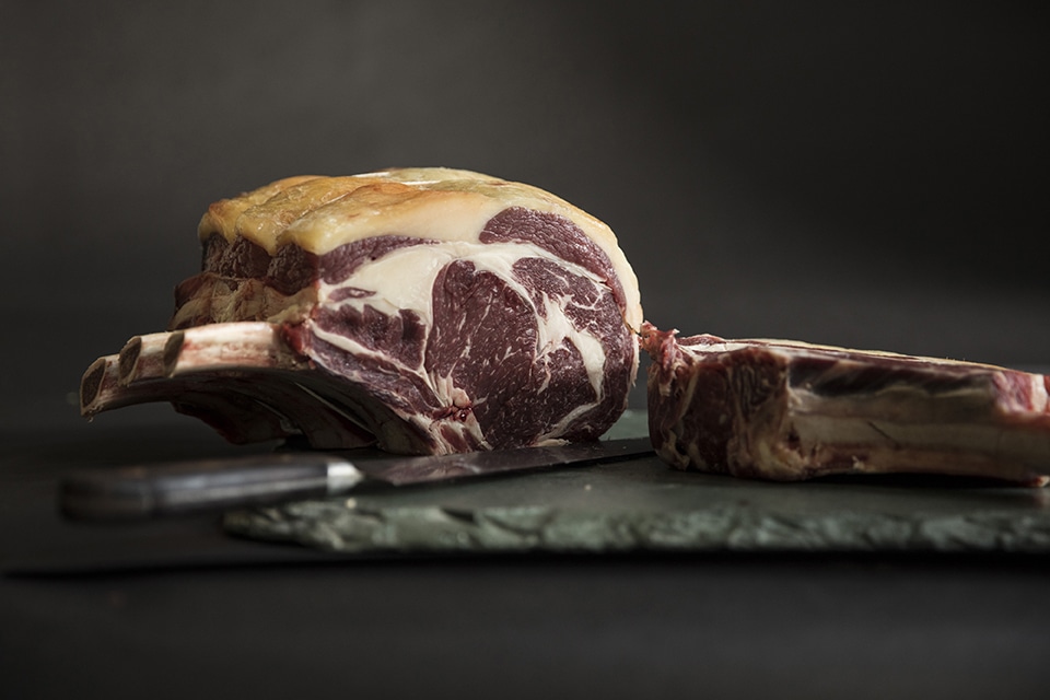
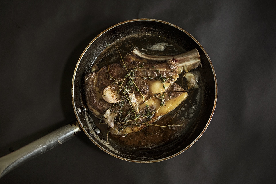
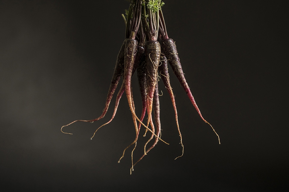
The site features high quality photography and videography, created during a shoot with Manchester art photographer Simon Pantling. We art directed the shoot with the specific intention of creating videos whose stills would double as eye-catching images. This results in a pleasing touch of trickery on the website – when the cursor hovers over the images, they come to life in colour and movement, only to freeze and desaturate again when the cursor moves away.
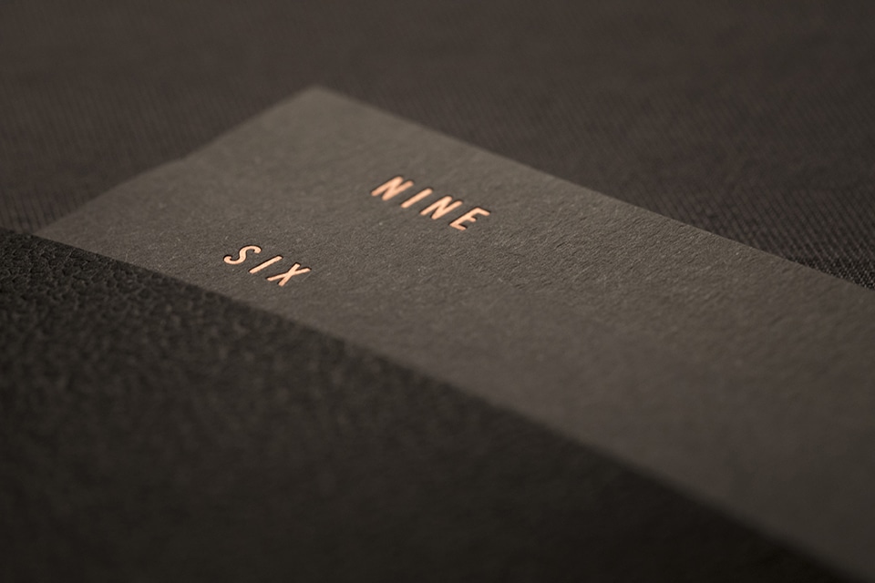
We created a full suite of print for The French, including business cards, stationery and menus. The menus are housed in a copper rivet-bound cover complete with copper foil ambigram. Printed on Colorplan paper in Ebony, Smoke and Pale Grey, all with Morocco embossing, they bring a final touch to The French’s subtle luxury.
Contact us
Get in touch
 NEXT PROJECT