Brief
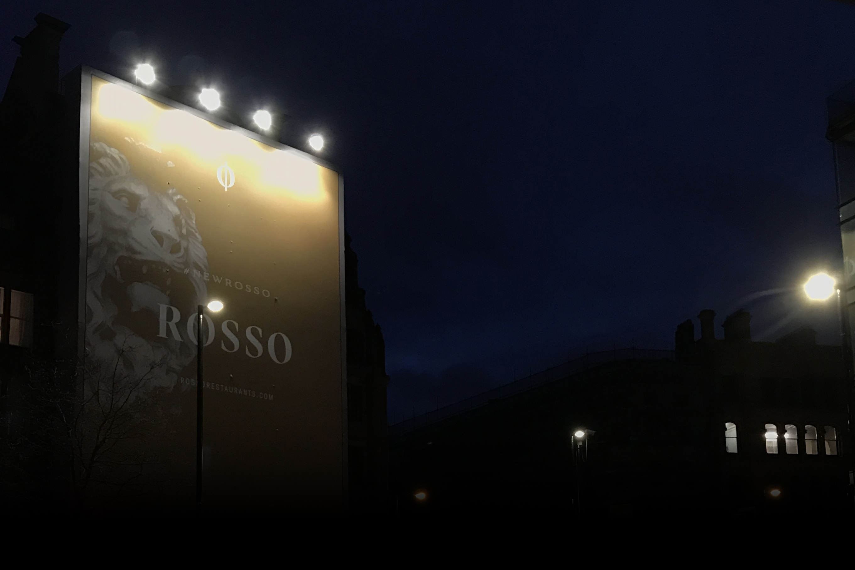
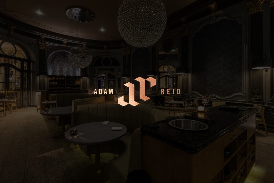
When luxury Italian restaurant, Rosso, underwent a sleek interior fit-out, Ahoy was commissioned to bring their brand in line, injecting a sense of luxury and elegance to the existing visual identity.
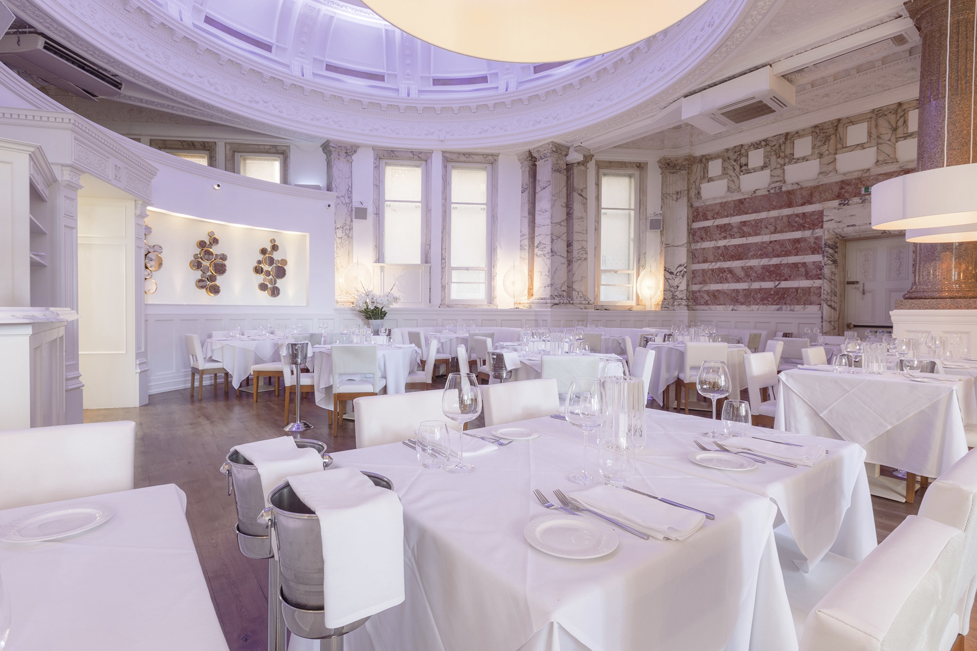
Part-owned by Rio Ferdinand, Rosso occupies a Victorian Grade II listed building in an enviable location near Manchester’s luxury King Street, close to the city’s theatres, galleries and boutiques.
Our goal was to evolve the restaurant’s existing brand, and to roll out the new visual identity across all print and digital touchpoints, offering Rosso’s clientèle a sleek brand to match the sophisticated drinks and dining experience.
THEORY
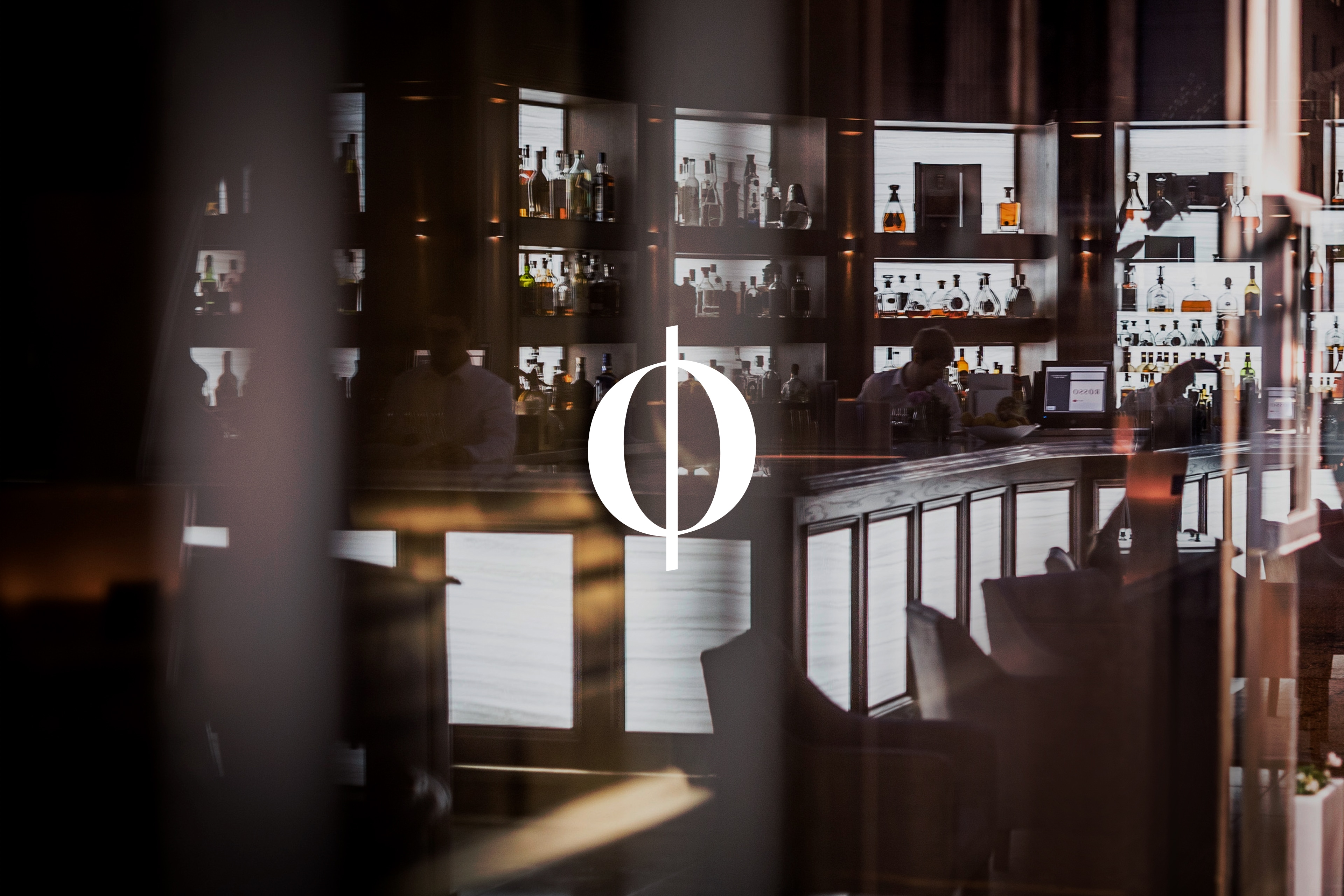
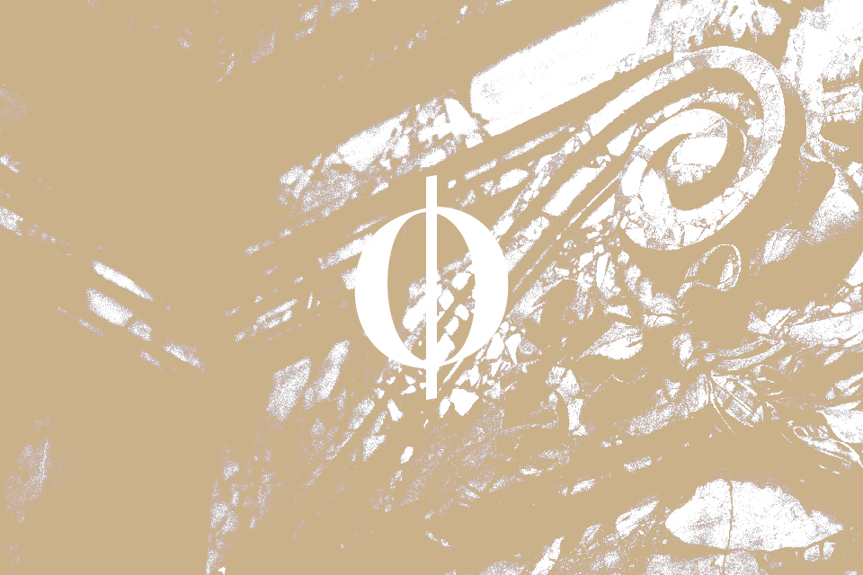
The aim was to construct an elegant and luxurious brand around the restaurant’s iconic ‘O’ logo, situating the logo itself within the word ‘Rosso’, and replicating its curves throughout the brand’s visual identity.
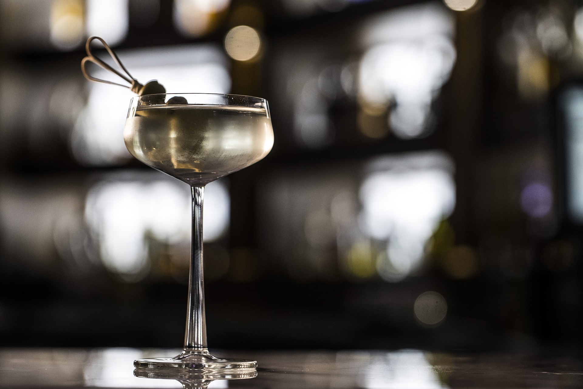
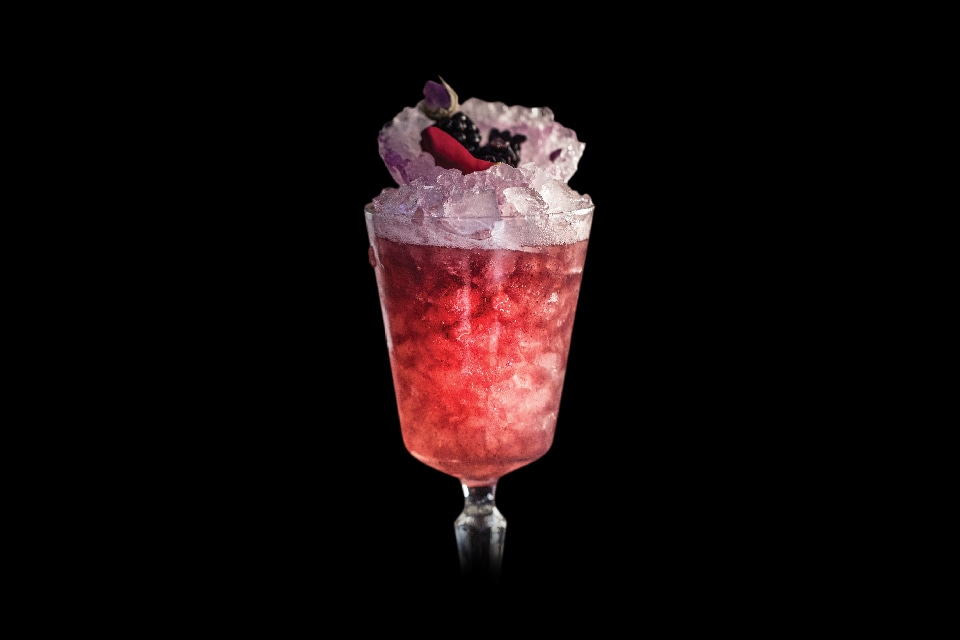
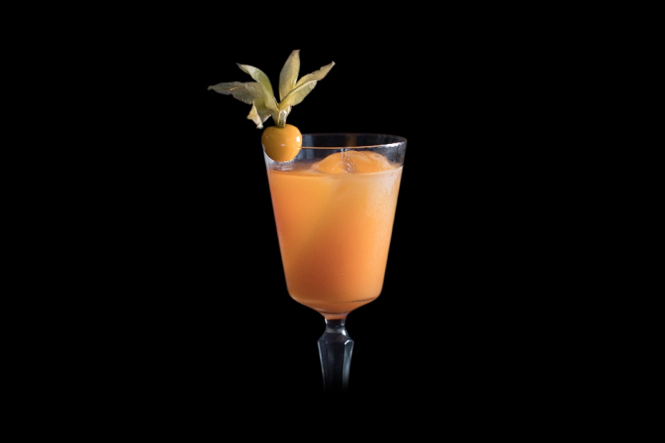
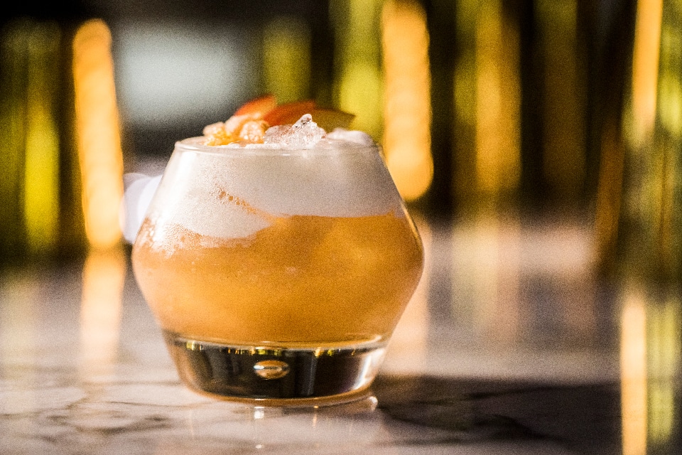
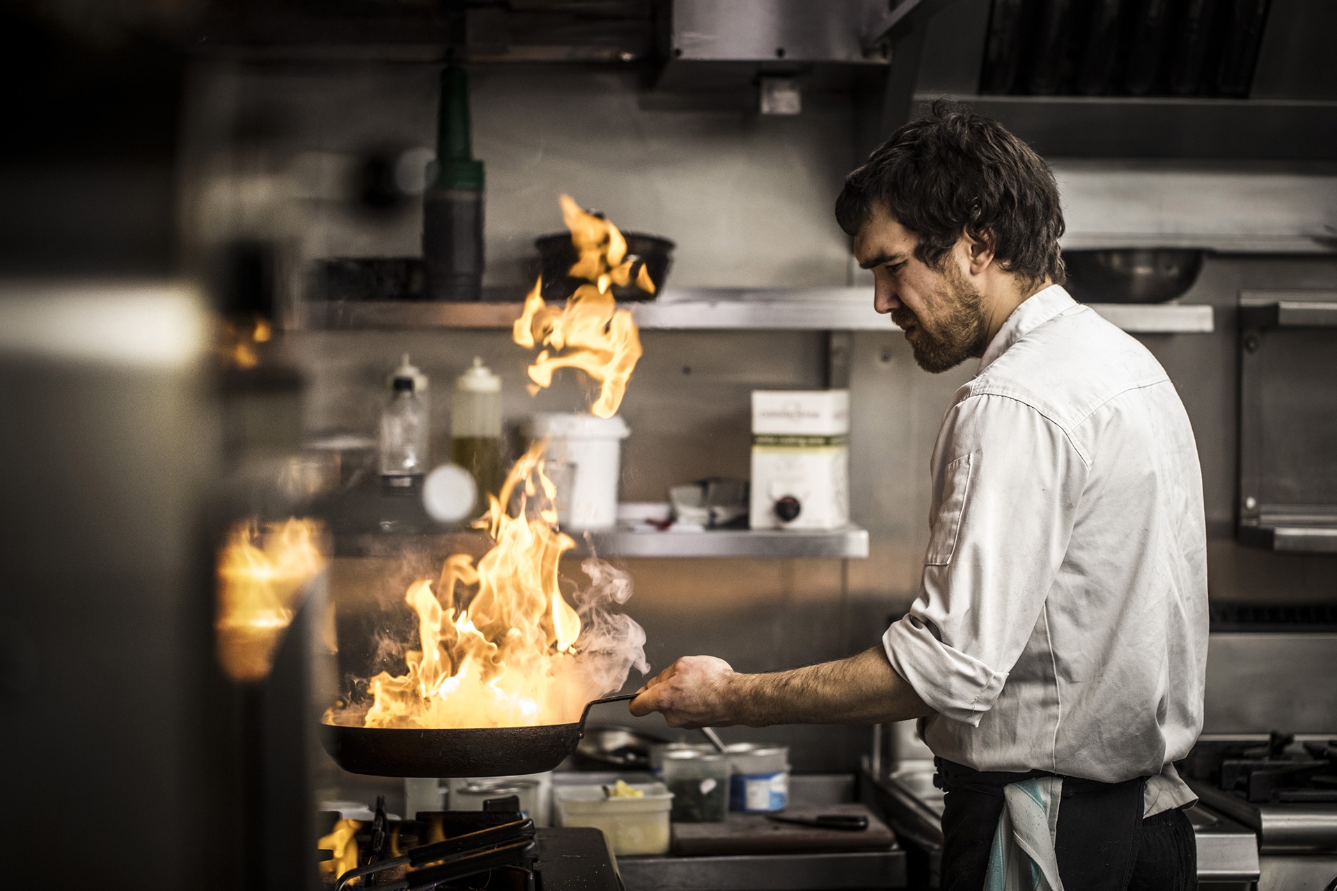
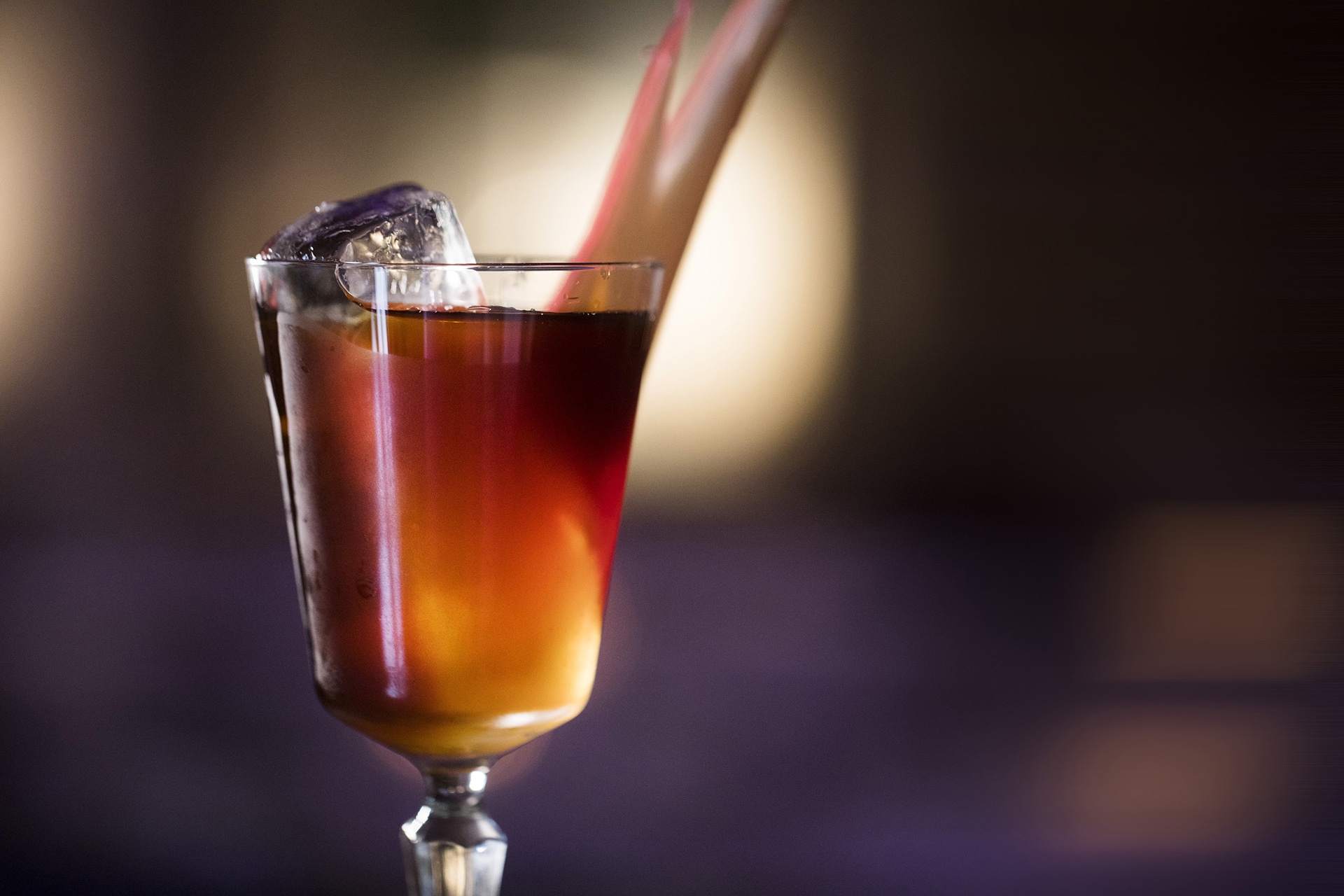
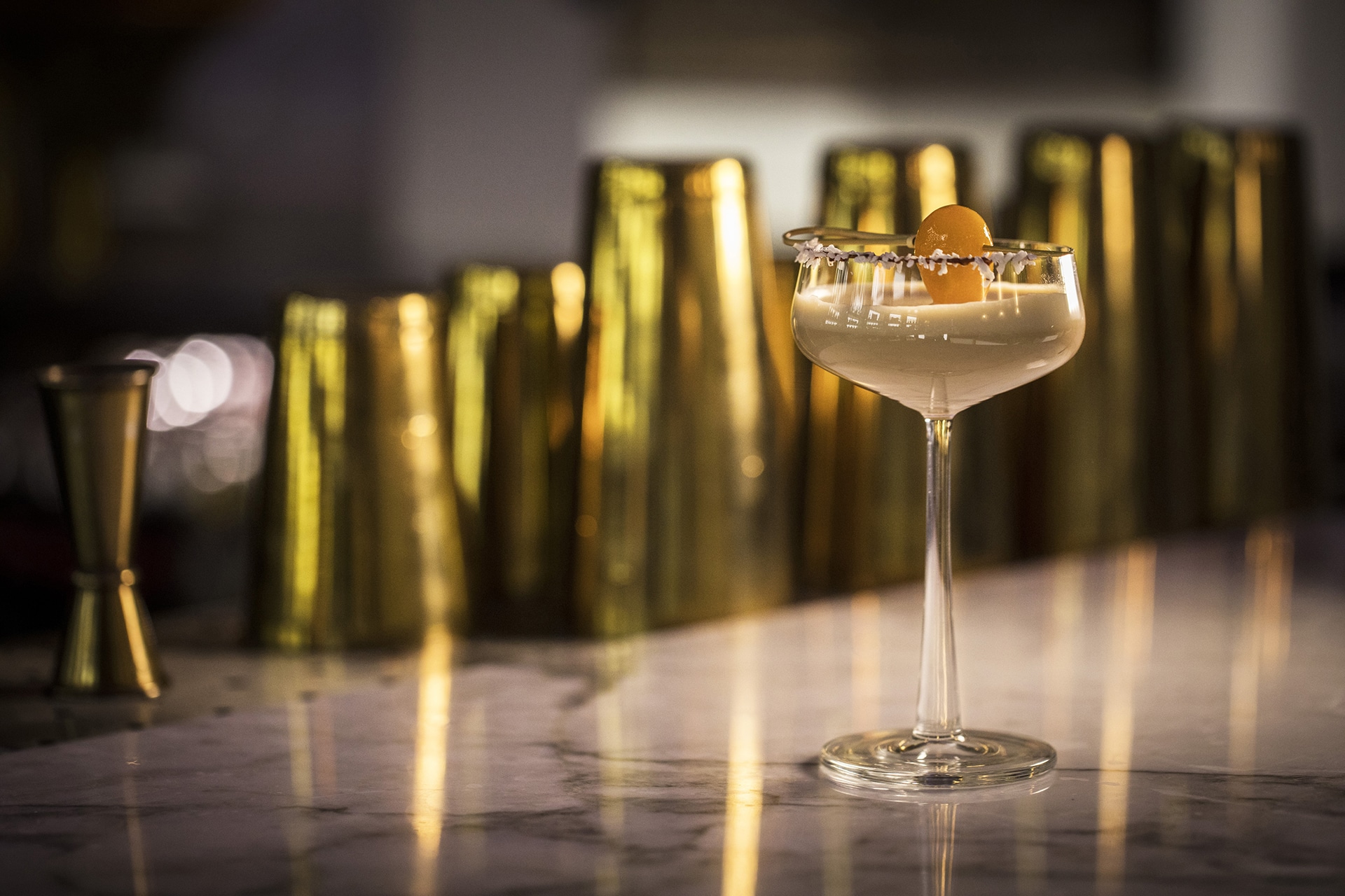
Understated but nonetheless opulent glamour was what we were aiming for, capturing the style of Rosso and its typical clientèle: distinctive, effortless and sumptuous. We extended the brand’s relatively minimal palette of muted fawn and ivory white to include a stylish slate blue, mixing this trio of classic colours with stylish monochrome imagery, often featuring Renaissance Italian architecture as a backdrop.
Increasing the visibility of the Italian influence in the branding was another of our core aims. In addition to the architectural photography, we introduced a Didone typeface to the brand, combining traditional European style and contemporary minimalism.
PROCESS
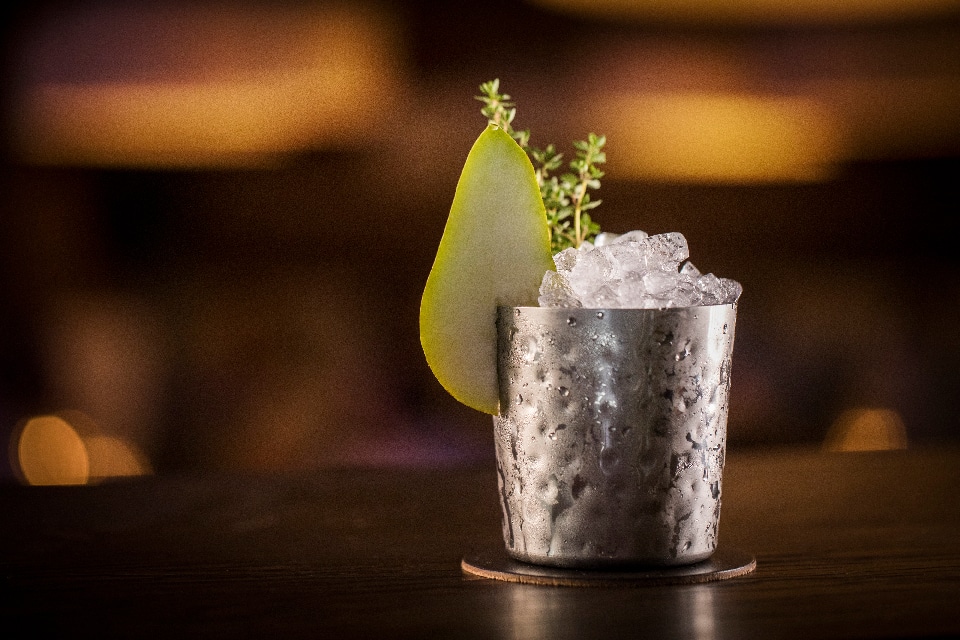
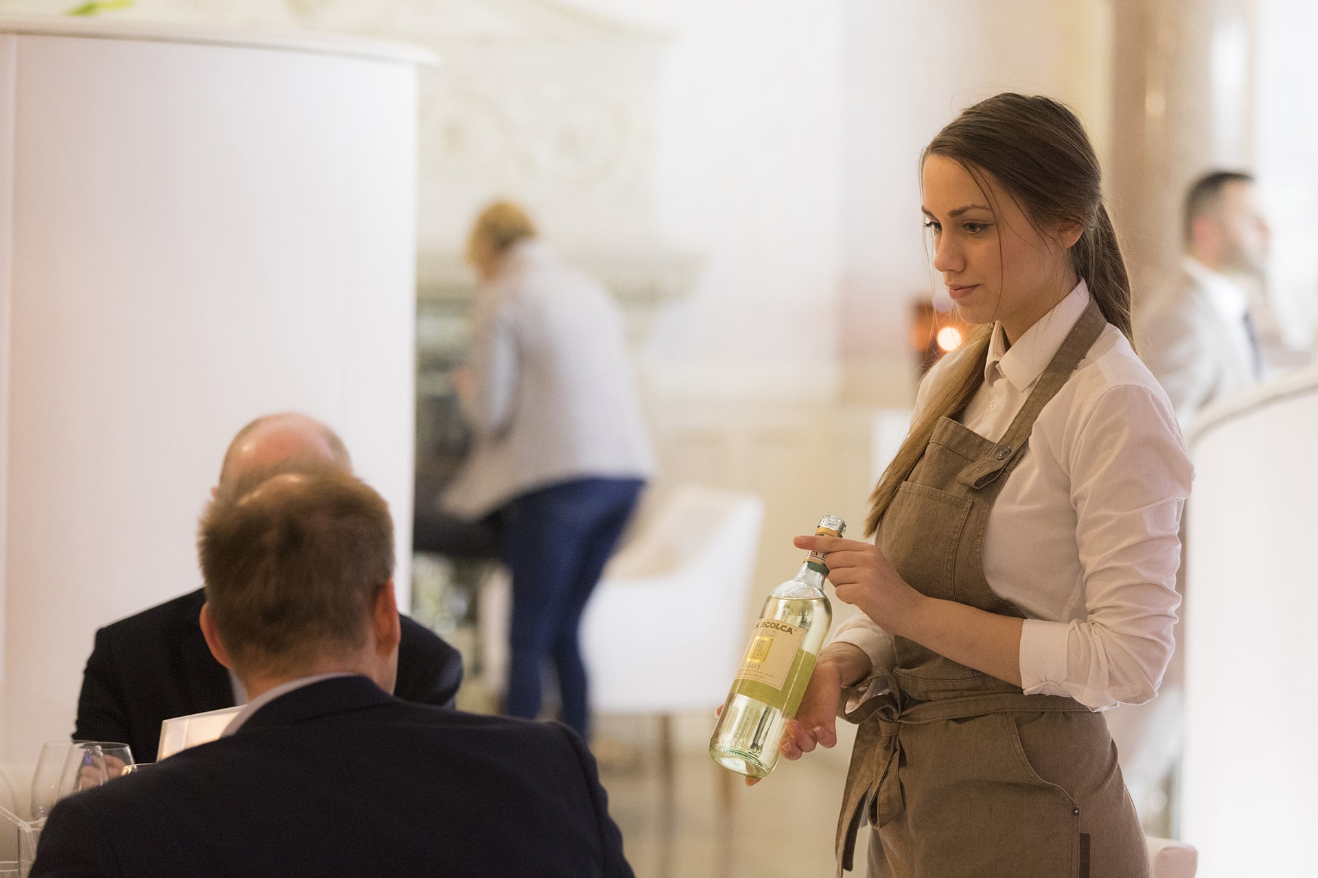
A two-day directed photoshoot provided us with a wealth of product and lifestyle photography and videography to be used across a number of Rosso’s intended touchpoints: the website, print collateral, and launch campaign literature.
The new responsive website features a Parallax-effect vertical scroll with stylish screen locking to isolate each section of content and create a sleek user experience. The website manages to balance emphasis between Rosso’s food menu and its extensive drinks list, positioning the venue as somewhere to stay and eat, or just enjoy some relaxed drinks.
Prior to launch, the website featured a countdown landing page, complete with live timer, helping to build excitement around the rebrand.
PROCESS CONTD
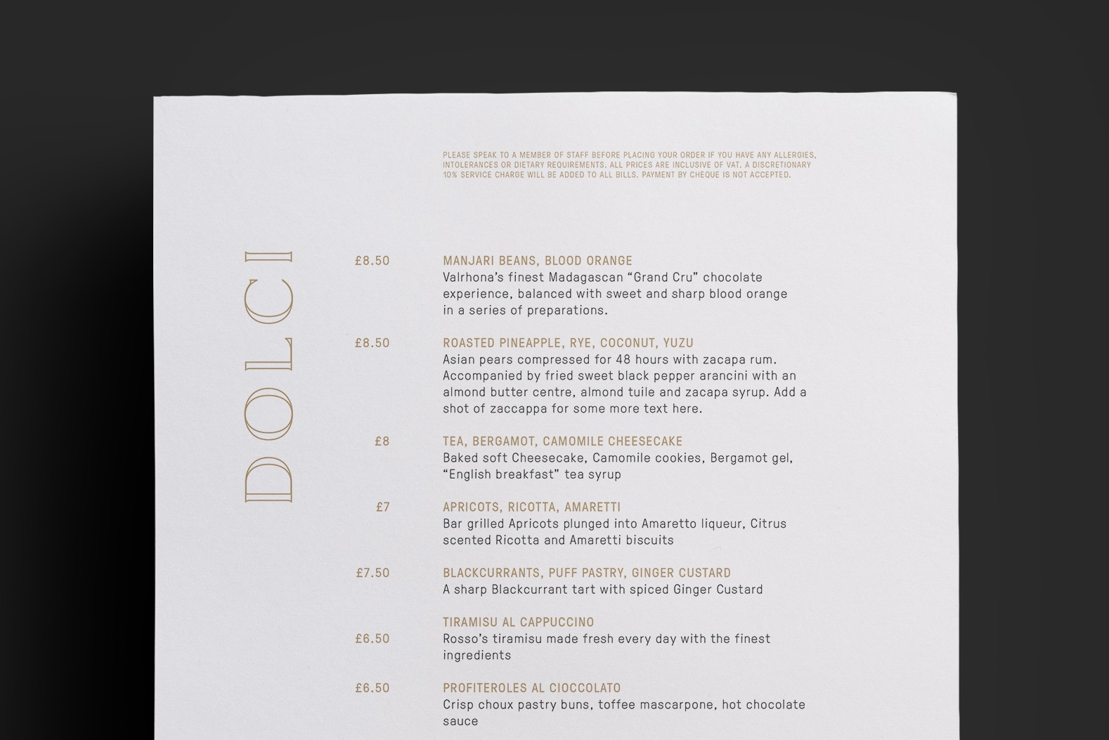
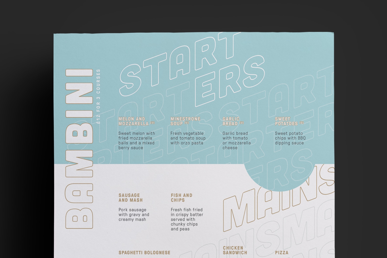
The new visual identity was rolled out across print collateral including menus, die-cut VIP invitations to the launch party, and bespoke children’s menus, which featured an adapted version of the core brand, and a fun colouring page for the bambini dining at Rosso.
Contact us
Get in touch
 NEXT PROJECT