BRIEF
BIMBox is a brand, an initiative born out of the union of architects, surveyors and interior designers – all of whom are working together for a common, industry-serving cause, one of making BIM objects easier to access and work with than ever before. Our job was to make that dream a reality, building an easily-accessible, completely free to use library of BIM objects in the hope that it would become the web’s go-to location for completely accurate and lovingly recreated and represented BIM objects, with direct links back to the manufacturers and designers of each piece.
THEORY
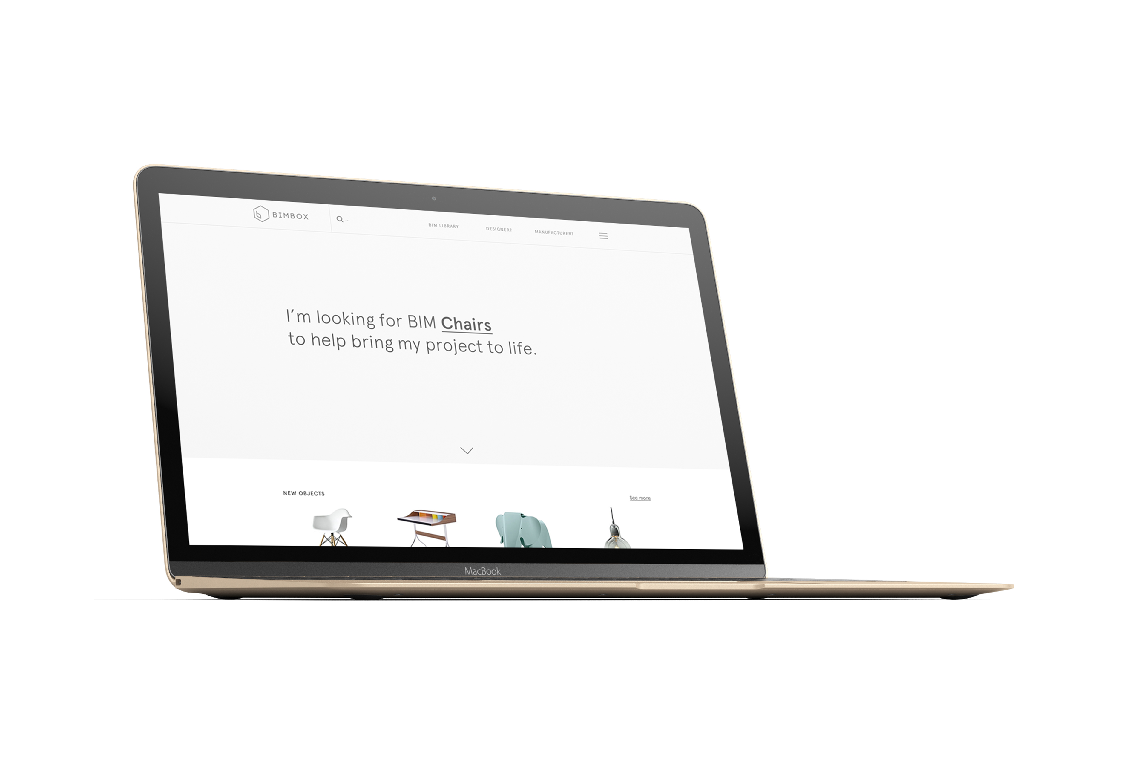
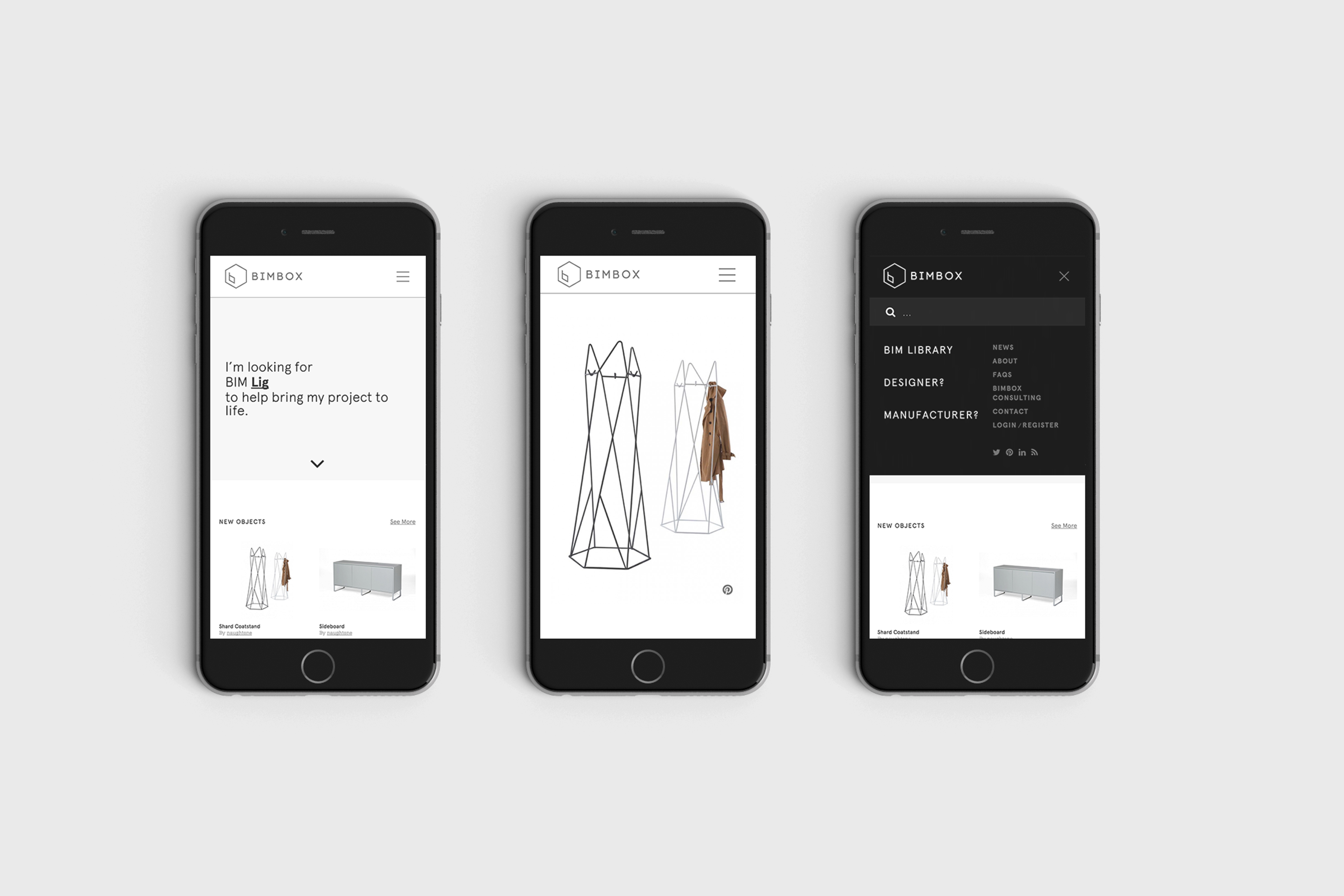
In order to achieve our main goal, user experience was absolutely key. As such, we wireframed the entire site from scratch, creating a user flow that wasn’t just functional, but thoroughly enjoyable too. The homepage we designed is dominated by search – with the search field slowly animating to give the impression of text being entered into it (as well as being deleted from it as though the user typing on your behalf had changed their mind – reinforcing the location of the space into which they can enter text themselves), practically begging users to engage with it. Of course, if the user scrolls down, they are still presented with more traditional browsing options in the form of two panels dedicated to “new” and “popular” BIM objects.
PROCESS
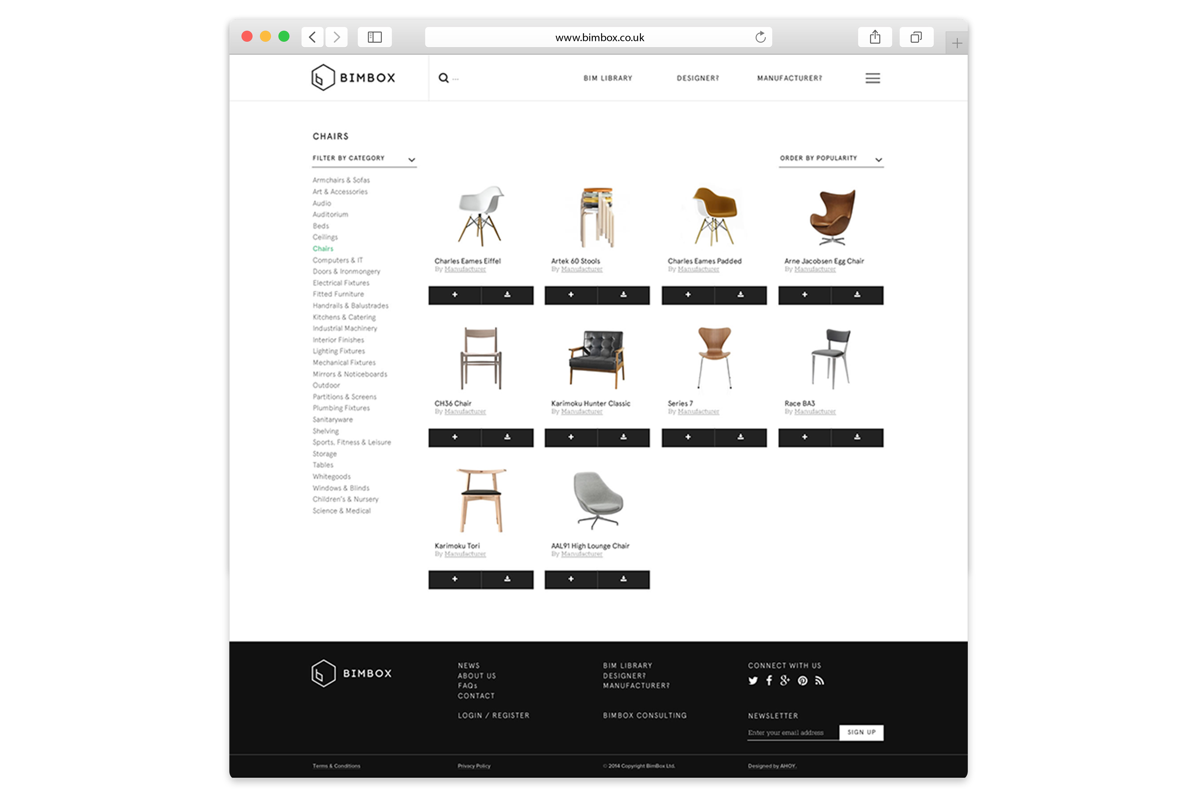
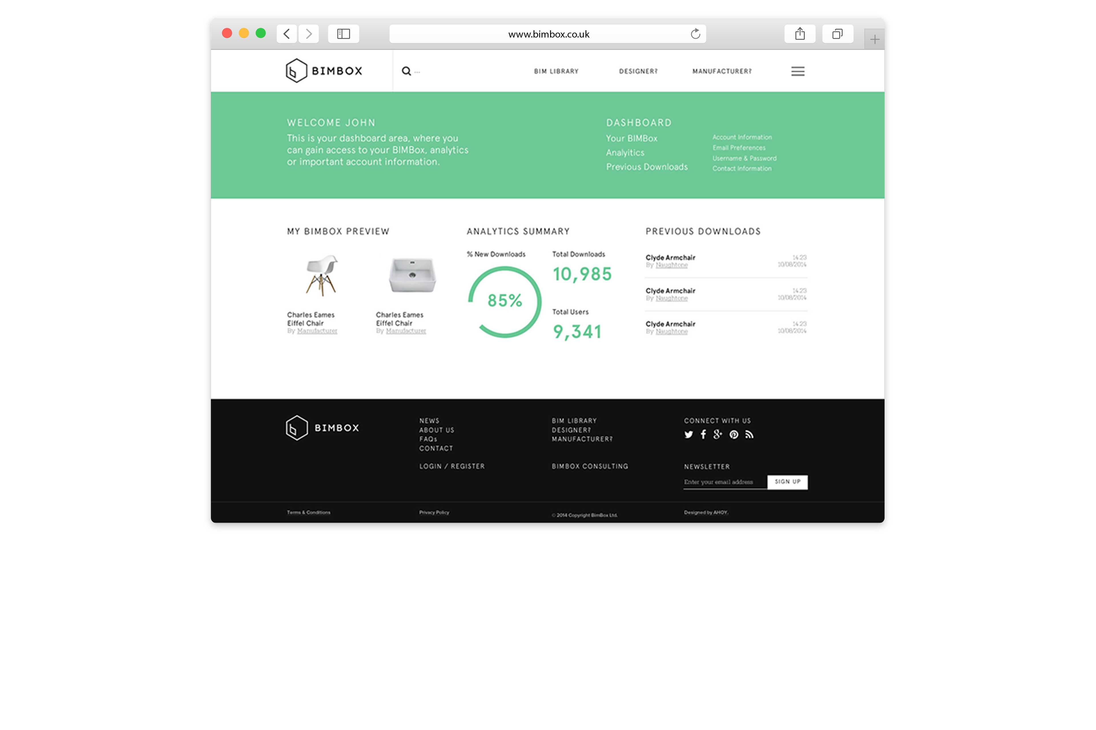
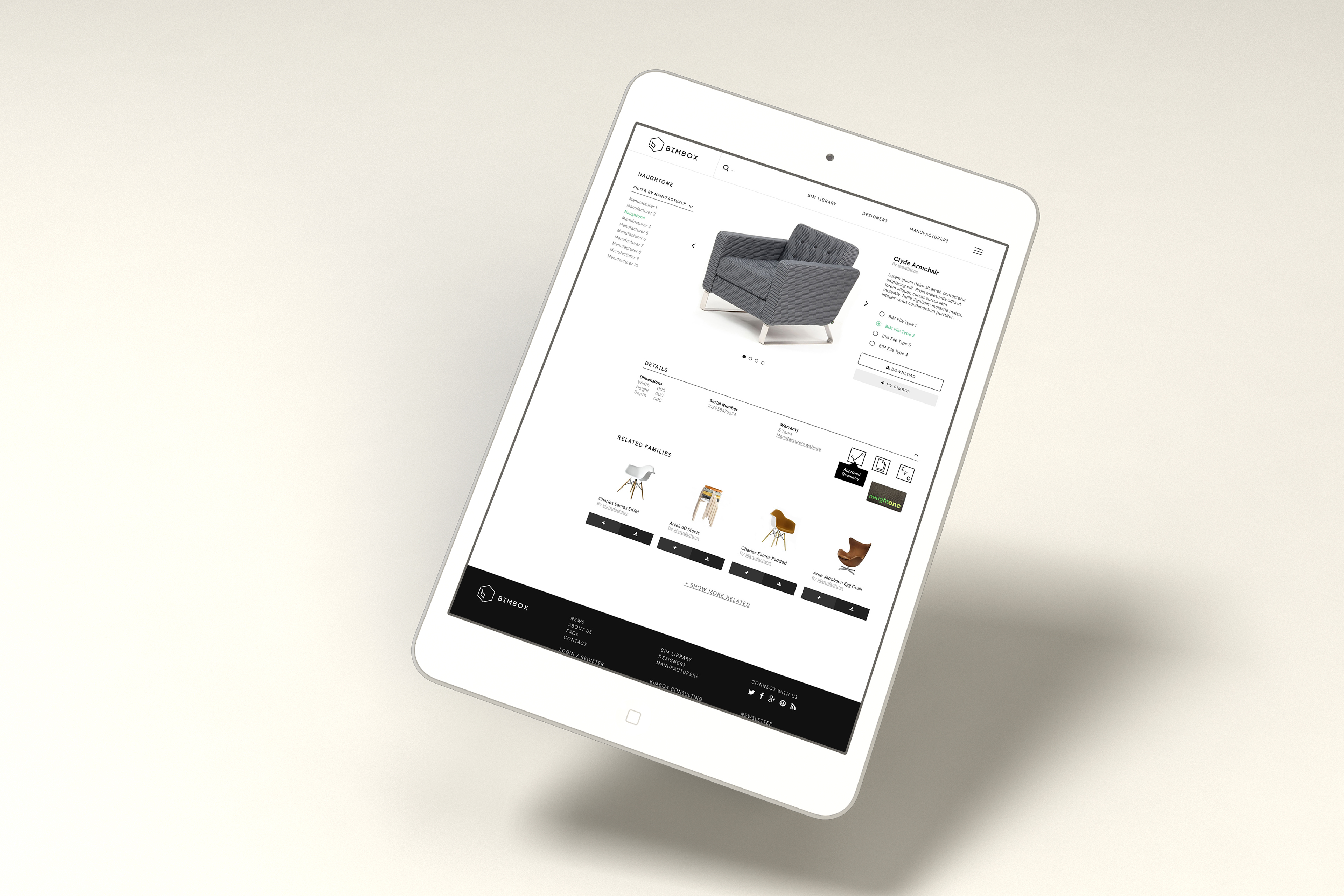
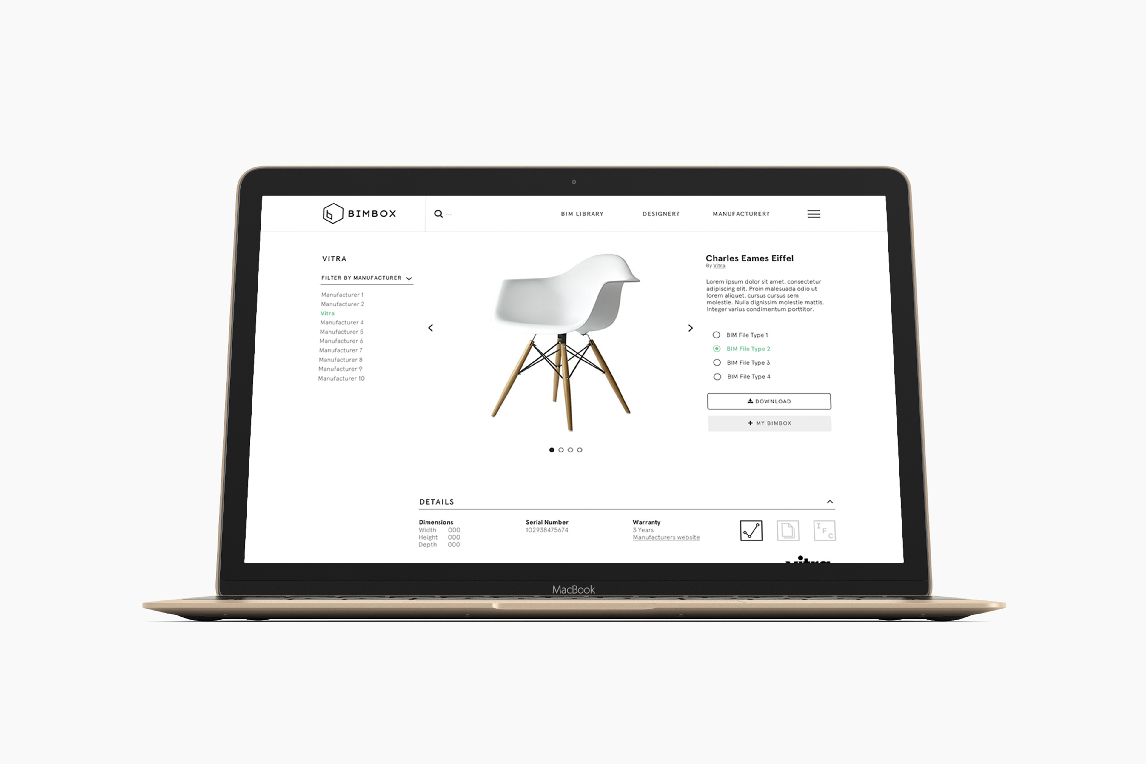
Functionality and BIMBox’s free library vision aside, this would all be for naught if the site’s visuals didn’t appeal to the expected day-to-day audience of architects, interior designers and so on. As a result, we used BIMBox’s brand guidelines to create a site design that was attractive without compromising on functionality or site performance – making heavy use of white space, and block blacks to emphasise functionality and essential links or information.
