BRIEF
Steamhaus is a brand and concept born out of the simple desire to re-evaluate the way that hosting and cloud services are offered to SMEs. With Steamhaus, emphasis is placed upon the customer service side of the hosting equation, rather than the technical aspect. This is the exact opposite of the way that the majority of Steamhaus’ competitors handle proceedings. The brainchild of Daniel and Dennis Keighron-Foster, Steamhaus is anything but another another hosting company. When Daniel and Dennis first approached us, they were still working out a lot of the logistics and as such, we were entrusted with elevating Steamhaus from concept to full-blooded brand.
THEORY
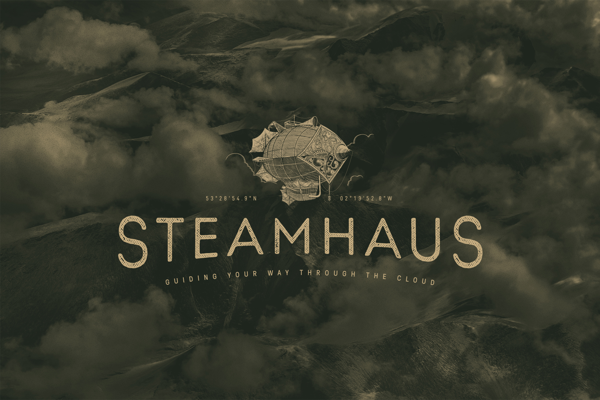
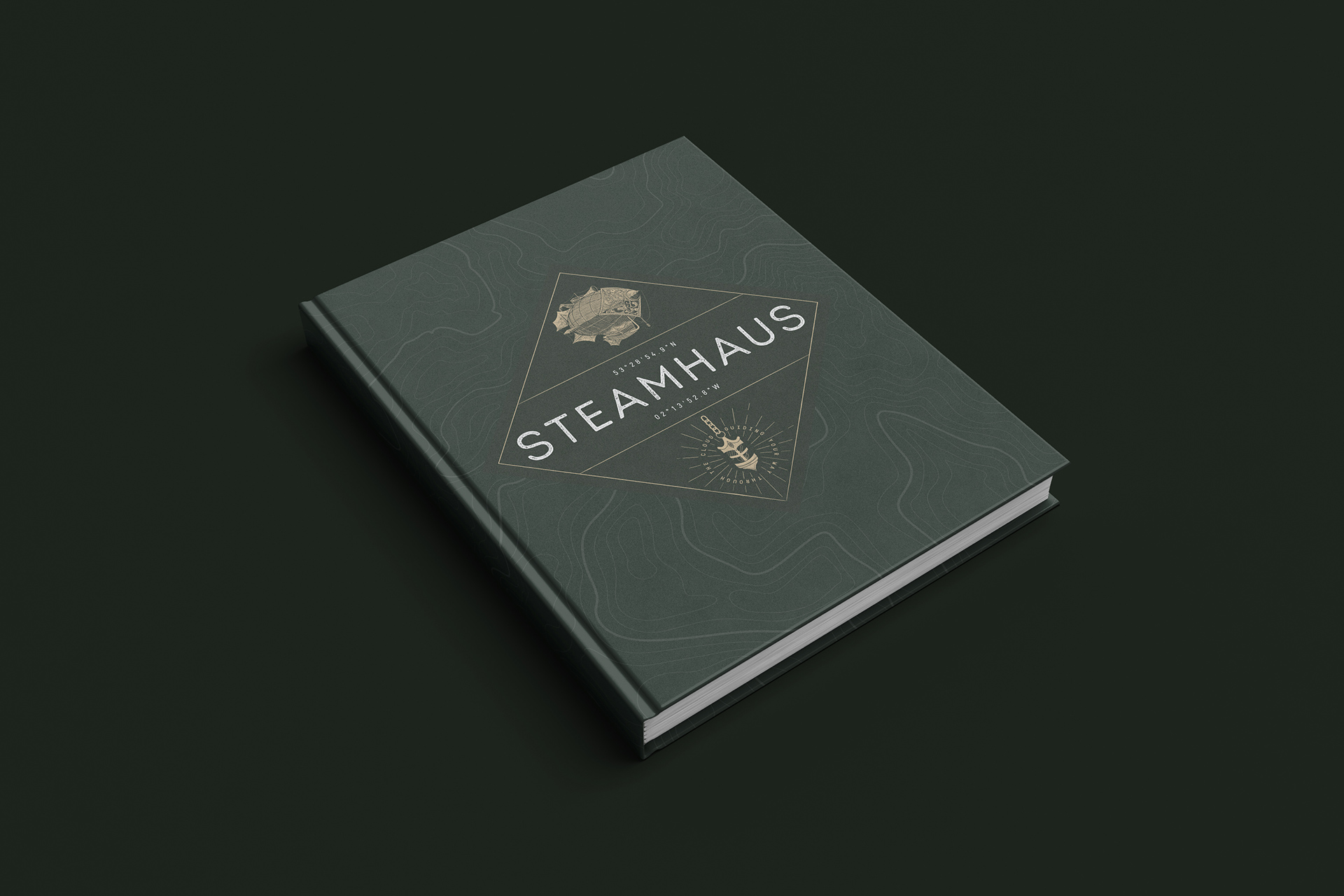
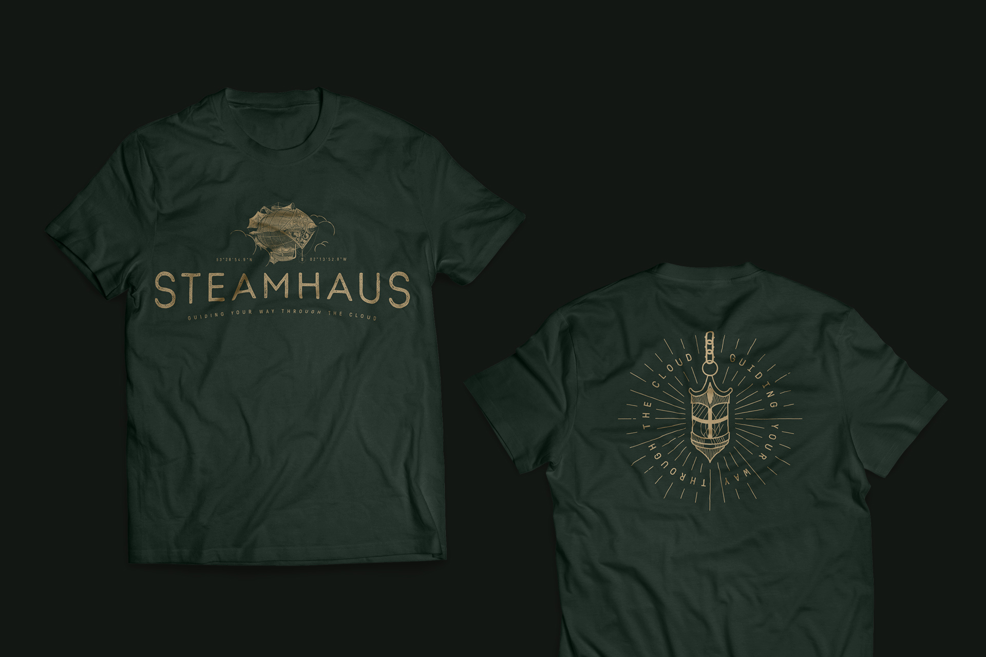
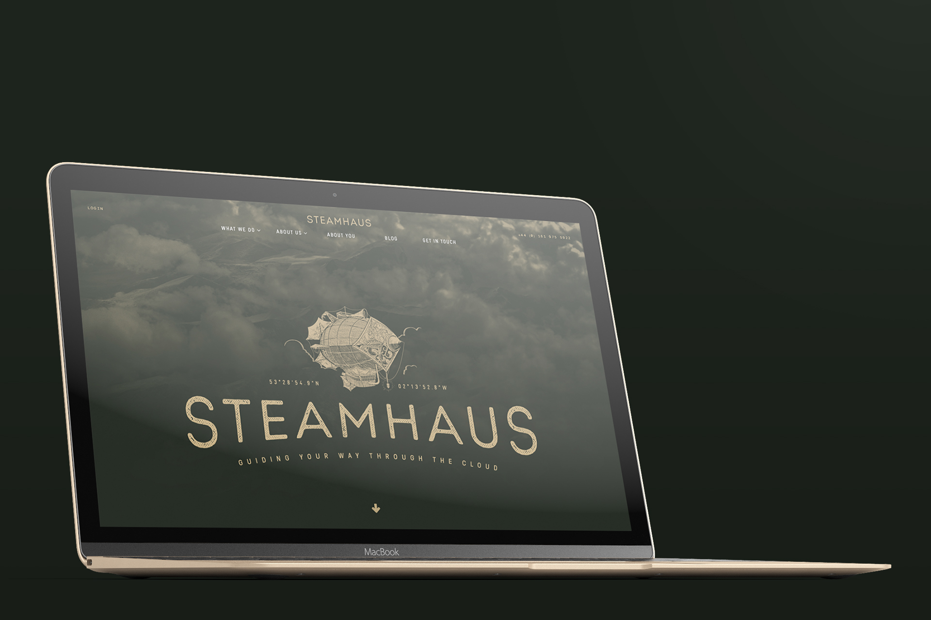
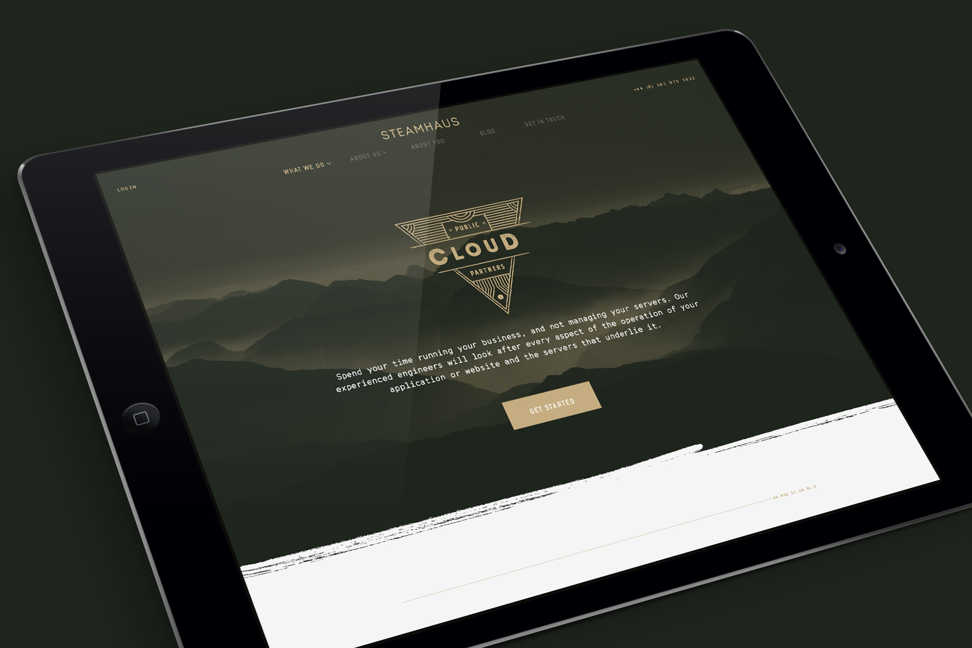
With the ‘Steamhaus’ name already (mostly) decided upon at the start of the project, it was only fitting that, alongside other routes, we would explore a ‘steampunk’-inspired route. Steampunk is an aesthetic that is so often shunned by designers, tending to be the domain of enthusiasts only. We wanted to leverage steampunk in a more palatable, accessible and contemporary way, leading us to work with local illustrator, Rick Jones to create an iconic central airship marque to build a brand identity around. The central illustration that Rick created is stunning, rendered lovingly in exquisite detail.


PROCESS
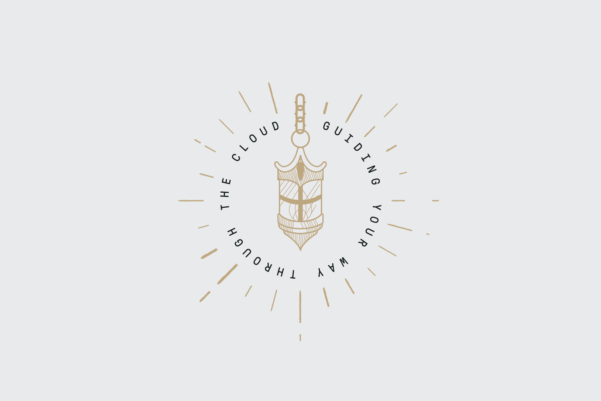
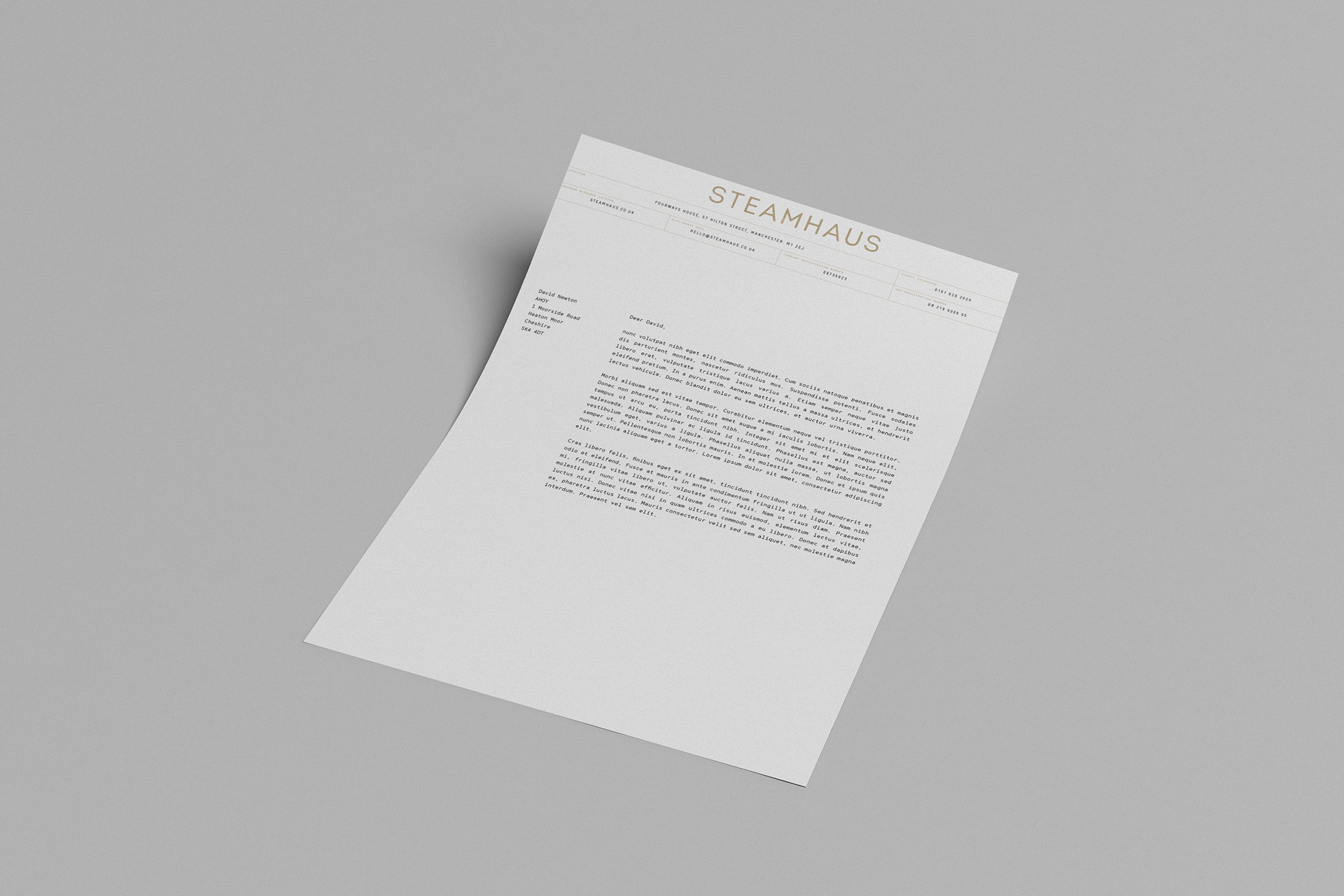
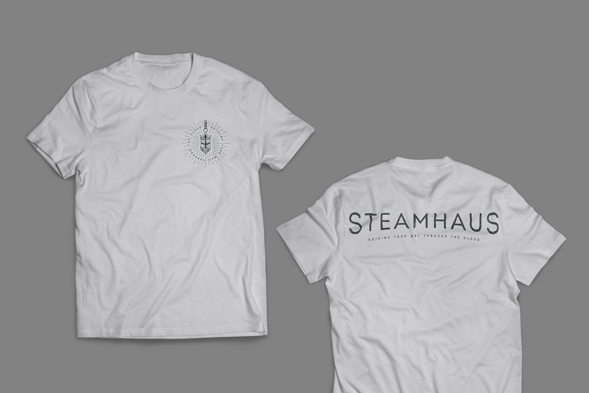
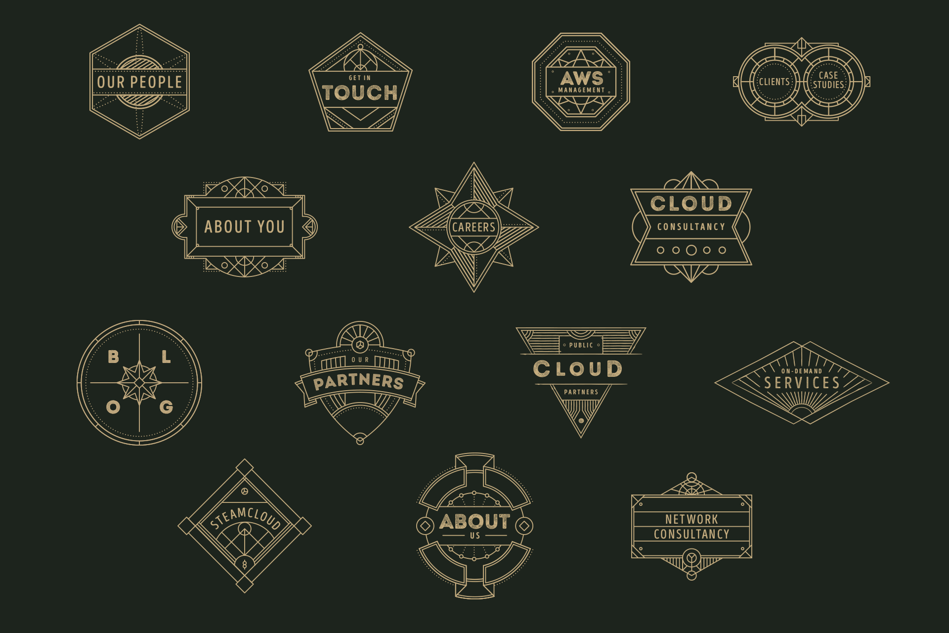
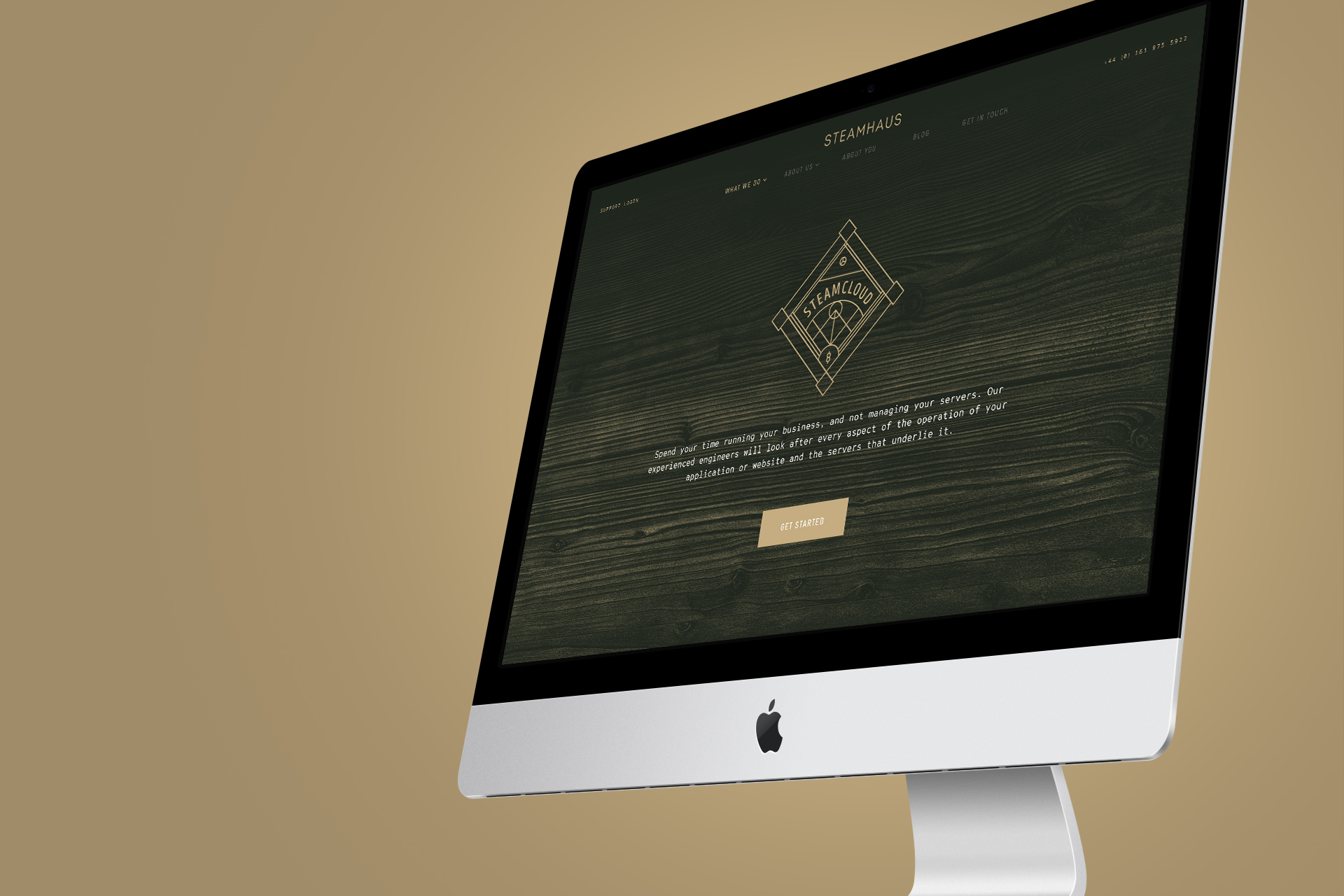
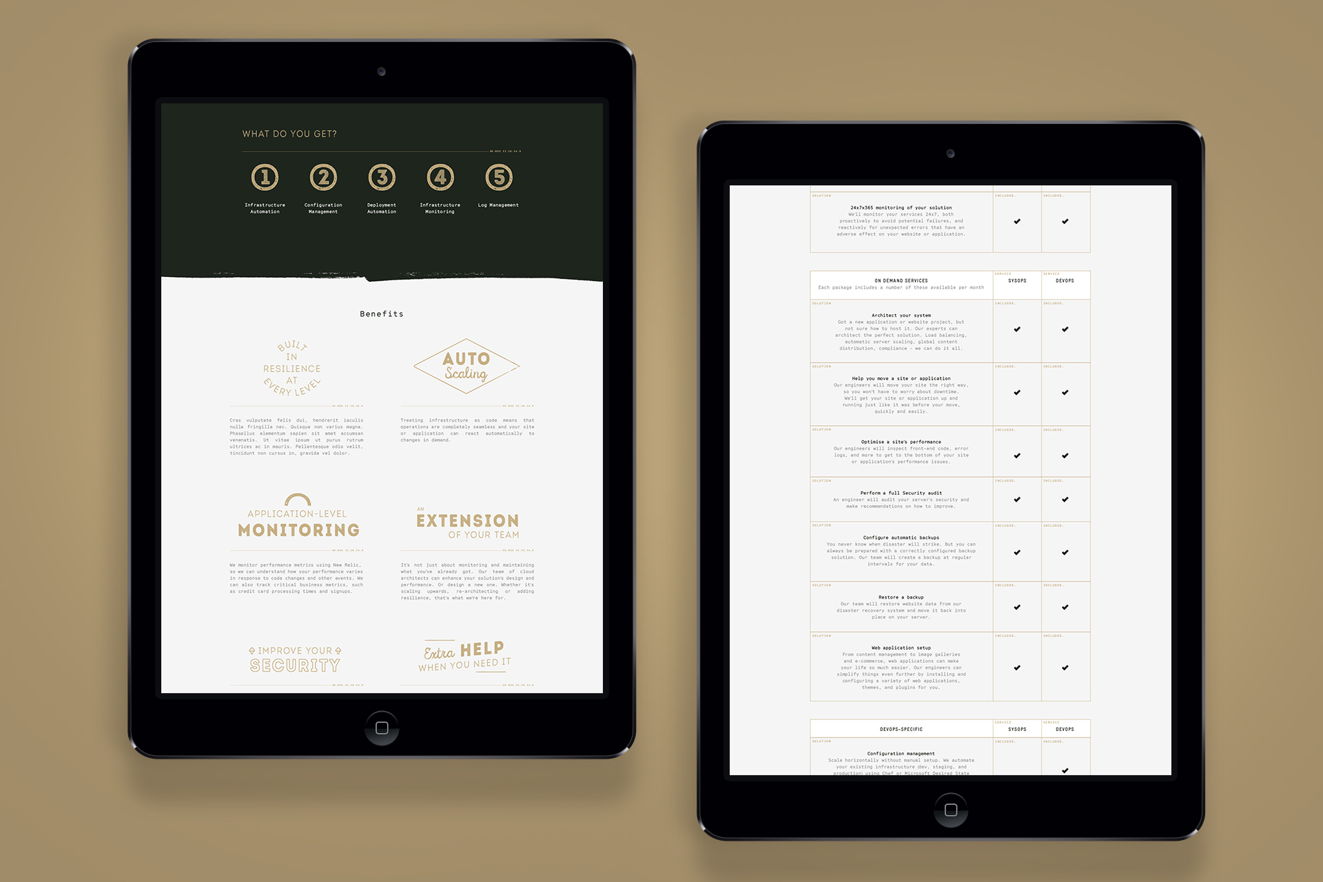
With Rick’s illustration serving as our foundation, we created and decided upon the broad brand picture that surrounds it, starting with the striking brand colour palette marrying gold with a rich, obsidian green to create a timeless, premium aesthetic, one that can be carried through to every brand element – including photography. This was supported by our creation of a number of bespoke brand badges and text lock-ups to add emphasis or flourishes to sections of body copy. We also designed and built a fully responsive website, with an easily-editable WordPress CMS, one that Daniel and Dennis described as the best WordPress implementation that they have ever seen.
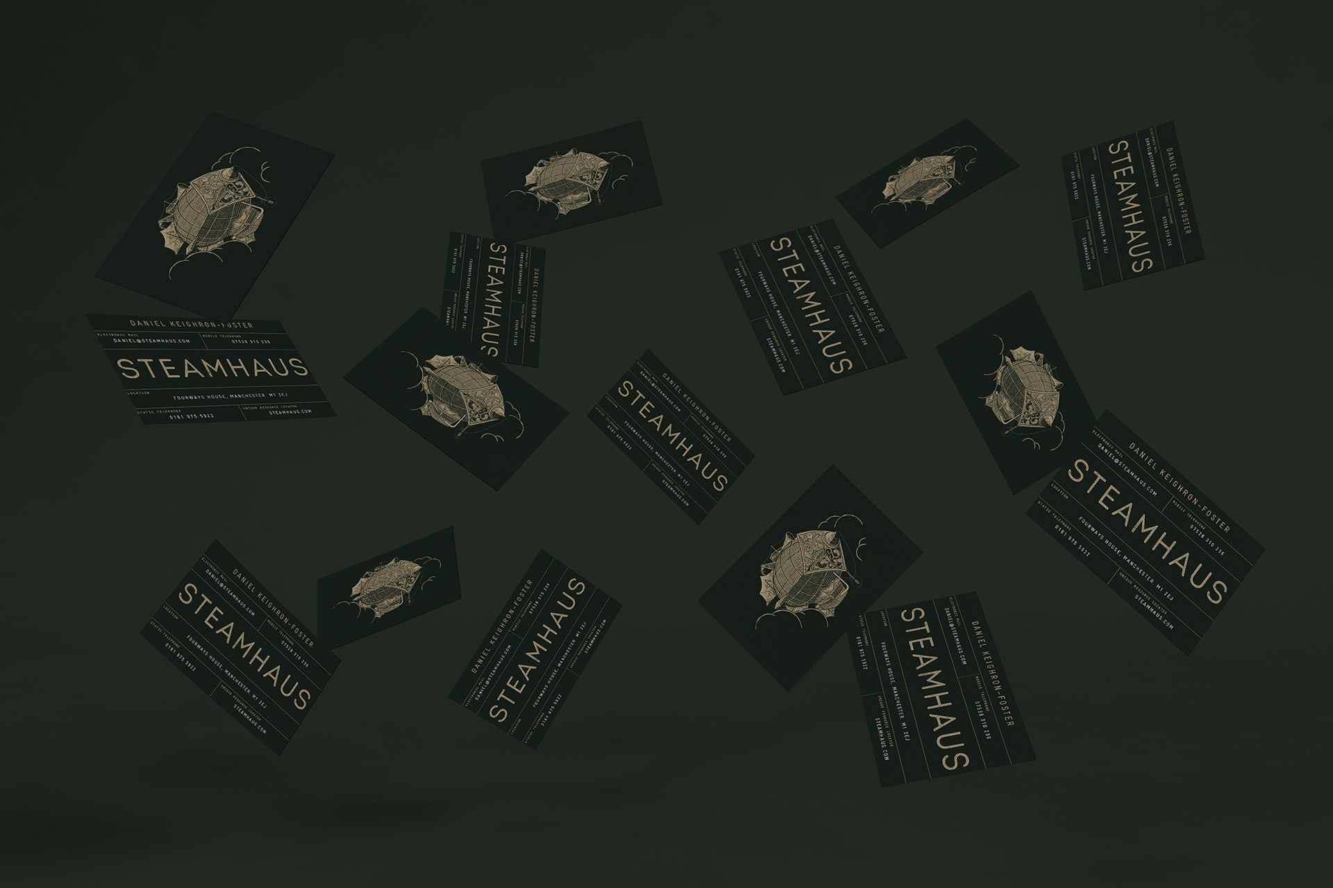
Given the intricate details within the core airship illustration, faithfully recreating it in print for the brand business cards was more challenging than we originally expected, leading to our use of GF Smith’s Strathmore Cambric Helmock paper, but also our use of a Pantone gold rather than a gold foil to reduce some of the printing costs. The end result is a hosting company brand identity unlike anything else in the sector, one that should serve them well as they establish themselves as major players in Manchester’s tech scene.
Contact us
Get in touch
 NEXT PROJECT