BRIEF
Originally known as Internet Logistics, the brand transformed into Core Fulfilment in February 2014. Their original branding was functional, communicating quite literally what the company did on a day-to-day basis, but it did little to explain the difference that they make to the daily operations of their customer base – the majority of which are micro SMEs.
THEORY
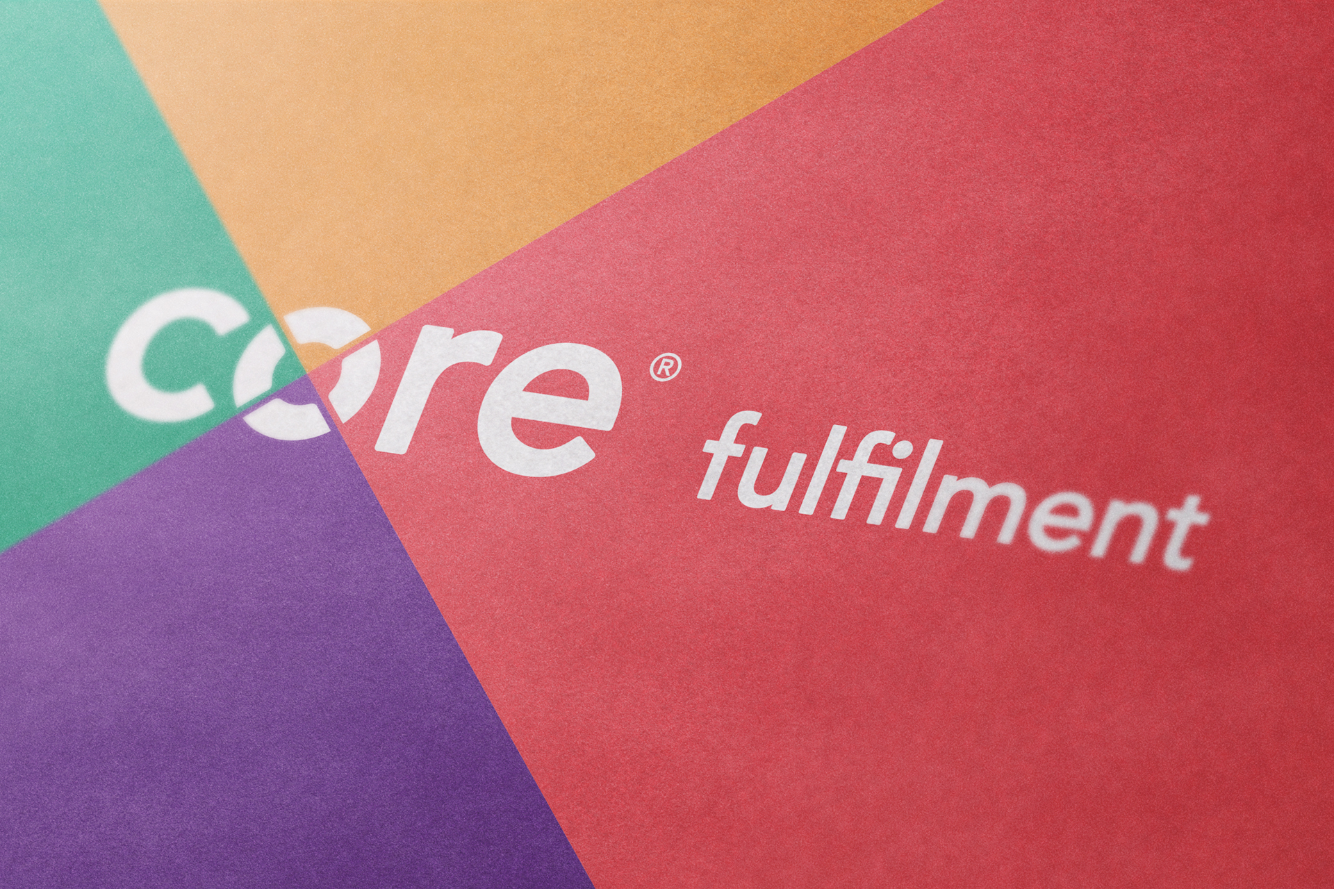
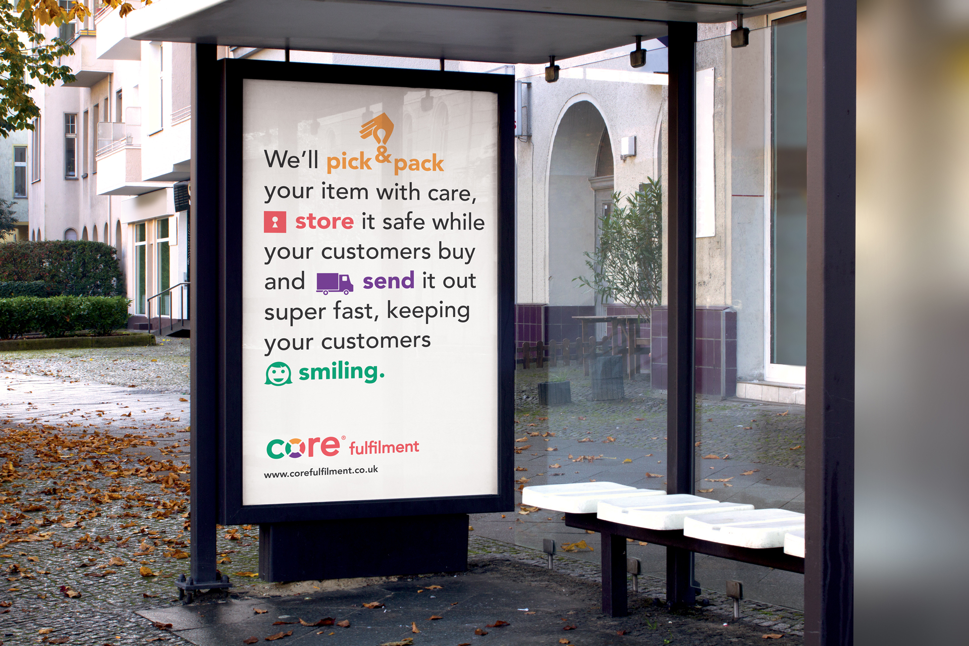
The Core Fulfilment brand is more aspirational, born out of a renewed brand-wide commitment to personal service, meticulous attention to detail and loyalty. Previously, Internet Logistics displayed and described the services that they offered with an animated jigsaw graphic on their homepage. Taking inspiration from this, we made sure that the brand’s main four services were depicted right in the ‘o’ of the main “core” type – creating a memorable logo for the brand that is visible and prominent throughout the site and brand literature.
PROCESS
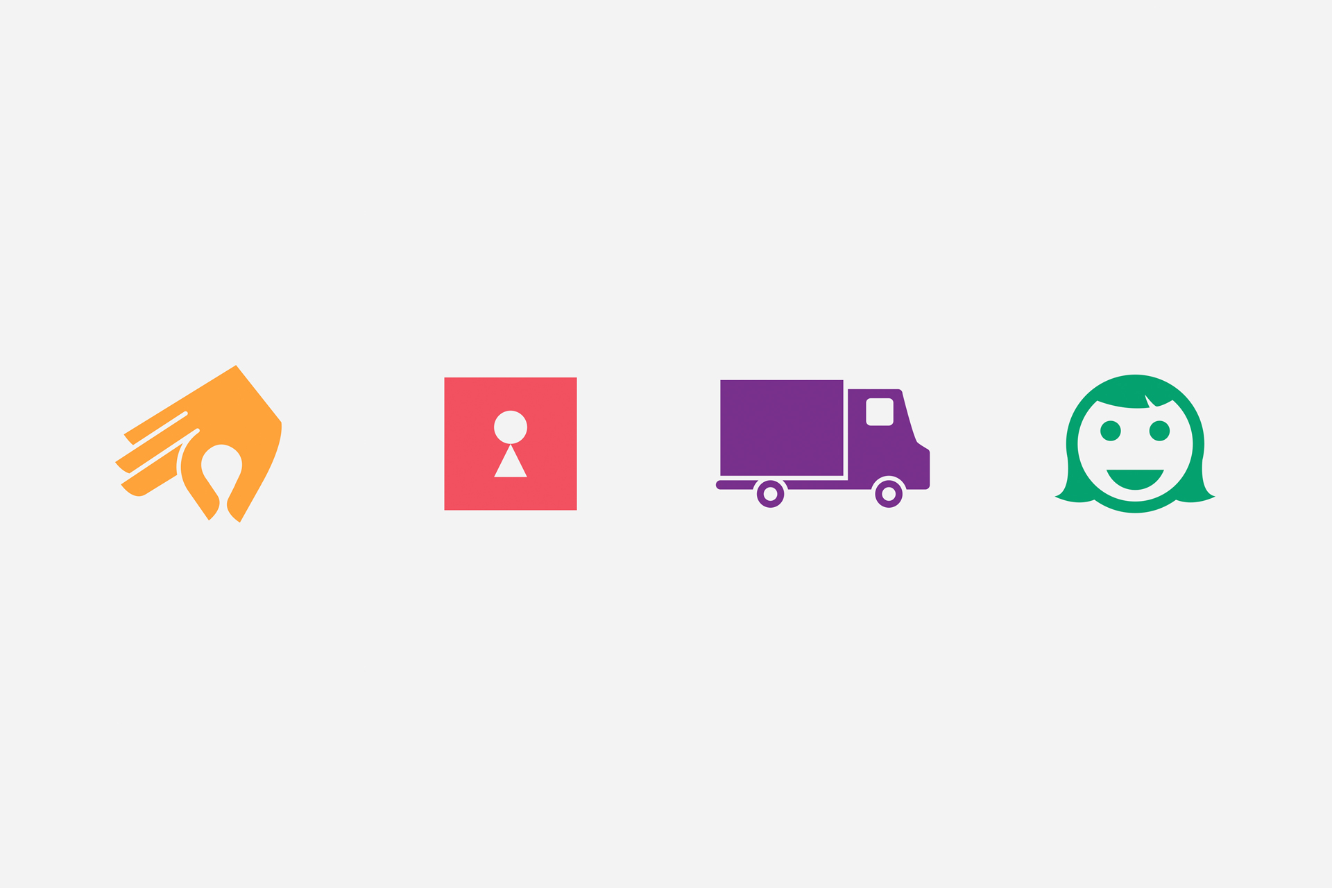
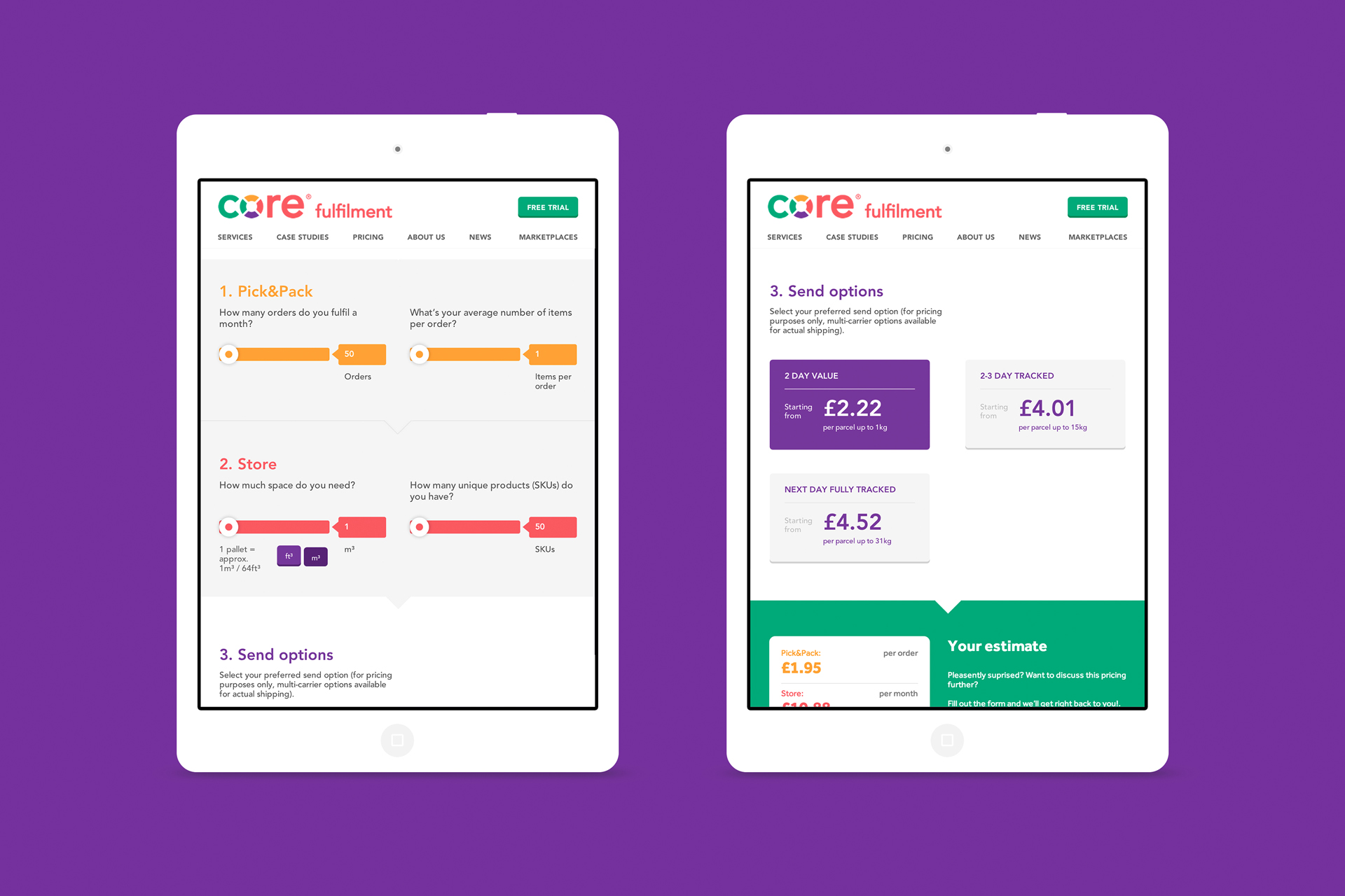
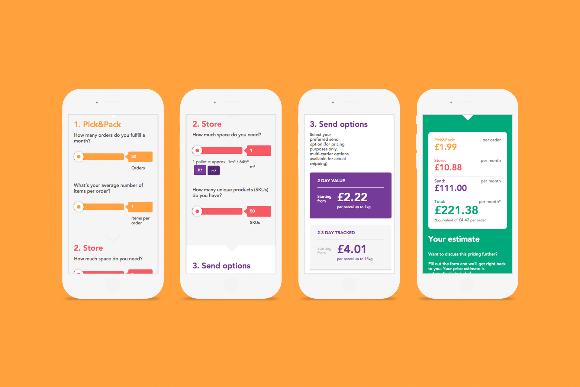
In keeping with Core’s values of openness, honesty and delighting customers, we created an interactive quote generator – letting prospective customers adjust sliders for how many orders their business fulfils in a month, the average number of items in each other, how much storage space they need and so on. This process generates an estimate broken down into the various services that Core offers – Pick&Pick, Store and Send.

Contact us
Get in touch
 NEXT PROJECT