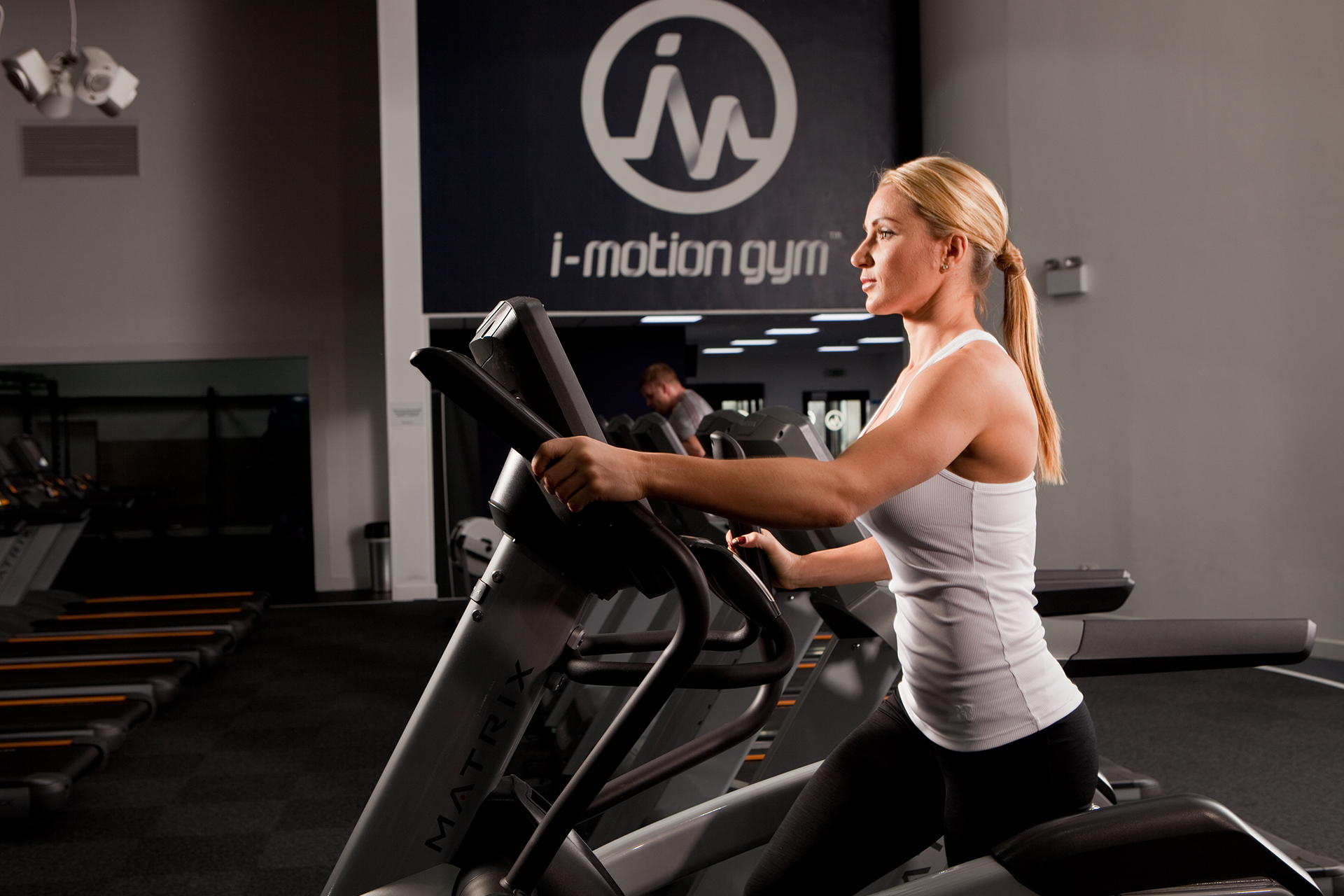
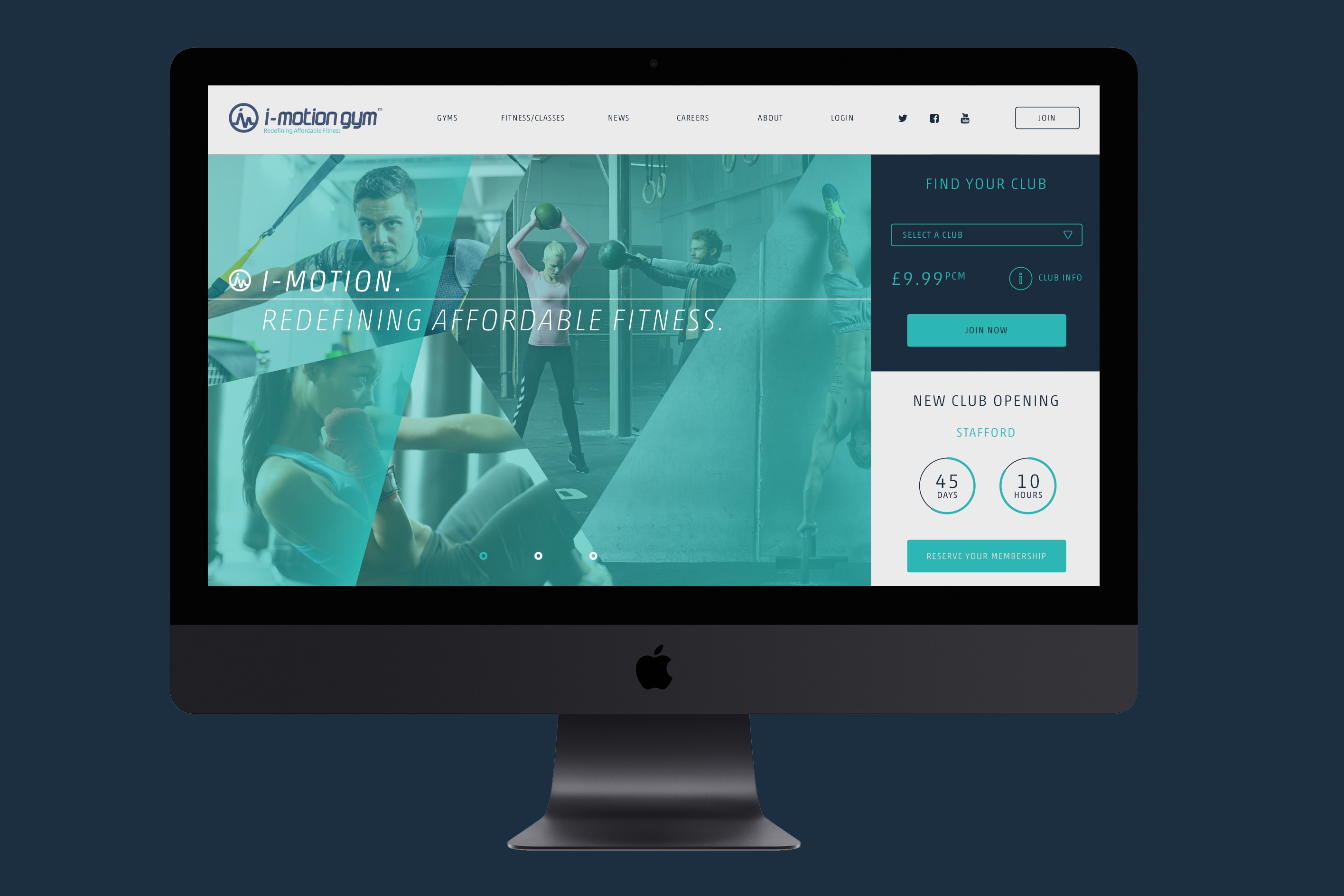
BRIEF
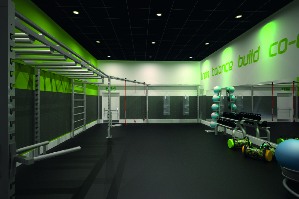
i-motion gyms are a new chain of state of the art gyms, only, i-motion offer access to high-end gym equipment with affordable memberships and without restrictive monthly contracts. Starting with a branch in Rotherham, they hope to expand and add additional branches to their repertoire in the near future. They needed a brand that reflected the fresh and interactive gym experience that i-motion strive to provide.
THEORY
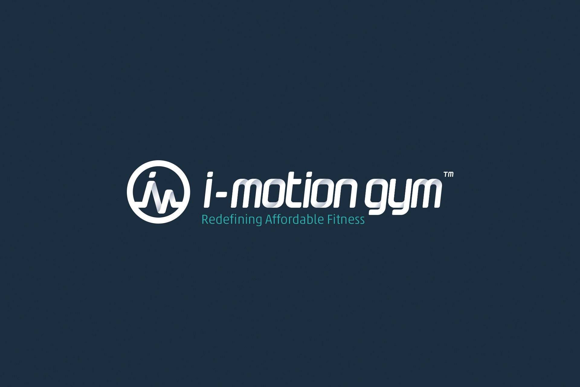
We arrived at the bespoke i-motion logo after producing a heart rate reading that was made up of the i-motion company initials. We then ran with that theme to produce a custom-made typeface that gives the i-motion type a three-dimensional, folded look – almost reminiscent of figures bending and contorting into those forms. In addition, our “redefining affordable fitness” tagline summarised i-motion’s mission statement of offering premium facilities at affordable prices.

PROCESS
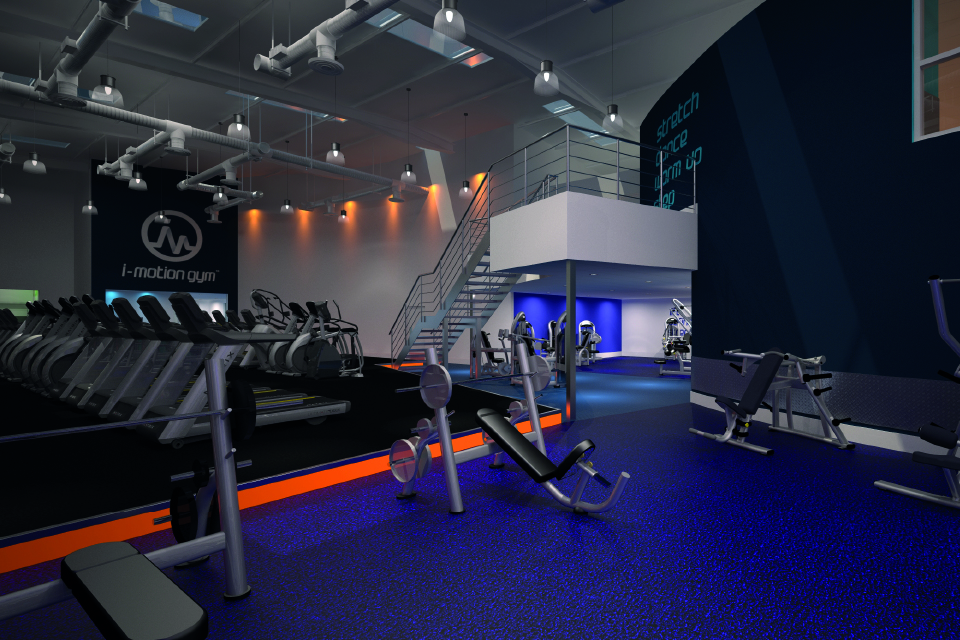
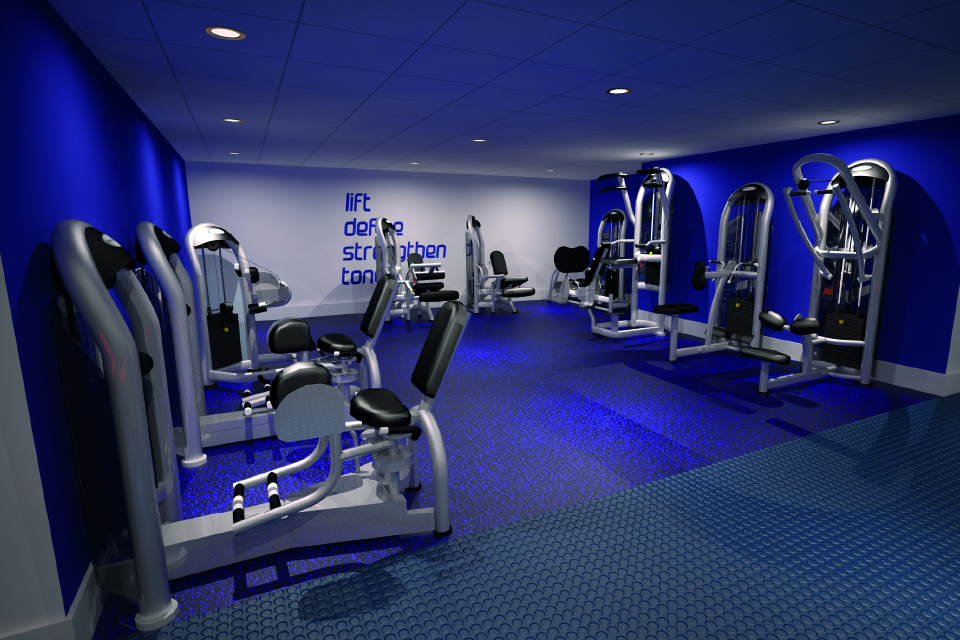
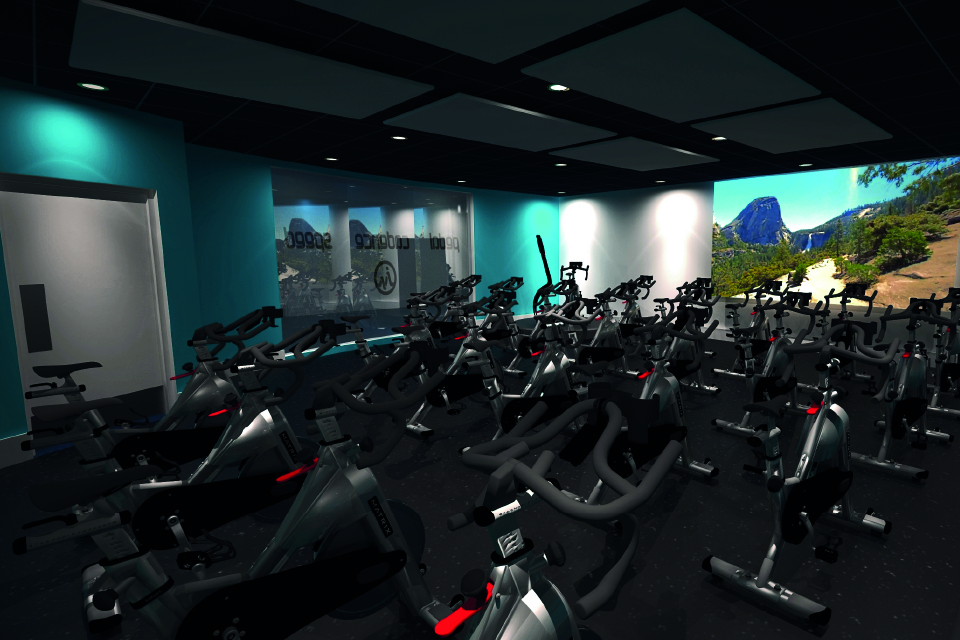
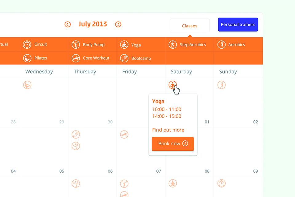
As well as creating a polished brand that would emphasise the interactivity of the i-motion gym experience, we were also responsible for developing way-finding signage and for creating colour-coded zones within the gym. One of the key challenges of the project was to develop a website that was as easy to use and navigate as the gym space itself. The centrepiece of our approach to this challenge can be seen in the interactive class timetable we created, giving members the ability to choose from the 80+ available classes each week, and confirm their attendance in a few simple clicks.
Contact us
Get in touch
 NEXT PROJECT