Brief
For five years, The Mere Golf Resort & Spa had maintained the same website, one that was more online brochure than considered digital experience. It was functional, but not exciting, doing little to convey the unique Mere experience. With brand guidelines already established (and then later refreshed and expanded by AHOY) we were free to really get into the heads of both The Mere team, and their customers, to deliver an effortless, memorable user experience.
ATTENTION TO DETAIL
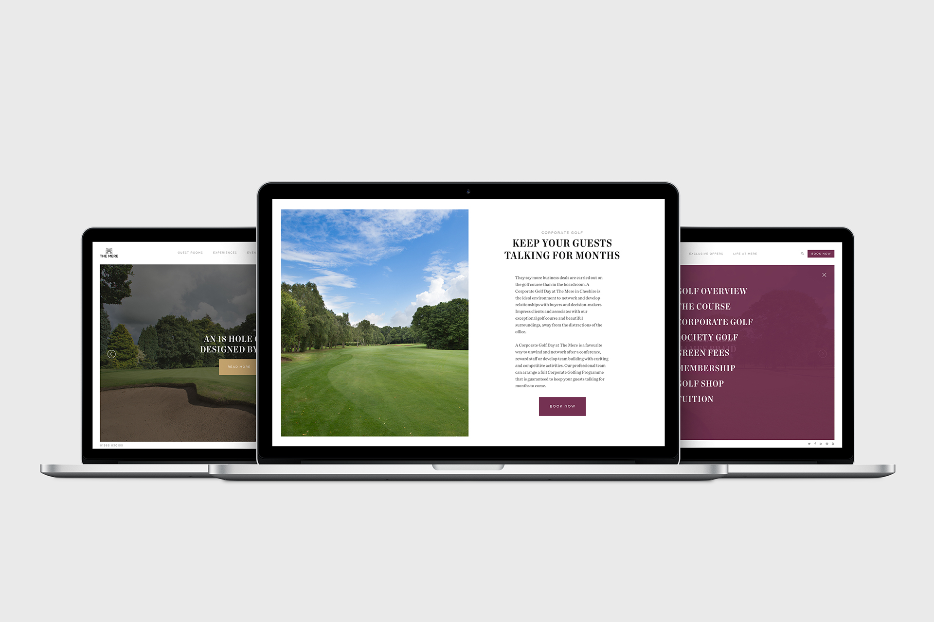
We honestly feel that the final Mere site offers a more authentic luxury experience than any other brand touchpoint ever could. Making the most of their written content and imagery with editorial design and supporting it with tasteful transitions and animated flourishes, we have crafted a user experience with the same care and attention that goes into every experience that the golf resort and spa offer.
UNCOMPLICATED COMPLEXITY
As a hotel and resort The Mere have a whole host of different offerings and services, including an 18 hole golf course, two full restaurants, a spa, gym with swimming pool, conference and event rooms on top of being a wedding venue with multiple rooms. Such a complex structure had to be broken down into an uncomplicated system for users to easily navigate.
EDITORIAL STYLE
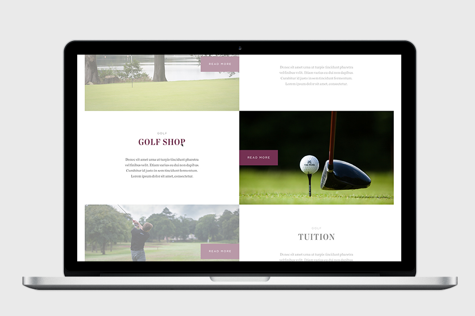
Sectioned content that makes full use of imagery using a combination of fixed and scrollable layout.
EVENT & WEDDING PLANNER
Creating a personal experience for anyone planning events and weddings, a simple multiple choice form allows users to find the best room for their needs. Data capture also helps the sales team structure their response and provide relevant links and case studies of similar themed events and weddings.
Gallery
A gallery is a quick and high-level overview of everything that a hotel and resort offers, and is often the first destination that prospective customers visit. Our gallery was modelled on the usability of Google Images, allowing users to click and swipe through images, and flick through them with the arrow keys.
Theory
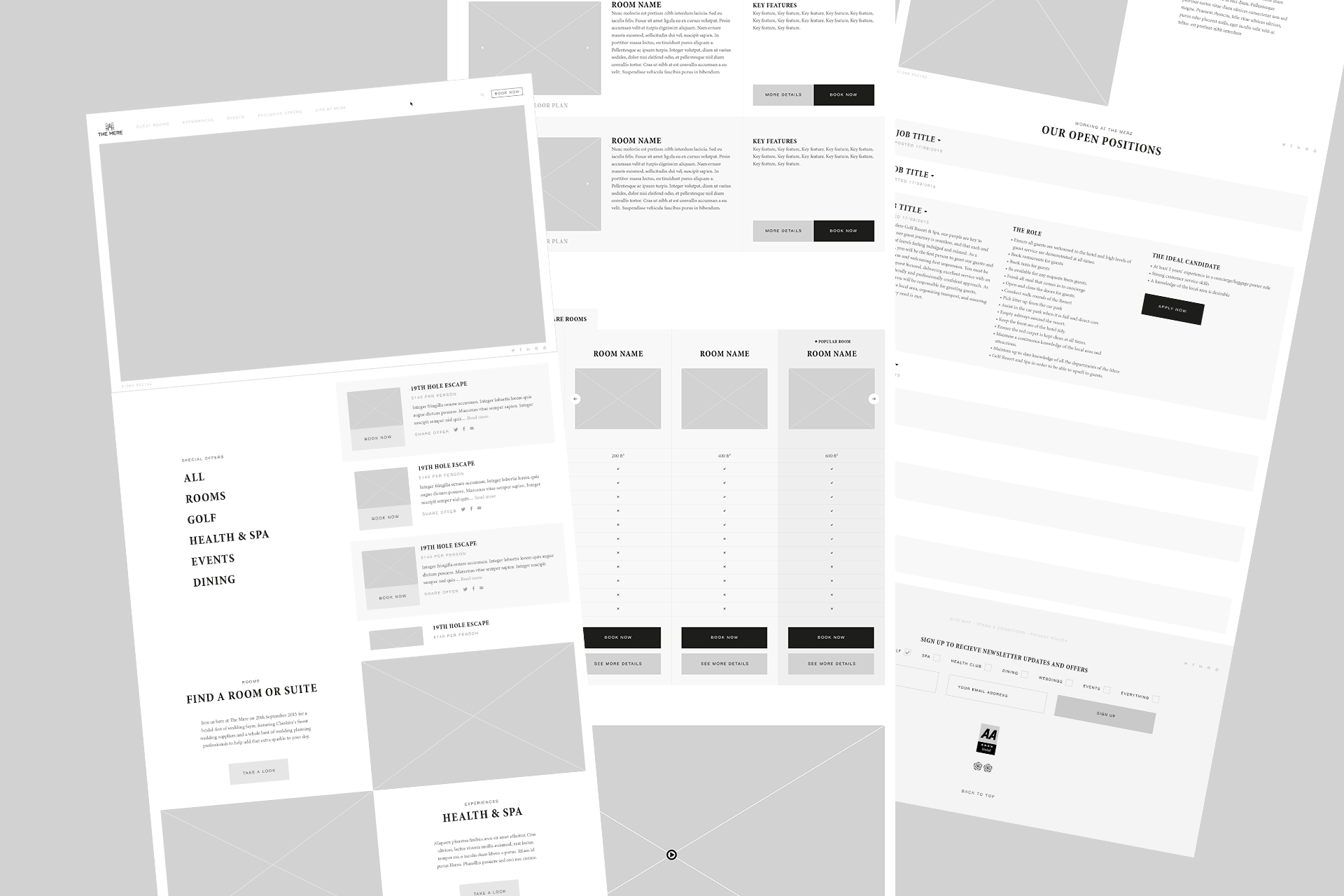
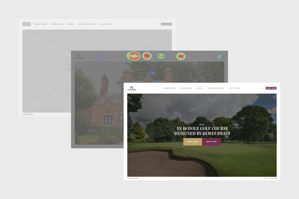
The culmination of months of planning and collaboration, The Mere project was our largest scope user experience project up to that point, spending more time than we ever had before designing and developing the user journey and flow of information through the site from arrival to conversion. The real challenge was getting across luxury, not just with copy or imagery, but with the actual feel of the site too.
Navigation
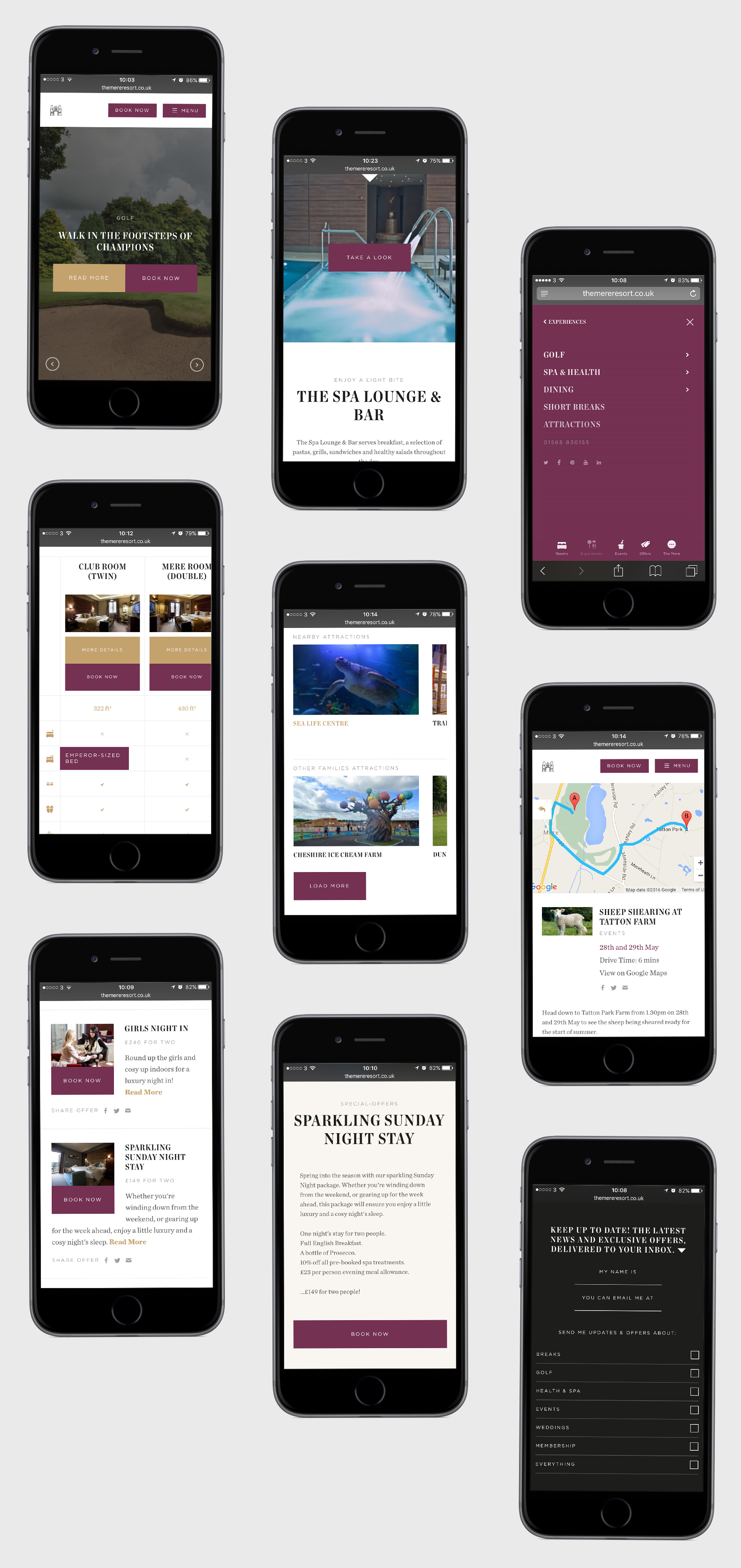
Leading on from testing we developed easy navigation through pages and through the menu. Treating mobile more like an app.
Brand REfinement (1/2)
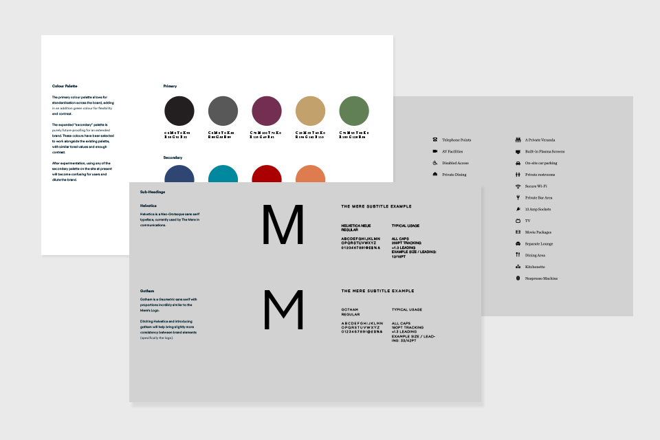
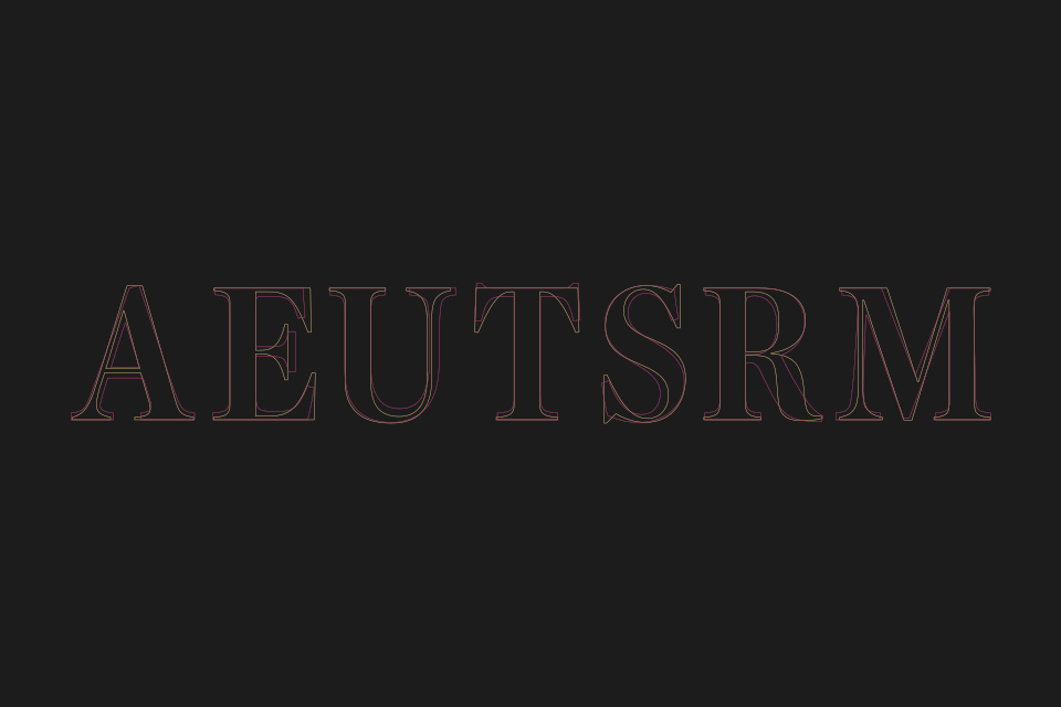
The site is supported by AHOY’s refreshed and augmented brand guidelines for the Mere, adding typefaces…
BRAND REFINEMENT (2/2)
….adjusting colour palette usage, overhauling how images and text are used throughout, as well as evolving and adding brand assets like iconography.
