With an increasing number of holiday makers seeking the personal and exclusive experience, the business of luxury holidays is a fiercely competitive one. Every operator needs to stand out from the crowd.
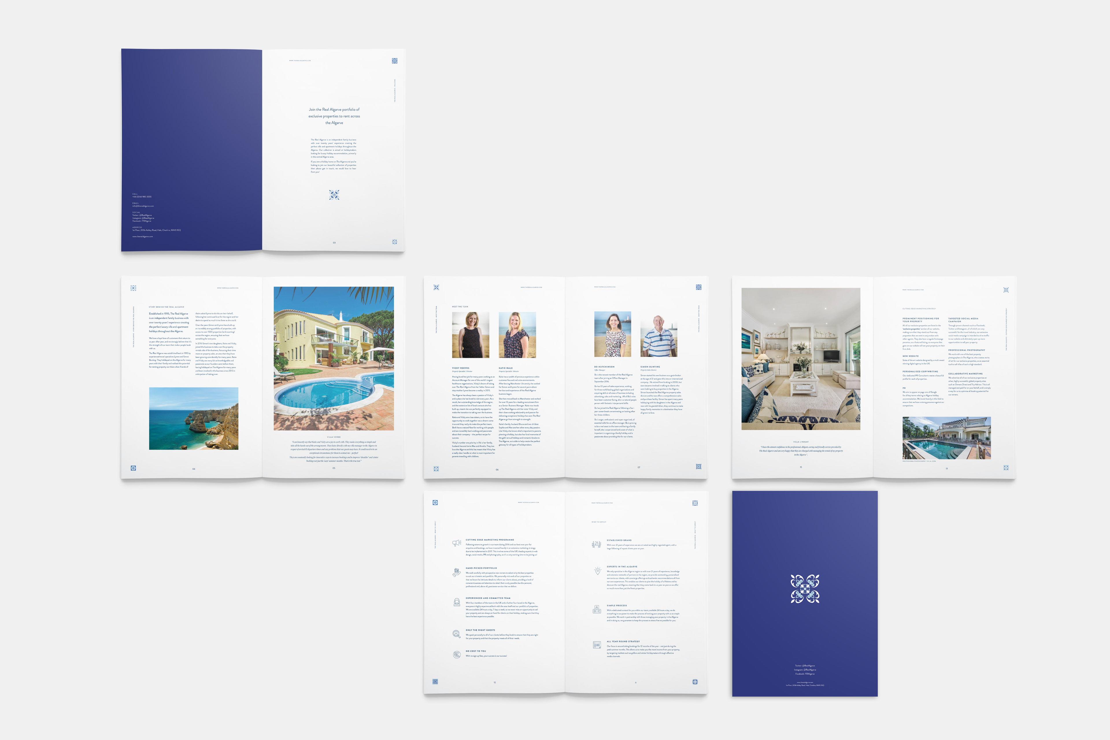
For over 20 years, this family-run business has offered exclusive luxury accommodation paired with the highest levels of service and expert knowledge, gained from living and working in the Algarve. However, when the business moved to the next generation of the family, an ageing website and dated visual style no longer reflected the passion and professionalism that made The Real Algarve stand above the competition. Ahoy’s task was to change this.
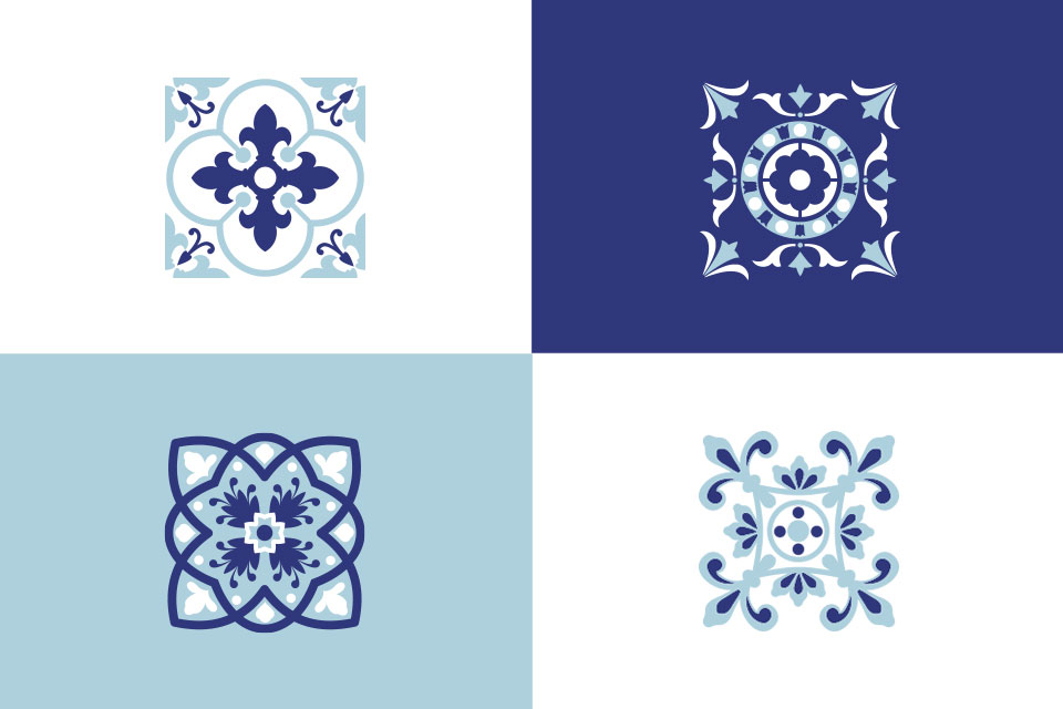
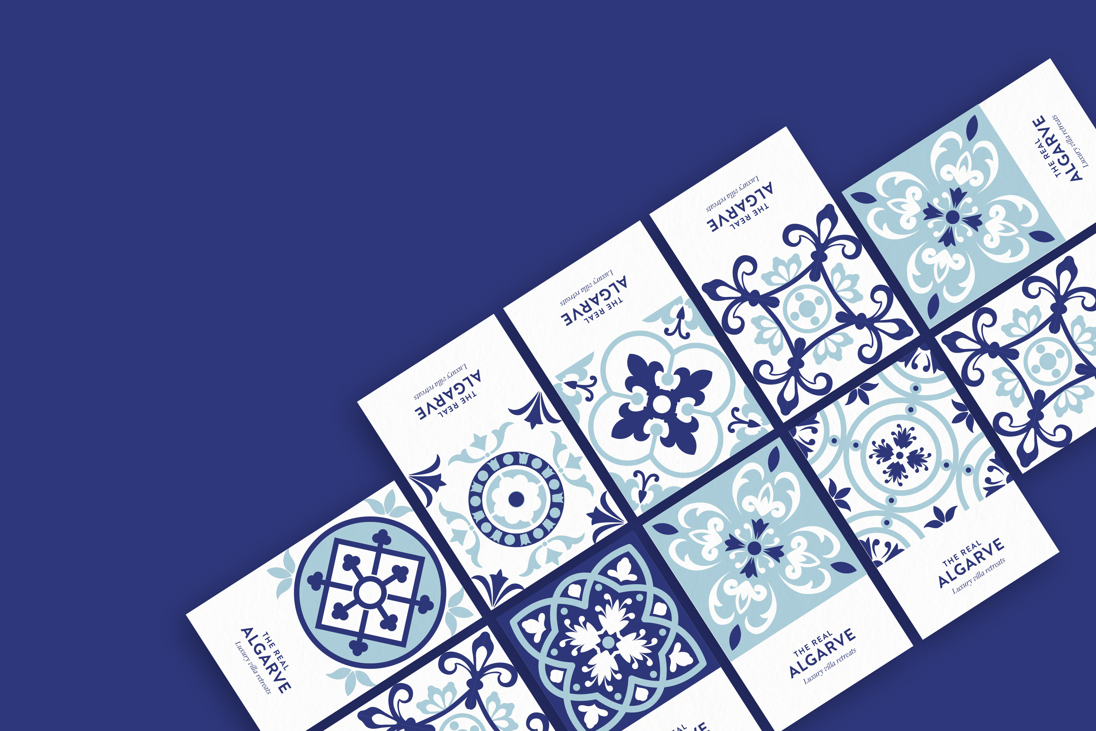
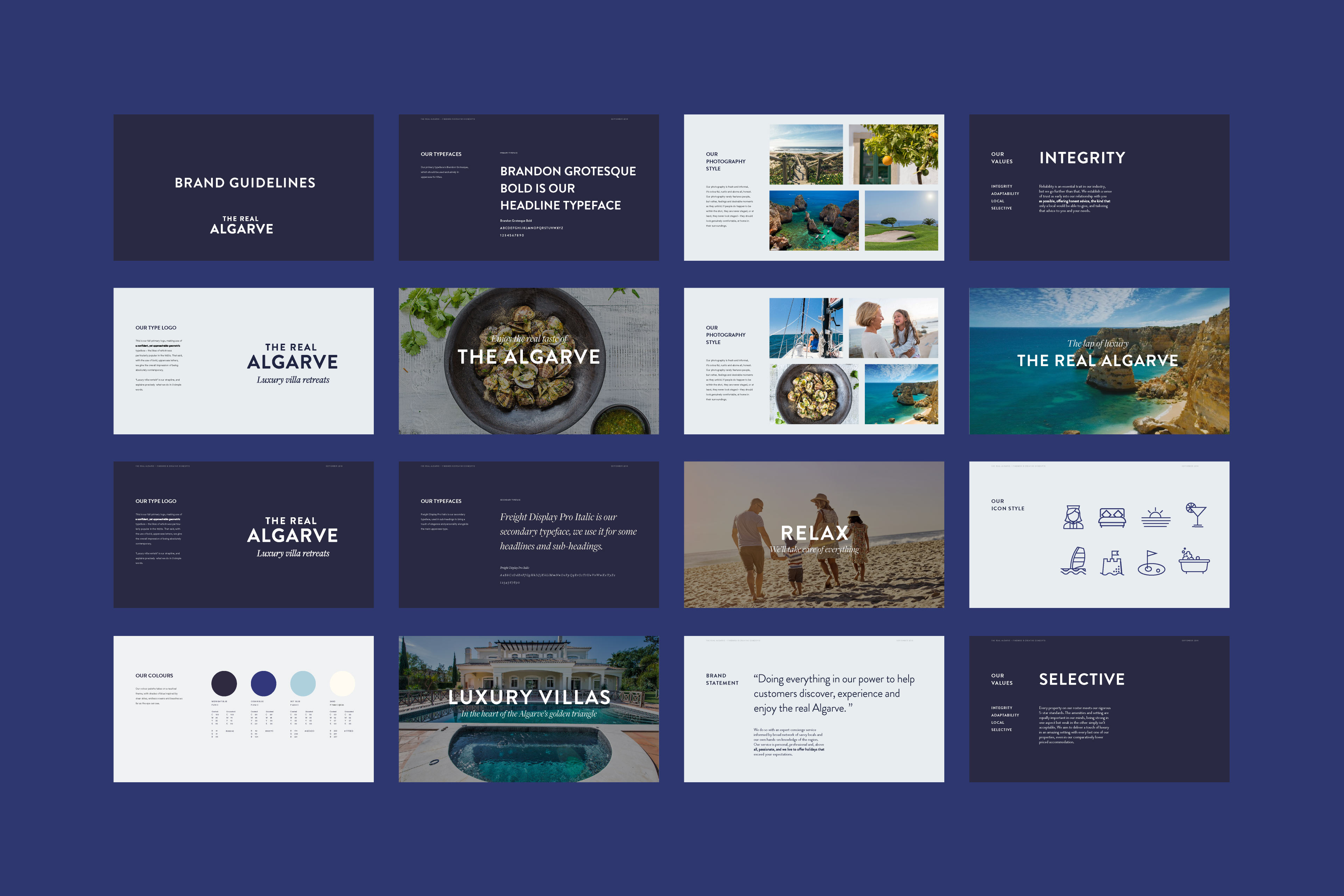
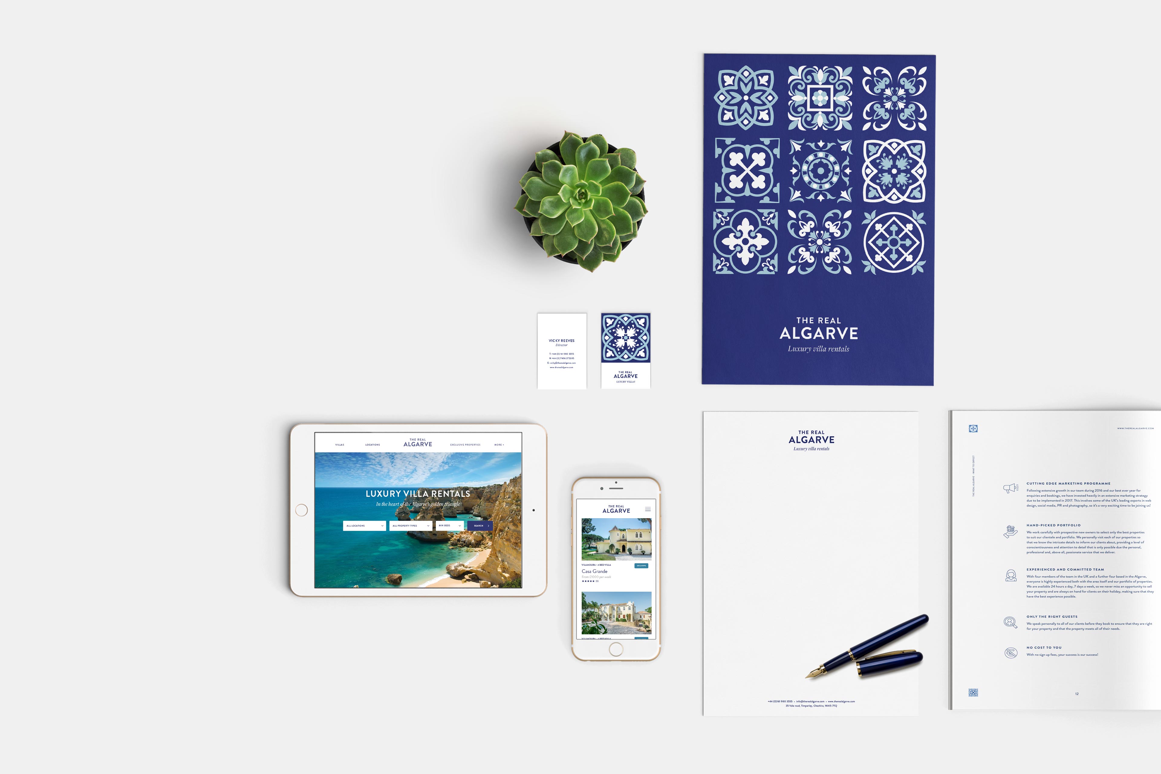
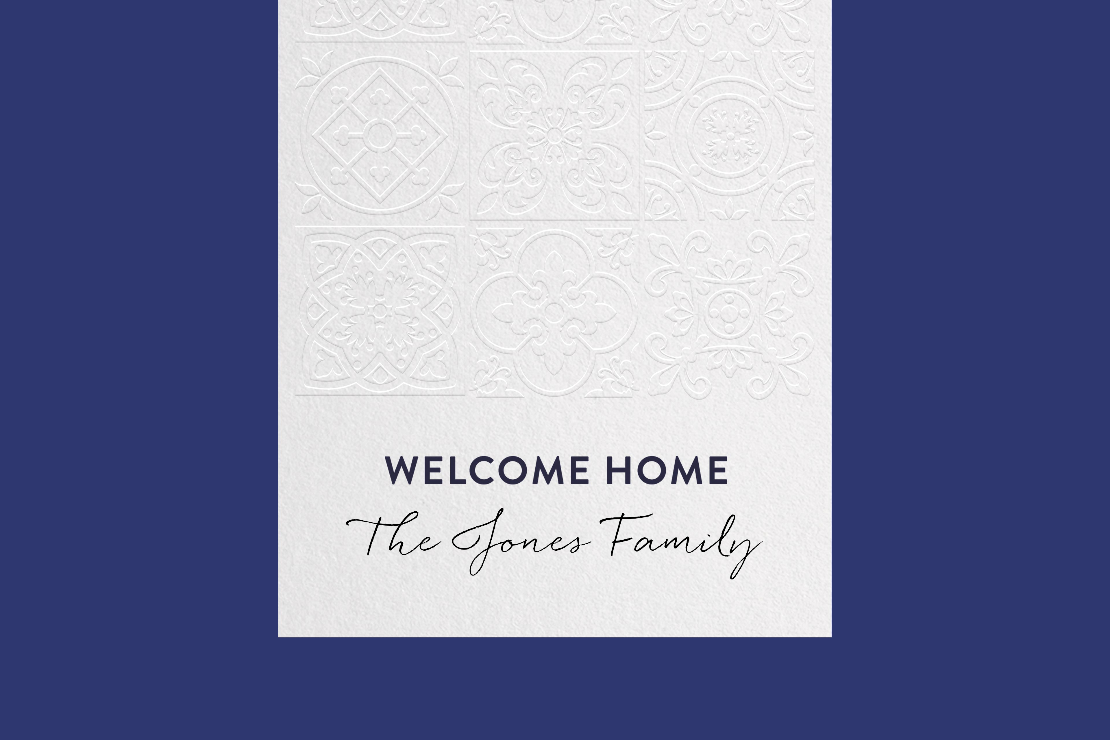
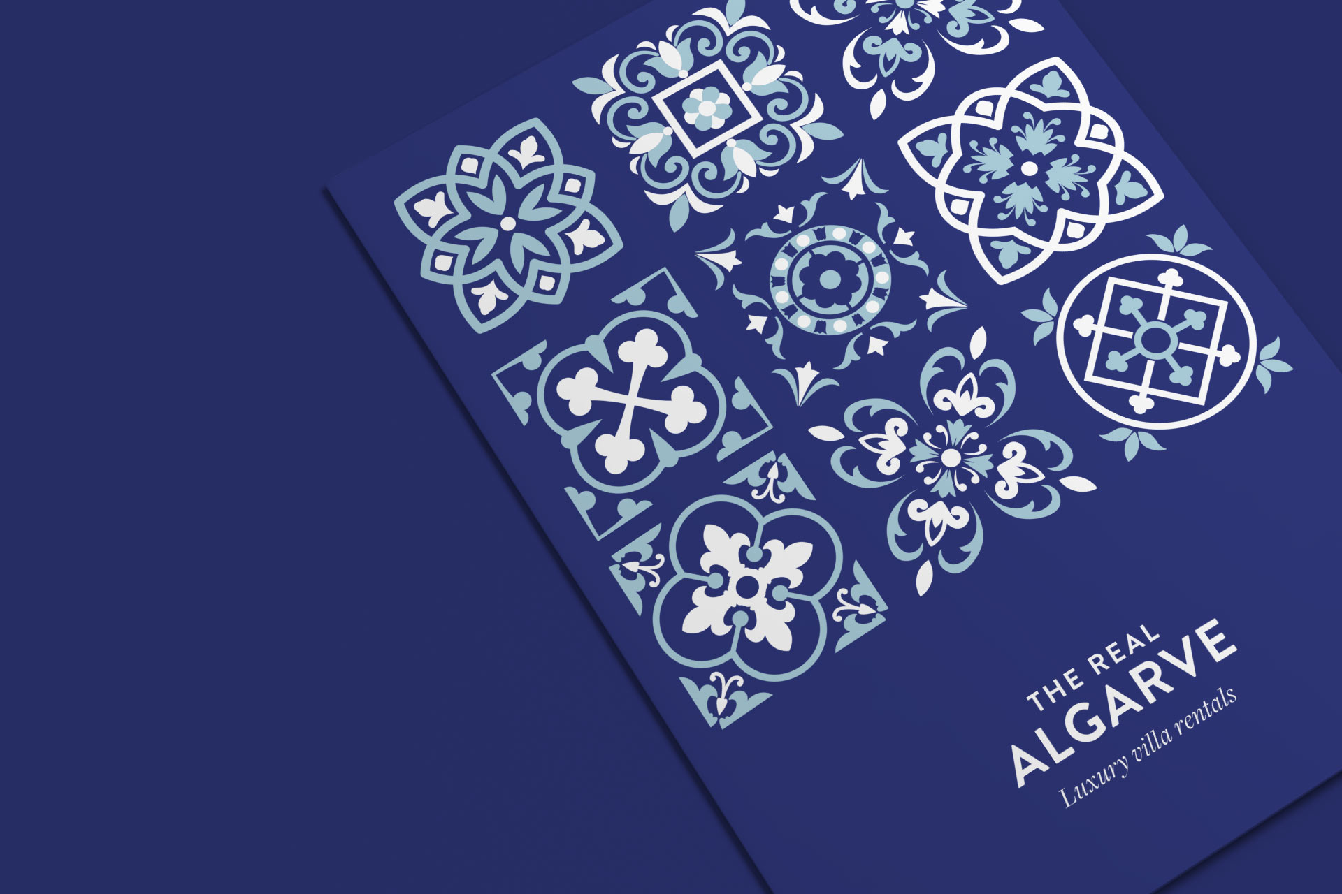
Taking inspiration from the mix-and-match ceramic tiles that adorn buildings throughout Portugal, we designed a series to decorate all assets of the brand. By switching colours, this handful of tiles can produce an endless number of unique visual markers to cement The Real Algarve’s bespoke, authentic nature.
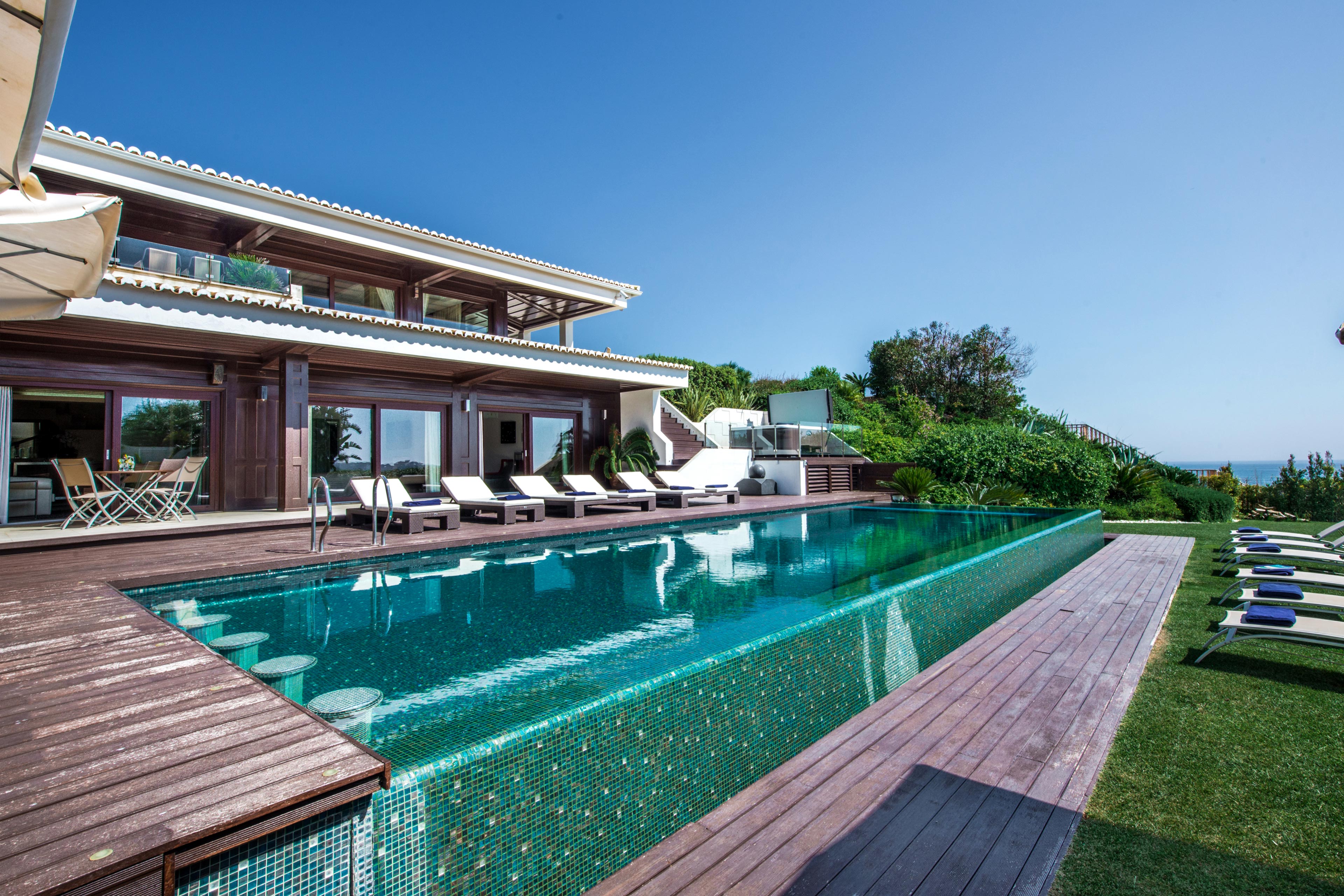
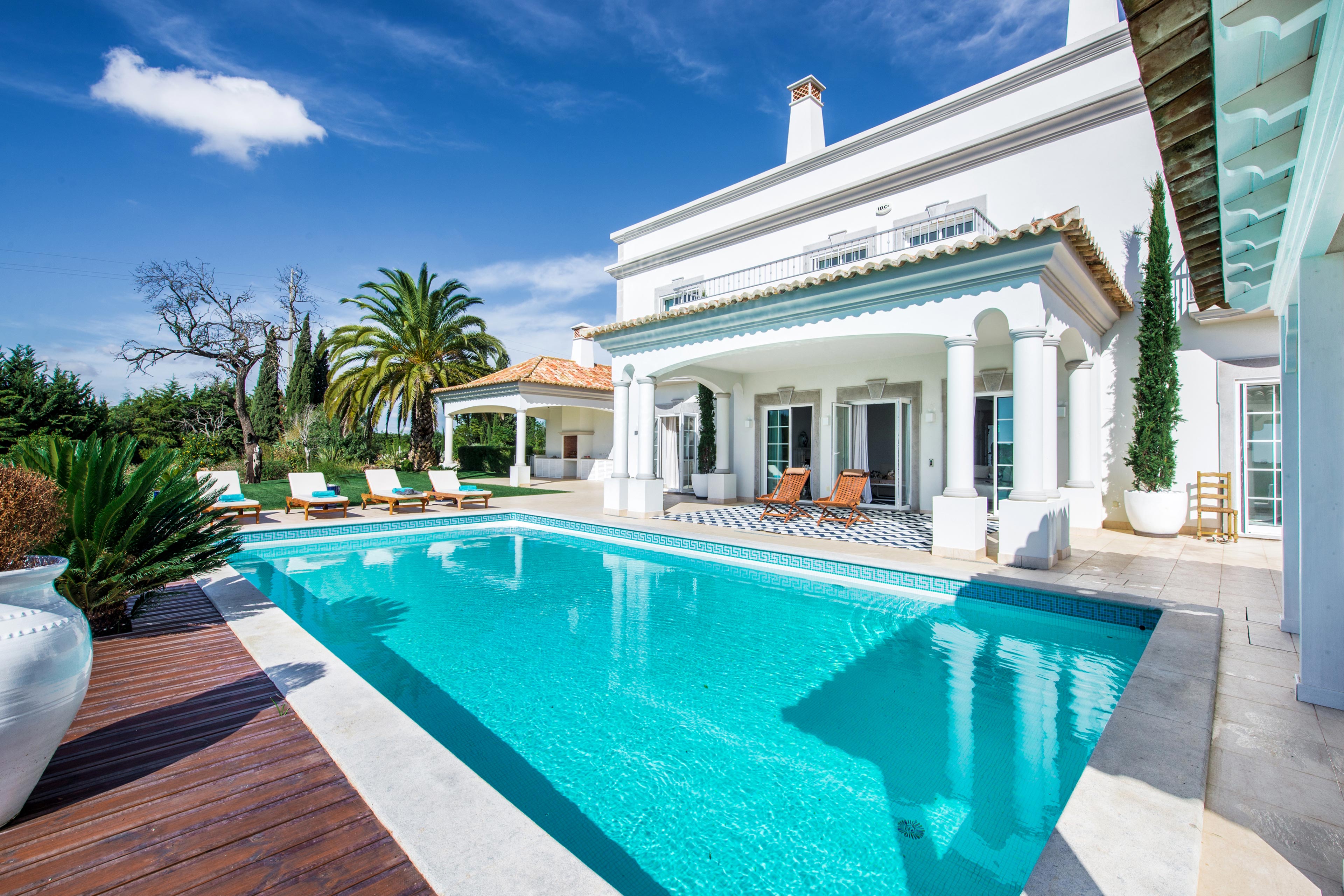
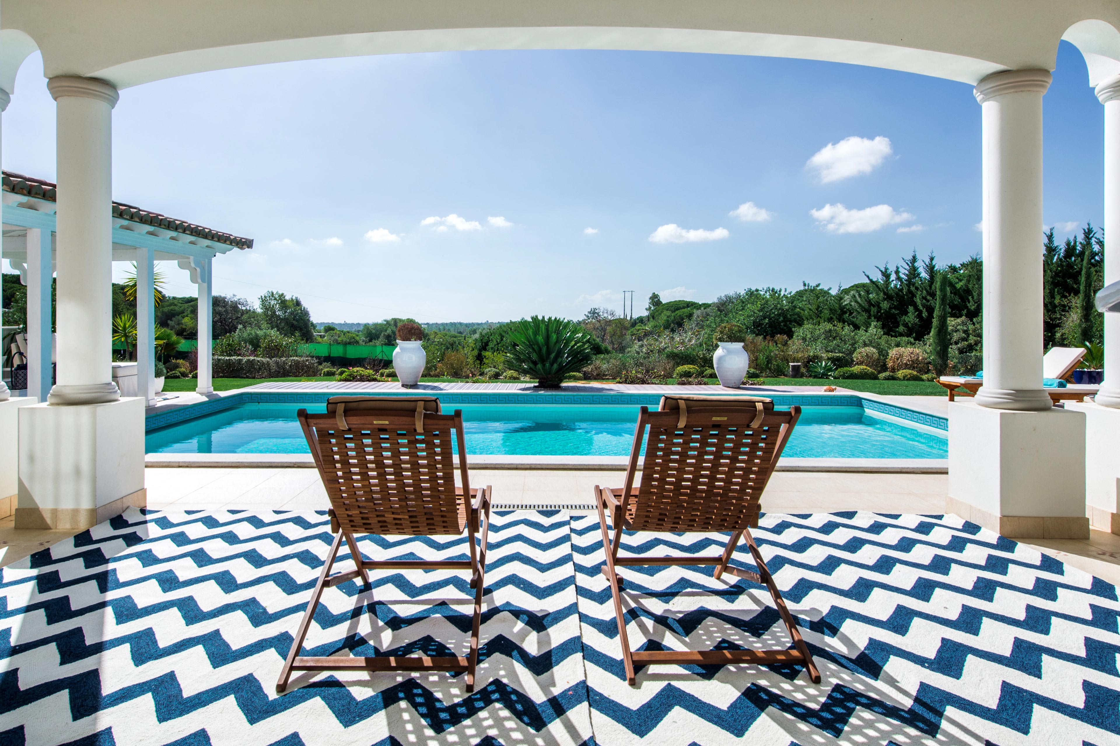
By adopting a nautical colour palette, we tied the brand’s identity into the Algarve’s coastline of deep blue oceans and clear blue skies. Influenced by 1920s travel posters, the art deco logo type hints at the style and glamour of travel, whilst the introduction of natural and informal photography captures a unique experience on the Algarve.
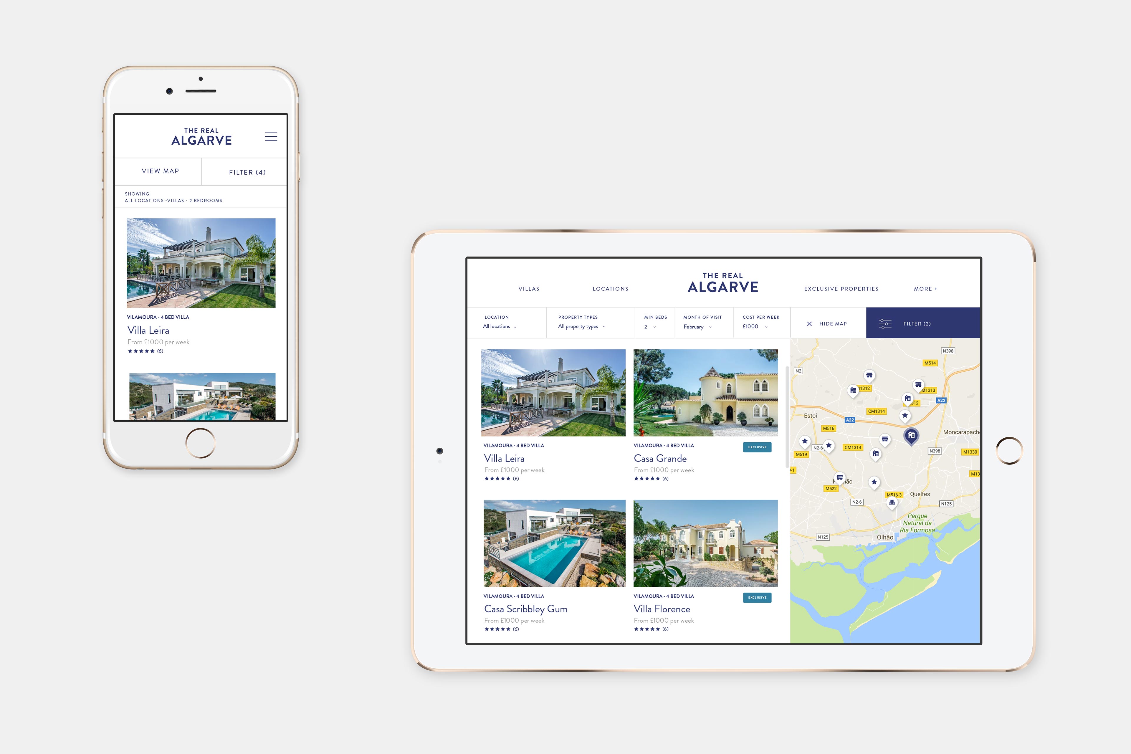
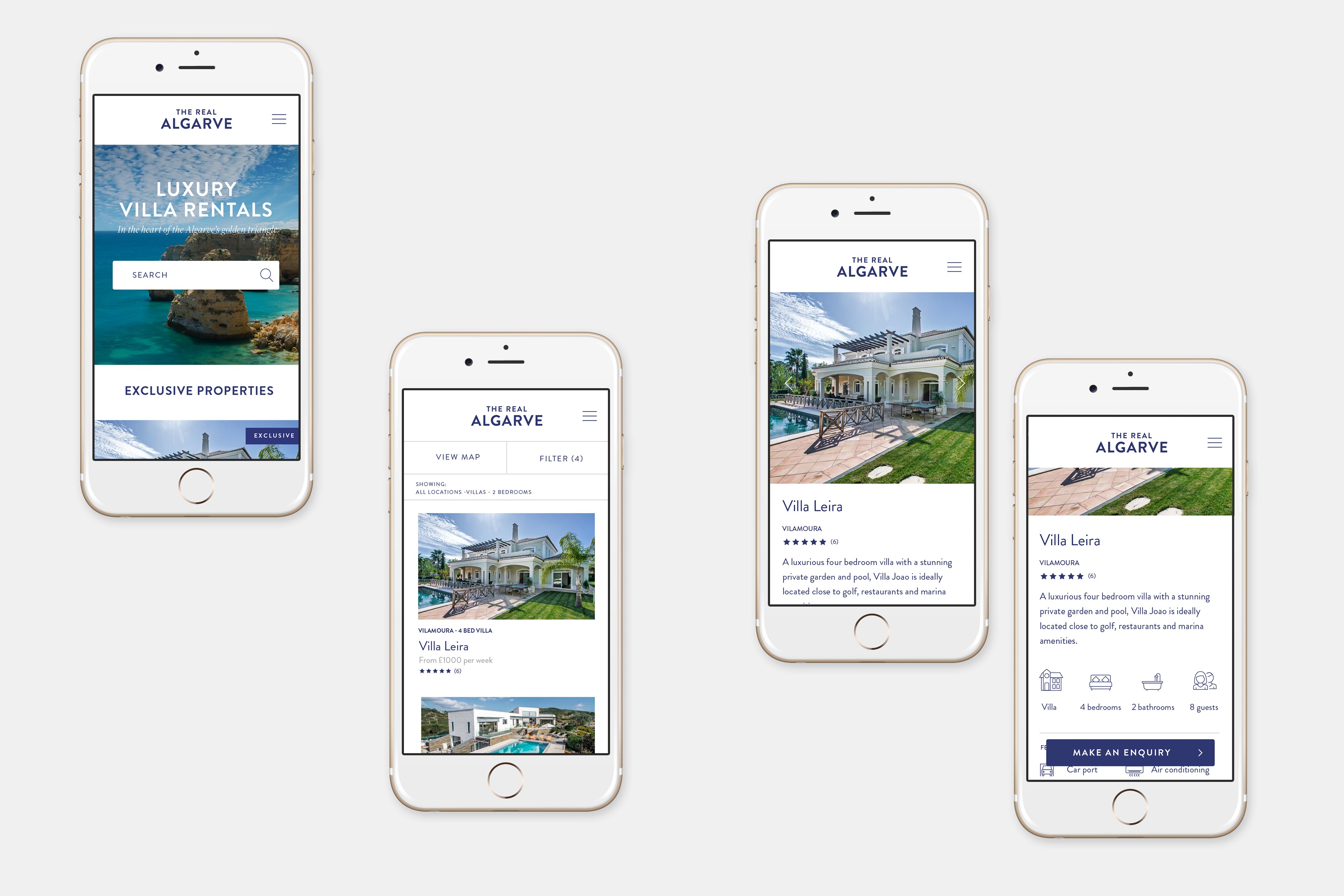
When it came to the website; it’s structure was largely determined by primary user goals. The main menu was reduced to 3 titles — lowering the number options and creating a more direct route to fulfill these goals.
Finding the perfect property quickly and easily was the site’s primary goal. As a result, fast and accurate search functionality was placed at it’s core.
Key search criteria drop-downs took prime position on the homepage, allowing users to reach a selection of ideal properties quickly and efficiently. At the second stage, users could refine their search further by selecting specific facilities if they so wished.
Over 70 icons were designed and developed — each representing an individual facility. In the site’s back-end, these icons could be assigned to properties from a check-box list, allowing the front-end user to gain a detailed overview of the property at a quick glance.
With 60% of travel searches beginning on mobile and 94% of all users switching between devices as they plan or book a holiday, it was vital we created a fully responsive design that worked seamlessly across all devises without compromising on functionality.
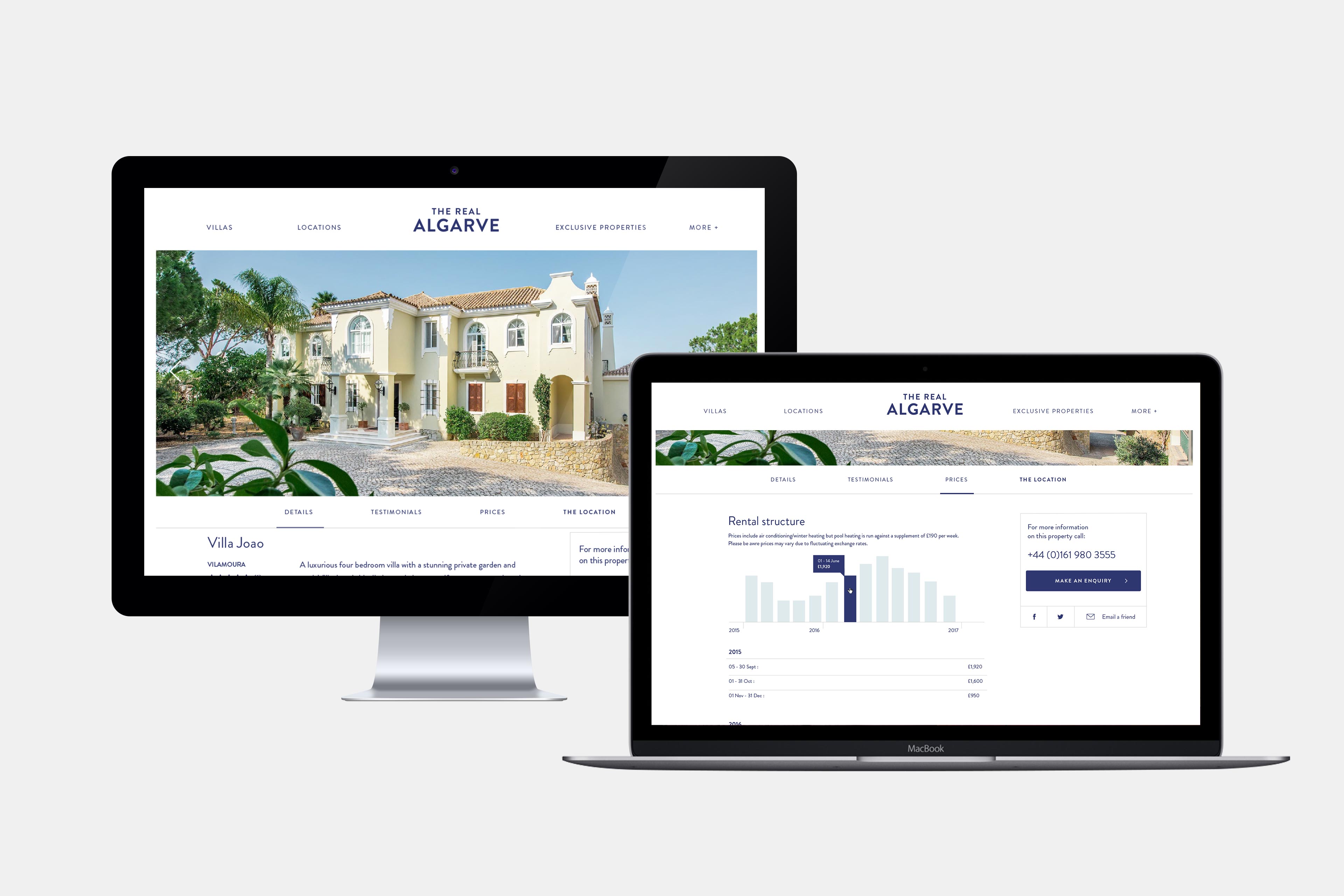
We made full use of The Real Algarve’s existing property photography and incorporated full-width imagery where ever possible.
An interactive pricing chart was also developed, enabling users to compare prices visually month by mouth – helping the user determine when would be an affordable time to travel.
Contact us
Get in touch
 NEXT PROJECT