BRIEF
United Environmental Services came to Ahoy looking for a complete rebrand. The original brand had been established a number of years previously, when the company consisted of just two people, and it no longer reflected the scale of the work UES was now able to undertake. We were asked to create a visual identity that better represented UES in the present: an ambitious and growing company able to hold their own against much larger competitors, and handle extensive and in-depth projects.
THEORY
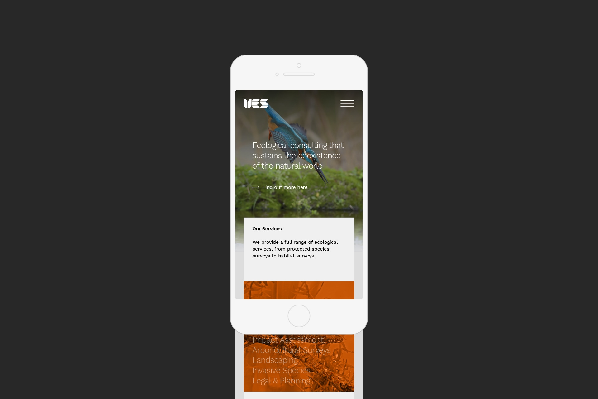
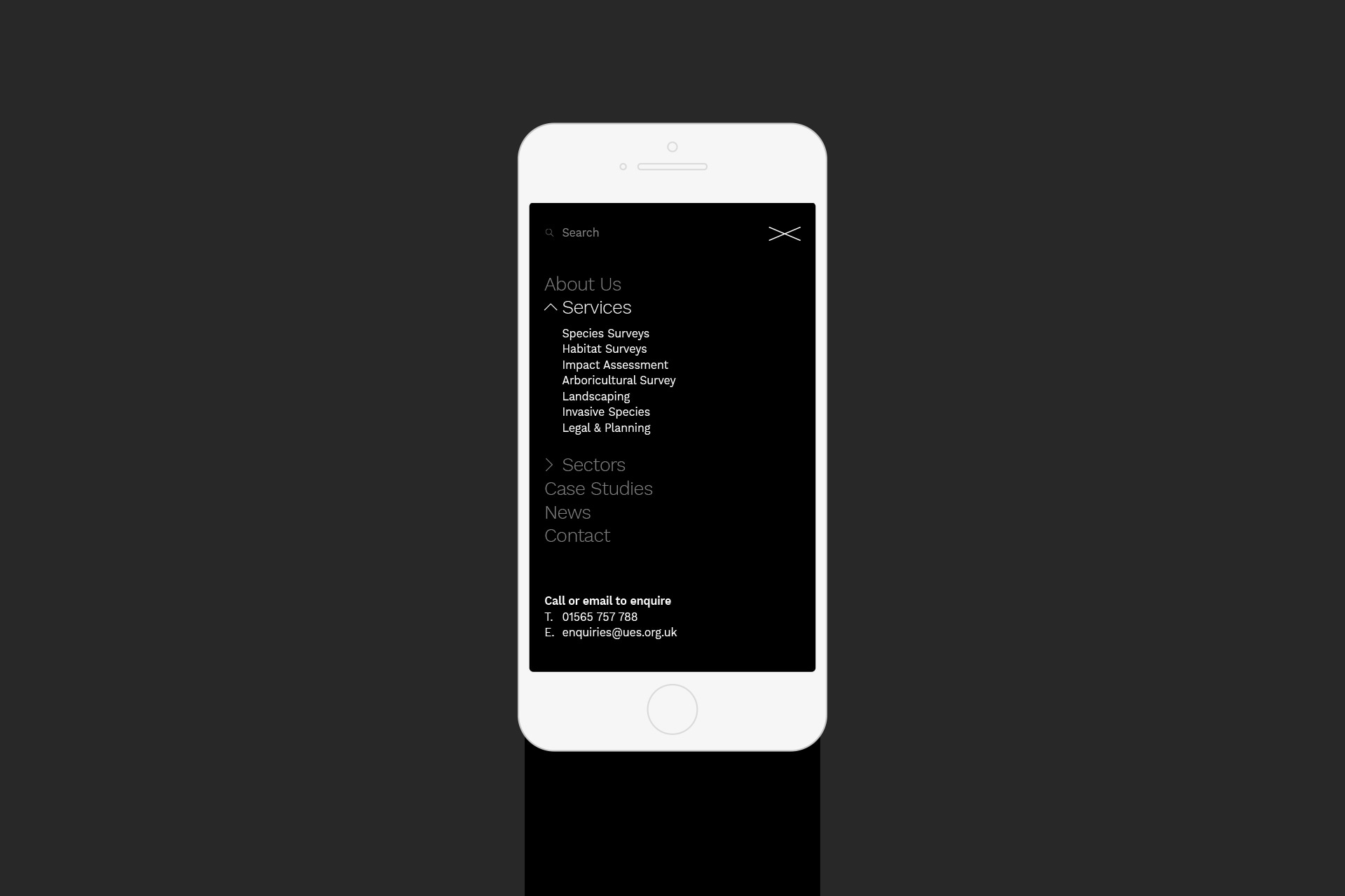
UES are experts in evaluating, protecting and mitigating. Their work requires attention to detail, a systematic approach, and in-depth knowledge of how to maintain the delicate balance between nature and urban regeneration. The website needed to be as informative as possible, breaking down complex information and communicating the benefits of UES’s services to experts and laypersons alike.
PROCESS
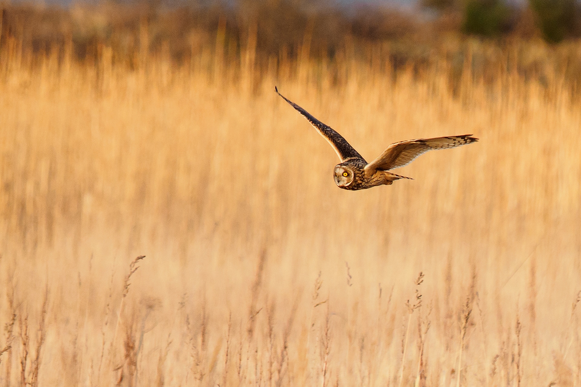
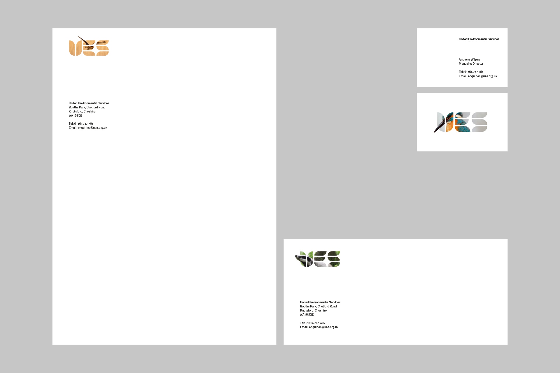
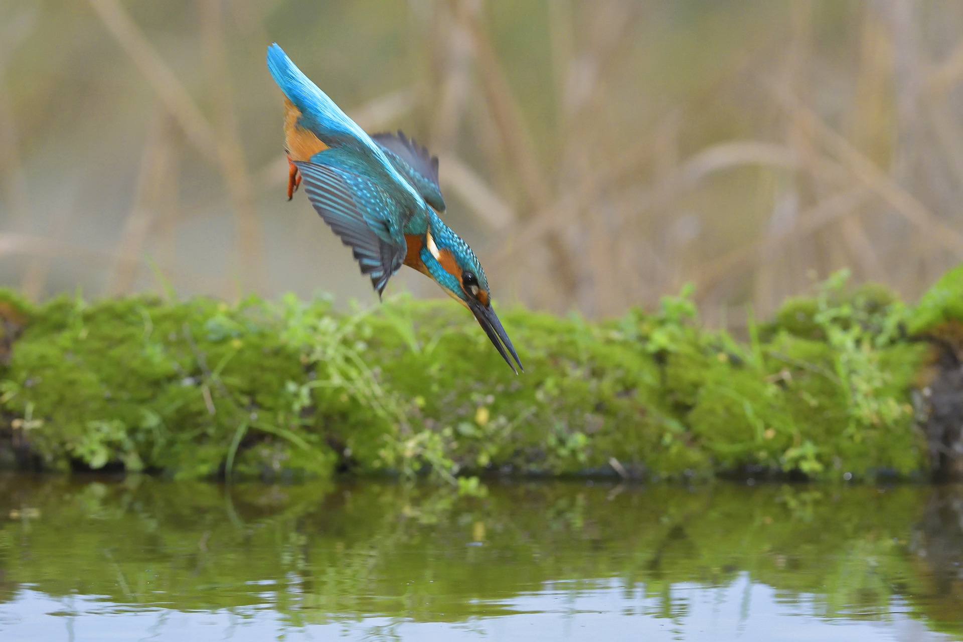
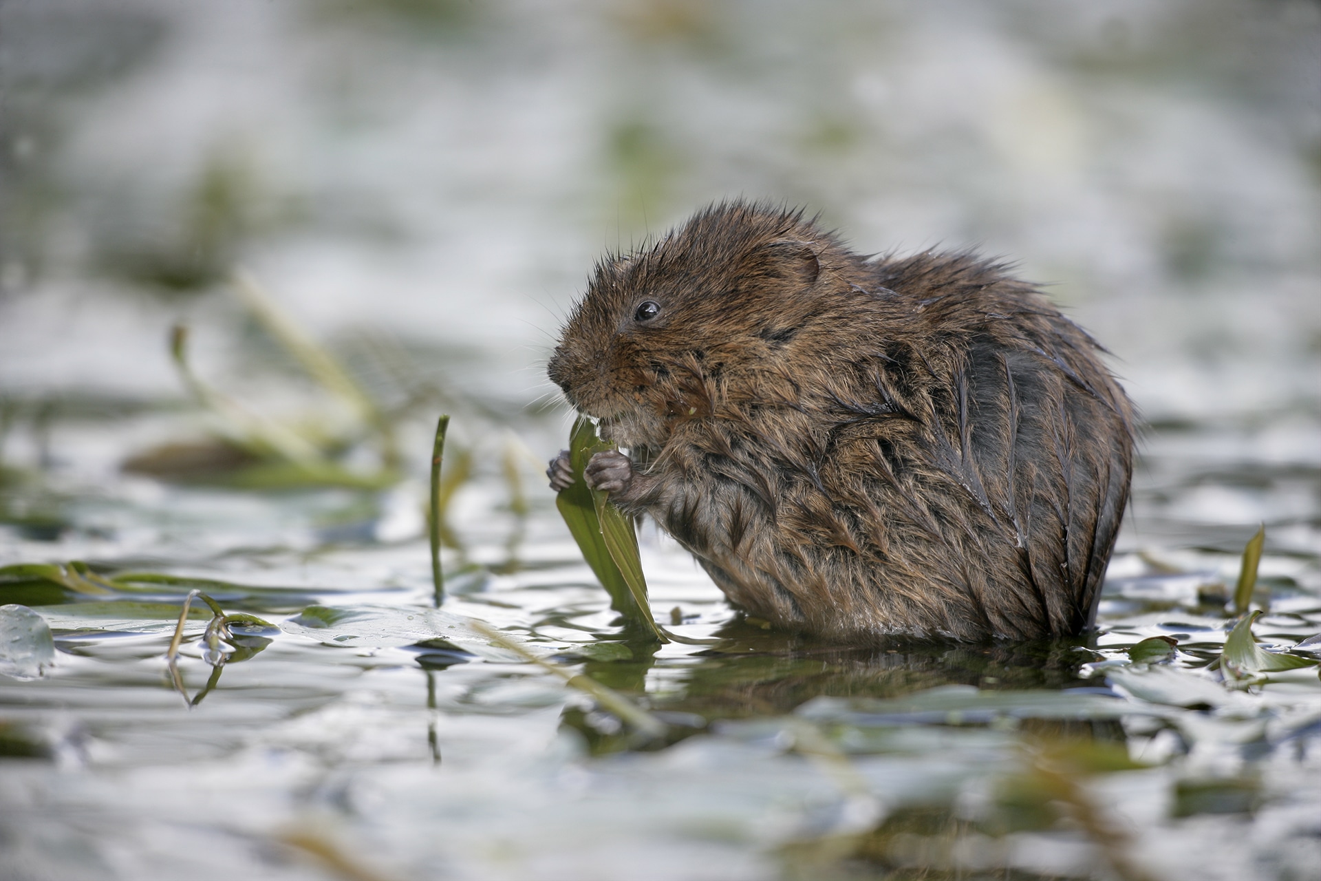
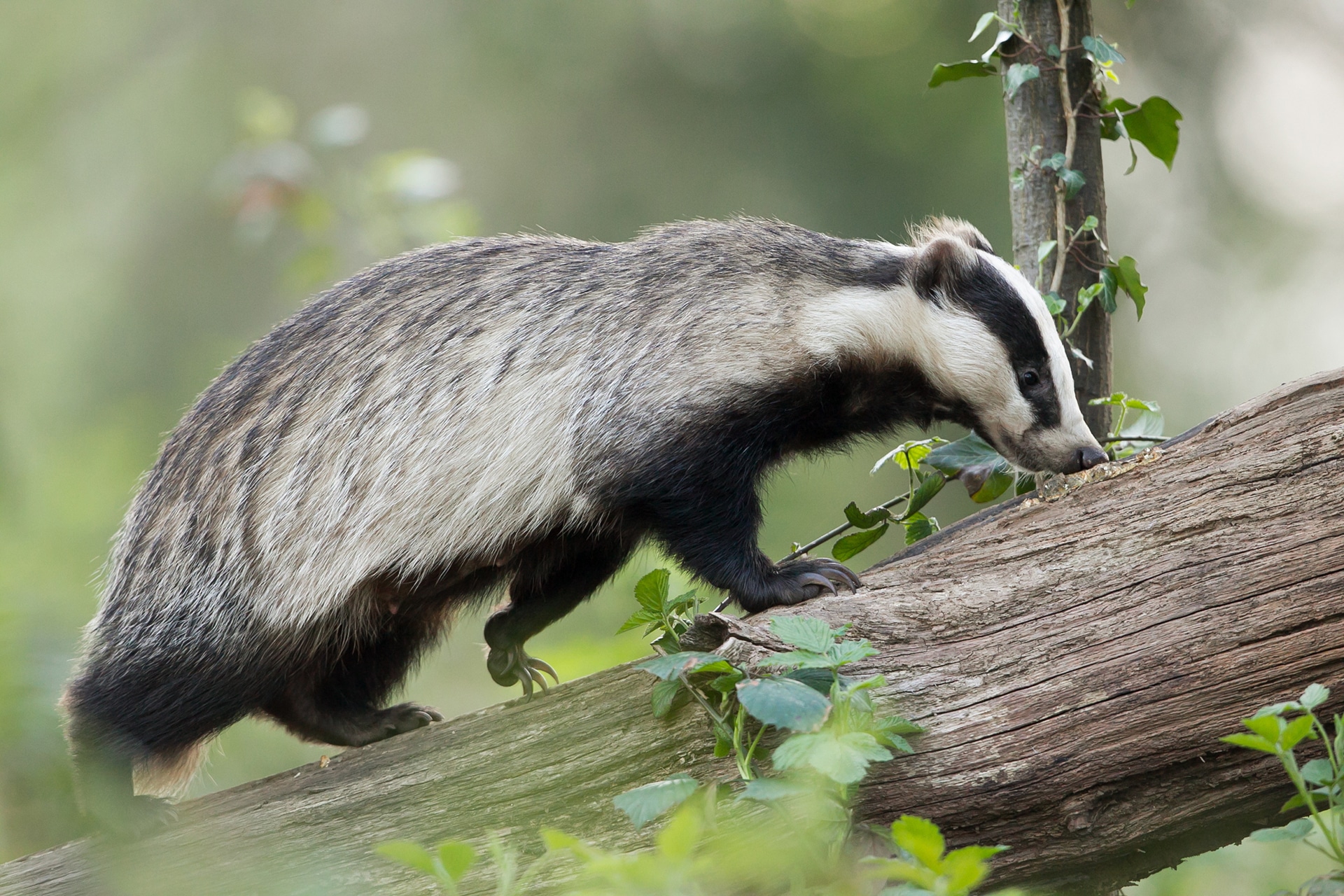
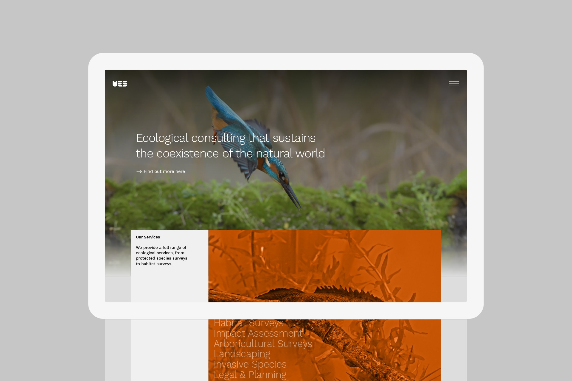
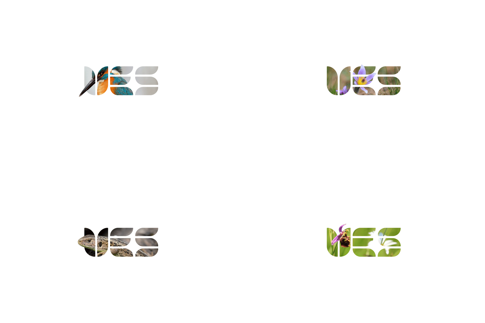
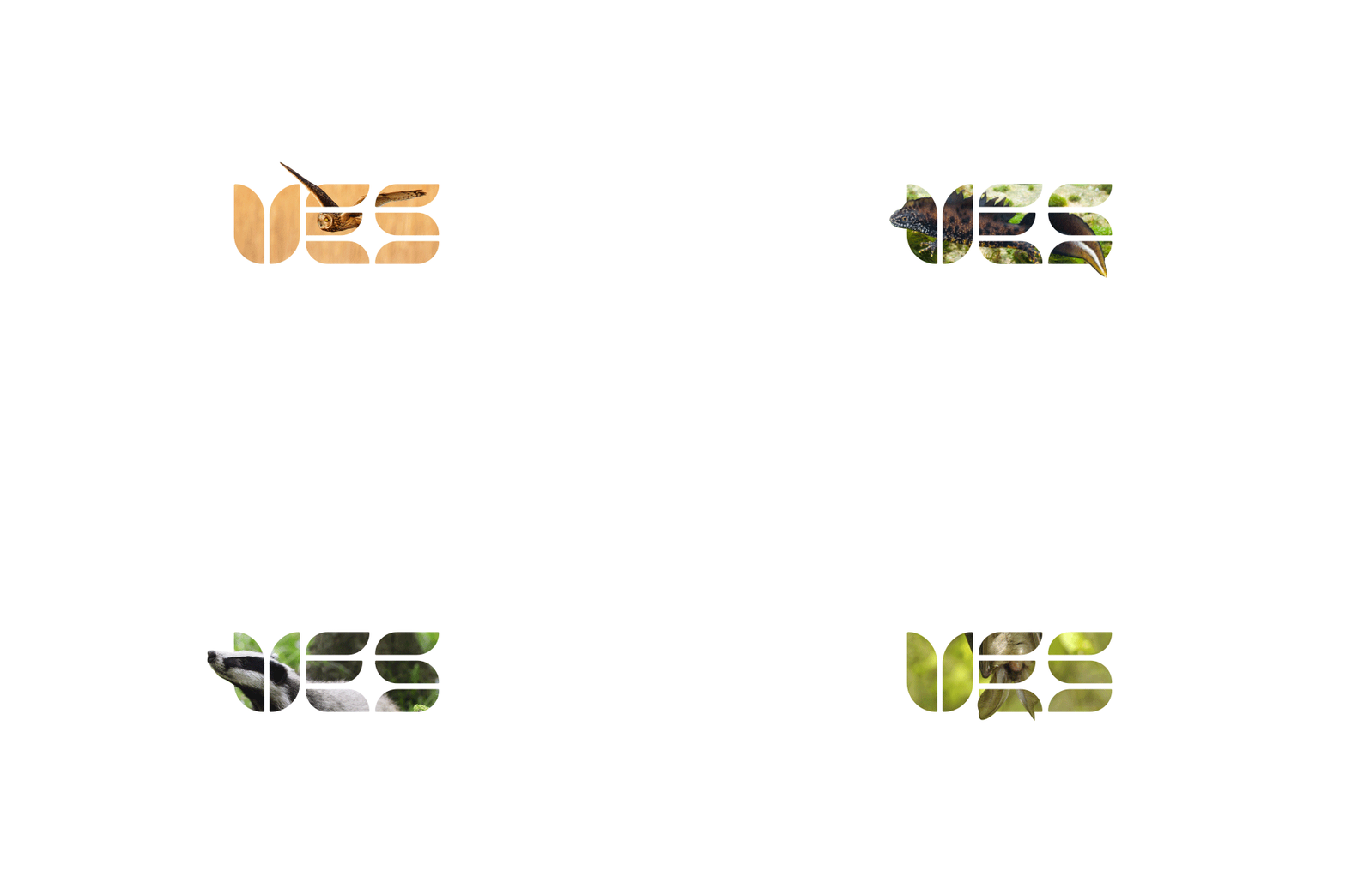
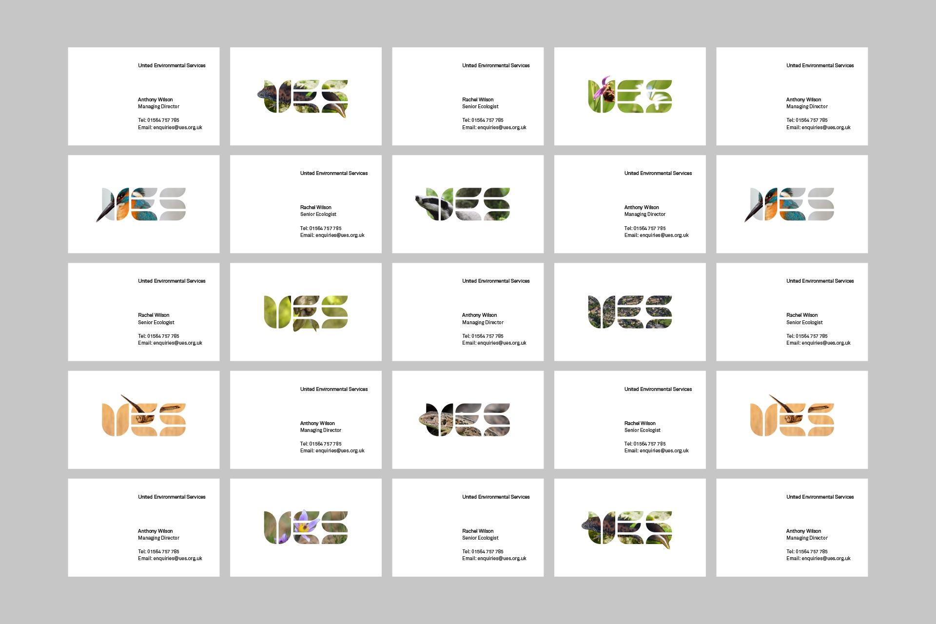
Using the ‘U’ of UES as a starting point, we mirrored a simple shape to create a form reminiscent of a flower and a shield–another nod to UES’s role as a protector of our rural landscape and the wildlife within it. The rest of the logo carried through this bespoke typography for a completely unique look. Breaking these shapes with the imagery allowed us to create a window into the natural world. This almost three-dimensional effect breaches the barrier between UES and its customers, again helping to break down the complexity of what UES does and helping the company to engage directly with viewers.
PROCESS cont.
For the staff at UES, the wildlife photography behind the logo really gave them a sense of involvement and ownership. The different backgrounds add variety to the brand and allow staff to personalise their print collateral. In line with the engaging new visual identity, we also adapted a significant portion of UES’s written content, rewriting and restructuring the text for readability, concision, and SEO purposes.
